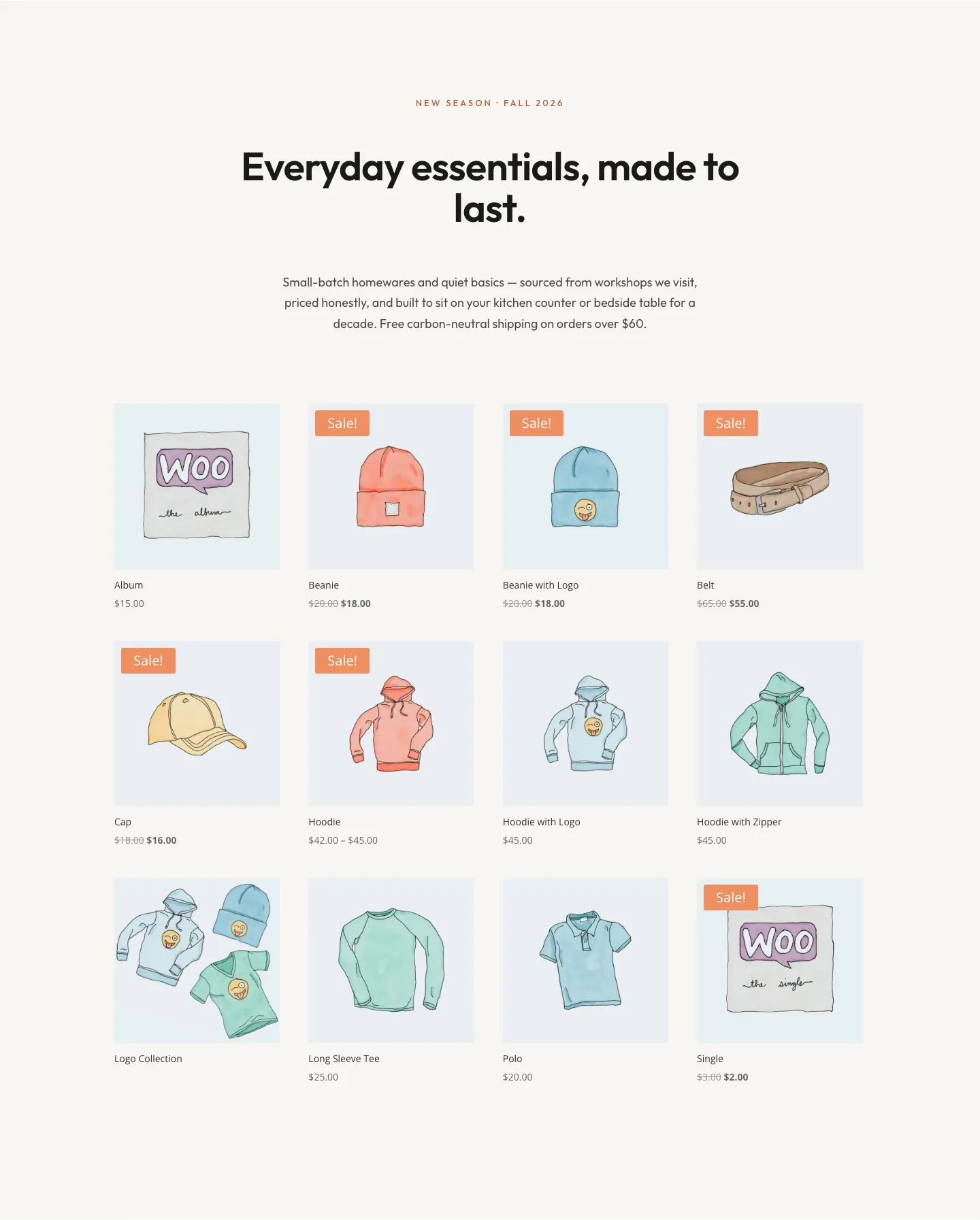
Halcyon Atelier: Elegant Ecommerce Shop Layout for Divi 5
An elegant Divi 5 shop layout for ecommerce brands selling handcrafted goods: featuring a serif hero, product grid, featured studio story, and newsletter CTA.
Rate this element
Download this section, free
- Divi 5 JSON, imports in seconds
- Commercial license included
- No account needed
Click to view the full page
Overview
Halcyon Atelier is a full ecommerce shop layout built for brands that want their storefront to feel like a curated boutique, not a template. The design pivots on a warm cream canvas (#FAF7F2) with a sand-toned pause section (#F0EAE0) between promise cards and an inky close (#1F1B18) on the newsletter, three distinct backgrounds that give the page a natural rhythm as visitors scroll from mood to browse to trust to conversion.
Type carries most of the hierarchy. Cormorant Garamond runs the display headings (78px in the hero, dropping to 56px on tablet and 40px on phone) paired with Outfit for eyebrows and body copy, so the page reads editorial without feeling precious. A single terracotta accent (#B85C3E) ties the eyebrows, primary buttons, the featured-studio link, and every FontAwesome icon together, and pill-shaped 999px-radius buttons keep every CTA visually consistent across light and dark sections.
Structurally, the layout opens with a centered intro (eyebrow + display headline + 640px-wide subhead + a primary/ghost button pair in a flex group), drops into a three-column trust bar of icons for shipping, returns, and secure checkout, then hands off to the native Divi 5 Shop module inside its own softly padded section. A 50/50 featured-studio split with an 18px-radius image reintroduces breathing room, three white promise cards with hover-lifting box shadows do the value work, and the dark closing section anchors a subscribe CTA. On phone, every row collapses to a single stacked column.
What’s inside
- Native `divi/shop` module dropped into a padded showcase section, pulls your live WooCommerce catalog with zero extra setup
- Centered hero: eyebrow + Cormorant Garamond display headline + 640px-wide subhead + paired primary and outline pill buttons in a flex group
- Three-column trust bar with FontAwesome icons for complimentary shipping, 30-day returns, and secure Stripe/Apple Pay checkout messaging
- Split 50/50 featured-studio row with an 18px-radius image (drop-shadow preset), story paragraph, and inline read-more link
- Three white value-prop cards on a sand background, rounded 18px with hover box-shadow lift to signal interactivity
- Dark newsletter closer with centered Cormorant heading, muted subcopy, and a full-width terracotta subscribe button
- Tuned responsive scaling: display headings step down at tablet and phone, and every row switches to a stacked column on mobile
- Cohesive design tokens (Cormorant Garamond + Outfit, cream/sand/ink/terracotta palette) applied consistently across every module
Who it’s for
Halcyon Atelier is built for ecommerce brands whose product is craft, care, or story: small-batch homewares, ceramics and pottery studios, linen and textile labels, artisan lighting, natural skincare, curated gift shops, independent perfumers, tea and coffee merchants, and boutique fashion or accessories houses. The editorial serif type and hand-mixed neutral palette suit brands that sell fewer, considered pieces at a mid-to-premium price point rather than high-volume mass retail. It also works for gallery and studio storefronts, made-to-order artisans, and lifestyle brands launching a seasonal collection page. Anywhere a live WooCommerce grid needs to sit inside a real story (trust bar, featured maker, brand promise, newsletter capture), this layout gives you the frame.
Customization tips
Recolor everything from a single preset swap: the terracotta (#B85C3E) drives every button, eyebrow, icon, and link. Replace it once and the whole page shifts. Keep display headings under about 40 characters so the 78px Cormorant scale doesn't wrap awkwardly on desktop, and cap the hero subhead at roughly two lines inside the 640px max-width. Eyebrow labels look best at 3–5 short words in all-caps (the 4px letter-spacing does the visual work).
For imagery: the featured-studio image sits in a 50/50 column, so a 3:2 landscape crop around 940×650 fills the 18px-rounded frame cleanly. Product images come from your WooCommerce catalog through the native Shop module, square 1:1 crops read most consistently in a multi-column grid. The three promise cards each take about 25 words of body copy plus one FontAwesome icon; keep card titles to two or three words so the row aligns. On phone, every row already stacks. No extra work needed.
How to install this layout
- Download the layout JSON file from this page.
- Open the target page in the Divi 5 builder.
- Open the portability panel (up/down arrows icon) and choose the Import tab.
- Upload the JSON. Tick “replace existing content” only for full-page imports.
- Check the page at desktop and mobile widths, then swap in your copy and images.
Full walkthrough with troubleshooting: How to Import a Divi 5 Layout.
Questions about Halcyon Atelier: Elegant Ecommerce Shop Layout for Divi 5
Which Divi module actually powers the product grid?
The native Divi 5 Shop module. On a WooCommerce site it automatically pulls your live products into the grid: no manual list, no external plugin. You can filter by category, tag, sale items, or 'featured' from the module settings.
How does the type scale across breakpoints?
All display headings have three tuned sizes. The hero H1 drops from 78px to 56px to 40px (desktop/tablet/phone), section titles go 56 → 42 → 34, the featured-studio H2 goes 48 → 38 → 32, and card titles hold at 26px. Rows also switch to a stacked column layout at the phone breakpoint.
What should I customize first?
Four things reskin it to your brand without touching structure: the terracotta accent color, the featured-studio image, the trust-bar copy (shipping / returns / checkout), and the three 'Our Promise' cards. Change those and the layout already feels like yours.
Where do the demo images come from?
The featured-studio placeholder pulls from Pexels, swap it for a real workshop or lifestyle photo before publishing. Product imagery in the shop grid comes from your own WooCommerce product photos, not the layout file.
Do I need WooCommerce for this to work?
The Shop module needs WooCommerce active to render products. Without Woo, that one section shows a placeholder: the rest of the page (hero, trust bar, featured studio, promise cards, dark newsletter CTA) still works independently.
How is the newsletter section built?
It's a dark full-width section with a centered eyebrow, Cormorant heading, muted subcopy, and a single terracotta pill button. No form module. Wire the button to your email provider's hosted form, or drop a Divi Email Optin module in its place.
Which Divi version does this layout need?
Divi 5. The layout is generated natively for Divi 5 and validated against its real module structure before publication, so it imports clean into the current builder.
Can I use this layout on client websites?
Yes. Every download includes a commercial license covering unlimited sites you own or build for clients. Only reselling or redistributing the layout file itself is prohibited.