
CTA Divi 5 Layouts
A CTA section is the moment your page stops explaining and starts asking. Done well, it feels less like a shove and more like an obvious next step: one clear promise, one clear button, nothing else fighting for the click.
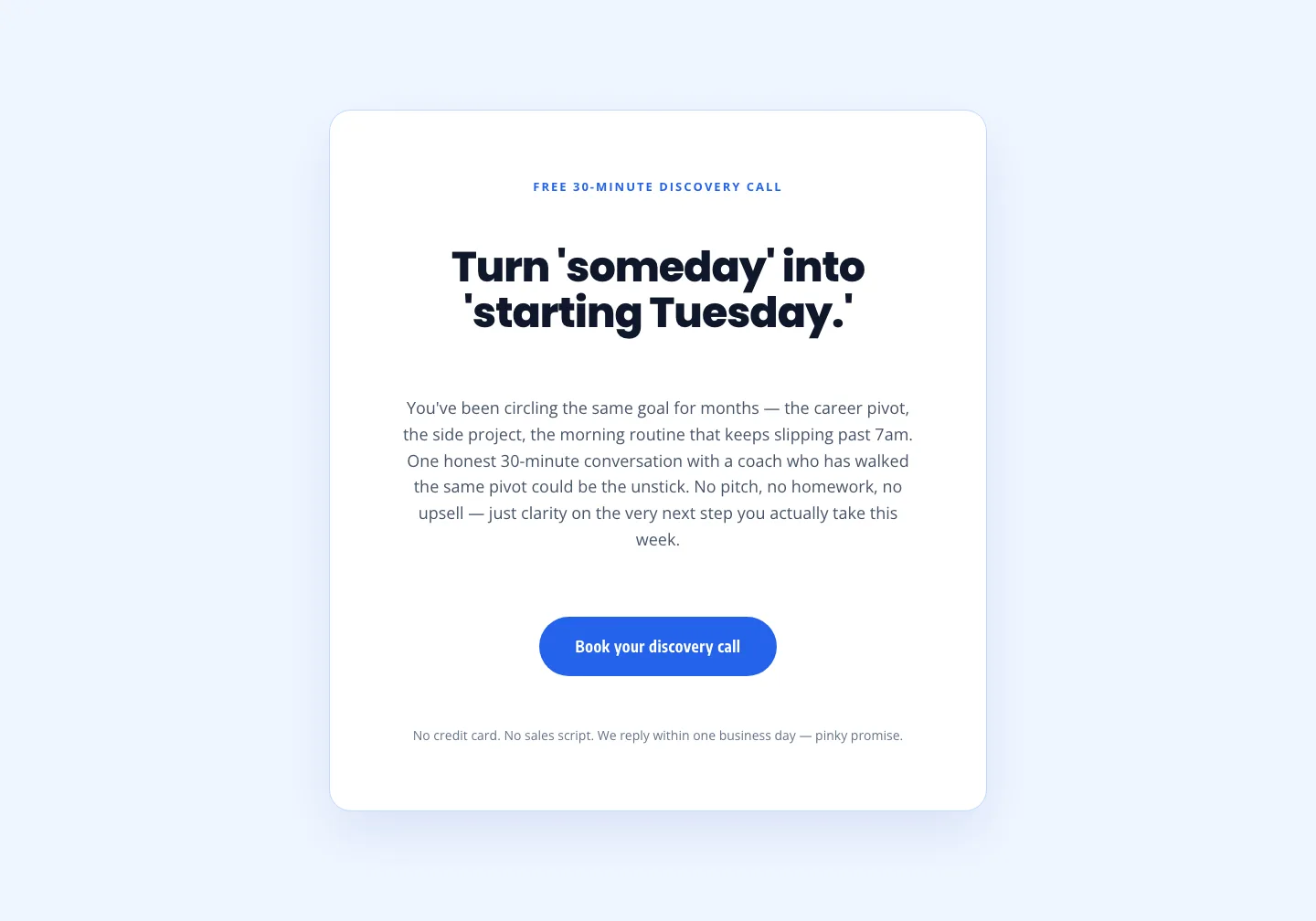
Coaching Discovery Call CTA: Playful Divi 5 Layout
cta · coaching · playful
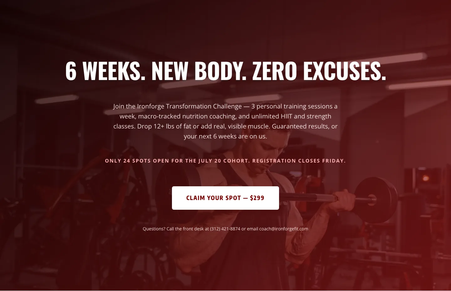
Bold Fitness CTA: Full-Bleed Banner
cta · fitness · bold
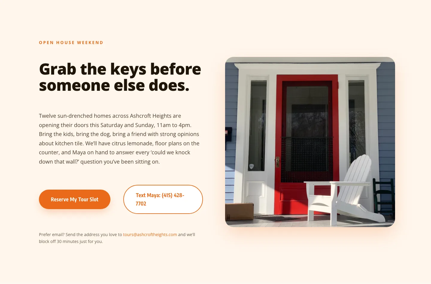
Playful Real Estate CTA: Open House Weekend Tour Booking
cta · real_estate · playful
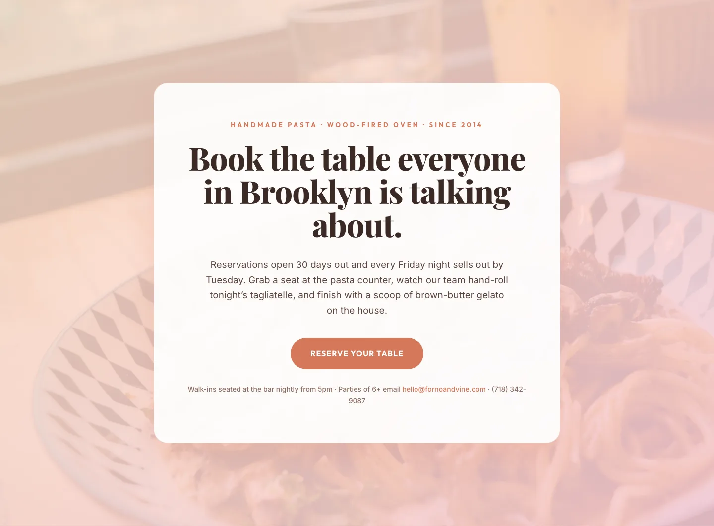
Bold Restaurant Reservation CTA: Divi 5 Layout
cta · restaurant · bold
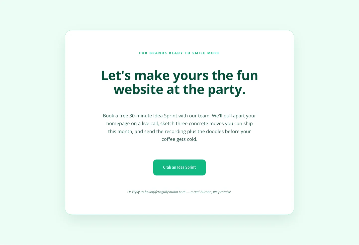
Playful Agency CTA: Idea Sprint Booking Card
cta · agency · playful

Bold Purple SaaS CTA Banner: Full-Bleed Divi 5 Layout
cta · saas · bold
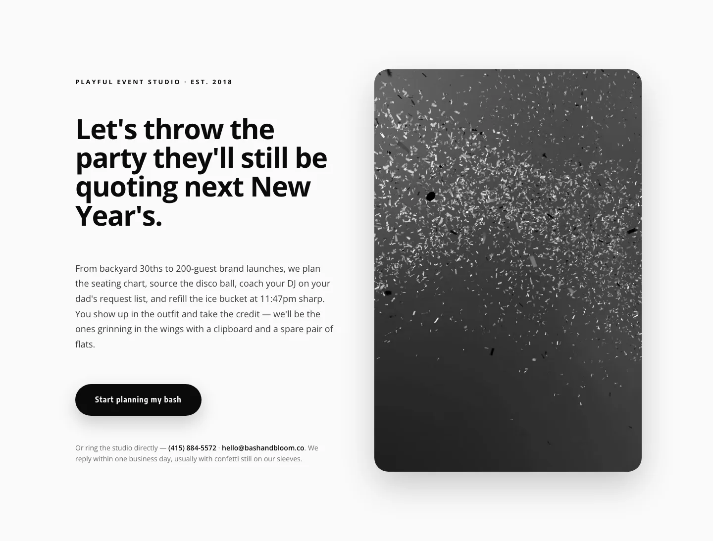
Playful Events CTA Layout for Divi 5: Bash & Bloom
cta · events · playful
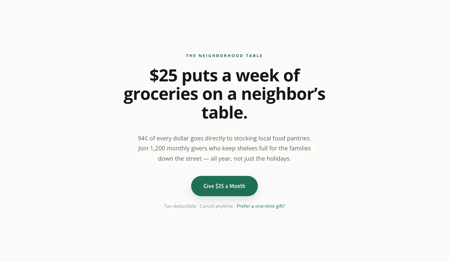
Minimal Nonprofit Donation CTA: Divi 5 Layout
cta · nonprofit · minimal
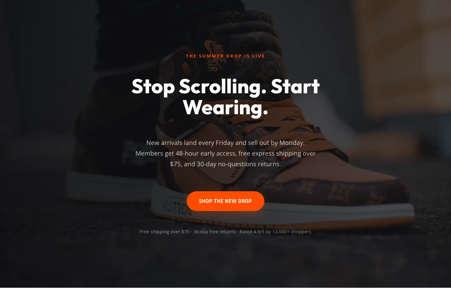
Bold Ecommerce CTA Section: 'The Drop Is Live' Divi 5 Layout
cta · ecommerce · bold
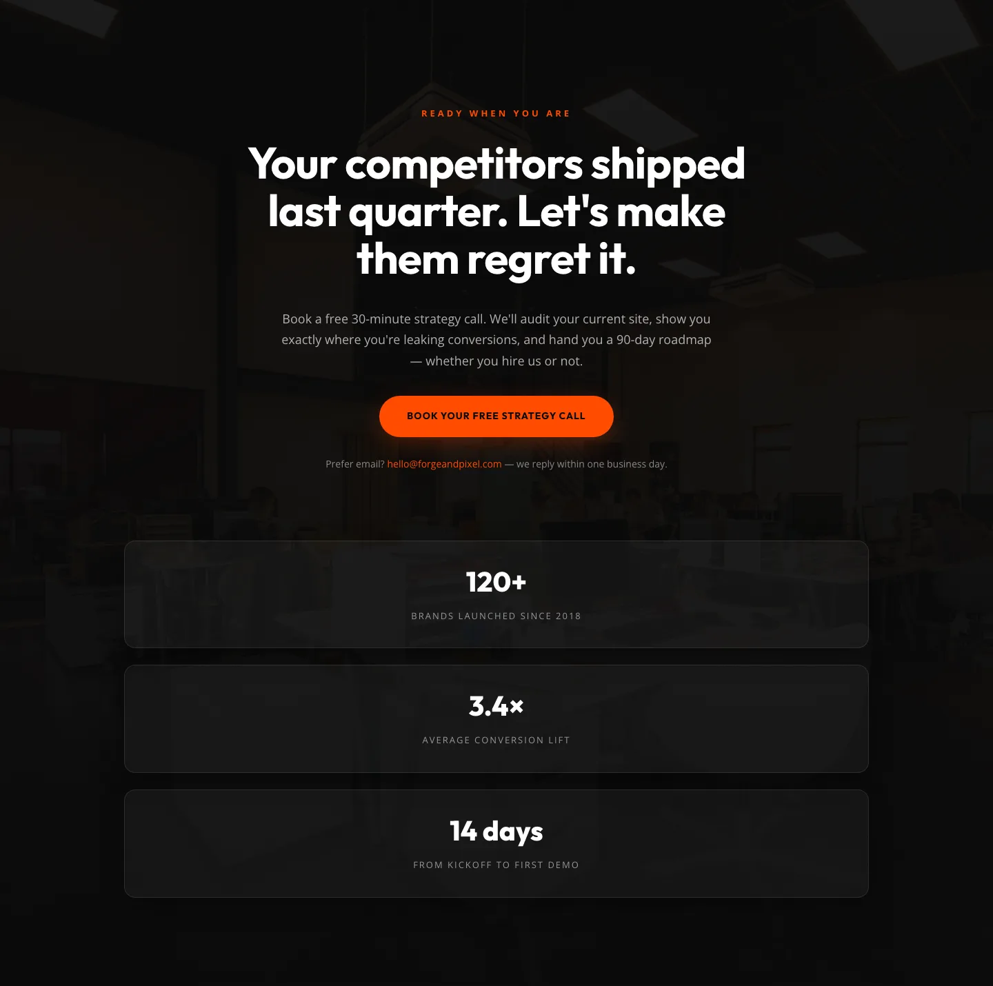
Dark Agency CTA Section with Strategy Call Booking & Proof Stats: Divi 5 Layout
cta · agency · dark

CTA: Portfolio Bold Blue
cta · portfolio · bold
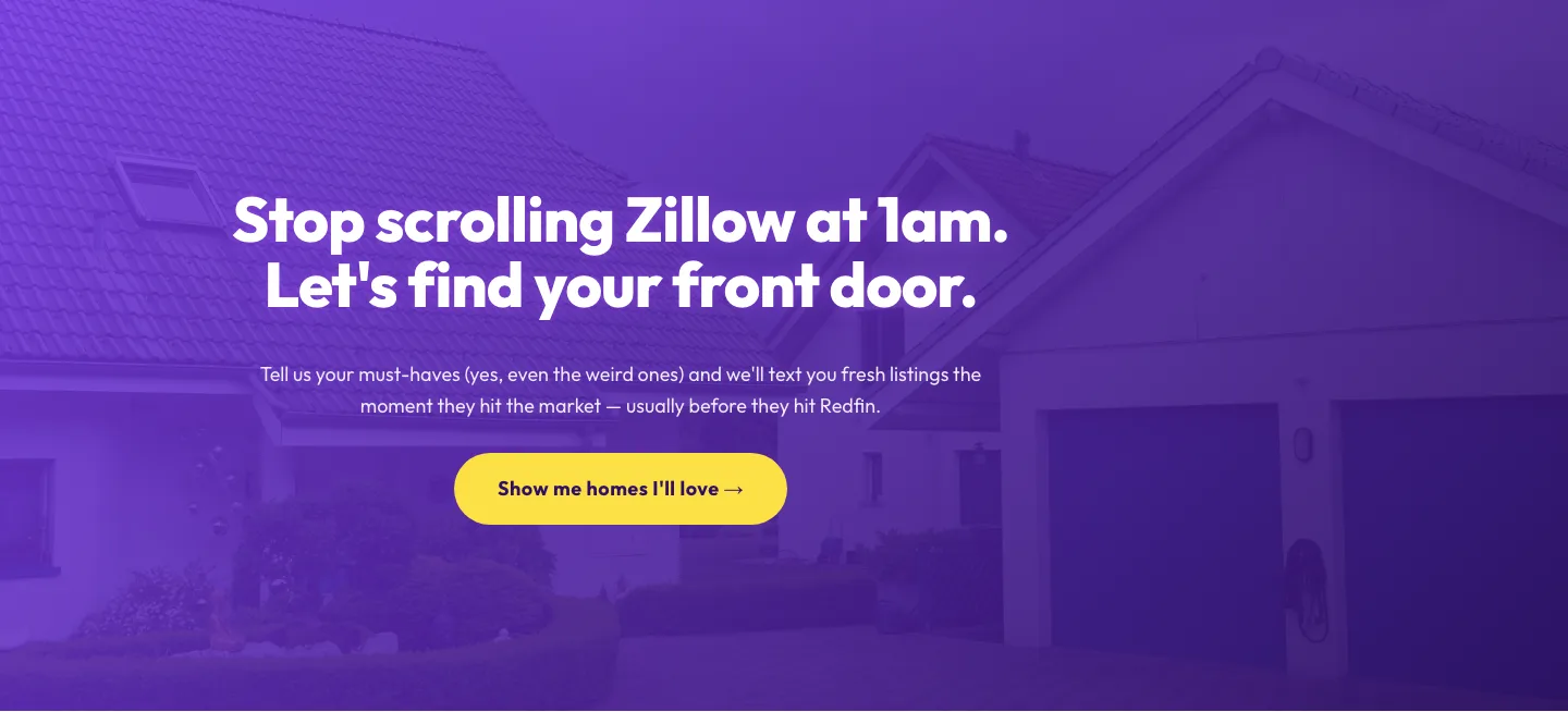
Playful Real Estate CTA: Purple Gradient Listing Alert Signup
cta · real_estate · playful
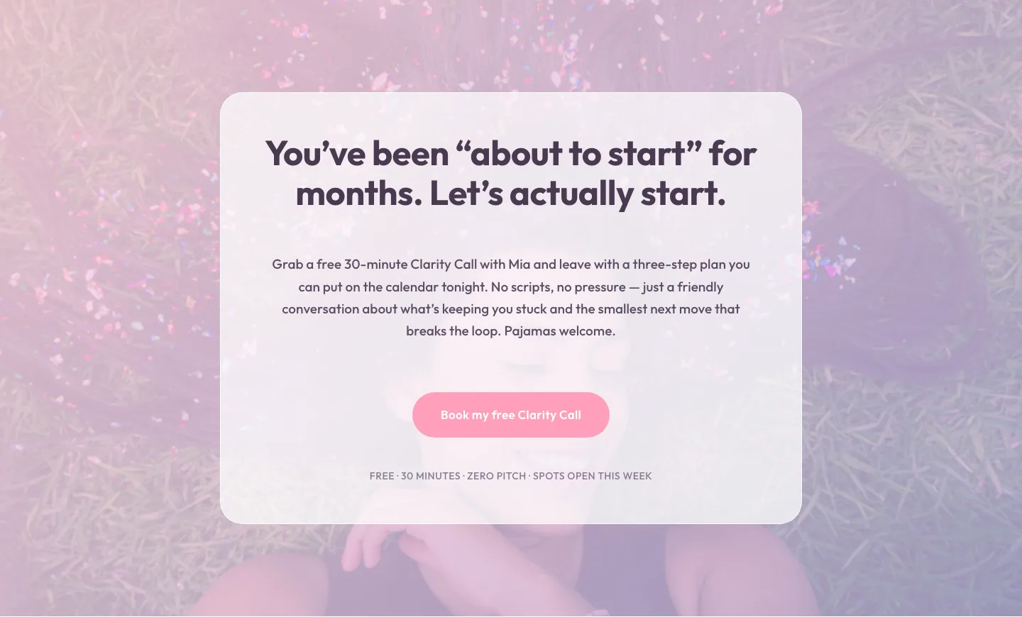
Playful Pastel Coaching CTA: Free Clarity Call Banner
cta · coaching · playful
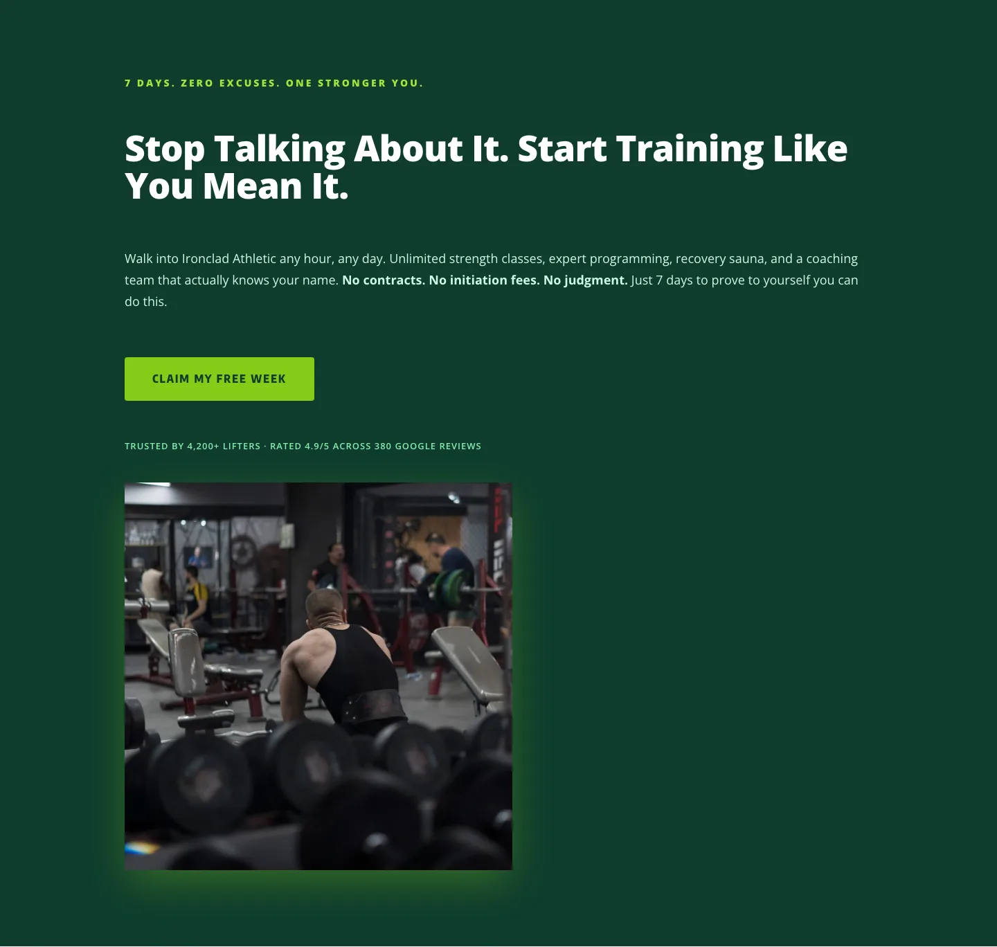
Bold Fitness CTA: Free Week Trial Divi 5 Layout
cta · fitness · bold
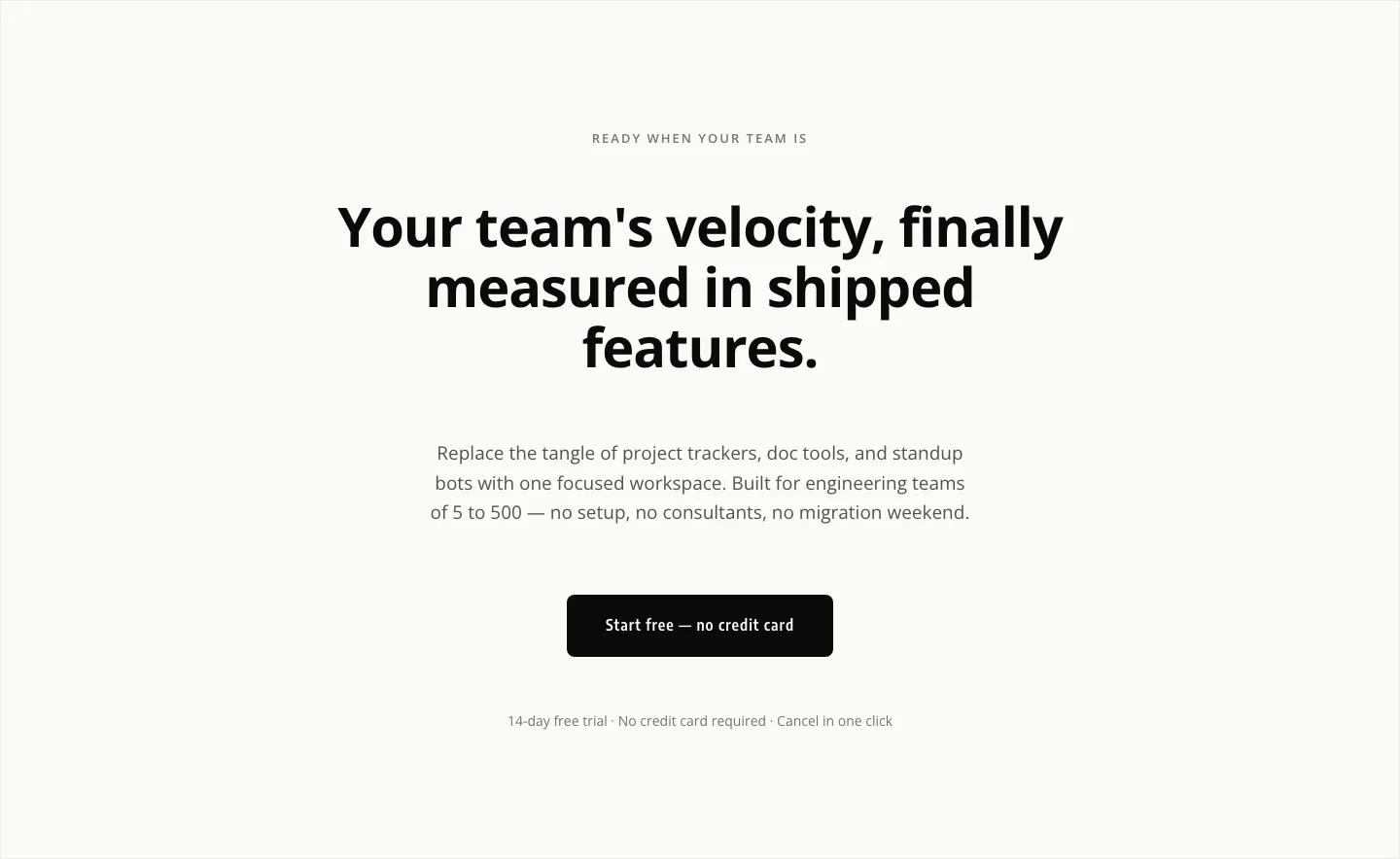
Minimal SaaS CTA: Ship Features Faster
cta · saas · minimal
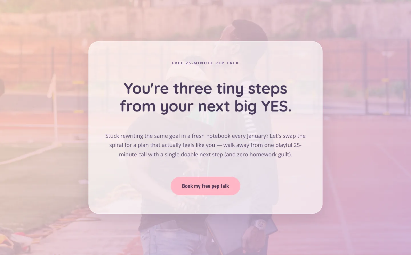
Playful Coaching CTA: Free Pep Talk Booking Block
cta · coaching · playful
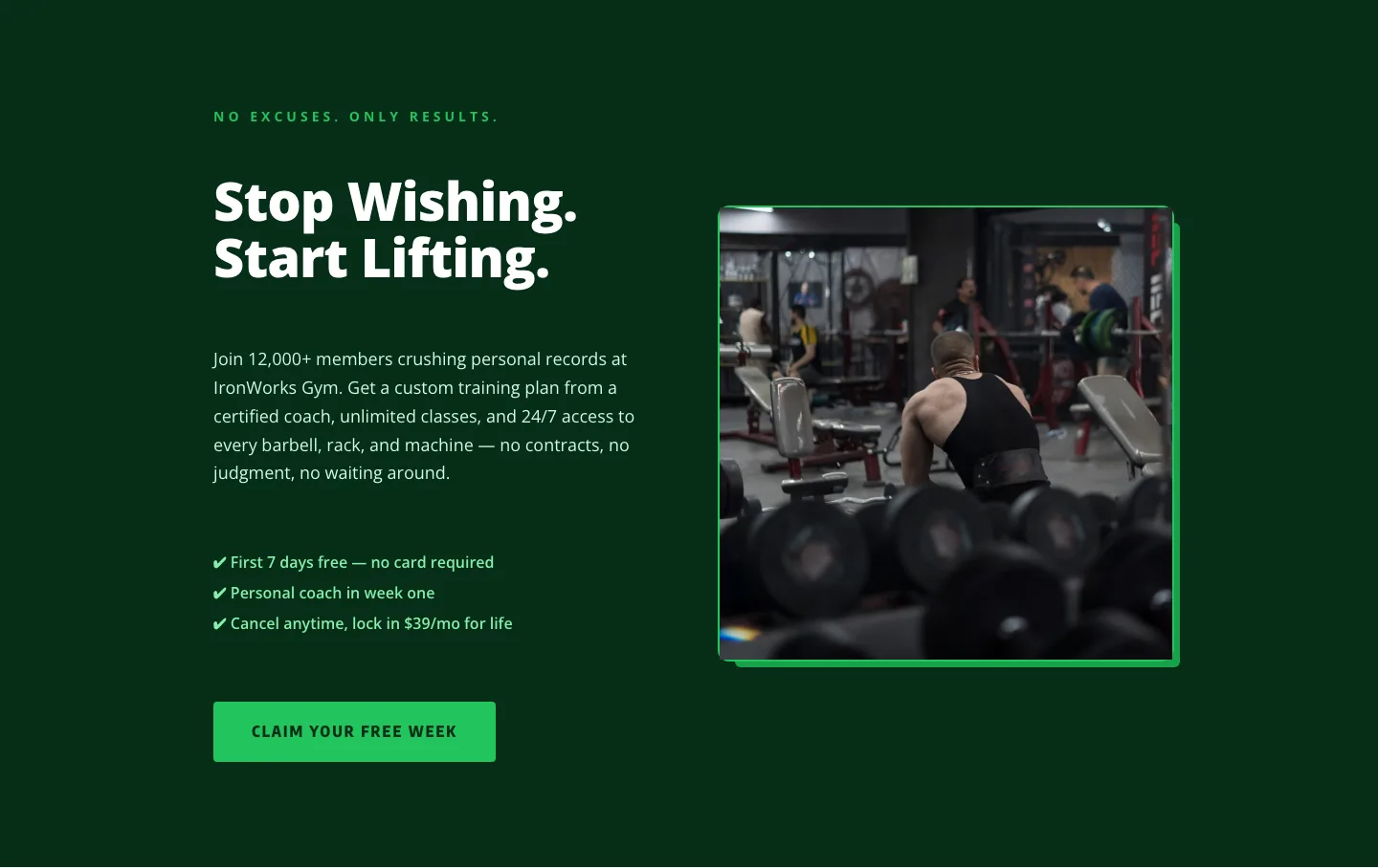
Bold Fitness CTA Layout for Divi 5: Start Training Today
cta · fitness · bold

Playful Real Estate CTA Section for Divi 5: Happy-Dance Home
cta · real_estate · playful
What makes a strong CTA layout
Great call-to-action sections earn the click by being ruthlessly focused. One headline that names the payoff (not the product), one line of subtext to handle the last objection, one primary button whose label describes what happens next. Everything else (secondary links, testimonials, badges) is either a supporting whisper or noise. If your eye can't land on the button within a second of scrolling in, the layout is doing too much.
Contrast is the other half of the job. A CTA needs to feel like a scene change: a different background tone from the sections around it, generous vertical padding so it breathes, and a button that visually outweighs every other element on the row. Dark-on-light strips, gradient bands, and full-bleed color blocks all work for the same reason. They break the page's rhythm and pull the eye down to the decision.
Who uses these
CTA sections are the closers on SaaS trial pages, agency contact sections, course sales pages, event registrations, and lead-magnet landers. You'll drop one at the end of a long-form page, between value props to catch mid-scroll intent, or as a sticky repeat above the footer. Designers building for clients keep a small library of CTA blocks in different tones (urgent, calm, playful, premium) and swap them per brand without rebuilding the layout from scratch.
Customizing a CTA in Divi 5
Every layout here is validated against Divi 5 structure before it's published, so you're importing something that opens cleanly in the visual builder. From there:
- Presets: save your button preset once (radius, padding, hover state, icon) and every CTA you import from Divi5Lab inherits your house style with two clicks.
- Palette, set your two accent colors in the global palette before importing. The CTA background and button color pick up your brand automatically instead of the placeholder tones in the preview.
- Copy: rewrite the headline as a benefit, not a feature ("Ship your first landing page tonight" beats "Get started with Divi5Lab"). Match the button label to the promise: Start free trial, Book a call, Send me the templates. Never Submit.
- Density: for a softer ask, widen the row padding and lighten the background. For an urgent ask, tighten padding, add a small eyebrow line ("Limited spots"), and lean into a saturated accent.
Screenshots on every listing show the real desktop and mobile render, so you can pick the block that already fits your rhythm. Then make it yours.