
Playful Pastel Coaching CTA: Free Clarity Call Banner
A playful pastel Divi 5 CTA section for coaches: rounded white card on a pink-purple gradient, friendly headline, pill button, and a free Clarity Call offer.
Rate this element
Download this section, free
- Divi 5 JSON, imports in seconds
- Commercial license included
- No account needed
Click to view the full page
Overview
This is a single-purpose CTA banner built around one job: turn a lukewarm reader into a booked discovery call. The section stacks a soft pink-to-lilac gradient (#FFE4EC to rgba(199,184,234,0.78) at 135°) over a portrait Pexels photograph, then floats a frosted white card (rgba(255,255,255,0.72), 32px radius) on top. The row is capped at 820px and centered with auto margins, so the invitation reads as a compact island of copy rather than stretching across a wide screen and losing its warmth.
Inside the card, four elements sit in a strict vertical rhythm: a tight-tracked Outfit 700 heading at 3.4vw (color #4A3A52, -0.5px letter-spacing), a 19px body paragraph in a softer purple-grey (#5C4F66, 1.65 line-height) with 18px top and 32px bottom margins, a pill CTA button (radius 999px, #FF9EBB with an #E87BA0 hover and a diffused pink drop shadow), and a small uppercase microcopy line (#8A7A92, 14px, 0.5px letter-spacing) that reinforces the offer with "Free · 30 minutes · Zero pitch · Spots open this week." The column uses flex-column with items centered, so nothing needs manual alignment tweaks.
On mobile the section switches from vw-based to fixed padding (60px vertical, 24px horizontal), the card padding collapses to 32/24, and the heading drops from 3.4vw to a locked 30px so it always breaks cleanly across two or three lines. Because the entire banner is one column inside one row, there is no reflow logic to babysit. Everything simply reproportions from desktop to phone in place.
What’s inside
- Full-width Divi 5 section with a two-stop 135° pastel gradient layered over a background photo (image is optional and easy to swap or delete)
- Centered row capped at 820px so the invitation stays a tight, readable island on ultra-wide screens
- Frosted glass column (rgba(255,255,255,0.72), 32px rounded corners, 1px inner highlight border) with generous 56px desktop padding
- Outfit 700 headline sized fluidly at 3.4vw desktop and locked to 30px on phone, with -0.5px tracking for a modern feel
- 19px Outfit body paragraph at 1.65 line-height, center-aligned, with intentional 18/32px margins framing the button
- Pill-shaped CTA button (999px radius, #FF9EBB → #E87BA0 hover) with a soft 28px pink drop shadow
- Uppercase microcopy line beneath the button reinforcing the offer ("Free · 30 minutes · Zero pitch · Spots open this week")
- Mobile-only padding overrides (60/24 section, 32/24 card) so the layout never feels cramped on small screens
Who it’s for
Life, mindset, business, and wellness coaches inviting readers to a free discovery or clarity call. Especially solo practitioners whose funnel converts through a friendly one-to-one conversation. It also fits therapists, nutritionists, fertility and postpartum coaches, career coaches, and small course creators running a nurture-first funnel. The pastel palette leans warm and feminine out of the box, so it slots naturally into brands built around care, softness, or emotional work, but it recolors cleanly for calmer or more neutral tones. Drop it above the fold on a booking page, use it as a mid-page interrupt on a services page, or park it just above the footer as a soft "one more chance" invitation across the site.
Customization tips
Palette: swap the two gradient stops for any brand-friendly pastel pair and keep the opacities high (0.7–0.9) so the frosted card still pops. The background photo is optional, replace it with a candid portrait or delete the image URL entirely and the gradient carries the section on its own. Rename "Mia," adjust duration and microcopy, and rewrite the headline in first-person if that suits your voice. Keep the heading under about 12 words / 85 characters so it wraps to two lines at 3.4vw; shorter is punchier. Body copy sits comfortably up to ~40 words before the button starts pushing off a small viewport. The button label reads best between 20 and 28 characters. For a darker brand, raise the column background opacity toward 0.9 and darken the heading to something like #2E2333. Widen the row to 940px for longer bios or drop it to 720px for an even tighter island.
How to install this layout
- Download the layout JSON file from this page.
- Open the target page in the Divi 5 builder.
- Open the portability panel (up/down arrows icon) and choose the Import tab.
- Upload the JSON. Tick “replace existing content” only for full-page imports.
- Check the page at desktop and mobile widths, then swap in your copy and images.
Full walkthrough with troubleshooting: How to Import a Divi 5 Layout.
Questions about Playful Pastel Coaching CTA: Free Clarity Call Banner
What Divi 5 modules is this built from?
Just five native modules: Section, Row, Column, Heading, two Text modules, and a Button. No third-party plugins, no code modules, no custom CSS. Everything is editable inside the visual builder.
How does it behave on mobile?
The section padding switches from 9vw/6vw to a fixed 60px vertical / 24px horizontal, the card padding drops to 32/24, and the heading resizes from 3.4vw to a locked 30px so it always breaks to two or three lines cleanly. The column stays centered and vertical, there is no side-by-side layout to reflow.
Do I need to use the background photo?
No. The gradient (#FFE4EC to a lilac stop) is designed to stand on its own. Remove the image URL in the section background and you get a clean pastel wash. If you keep an image, portrait shots of the coach at 940×650 or larger work best because the section uses cover / center-center positioning.
What should I edit first?
The coach's name ("Mia") in the body copy, the headline, the button label, and the microcopy line beneath the button. After that, swap the button and gradient colors to your brand and (optionally) the background photograph.
Can I use this above the fold as a hero?
Yes. Because the row is capped at 820px and the column is self-contained, it works as a compact hero, a mid-page interrupt on a services page, or a soft final invitation just above the footer.
Will the pill button and shadow still look right if I change the palette?
The button uses a solid fill (#FF9EBB) with a matching translucent drop shadow (rgba(255,158,187,0.45)). If you recolor the fill, update the shadow color to the same hue at ~45% opacity so the soft glow keeps reading as intentional rather than muddy.
Which Divi version does this layout need?
Divi 5. The layout is generated natively for Divi 5 and validated against its real module structure before publication, so it imports clean into the current builder.
Can I use this layout on client websites?
Yes. Every download includes a commercial license covering unlimited sites you own or build for clients. Only reselling or redistributing the layout file itself is prohibited.
More call-to-action
Browse all call-to-action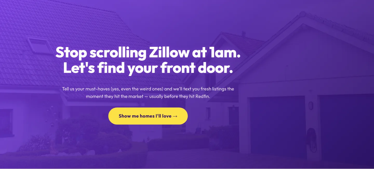
Playful Real Estate CTA: Purple Gradient Listing Alert Signup
cta · real_estate · playful
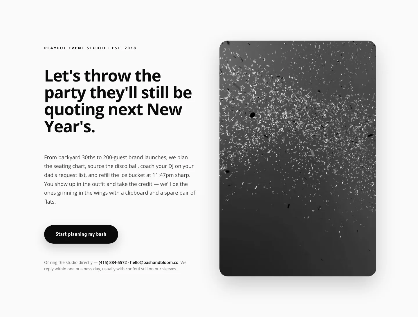
Playful Events CTA Layout for Divi 5: Bash & Bloom
cta · events · playful
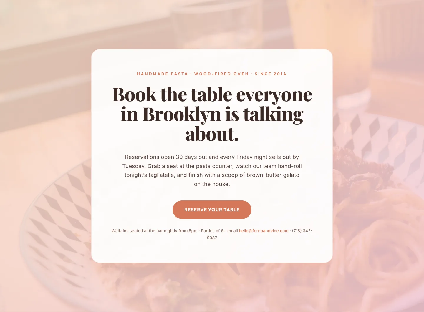
Bold Restaurant Reservation CTA: Divi 5 Layout
cta · restaurant · bold
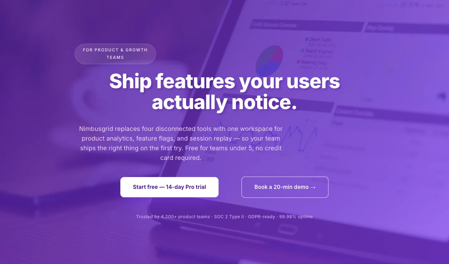
Bold Purple SaaS CTA Banner: Full-Bleed Divi 5 Layout
cta · saas · bold
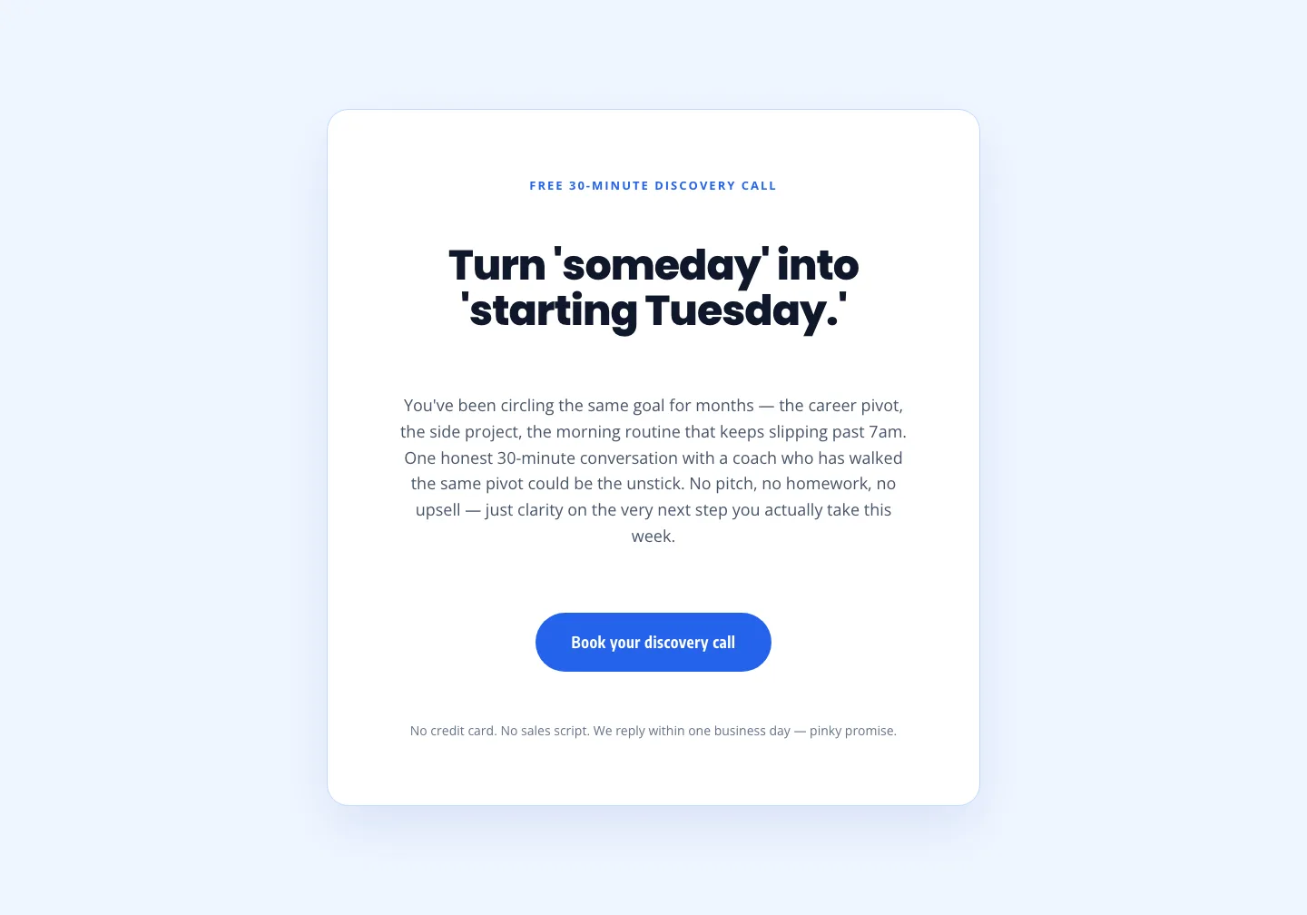
Coaching Discovery Call CTA: Playful Divi 5 Layout
cta · coaching · playful
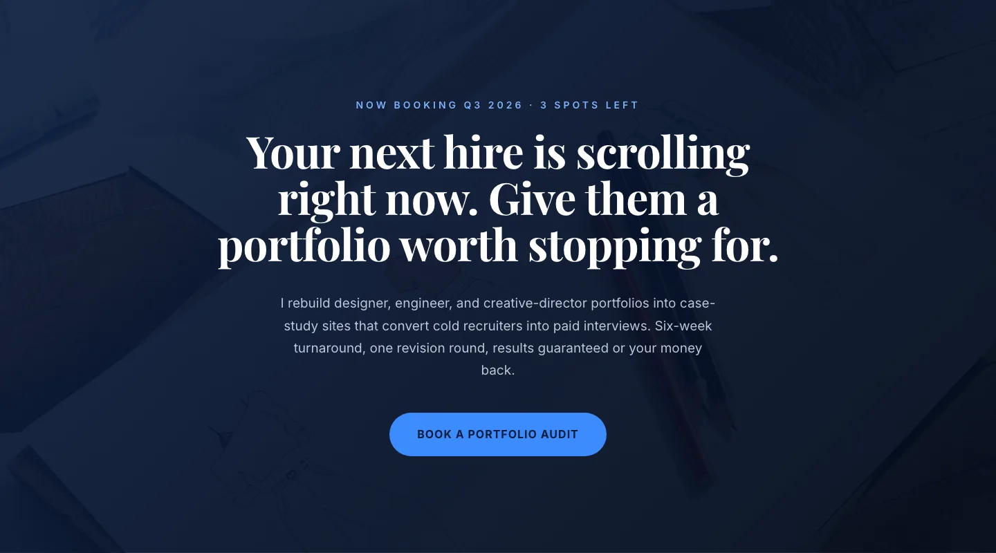
CTA: Portfolio Bold Blue
cta · portfolio · bold