
Pricing Divi 5 Layouts
A pricing section is where a visitor stops browsing and starts deciding, so the layout has to do real work: make plans comparable at a glance, make the recommended tier obvious, and get out of the way. Every pricing layout in this collection is validated against Divi 5's structure before publication and shown with real desktop and mobile renders, so what you preview is what actually imports.
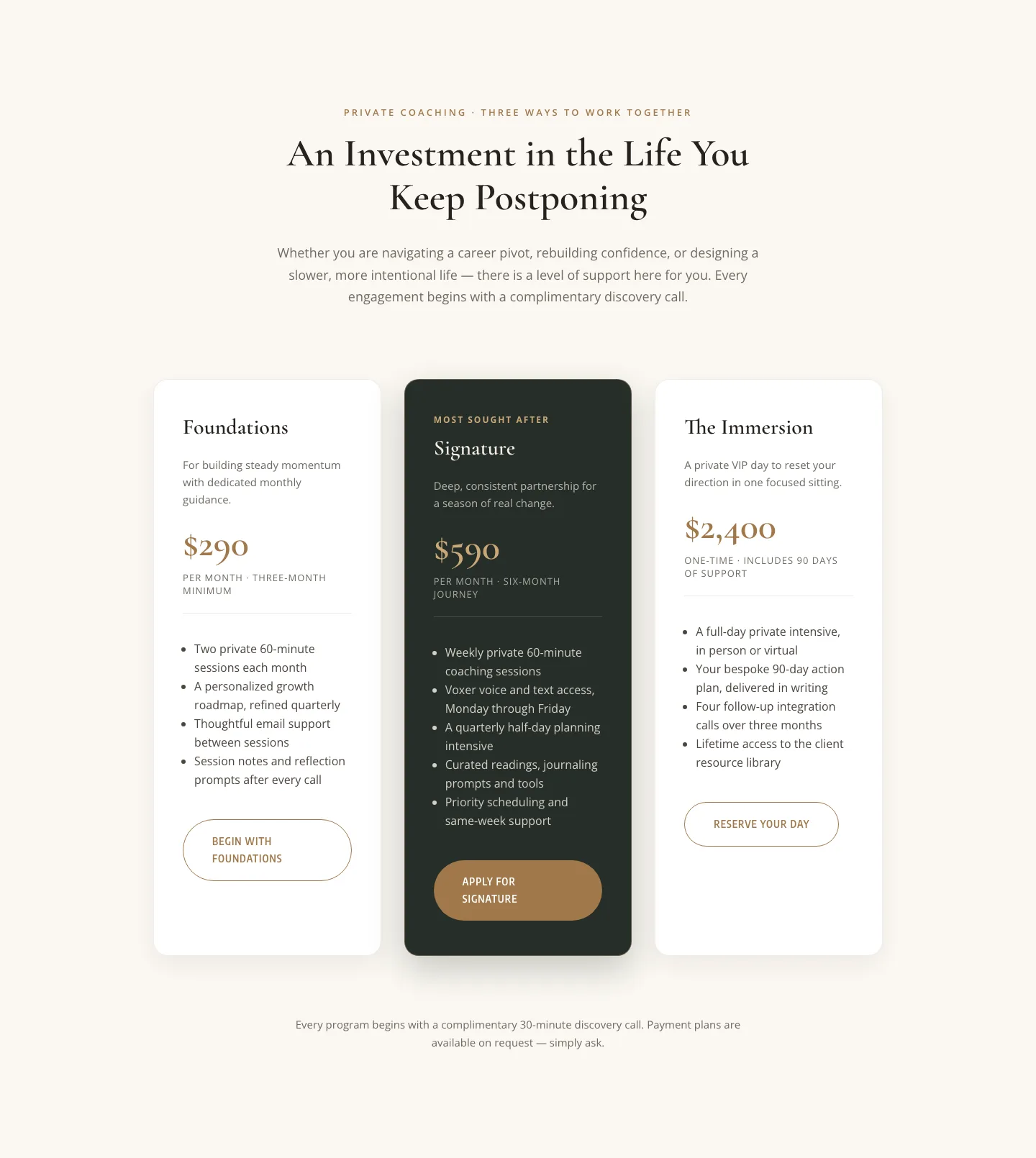
Elegant Coaching Pricing Section: 3-Tier Divi 5 Layout
pricing · coaching · elegant
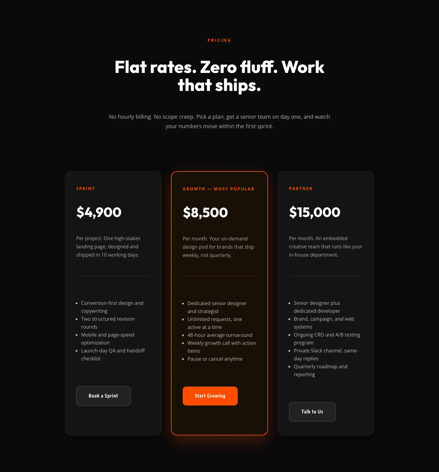
Bold Agency Pricing Section: Dark 3-Tier Divi 5 Layout
pricing · agency · bold
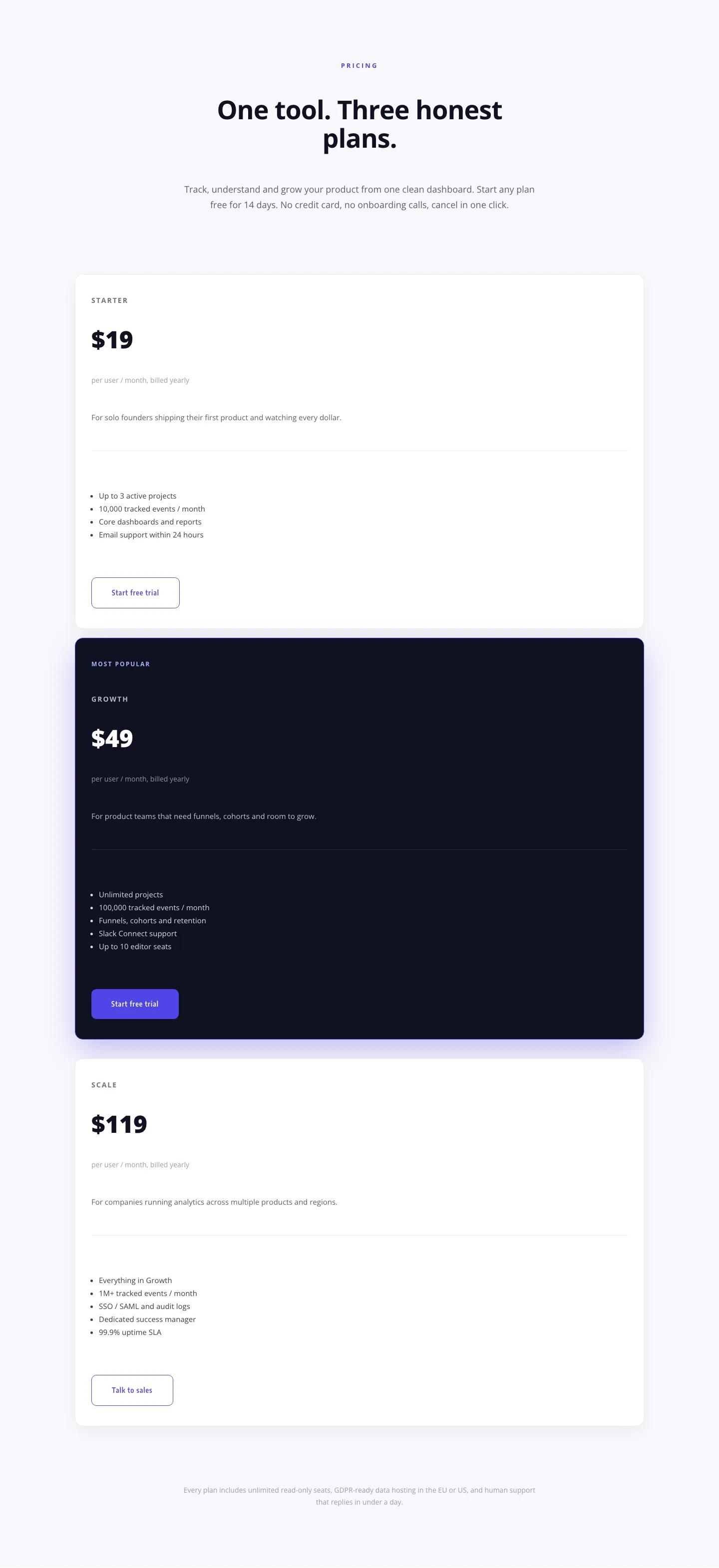
Minimal SaaS Pricing Section: 3-Tier Plan Cards with Featured Dark Tier | Divi 5 Layout
pricing · saas · minimal
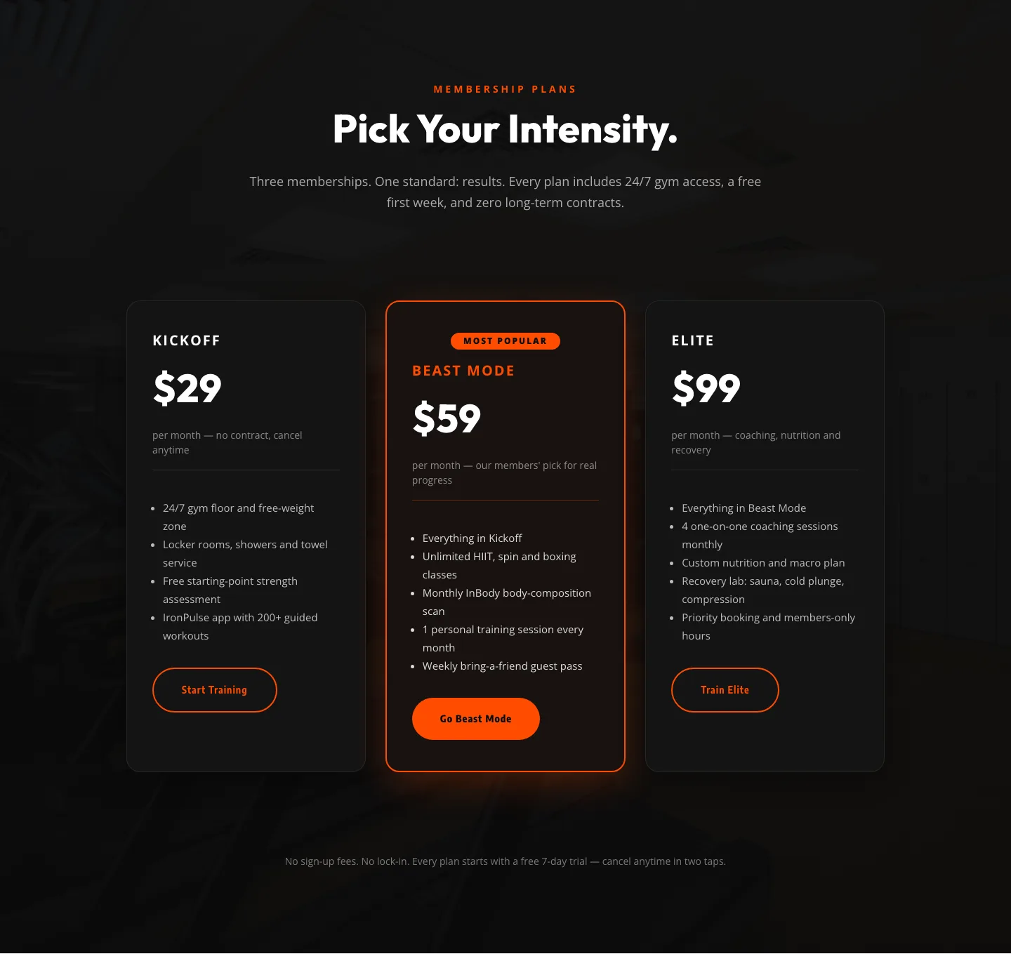
Bold Fitness Pricing Table: Dark Gym Membership Plans Divi 5 Layout
pricing · fitness · bold
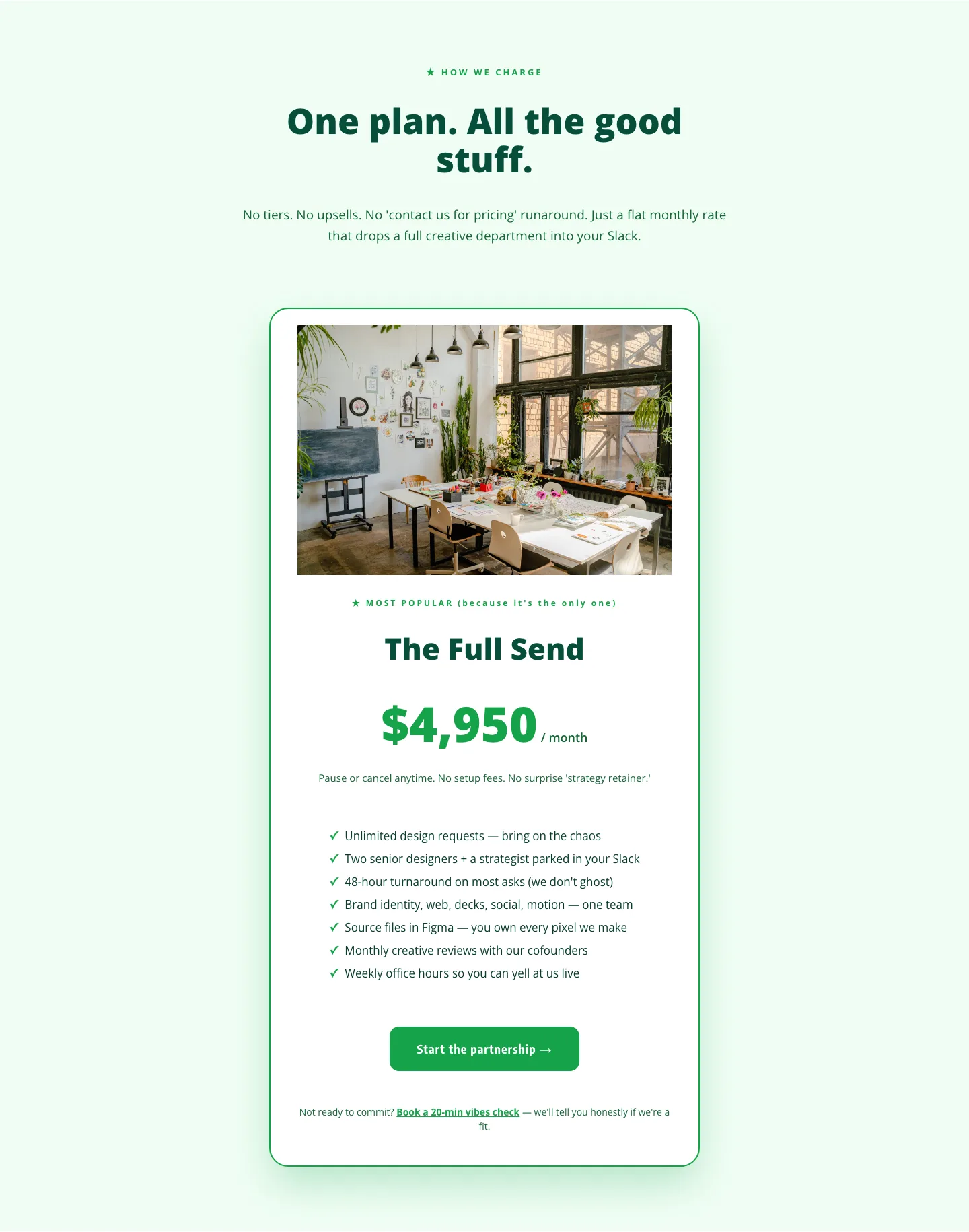
Playful Agency Pricing Section: Flat-Rate Divi 5 Layout
pricing · agency · playful
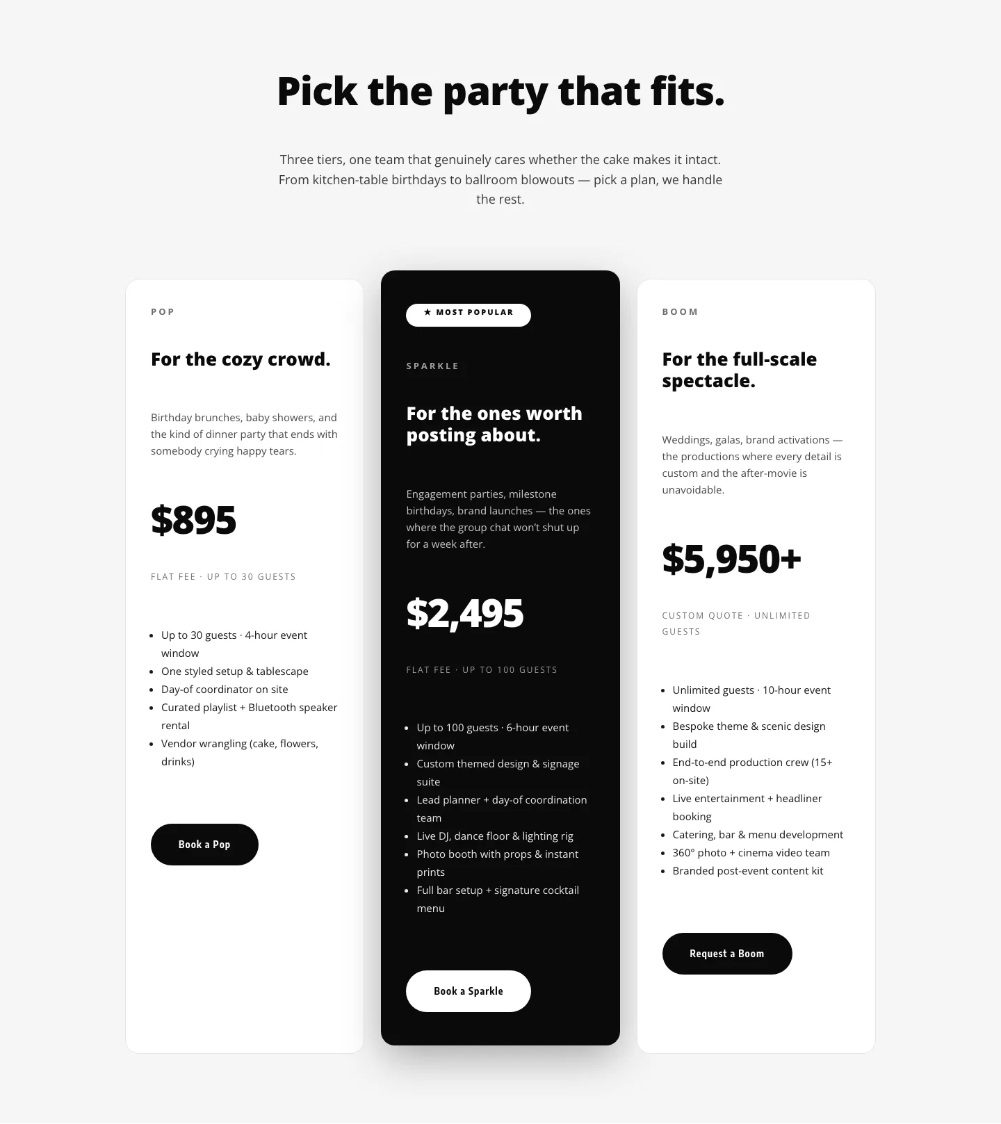
Playful Three-Tier Event Pricing Section for Divi 5
pricing · events · playful

Bold Agency Pricing Page: Blackline Studio Divi 5 Layout
pricing · agency · bold

Bold SaaS Pricing Section: Three-Tier Dark Layout for Divi 5
pricing · saas · bold
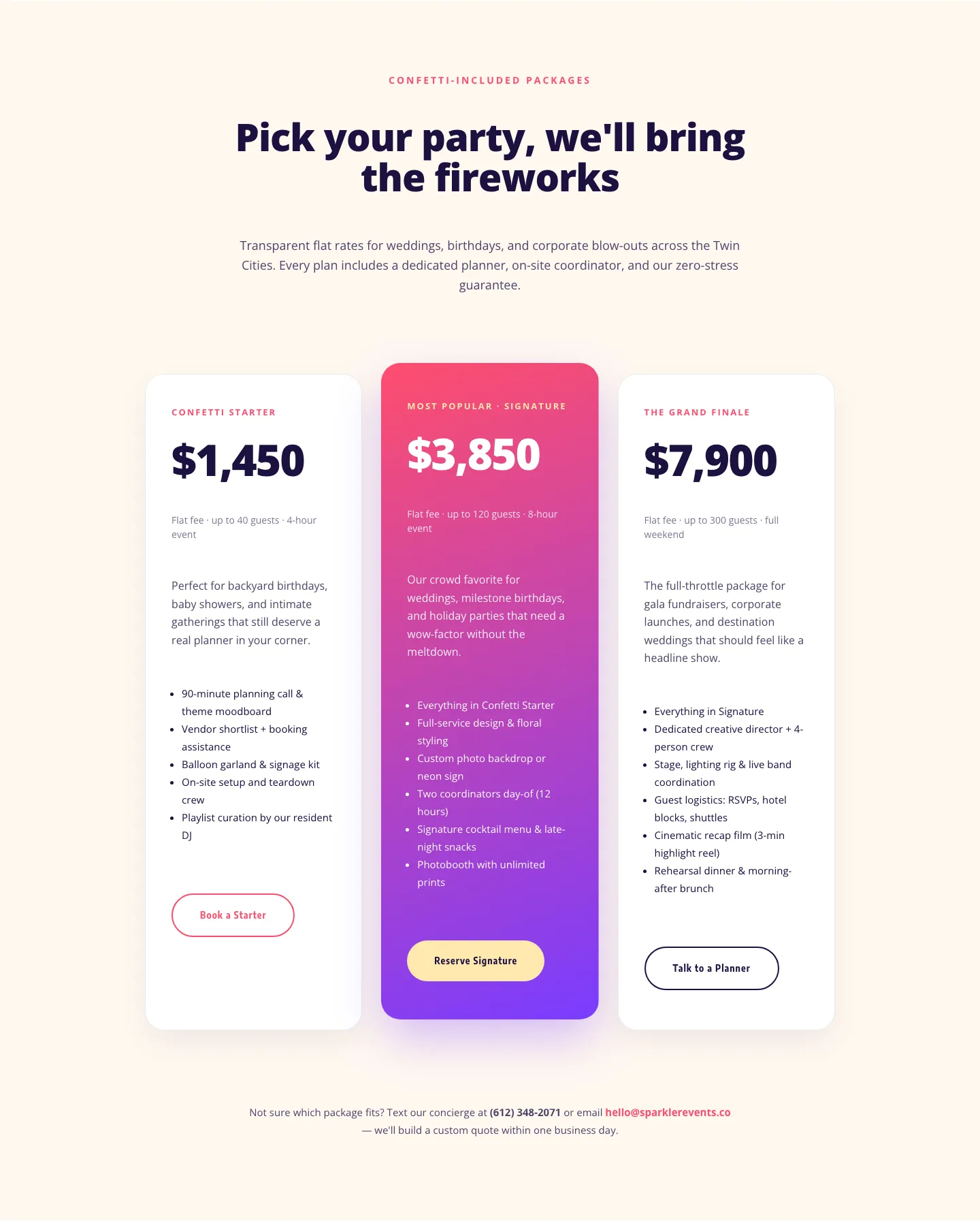
Playful Events Pricing Layout: Divi 5 Party Package Tiers
pricing · events · playful
What makes a good pricing layout
A strong pricing section is an exercise in restraint. The visitor arrives with one question (what does this cost and which option is mine?) and the design should answer it in a few seconds. That means a clear tier structure (two to four columns is the sweet spot), one visually elevated "recommended" plan, feature lists that scan as differences rather than duplicated bullets, and a single unambiguous button per tier. Good pricing layouts also handle honesty details well: billing-period toggles, small print about renewals, and enough breathing room that numbers don't feel crowded. Watch the mobile render especially: columns that compare beautifully side by side on desktop must stack in a deliberate order on a phone, with the featured plan surfacing first. That's why every layout here ships with both desktop and mobile screenshots taken from a real render, not a mockup.
Who uses pricing sections
SaaS founders and membership sites lean on tiered tables. Agencies and freelancers use simpler two-column "project vs. retainer" framings. Gyms, coaches, and course creators tend toward a single highlighted offer with an anchor price beside it. If you build client sites, a validated pricing section is one of the highest-leverage things to keep in your library. It's the page clients scrutinize most and the one you least want to rebuild from scratch every project.
Customizing a pricing layout in Divi 5
Once imported, treat the layout as a system rather than a canvas. Start with presets: the tier cards, buttons, and feature lists in these layouts share element presets, so restyling one card border or button shape cascades across every plan. You're never nudging three columns into agreement by hand. Next, map the section to your global color palette: swap the accent used on the featured tier and the button fills, and the whole section adopts your brand without touching individual modules. Finally, rewrite the copy with intent: plan names your customers would actually say out loud, feature bullets phrased as outcomes, and button labels that state the action ("Start free trial" beats "Sign up"). Prices themselves deserve a hierarchy check: the number should be the loudest element in each card.
Every pricing section here is a free download: enter your email and it's yours, with a commercial license that covers client work. Import it, wire up your presets and palette, and you're testing real pricing pages instead of building tables from zero.