
Blog Divi 5 Layouts
Blog layouts are where publishing frequency meets brand craft, the difference between a homepage that treats content as an afterthought and one that treats it as the product. The best Divi 5 blog layouts frame the reading experience without stealing focus from it, and scale gracefully from a two-post launch to a 400-article archive. Every layout below is validated against Divi 5 structure before it goes live, so you can drop it into a fresh install and start writing the same afternoon.
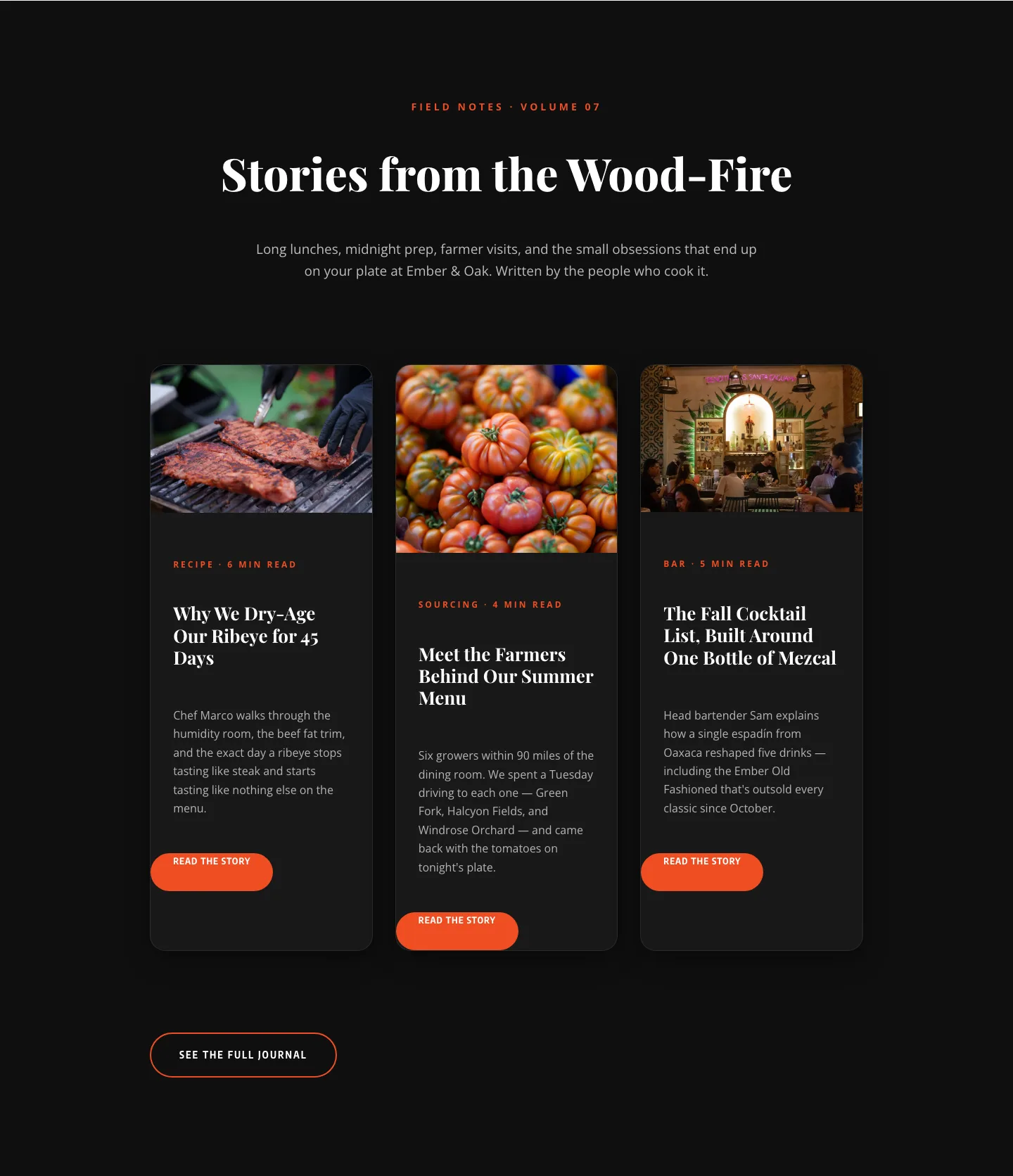
Bold Restaurant Blog Layout for Divi 5: Wood-Fire Journal
blog · restaurant · bold
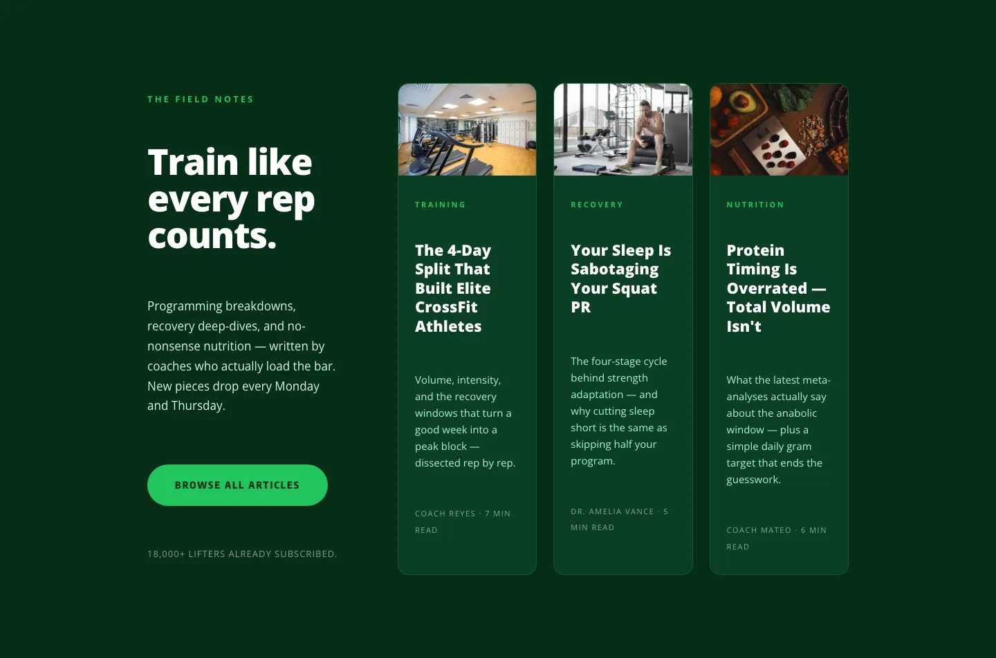
Bold Fitness Blog Layout for Divi 5: Green Asymmetric Split
blog · fitness · bold
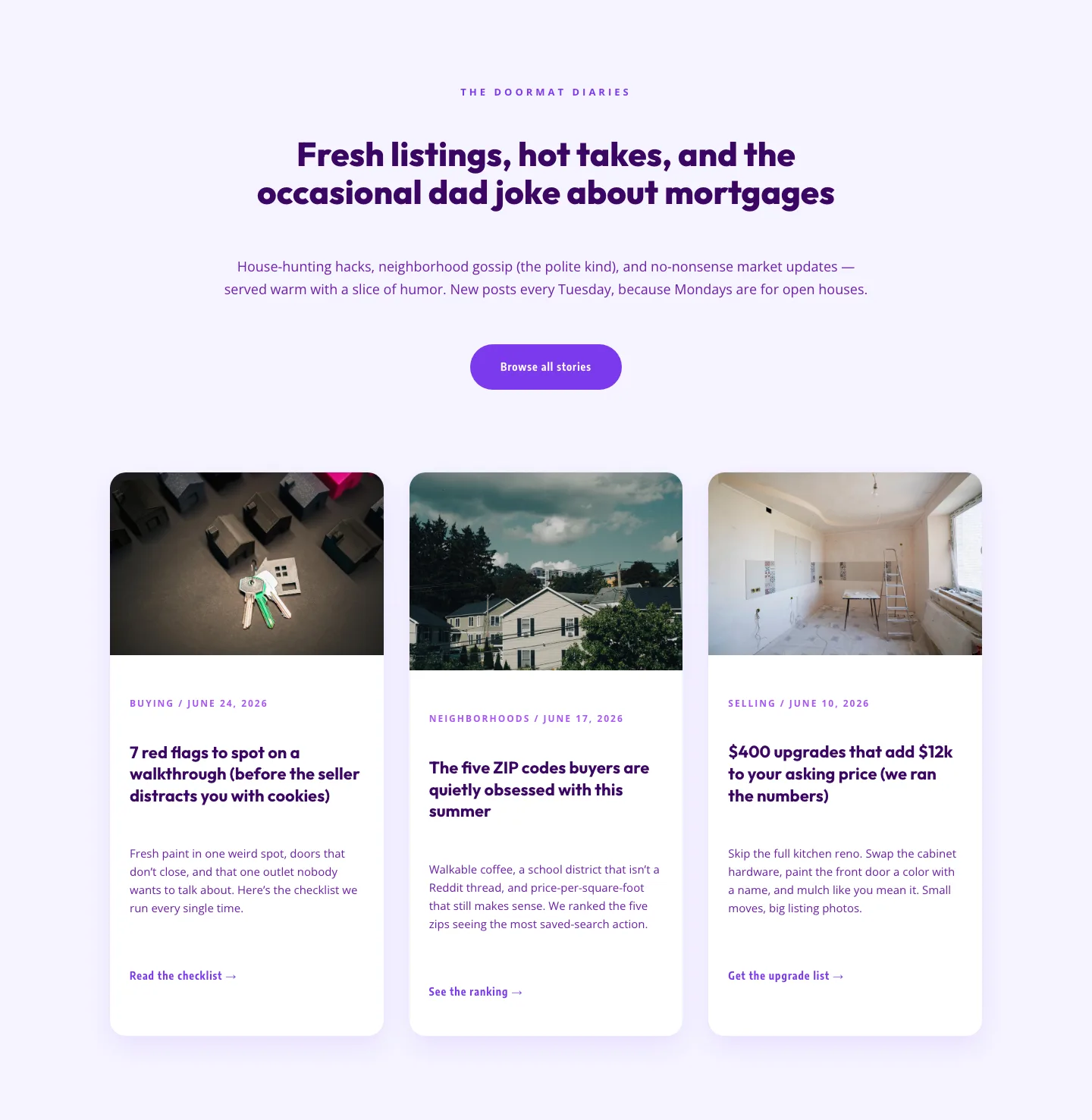
Playful Real Estate Blog Layout for Divi 5 | Divi5Lab
blog · real_estate · playful
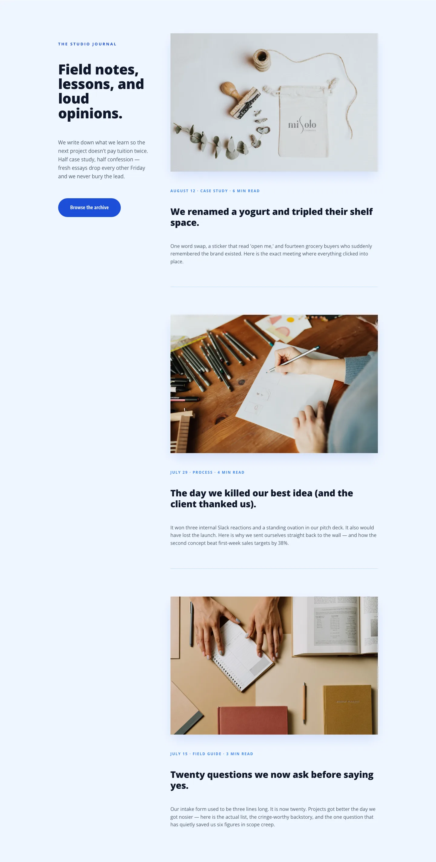
Playful Agency Blog Layout for Divi 5: Studio Journal
blog · agency · playful
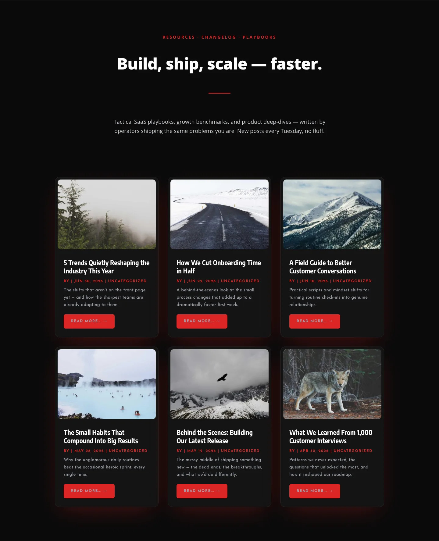
Bold SaaS Blog Layout: Resources & Insights Grid for Divi 5
blog · saas · bold
What makes a blog layout worth using
A good blog layout does three quiet jobs at once: it makes new posts easy to scan, it keeps typography readable at the paragraph length, and it gives evergreen content a way to resurface. Cards are the workhorse (a clean grid of featured image, category tag, headline, and dateline) but the layouts that actually convert visitors into subscribers pair that grid with a genuine hierarchy: a hero or featured post above the fold, a filterable stream below, and a sidebar (or inline block) that surfaces related reads instead of stale widgets.
Watch the details that separate a template from a publication. Line length should sit around 65–75 characters. Category chips need enough breathing room that a five-category taxonomy doesn't wrap awkwardly. Author bylines with a real face and a one-line credential do more for trust than any "about" page. And the featured image ratio should be consistent across cards (16:9 or 3:2, pick one) so the grid holds its rhythm even when a contributor uploads a portrait.
Who these layouts are for
Content-led SaaS teams building a topic authority, agencies running a client's editorial site, solo creators launching a newsletter-adjacent blog, and course businesses using long-form as their top-of-funnel. If your traffic strategy leans on search and you need pages that Google understands structurally (clear headings, semantic post metadata, breadcrumbs) start here.
Customizing in Divi 5
Each layout ships as a Divi 5 JSON export. Import it into a page (or set it as your blog template in the Theme Builder), then work top-down:
- Apply your palette. Swap the accent color first: it usually appears in category chips, hover states, and the read-more link. Divi 5's global colors mean one edit propagates through the whole layout.
- Set two presets and stop. One for headings, one for post-card body. Resist adding a third; consistency across an archive matters more than variety on a single card.
- Rewrite the featured-post copy in your voice. The dummy headline is a placeholder for a real hook: usually your best-performing post, not your newest one.
- Wire the query. Point the post module at the right category or tag, decide on pagination vs. infinite scroll, and set the excerpt length once so it holds across the grid.
- Check the mobile render. Screenshots on every layout page show the real mobile output, compare before you publish.
Download is free with an email; the commercial license covers unlimited client sites.