
Bold SaaS Blog Layout: Resources & Insights Grid for Divi 5
High-impact dark blog layout for SaaS brands. Features a bold red-accent headline, operator-grade intro copy, and a card-style post grid with custom Read More CTAs.
Rate this element
Download this section, free
- Divi 5 JSON, imports in seconds
- Commercial license included
- No account needed
Click to view the full page
Overview
The section frames a resources/changelog hub against a near-black canvas (#0a0a0a) with 110px of vertical breathing room, so the grid below reads as a deliberate destination rather than a footer afterthought. The intro column stacks four elements in a strict centered rhythm: a red eyebrow ("RESOURCES · CHANGELOG · PLAYBOOKS") tracked out at 3px letter-spacing, a heavy 3.25rem headline in white with a tightened -1px letter-spacing and 1.08 line-height, a 72px red divider (#DC2626), and a 700px-capped subhead in light gray (#D1D5DB) at 18px. That top block does the whole "editorial voice" job before a single post loads.
Below it, the native Divi 5 Blog module renders a post grid. Each card is a dark #141414 tile with a hairline rgba(255,255,255,0.08) border, 16px rounded corners, and a red-tinted drop shadow (rgba(220,38,38,0.35)) that lifts the entire grid off the page without breaking the dark mood. Featured images sit at the top of every card with 10px rounding; titles are 22px white 700-weight; the excerpt is 15px in a muted #9CA3AF; and the meta line (author · date · category) prints in red uppercase with 1.5px tracking. Comments are intentionally hidden so cards stay quiet.
The Read More link is where the layout earns its "bold" label: custom CSS scoped to the Blog module turns it into a fit-content red pill with white uppercase text, 6px radius, and a subtle translateY hover, so it reads as a proper CTA instead of a WordPress default link. Pagination is off (this is a drop-in section, not a full archive page). On tablet the grid steps down to 2 columns, on phone it stacks to 1, and the row itself switches flexDirection to column at the phone breakpoint so the intro block and the grid never bunch against each other.
What’s inside
- Centered intro stack: red uppercase eyebrow, 3.25rem 800-weight H2, 72px red divider, and a 700px-capped subhead
- Native Divi 5 **Blog** module pulling real WordPress posts (category filter set to `all`, easy to narrow)
- 3-column post grid on desktop that steps down to 2 columns on tablet and 1 column on phone
- Dark cards (`#141414`) with hairline white-8% border, 16px radius, and a red-glow box shadow
- Meta row shows author, date and category in red uppercase; comments hidden to keep cards clean
- Custom-styled Read More: red pill button, uppercase 12px label, hover state that darkens and lifts
- Featured images rendered with 10px rounded corners for a consistent tile shape
- Pagination toggled off: designed as a drop-in section for a landing page, not a full archive
Who it’s for
Built for SaaS teams that need a resources or blog block on a marketing page: a company blog index, a changelog hub, a customer-story feed, a docs landing, or a "latest playbooks" strip on the homepage. The dark palette and red accent read as product-led and technical, which fits developer tools, API companies, DevRel programs, cybersecurity vendors, fintech, and B2B platforms more comfortably than lifestyle or consumer brands. It also works cleanly for startup media sites, engineering newsletters, and agency knowledge hubs where the content itself has to feel like the product. Anywhere the goal is "drive readers into posts without a lot of decoration," this section slots in.
Customization tips
Palette swap is a search-and-replace on four hex values: #0a0a0a (section), #141414 (cards), #DC2626 (eyebrow, divider, meta, button, plus #991B1B for the button hover in the module CSS), and the two grays #D1D5DB / #9CA3AF. For a light theme, invert the two backgrounds and darken the text; keep the accent for the eyebrow, meta and button so the hierarchy survives.
Keep the H2 to about 40 characters so the -1px letter-spacing stays punchy; the subhead comfortably takes ~180 characters before it wraps past the 700px cap. Featured images should be a consistent 16:9 landscape (roughly 1200×675), WordPress will crop, but matching ratios keeps card heights even. To narrow the feed, change the Blog module's Categories field from all to specific category slugs. Pagination is off; flip it back on in the module if you're using this as your main blog index rather than a homepage strip.
How to install this layout
- Download the layout JSON file from this page.
- Open the target page in the Divi 5 builder.
- Open the portability panel (up/down arrows icon) and choose the Import tab.
- Upload the JSON. Tick “replace existing content” only for full-page imports.
- Check the page at desktop and mobile widths, then swap in your copy and images.
Full walkthrough with troubleshooting: How to Import a Divi 5 Layout.
Questions about Bold SaaS Blog Layout: Resources & Insights Grid for Divi 5
Does the grid pull real WordPress posts, or is it a static mockup?
Real posts. It uses the native Divi 5 Blog module with the Categories filter set to `all`, so it renders your actual WP loop: titles, excerpts, featured images, author, date and category all come from the post.
How does it respond on tablet and phone?
The Blog module drops from 3 columns to 2 on tablet and to 1 on phone. The row wrapping the intro also switches to `flexDirection: column` at the phone breakpoint, so nothing collides on narrow screens.
Where does the red Read More button come from, is it a separate Button module?
No, it's the Blog module's built-in `.more-link`, restyled with a small custom CSS block scoped to the module (red background, uppercase 12px label, 6px radius, hover state). Edit those rules in the module's Custom CSS panel if you want a different shape or color.
What image ratio should I upload for featured images?
A 16:9 landscape (around 1200×675) is the safest, WordPress will crop to the Blog module's thumbnail size and the 10px rounded corners look consistent across cards. Portrait images will be cropped in ways you probably don't want.
Can I show more meta, like comments or read time?
Author, date and categories are on; comments are turned off in the module settings. Flip Show Comments back on in the Blog module if you want them. Read-time isn't a native Divi field, but any plugin that appends it to the excerpt will render inside the muted gray body copy.
What should I edit first after importing?
Three things: the eyebrow copy ("RESOURCES · CHANGELOG · PLAYBOOKS"), the H2 ("Build, ship, scale, faster."), and the Categories field on the Blog module so it only surfaces the posts you want to feature.
Which Divi version does this layout need?
Divi 5. The layout is generated natively for Divi 5 and validated against its real module structure before publication, so it imports clean into the current builder.
Can I use this layout on client websites?
Yes. Every download includes a commercial license covering unlimited sites you own or build for clients. Only reselling or redistributing the layout file itself is prohibited.
More blog layouts
Browse all blog layouts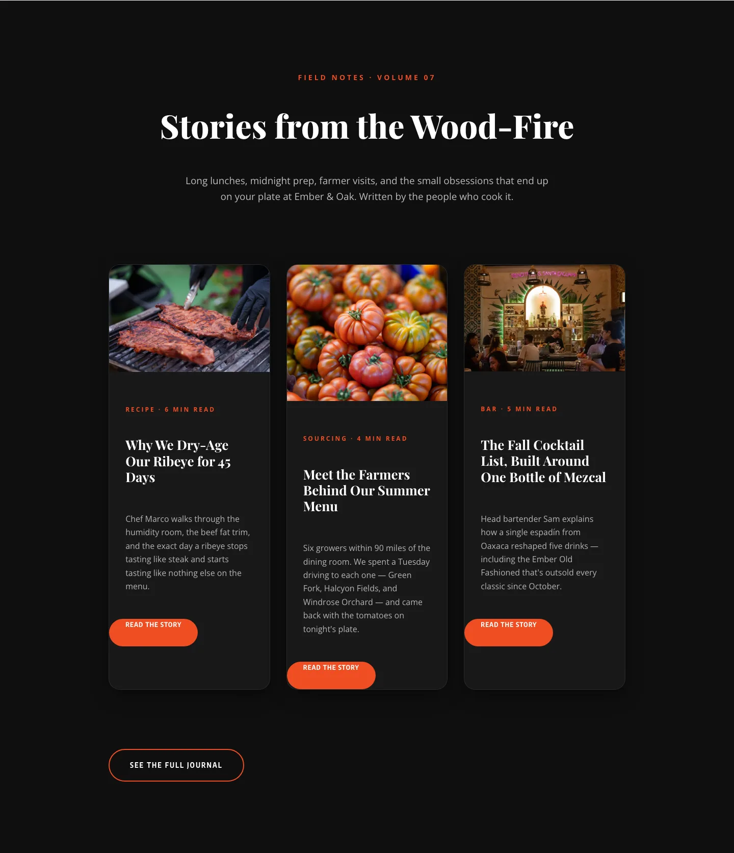
Bold Restaurant Blog Layout for Divi 5: Wood-Fire Journal
blog · restaurant · bold
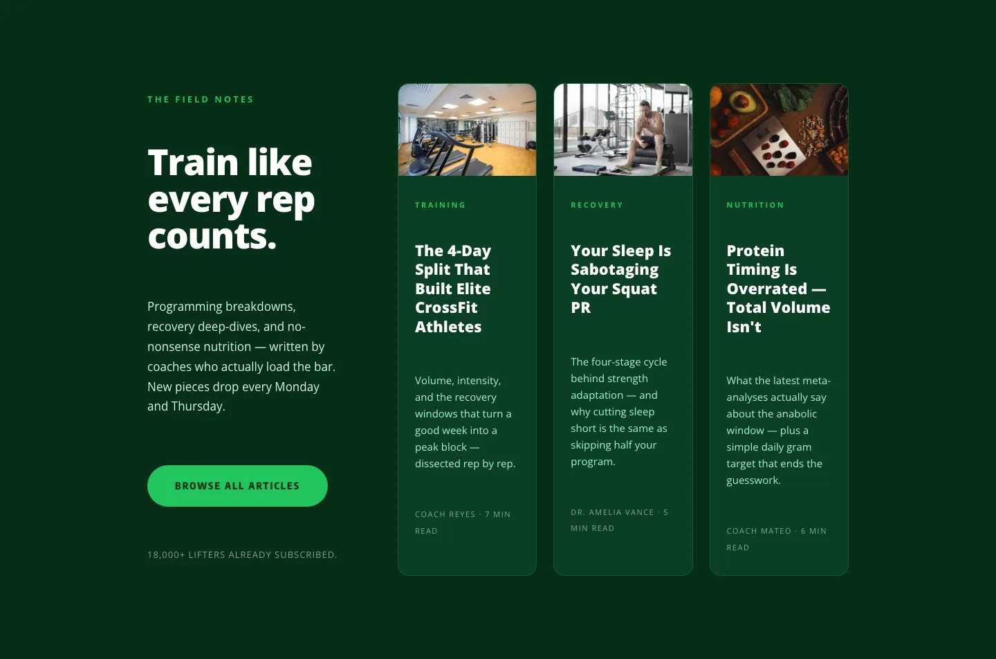
Bold Fitness Blog Layout for Divi 5: Green Asymmetric Split
blog · fitness · bold
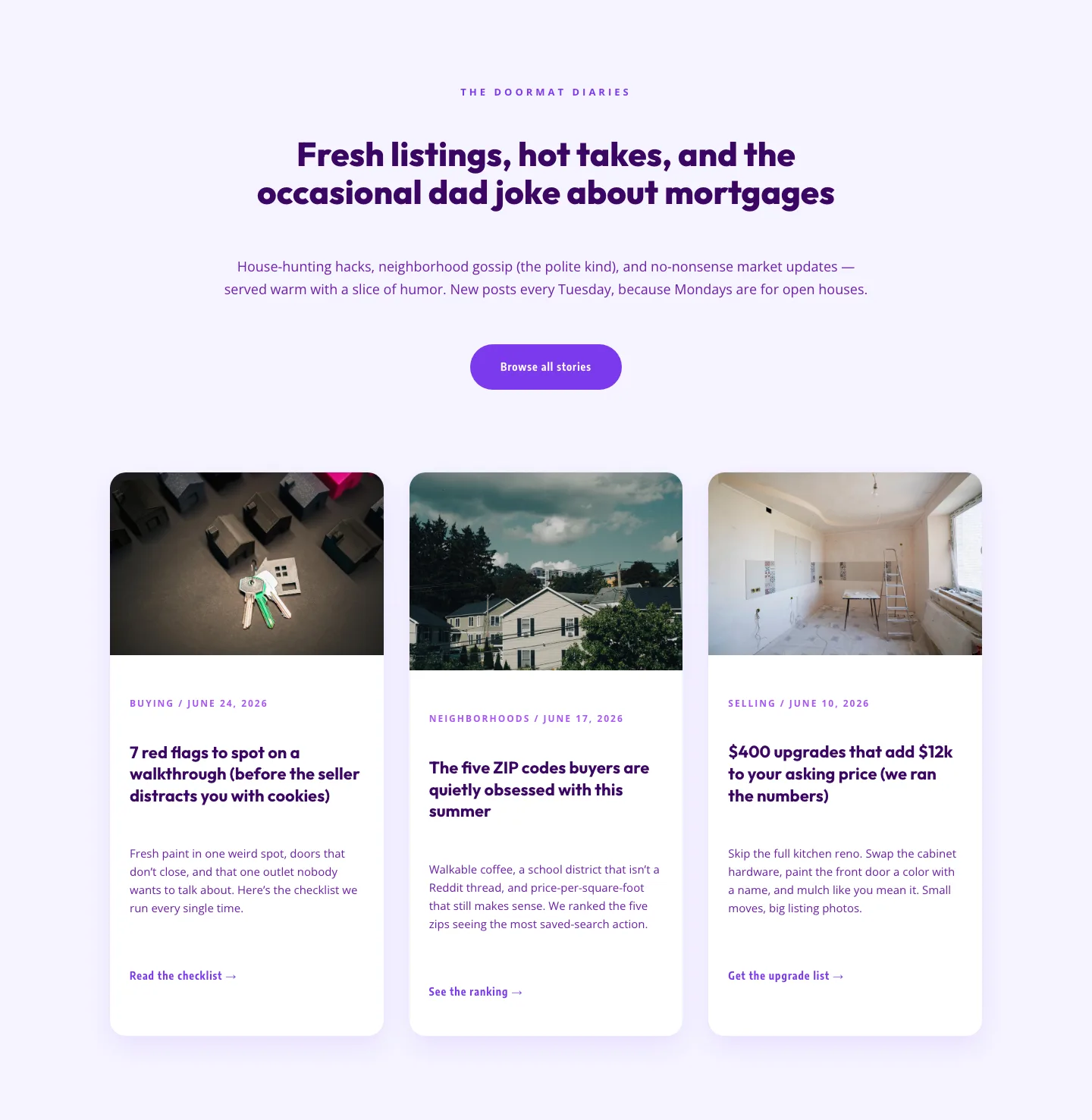
Playful Real Estate Blog Layout for Divi 5 | Divi5Lab
blog · real_estate · playful
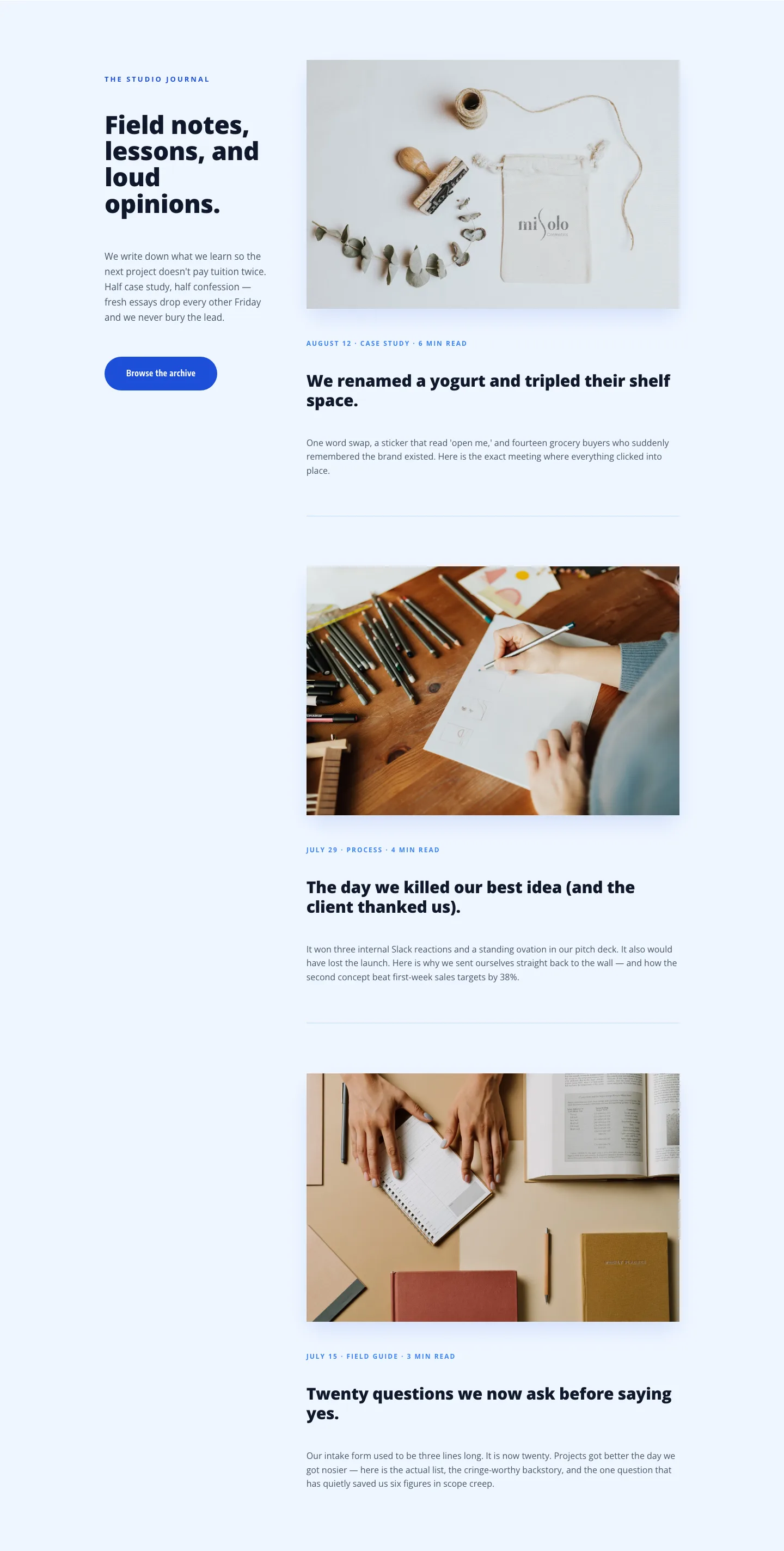
Playful Agency Blog Layout for Divi 5: Studio Journal
blog · agency · playful