
Bold Fitness Blog Layout for Divi 5: Green Asymmetric Split
High-impact Divi 5 blog layout for fitness coaches and gyms. Bold green palette, asymmetric split hero, and a 3-card article grid with categories, images, and author bylines.
Rate this element
Download this section, free
- Divi 5 JSON, imports in seconds
- Commercial license included
- No account needed
Click to view the full page
Overview
This is a magazine-style blog section built on a single deliberate move: an asymmetric 1/3 + 2/3 row that pins your editorial identity to the left and lets three article cards breathe on the right. The 1/3 column carries an uppercase green eyebrow ("The Field Notes"), a 52px display heading with tight -1.5px letter-spacing and a 1.02 line-height, a supporting paragraph in soft mint (#d1fae5), and a pill-shaped CTA in bright green (#22c55e) with a dark forest-green label. The same color logic used across the palette.
The palette is intentionally narrow and high-contrast. A deep forest section background (#052e16) frames slightly-lifted card backgrounds (#0a3f24) that are outlined with a subtle 1px green border at 20% opacity, so cards feel like objects on a surface rather than flat blocks. Article titles land in pure white at 22px/800, excerpts drop to #a7f3d0 for hierarchy, and metadata (bylines, subscriber count) fades to ~55% opacity white with uppercase tracking. Three tiers of emphasis without any decorative flourish.
Spacing does most of the layout work: the section pads 120px top and bottom, the row caps at 1400px and centers with margin: auto, the parent columns sit 72px apart, and the three inner cards share a 24px column and row gap so they can wrap gracefully. Each card is fully rounded (16px), clips overflow on its image, and uses internal 24px horizontal padding on the text block so the imagery bleeds edge-to-edge while copy stays inset. On mobile, both the outer 1/3–2/3 split and the inner 3-up card row collapse to a single column via flex-direction: column, which means the intro block reads first, then the three articles stack in order without any rearrangement gymnastics.
What’s inside
- Asymmetric 1/3 + 2/3 row (`1_3_2_3` structure) with a 72px column gap and a 1400px max-width
- Editorial intro block: uppercase eyebrow, 52px display heading, supporting paragraph, and a pill CTA (999px radius) in signature green
- Three-up article card row (`1_3_1_3_1_3`) with 24px gaps and stretch alignment so all cards match height
- Card container styling: forest #0a3f24 fill, 16px rounded corners, 1px translucent green border, hidden overflow to clip the image
- Per-card content stack: full-bleed image, uppercase category label, 22px bold headline, 15px excerpt, and a small uppercase byline
- Native Divi 5 modules only: Section, Row, Column, Text, Heading, Image, and Button. No custom code or third-party dependencies
- Deliberate three-tier type hierarchy (white / mint / 55%-white) that reads as clear editorial rank without extra styling
- Mobile behavior wired in JSON: outer split and inner card row both flip to `flex-direction: column` at phone breakpoint
Who it’s for
Fitness content brands are the obvious fit: strength coaches, CrossFit affiliates, personal trainers, hybrid athletes, run clubs, and nutrition writers who publish weekly programming, recovery, or fueling articles and want the homepage to feel like a magazine index instead of a link list. The dark, high-contrast palette also carries well into adjacent verticals with a similar energy: combat sports, cycling, obstacle-course racing, physique coaching, and men's or women's health newsletters. Beyond fitness, the same structure works for any editorial brand that pairs a strong voice with a rotating three-story lineup: outdoor/adventure media, whiskey and BBQ blogs, motorsport publications, or a course creator's "latest lessons" module. Skip it for softer, pastel, or minimal-corporate brands. The forest greens and bold weights will feel out of key.
Customization tips
Palette swaps are the fastest reskin. The design leans on four colors: section background #052e16, card background #0a3f24, accent #22c55e (used on the eyebrow, CTA, and card category labels), and text tint #a7f3d0. Change the accent to any brand hue and re-tint the excerpt text to a matching pastel, everything else can stay.
Copy limits matter. The 52px display heading looks best at 4–7 words; anything longer wraps into three lines and eats the CTA's breathing room. Card titles at 22px/800 tolerate up to about 55 characters (roughly two lines) before they start pushing the excerpt down. Keep excerpts to 18–24 words and bylines to Name · X min read, the uppercase tracking rewards short strings.
Images should be landscape at roughly a 3:2 ratio (the Pexels source URLs are sized 940×650) so the top of each card feels consistent. Photography with a single clear subject and dark ambient light will match the card background; bright, busy stock will fight the palette.
How to install this layout
- Download the layout JSON file from this page.
- Open the target page in the Divi 5 builder.
- Open the portability panel (up/down arrows icon) and choose the Import tab.
- Upload the JSON. Tick “replace existing content” only for full-page imports.
- Check the page at desktop and mobile widths, then swap in your copy and images.
Full walkthrough with troubleshooting: How to Import a Divi 5 Layout.
Questions about Bold Fitness Blog Layout for Divi 5: Green Asymmetric Split
How does this section behave on tablet and phone?
The outer 1/3–2/3 row and the inner three-card row both switch to `flex-direction: column` at the phone breakpoint, so the intro block reads first and the three articles stack beneath it in order. The 120px vertical section padding and 6vw side padding hold up well on tablet; on smaller phones you may want to trim the top/bottom padding to 80px to keep the fold tight.
Which Divi 5 modules make up each article card?
Each card is a Column with a background color, 16px border radius, and hidden overflow, containing four modules stacked top-to-bottom: an Image module (full-bleed to the card edges), a small Text module for the category label, a Heading module for the article title, and two more Text modules for the excerpt and the byline. Nothing custom, everything is native.
Can I add a fourth article card, or reduce it to two?
Yes. The inner row is a `1_3_1_3_1_3` structure, so you can duplicate a column and switch the row to `1_4_1_4_1_4_1_4`, or delete one to go two-up with `1_2_1_2`. Because `flex-wrap: wrap` is already set with a 24px row gap, four cards on a narrower viewport will wrap to 2×2 without any extra work.
What should I edit first when I drop this into my site?
Start with the intro column: the eyebrow ("The Field Notes"), the 52px headline, the paragraph, and the CTA text. Then swap the three card images (landscape, ~3:2), rewrite the category labels and titles, and update the bylines. The "18,000+ lifters" trust line at the bottom of the left column is a good sixth edit. Replace with your own number or remove it if you don't have one yet.
Are the article images linked to real posts?
No. They're static Divi 5 Image modules using Pexels placeholders. To wire the cards to live posts, either replace the image `src` with your featured images and link each card manually, or rebuild the three-card row using a Divi Blog module if you'd rather pull latest posts dynamically. The static version is easier to art-direct; the Blog-module version is easier to maintain.
Which Divi version does this layout need?
Divi 5. The layout is generated natively for Divi 5 and validated against its real module structure before publication, so it imports clean into the current builder.
Can I use this layout on client websites?
Yes. Every download includes a commercial license covering unlimited sites you own or build for clients. Only reselling or redistributing the layout file itself is prohibited.
More blog layouts
Browse all blog layouts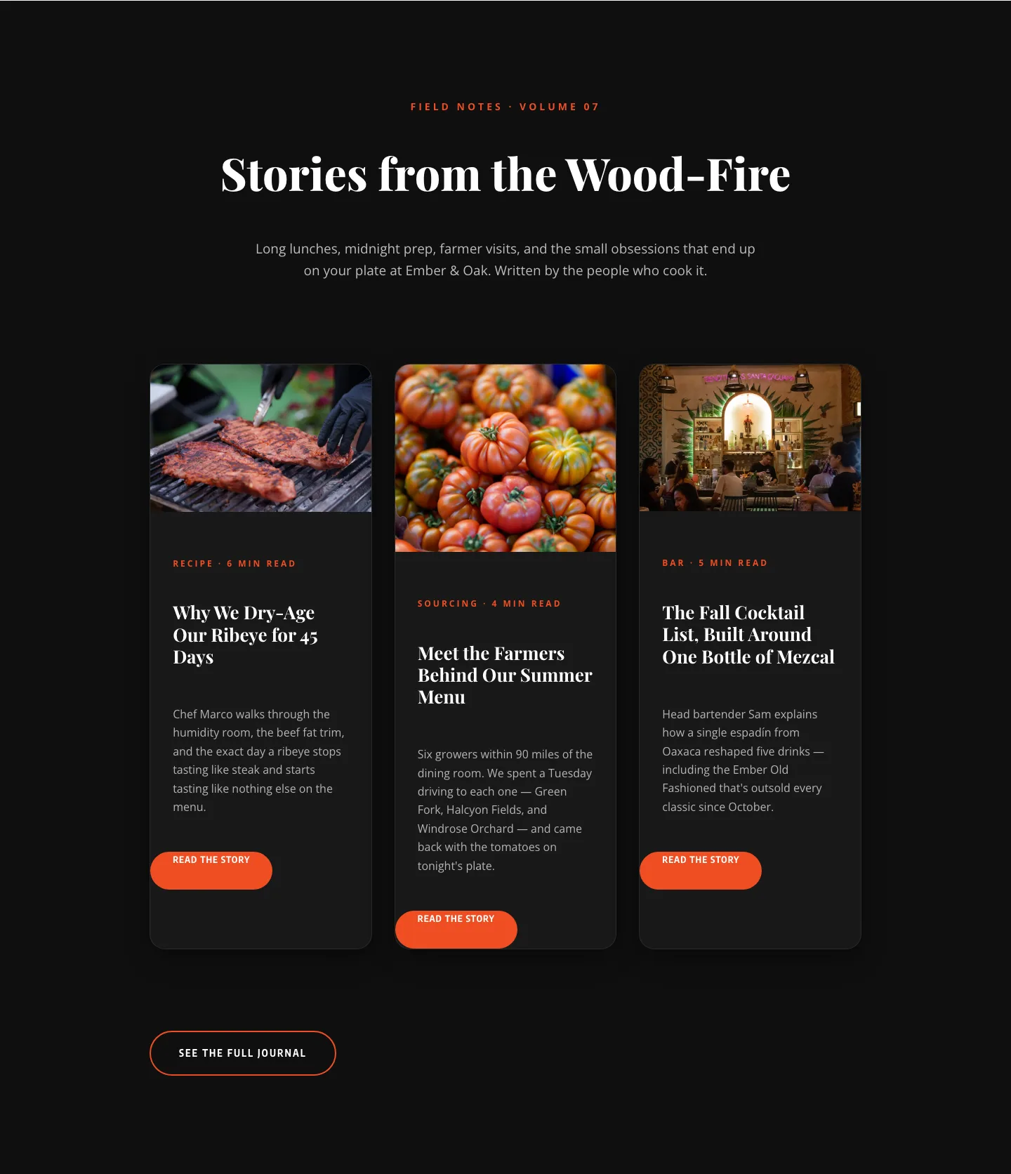
Bold Restaurant Blog Layout for Divi 5: Wood-Fire Journal
blog · restaurant · bold
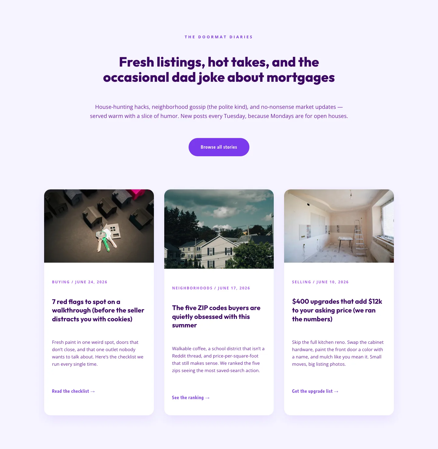
Playful Real Estate Blog Layout for Divi 5 | Divi5Lab
blog · real_estate · playful
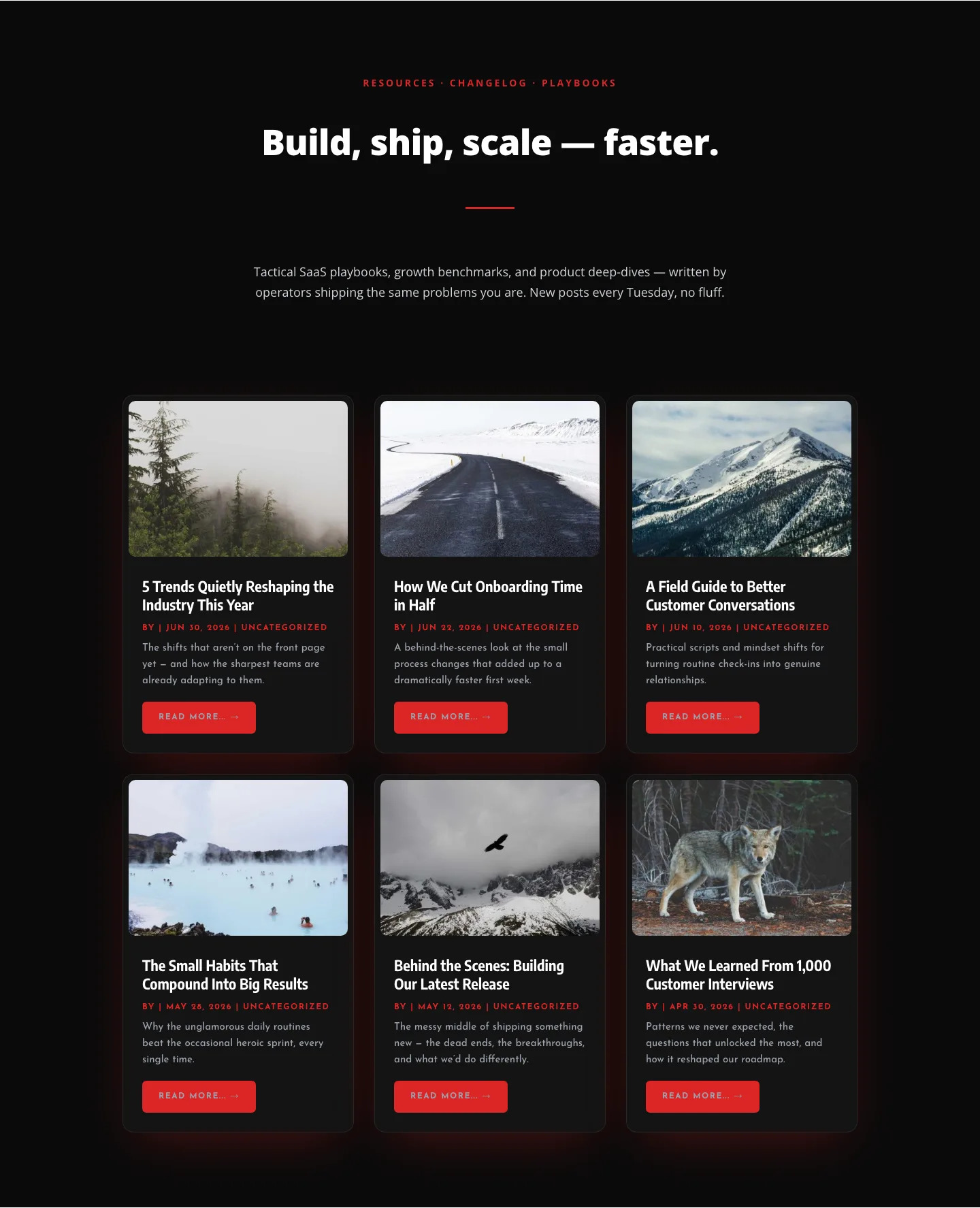
Bold SaaS Blog Layout: Resources & Insights Grid for Divi 5
blog · saas · bold
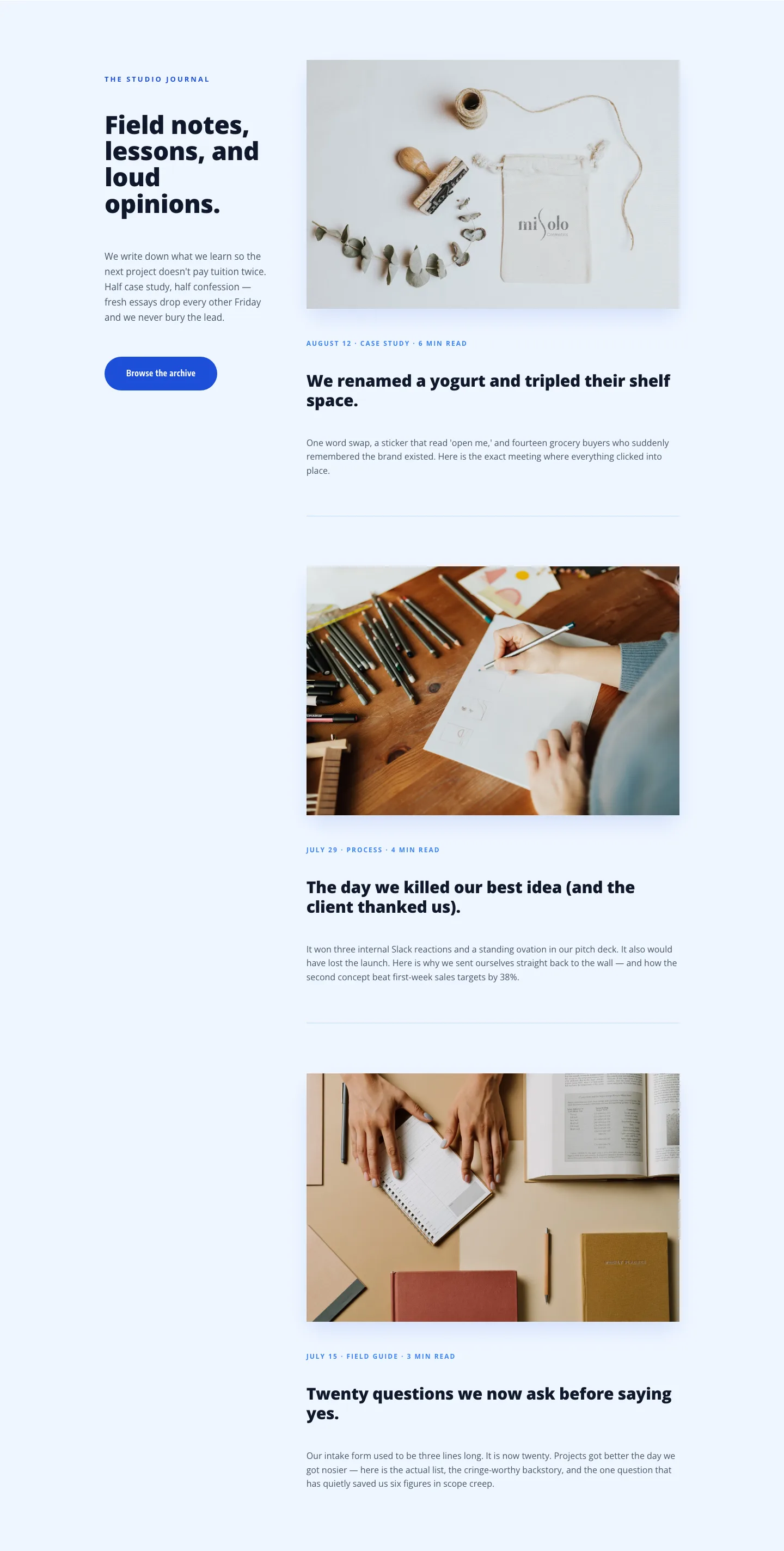
Playful Agency Blog Layout for Divi 5: Studio Journal
blog · agency · playful