
Playful Real Estate Blog Layout for Divi 5 | Divi5Lab
A playful, purple-hued Divi 5 blog layout built for real estate agents: featured post grid, category tags, and a warm, witty voice buyers actually read.
Rate this element
Download this section, free
- Divi 5 JSON, imports in seconds
- Commercial license included
- No account needed
Click to view the full page
Overview
This is a two-part blog section built inside a single Divi 5 section with a soft lavender (#f5f3ff) background and generous 110px top/bottom padding, so it breathes on any page you drop it into. The layout opens with a centered intro block capped at 860px: a small uppercase eyebrow in violet (#7c3aed), a bold 44px Outfit heading in deep purple (#3b0764), a friendly 18px supporting paragraph, and a pill-shaped primary button with a fully rounded 999px radius. The tone is deliberately playful (the copy calls out dad jokes and Tuesday posting cadence) while the type hierarchy stays disciplined so it still reads as a serious brand.
Below the intro, a nested three-column row (1/3, 1/3, 1/3) inside a 1180px container holds three article cards. Each card is a white Divi column with a 1px #ede9fe border, a 22px rounded corner, and a soft violet shadow (rgba(124,58,237,0.12) at 34px blur) that lifts it off the lavender background. Cards use hidden overflow so the top image bleeds edge-to-edge, followed by an uppercase category/date meta line, a 22px Outfit headline, a 15px body paragraph, and a transparent text-style CTA: no visual noise, just a clear read path.
Spacing is tuned for rhythm rather than density: 32px column and row gaps between cards, 26px inner padding on card text, and a 48px gap between the intro row and the grid. On phone, both rows switch to flexDirection: column, so the cards stack full-width in the order shown and the intro remains centered without any manual breakpoints to babysit.
What’s inside
- A full Divi 5 section with 110px vertical padding and a lavender `#f5f3ff` background, ready to drop between other sections
- Centered intro row (max-width 860px) with an uppercase eyebrow Text module, a Heading module (Outfit, 44px, 800), a supporting Text module, and a pill-shaped Button module
- A three-column grid row (max-width 1180px) with 32px column and row gaps and stretched alignment so cards match height
- Three fully-styled article cards, each with rounded 22px corners, a 1px violet border, a soft `rgba(124,58,237,0.12)` shadow, and hidden overflow for edge-to-edge imagery
- Per-card content stack: Image module, uppercase category/date Text, 22px Outfit headline, 15px body Text, and a transparent "Read →" Button
- Phone-specific overrides on both rows (`flexDirection: column`) so the intro and card grid stack cleanly without extra work
- Cohesive purple palette wired through headings (`#3b0764`), body copy (`#6b21a8`), accents (`#7c3aed` / `#a855f7`), and card chrome (`#ede9fe`)
- Real editorial copy across three post categories (Buying, Neighborhoods, Selling) so you can see the tone before you rewrite it
Who it’s for
This blog block is aimed at real estate agents, brokerages, and property teams who want a content hub that feels approachable instead of corporate. The playful copy tone works especially well for buyer-focused agents, first-time-homebuyer educators, neighborhood specialists, and boutique brokerages that lean on personality to stand out from listing-portal noise. The three-category structure (Buying, Neighborhoods, Selling) maps naturally to the way most real estate blogs are already organized. It also transfers cleanly to adjacent niches (interior design studios, home-staging services, mortgage brokers, moving companies, and property management blogs) anywhere a warm violet palette and a lightly humorous voice fits the brand better than a stiff editorial layout.
Customization tips
Start by rewriting the three card headlines, category/date meta lines, and CTA labels: the layout hinges on punchy, specific copy, so keep headlines to roughly 8–14 words. Card images use a landscape ratio (roughly 940×650); swap the Pexels URLs in each Image module for your own listings or lifestyle shots at a similar 3:2 crop to avoid awkward cropping inside the rounded card. To rebrand the palette, do a find-and-replace on the six purple hex codes: background #f5f3ff, headings #3b0764, body #6b21a8, primary accent #7c3aed, secondary accent #a855f7, and card border #ede9fe. Keep the pill button radius (999px) if you want the playful feel; drop it to 8–12px for a more corporate tone. To scale to more posts, duplicate a card column inside the 3-column row. The wrap and 32px gaps handle overflow onto new rows automatically.
How to install this layout
- Download the layout JSON file from this page.
- Open the target page in the Divi 5 builder.
- Open the portability panel (up/down arrows icon) and choose the Import tab.
- Upload the JSON. Tick “replace existing content” only for full-page imports.
- Check the page at desktop and mobile widths, then swap in your copy and images.
Full walkthrough with troubleshooting: How to Import a Divi 5 Layout.
Questions about Playful Real Estate Blog Layout for Divi 5 | Divi5Lab
How does this blog section behave on mobile?
Both the intro row and the three-column card row have a phone-level override that switches `flexDirection` to column, so the intro stays centered and the cards stack full-width in source order. You don't need to touch any breakpoint settings.
Which Divi 5 modules does the layout actually use?
Only native modules: Section, Row, Column, Text, Heading, Image, and Button. Nothing custom, no third-party add-ons. Everything is editable directly in the visual builder.
Is this a real blog feed or static cards?
The three cards are static content, hand-authored with Image, Heading, Text, and Button modules. If you want a dynamic feed, replace the inner row with a Divi Blog module and reuse the surrounding intro block and palette.
What image sizes should I use for the cards?
The included Pexels images are roughly 940×650 (a 3:2 landscape crop). Match that ratio for consistent card heights; the column has `overflow: hidden` so images sit flush against the top rounded corners.
What should I edit first after importing?
Rewrite the intro heading and supporting paragraph to match your brand voice, then update each card's category/date line, headline, excerpt, and button link. Swap the three images last so you're not distracted by placeholder photography while writing.
Can I change the purple palette to match my brand?
Yes: the layout is driven by six hex values (`#f5f3ff`, `#3b0764`, `#6b21a8`, `#7c3aed`, `#a855f7`, `#ede9fe`). Replace them consistently across the Section background, Heading colors, Text colors, Button background, and card border/shadow to rebrand in a few minutes.
Which Divi version does this layout need?
Divi 5. The layout is generated natively for Divi 5 and validated against its real module structure before publication, so it imports clean into the current builder.
Can I use this layout on client websites?
Yes. Every download includes a commercial license covering unlimited sites you own or build for clients. Only reselling or redistributing the layout file itself is prohibited.
More blog layouts
Browse all blog layouts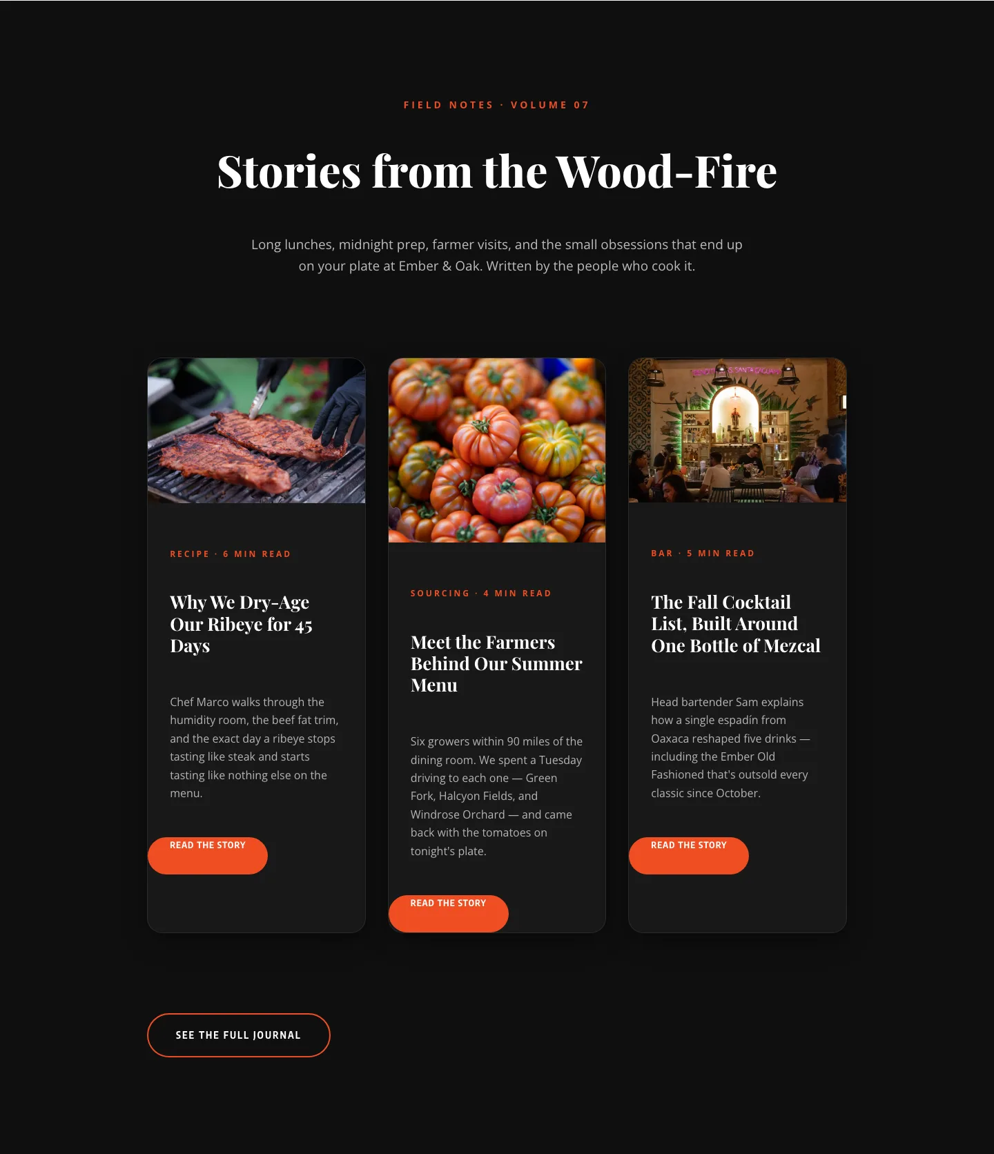
Bold Restaurant Blog Layout for Divi 5: Wood-Fire Journal
blog · restaurant · bold
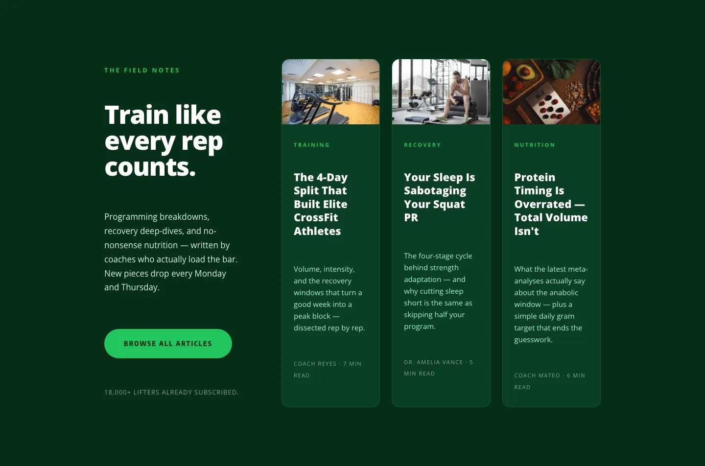
Bold Fitness Blog Layout for Divi 5: Green Asymmetric Split
blog · fitness · bold
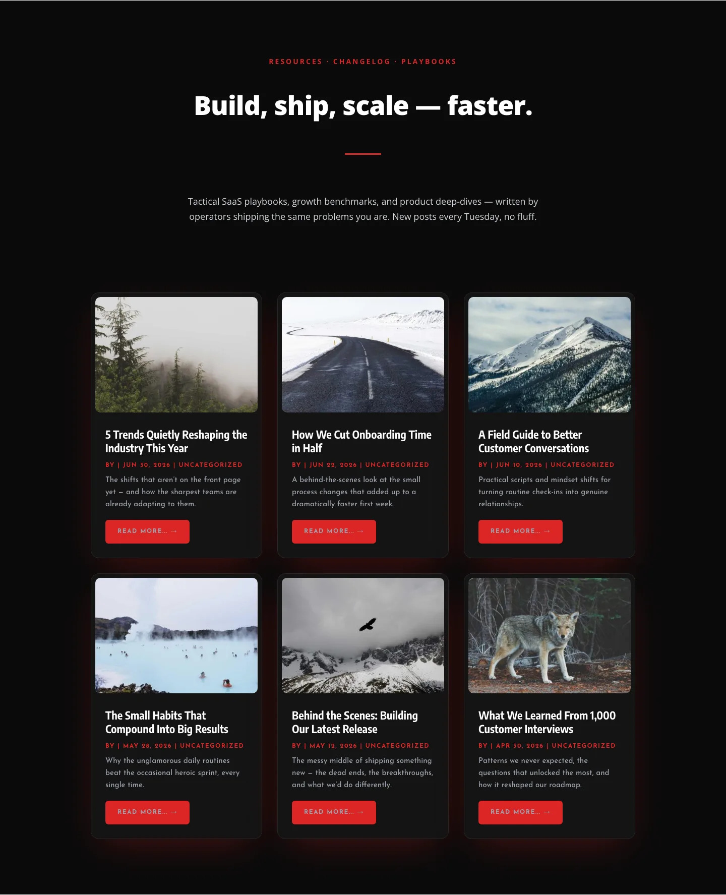
Bold SaaS Blog Layout: Resources & Insights Grid for Divi 5
blog · saas · bold
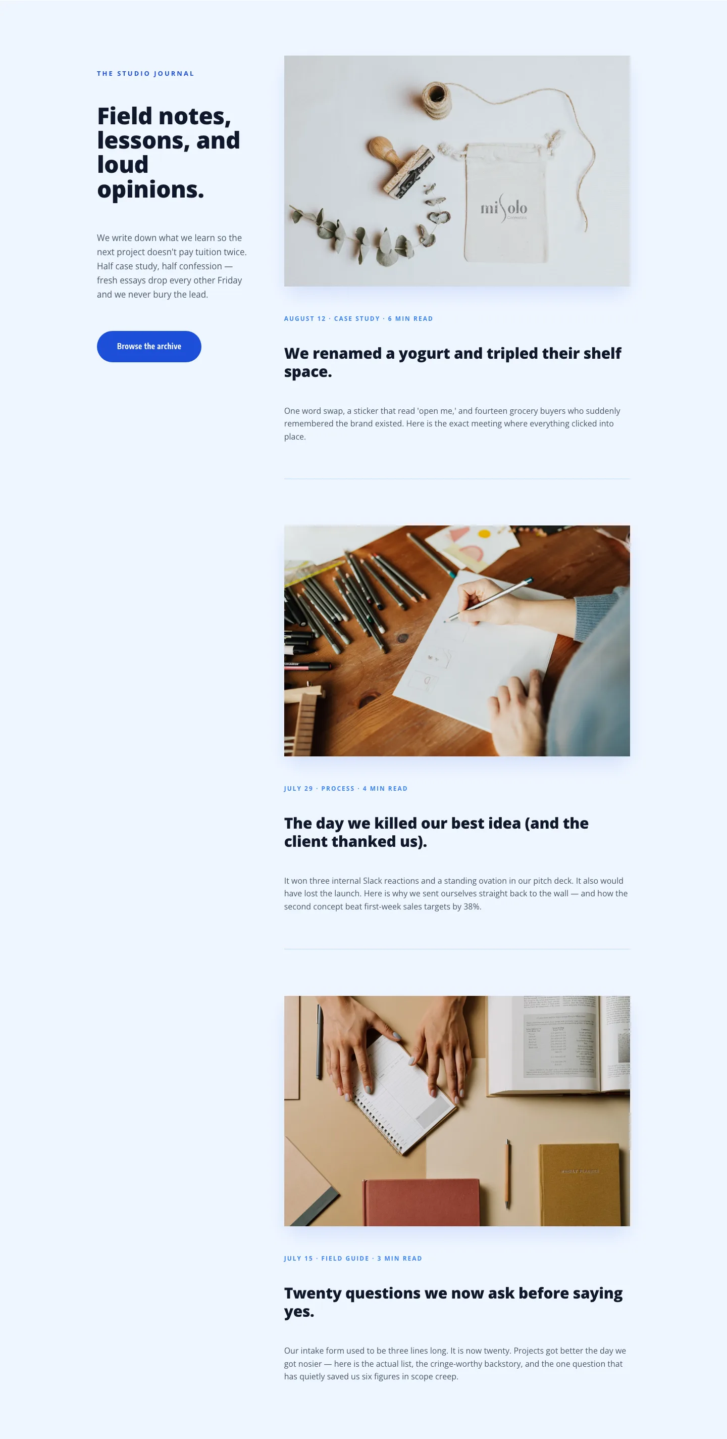
Playful Agency Blog Layout for Divi 5: Studio Journal
blog · agency · playful