
Bold Restaurant Blog Layout for Divi 5: Wood-Fire Journal
A bold, dark Divi 5 blog layout for restaurants: three-card journal grid with hero, recipe, sourcing, and bar stories. Wood-fire aesthetic, orange accents.
Rate this element
Download this section, free
- Divi 5 JSON, imports in seconds
- Commercial license included
- No account needed
Click to view the full page
Overview
Ember & Oak's journal section runs on a deep near-black canvas (#0f0f0f) with generous 140px top and bottom padding and 6vw side gutters, so the content sits well clear of the browser edges and lets the wood-fire orange (#f04e23) land hard against it. The intro row is centered: a tight uppercase orange eyebrow at 14px with 4px letter-spacing calls out the volume number, a 64px Playfair Display headline drops in at 800 weight with a compact 1.05em line-height, and a 19px subhead at 72% white opacity caps at 720px so it reads like a proper standfirst instead of stretching edge to edge.
Below the header, three equal cards ride a 32px gap in both directions. Each card is a #181818 tile with a 22px radius, a 1px hairline in rgba(255,255,255,0.08), and a soft preset3 shadow: on hover the shadow deepens and picks up an orange cast (rgba(240,78,35,0.35)) so the grid feels alive without any JavaScript. The image sits flush at the top, then a 32px-padded stack: a small uppercase category-and-read-time eyebrow in orange, a 26px Playfair headline in white, 16px body copy at 68% white opacity, and a pill CTA (999px radius, orange fill, brighter-orange (#ff6a3d) hover) reading 'Read the story' on all three cards for scannability.
On phone the row switches to flexDirection: column, so the cards stack full-width one under another and keep the 32px rhythm. The section closes with a centered ghost CTA (a transparent pill with a 2px orange border and wide-tracked uppercase 'See the full journal') that fills orange on hover and routes to the archive. The whole thing is one section, three rows, only native Divi 5 modules.
What’s inside
- Dark editorial section frame: #0f0f0f background, 140px vertical padding, 6vw side gutters
- Centered hero row: uppercase orange eyebrow, 64px Playfair Display headline, 19px subhead capped at 720px
- Three-column post grid on a 1/3 · 1/3 · 1/3 flex row with 32px column and row gaps
- Card treatment: #181818 tile, 22px radius, 1px hairline border, preset3 shadow that shifts to an orange glow on hover
- Card content stack: flush-top image, orange 'Category · N min read' eyebrow, 26px Playfair headline, muted body, pill CTA
- Pill 'Read the story' buttons at 999px radius with #f04e23 fill and #ff6a3d hover, matched across all three cards
- Ghost outline archive CTA at the bottom: transparent pill with 2px orange border, fills orange on hover
- Built entirely with native Divi 5 modules: section, row, column, image, text, heading, button
Who it’s for
Written for restaurants, gastropubs, wineries, coffee roasters, breweries, and any hospitality brand that publishes chef notes, sourcing stories, recipes, or cocktail features. The tone (Playfair headlines, uppercase category tags, muted body copy over deep black) reads editorial rather than promotional, so it also fits food magazines, supper-club newsletters, catering journals, private-chef sites, and hotel F&B blogs. Because it is a three-card blog grid with a strong hero and a routing CTA to the archive, it works equally well as a homepage 'latest from the journal' strip or as the top of a dedicated /journal index page. Anywhere a food brand wants to sound like it actually cooks, not just markets.
Customization tips
Swap the palette in one place: the section background (#0f0f0f), the card fill (#181818), and the orange accent (#f04e23 / hover #ff6a3d), recolor those three tokens and the whole layout re-skins for winery burgundy, matcha green, or espresso brown. Keep card headlines under about 55 characters so they land on two lines at the 26px Playfair size; the eyebrow reads best as 'Category · N min read' (12–20 characters). Card images render at 940×650, so upload landscape roughly 3:2, plating, ingredients, and bar shots all work, and overhead hero angles read stronger than tight macros at thumbnail scale. The centered hero subhead is capped at 720px, so keep it to one or two sentences (about 120–160 characters). If you only have two stories at launch, delete a column and the flex row will stretch the remaining two evenly. Keep pill button labels to 2–3 uppercase words.
How to install this layout
- Download the layout JSON file from this page.
- Open the target page in the Divi 5 builder.
- Open the portability panel (up/down arrows icon) and choose the Import tab.
- Upload the JSON. Tick “replace existing content” only for full-page imports.
- Check the page at desktop and mobile widths, then swap in your copy and images.
Full walkthrough with troubleshooting: How to Import a Divi 5 Layout.
Questions about Bold Restaurant Blog Layout for Divi 5: Wood-Fire Journal
How does the three-card grid behave on mobile?
The row uses flexDirection: column at the phone breakpoint, so cards stack full-width one under another while preserving the 32px vertical rhythm. Nothing shrinks or crops, each card gets the full column width.
What Divi 5 modules is this built from?
Only native ones: divi/section, divi/row, divi/column, divi/image, divi/text, divi/heading, and divi/button. No third-party plugins, no custom blocks, and no dependency on the WordPress posts CPT.
Do the cards pull real blog posts automatically?
No: each card is a hand-composed layout, not a dynamic Blog Post module. Point the three 'Read the story' buttons at your actual post URLs (they currently link to /journal/... placeholders), swap in your featured images, and edit the eyebrow, headline, and dek in place.
What image size should I use in the cards?
The source images are 940×650 (roughly 3:2 landscape). Upload at least that size and the layout scales to card width. Because the image sits flush against the top card border, avoid critical detail in the top 20px. The 22px radius crops a hair off the corners.
Can I change the number of cards?
Yes. The flex row is set to wrap, so any column count works: duplicate a column for a fourth card and the row will run as two-by-two, or delete a column and the remaining two will stretch evenly across the row.
What should I edit first for a live launch?
The volume number ('Field Notes · Volume 07') and the hero headline ('Stories from the Wood-Fire'), those two lines carry the section's voice. Then the three card headlines, images, and /journal/... links. Everything else can inherit.
Which Divi version does this layout need?
Divi 5. The layout is generated natively for Divi 5 and validated against its real module structure before publication, so it imports clean into the current builder.
Can I use this layout on client websites?
Yes. Every download includes a commercial license covering unlimited sites you own or build for clients. Only reselling or redistributing the layout file itself is prohibited.
More blog layouts
Browse all blog layouts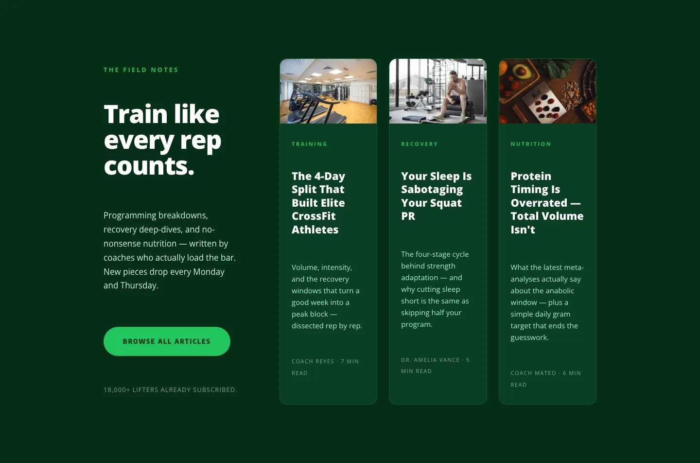
Bold Fitness Blog Layout for Divi 5: Green Asymmetric Split
blog · fitness · bold
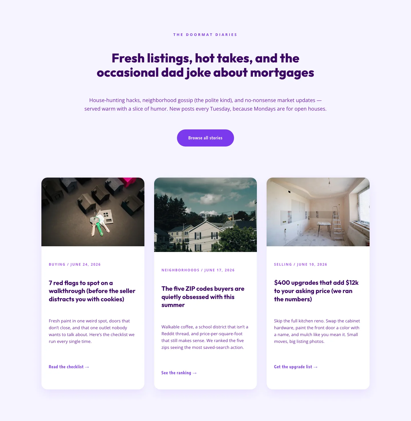
Playful Real Estate Blog Layout for Divi 5 | Divi5Lab
blog · real_estate · playful
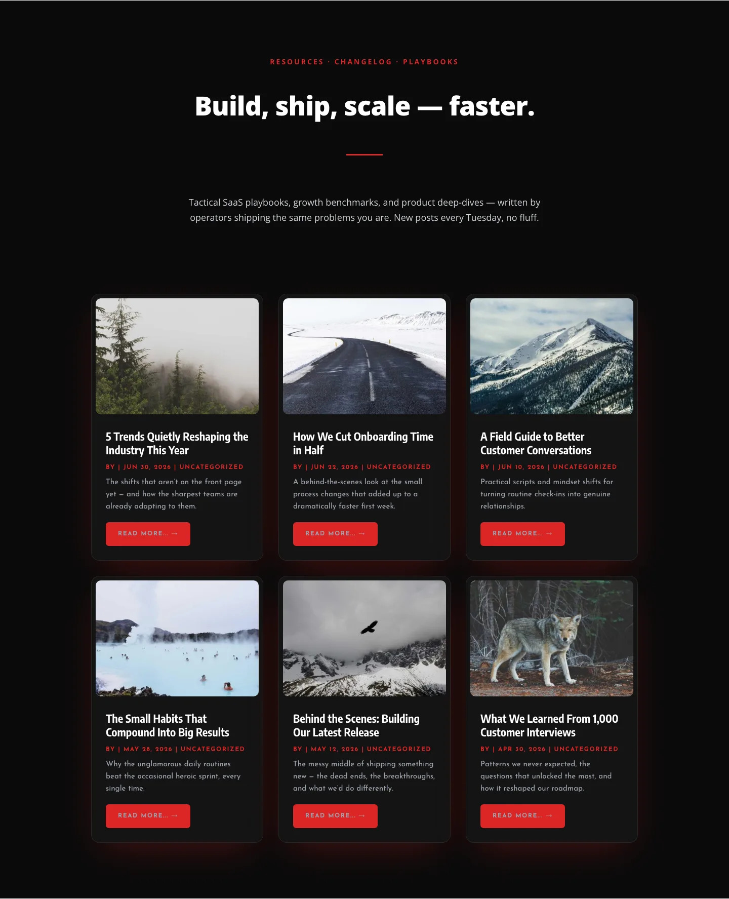
Bold SaaS Blog Layout: Resources & Insights Grid for Divi 5
blog · saas · bold
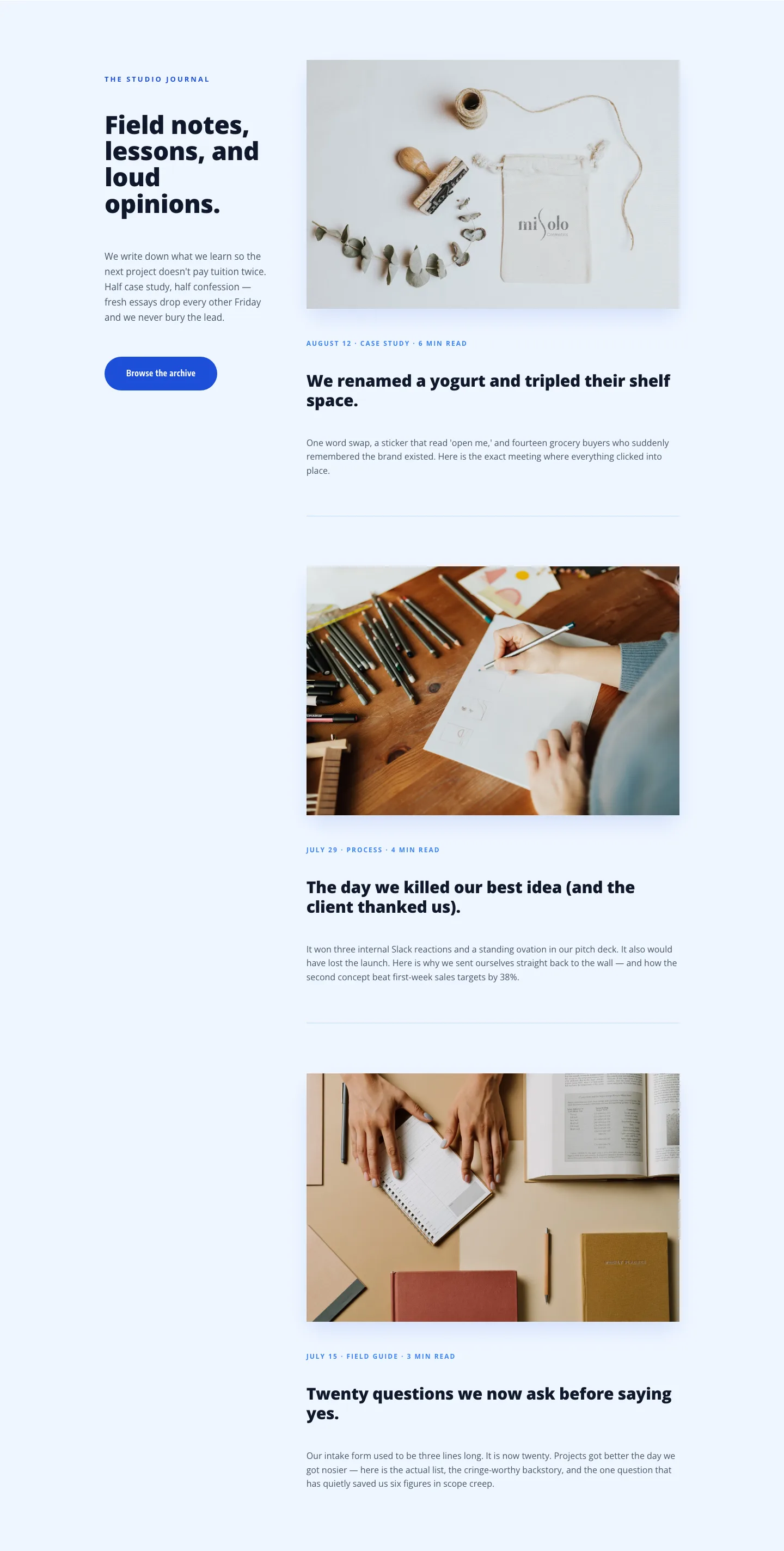
Playful Agency Blog Layout for Divi 5: Studio Journal
blog · agency · playful