
Minimal Divi 5 Layouts
Minimal layouts do the hardest thing in design: they earn attention without demanding it. Every section here leans on generous whitespace, a restrained type scale, and a single confident accent. So the message lands before the decoration does. Browse the grid, preview desktop and mobile renders, and download any section free (or the whole category as a pack) to drop straight into Divi 5.

Brightwell Family Dental: Minimal Medical Landing Page for Divi 5
full_landing · medical · minimal
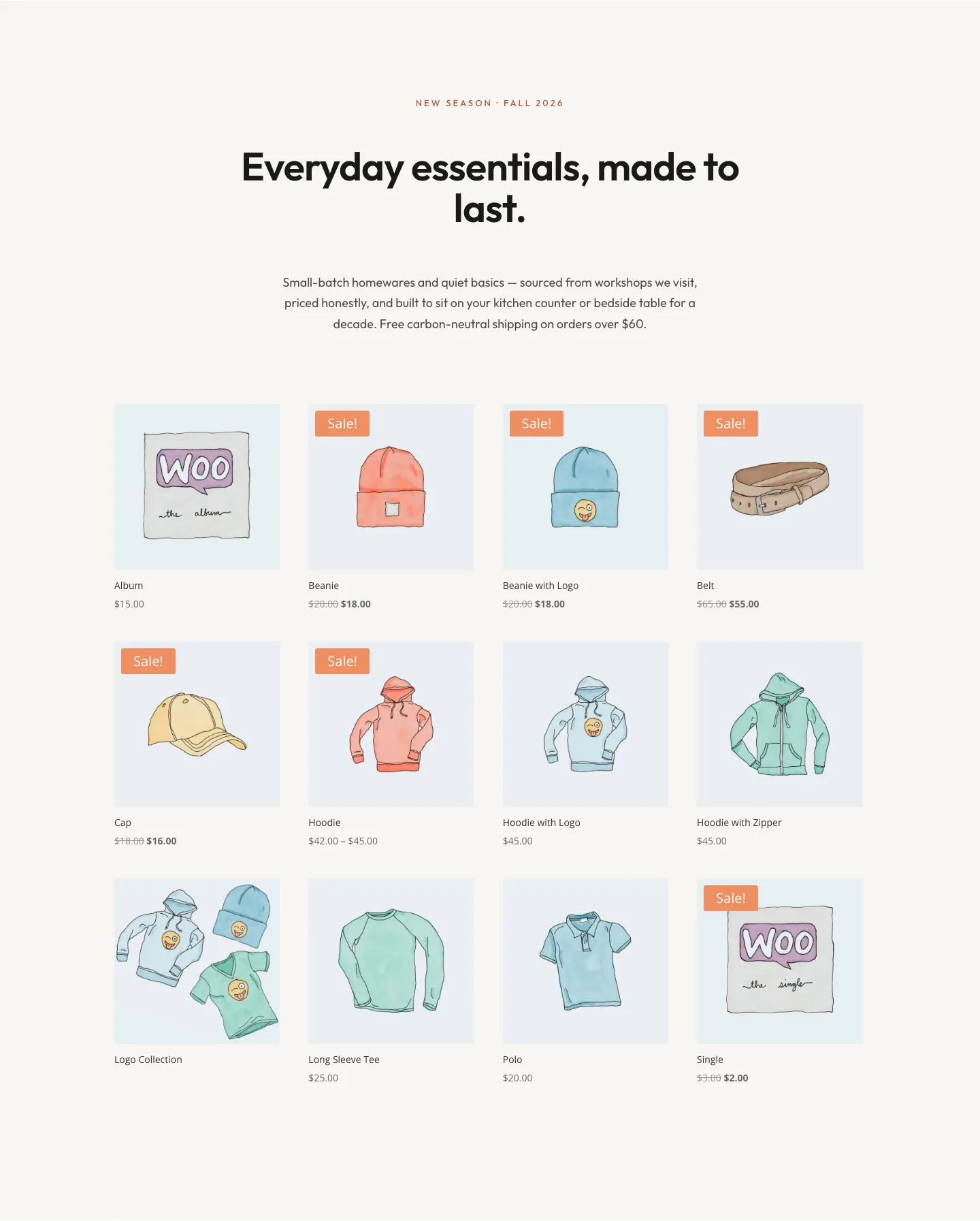
Minimal Ecommerce Shop Grid Layout for Divi 5: North Field Essentials
shop · ecommerce · minimal

Meridian Imaging: Minimal Medical Landing Page for Divi 5
full_landing · medical · minimal
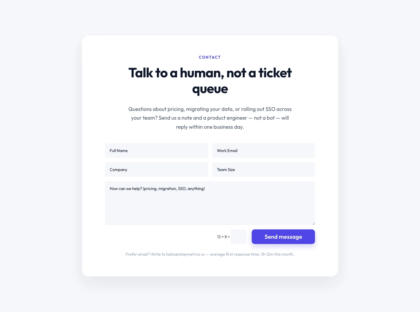
Minimal SaaS Contact Form Section: Divi 5 Layout
contact · saas · minimal
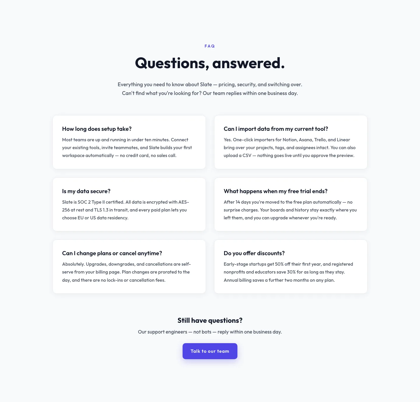
Minimal SaaS FAQ Section: Two-Column Card Layout for Divi 5
faq · saas · minimal
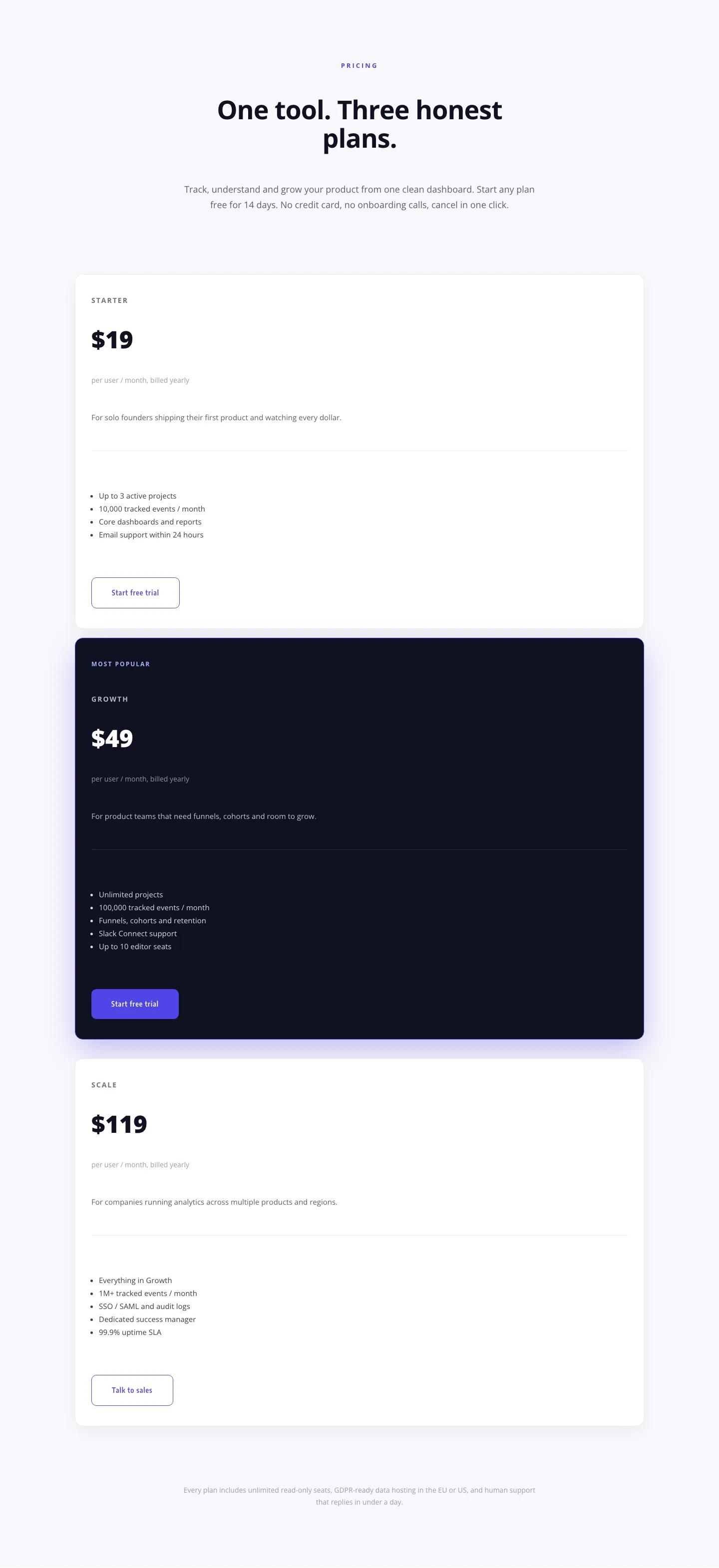
Minimal SaaS Pricing Section: 3-Tier Plan Cards with Featured Dark Tier | Divi 5 Layout
pricing · saas · minimal
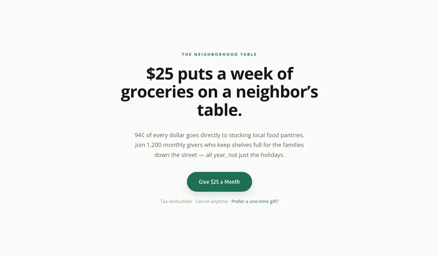
Minimal Nonprofit Donation CTA: Divi 5 Layout
cta · nonprofit · minimal
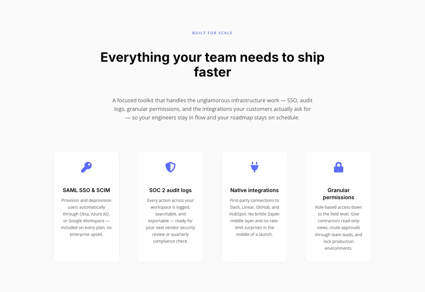
Minimal SaaS Features Section: 4-Column Icon Grid for Divi 5
features · saas · minimal
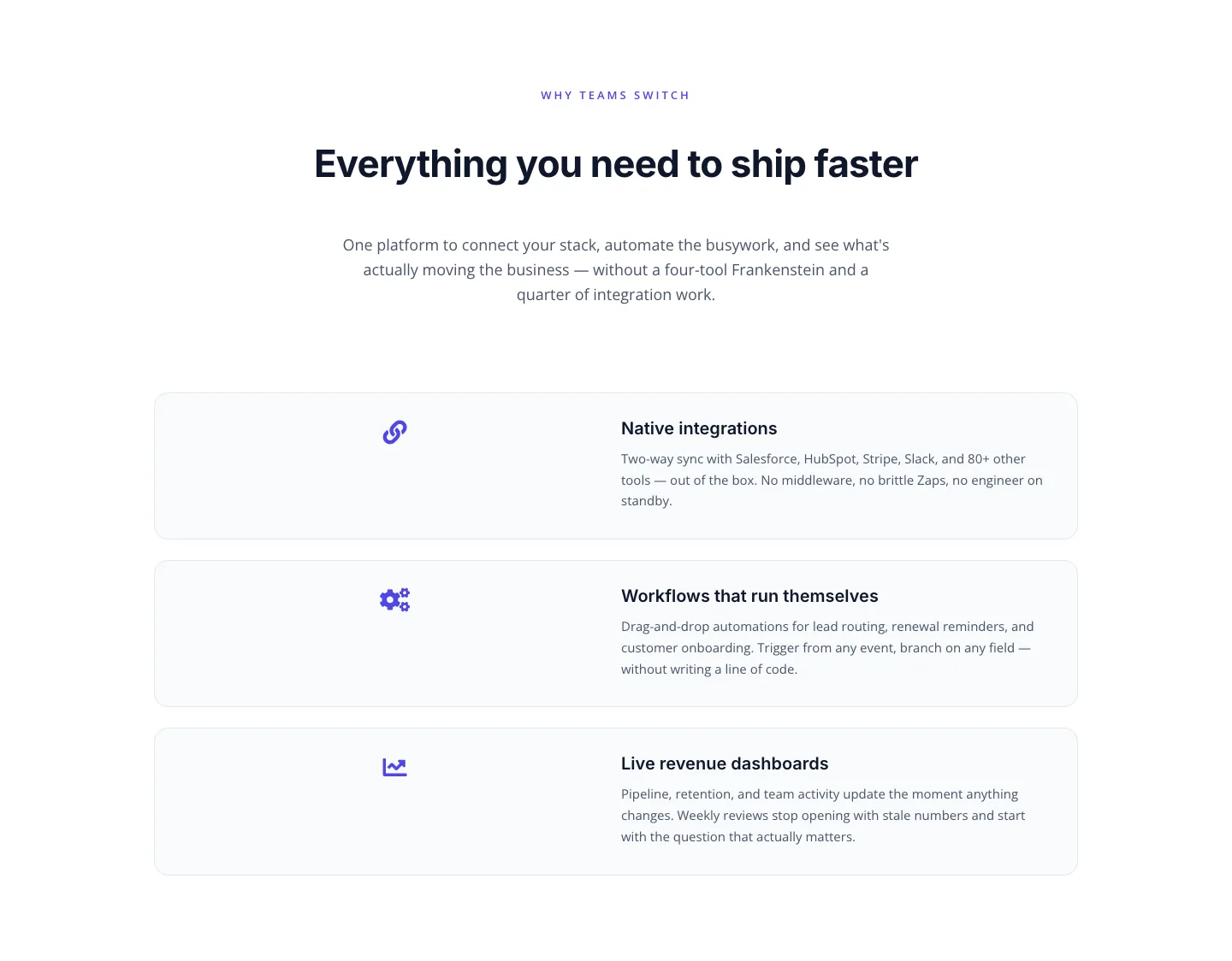
SaaS Features Section: Integrations, Automation & Live Dashboards
features · saas · minimal
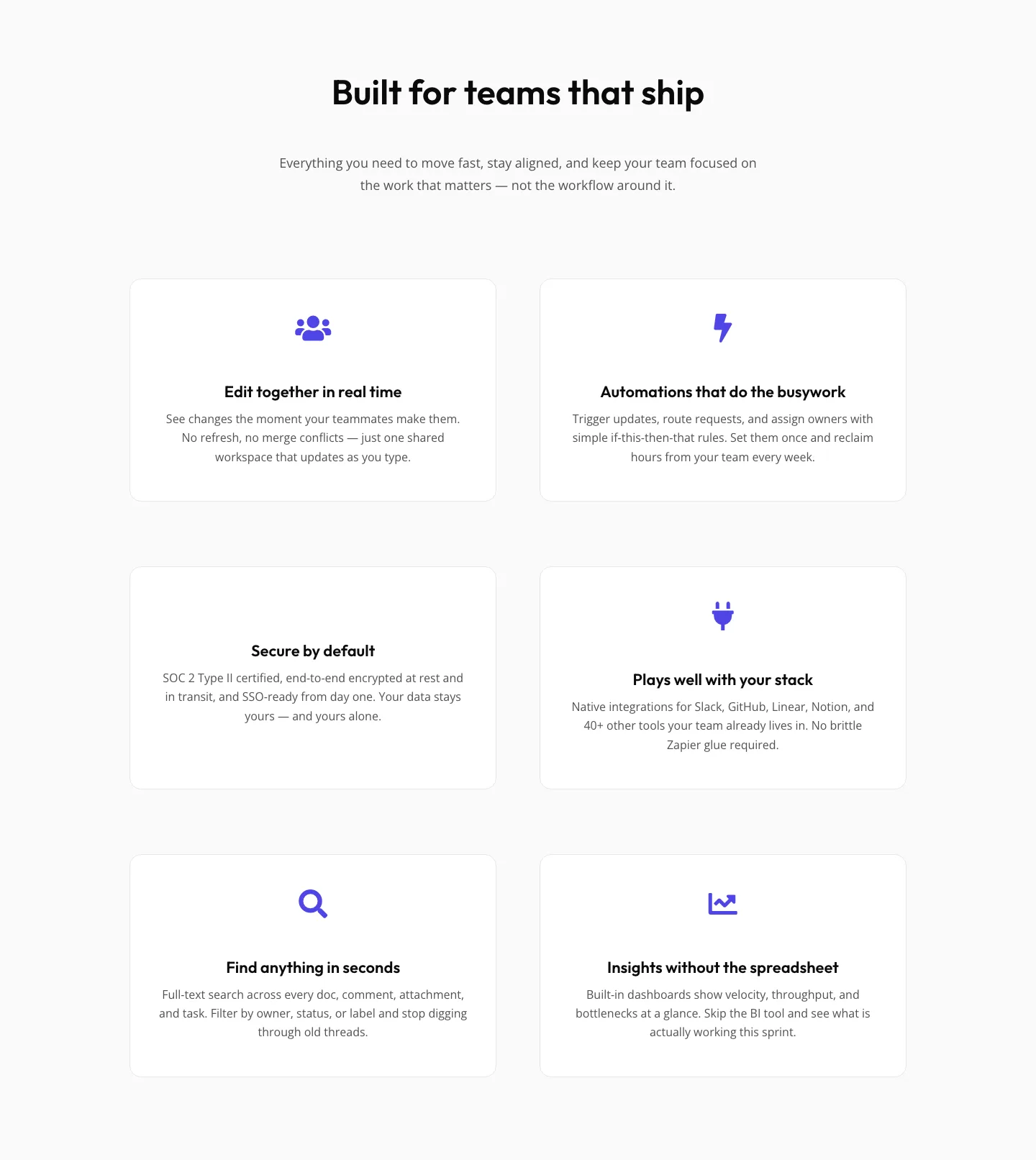
SaaS Features Section: Minimal Divi 5 Layout for Product Teams
features · saas · minimal
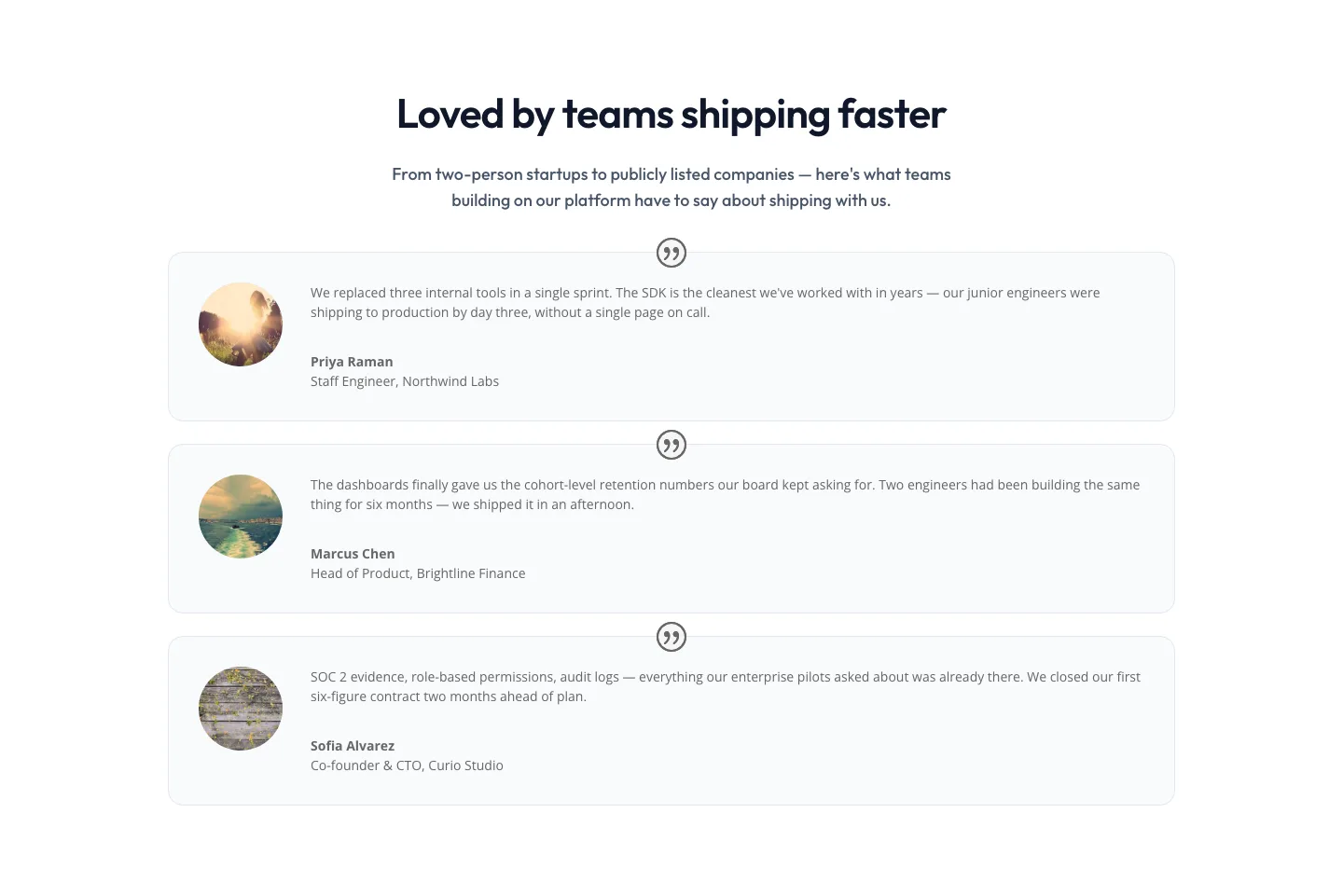
Minimal SaaS Testimonials Section: Three-Column Customer Quotes
testimonials · saas · minimal
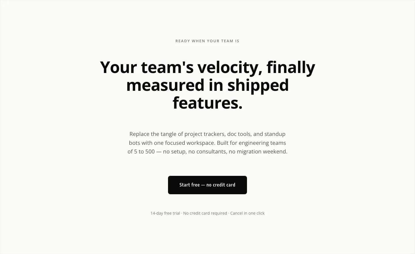
Minimal SaaS CTA: Ship Features Faster
cta · saas · minimal

Minimal SaaS Features Cards Layout for Divi 5
cards · saas · minimal

Minimal SaaS 3-Up Feature Cards Layout for Divi 5
cards · saas · minimal

Minimal SaaS Feature Cards Layout for Divi 5
cards · saas · minimal

Minimal SaaS Feature Cards Layout: 4-Column Divi 5 Section
cards · saas · minimal
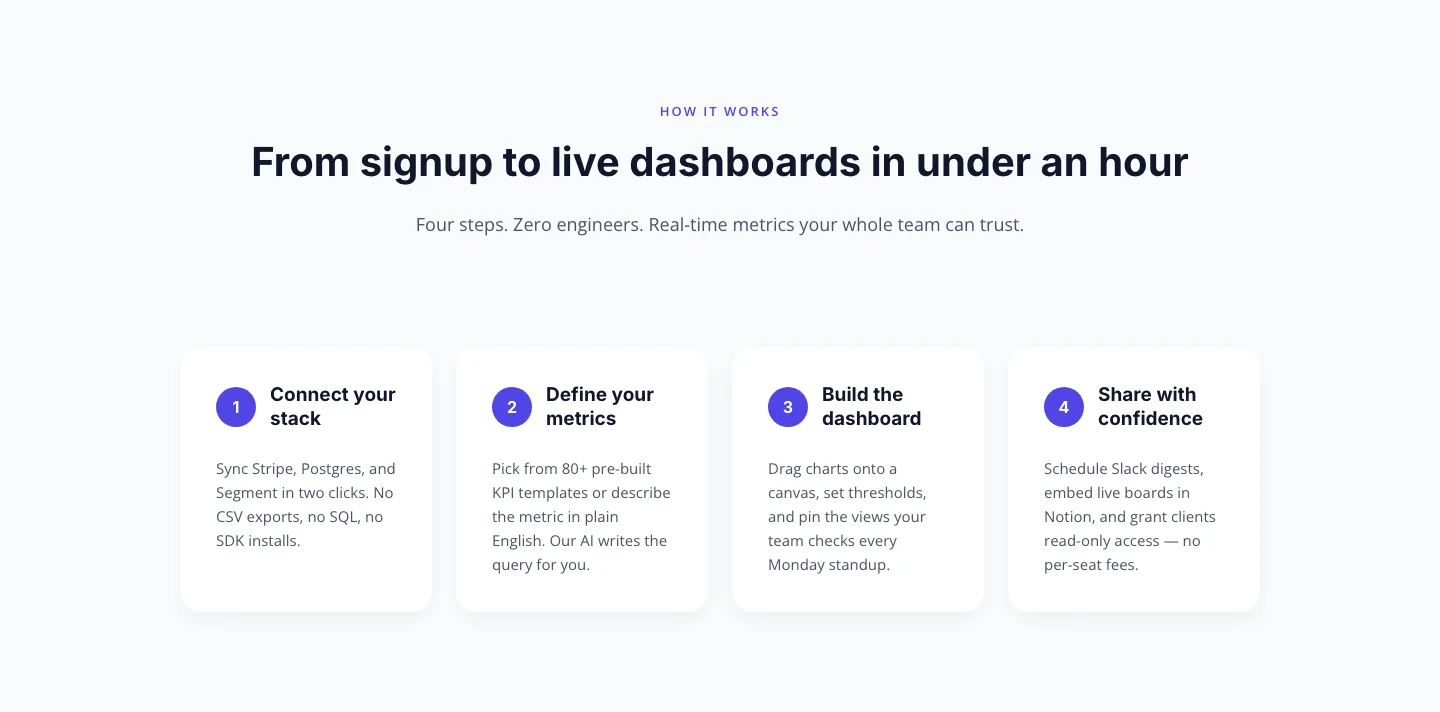
Minimal SaaS How-It-Works Cards: 4 Numbered Steps | Divi 5 Layout
cards · saas · minimal
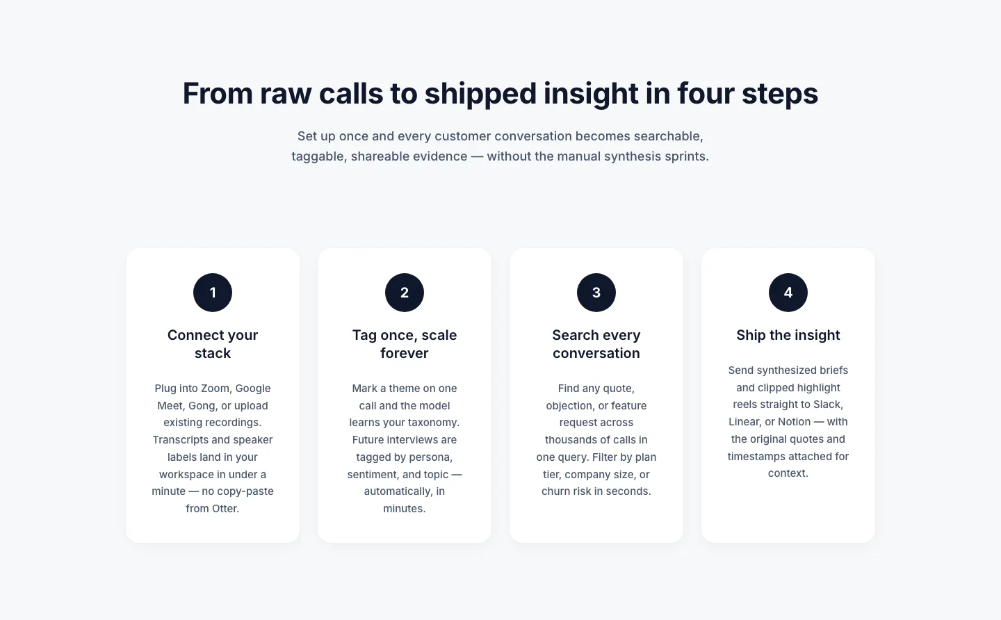
Four-Step How It Works Cards: Minimal SaaS Divi 5 Layout
cards · saas · minimal
Cards: Minimal SaaS
cards · saas · minimal
SaaS Feature Highlights: 4-Card Grid Layout for Divi 5
cards · saas · minimal
Three-Step How It Works Cards for SaaS Onboarding
cards · saas · minimal
SaaS Feature Cards: Minimal 3-Column Divi 5 Layout
cards · saas · minimal
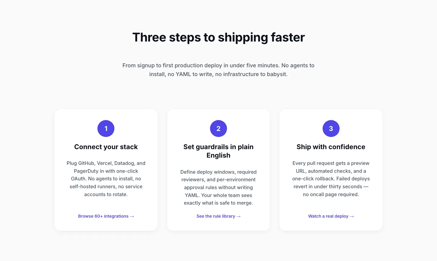
Three-Step SaaS Onboarding Cards: Minimal Divi 5 Layout
cards · saas · minimal
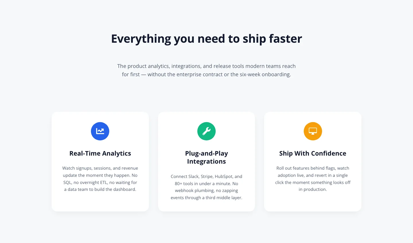
3-Column SaaS Feature Cards: Minimal Divi 5 Layout
cards · saas · minimal
What makes a minimal layout actually work
Minimalism is not the absence of design. It's the absence of noise. The best minimal layouts in this collection share a few disciplines: a two-weight type system (usually a light or regular display paired with a workhorse body), a neutral base (off-white, bone, or ink) broken by exactly one accent, and column structures that let content breathe at 1440px without collapsing awkwardly on a phone. Buttons are quiet. Dividers are hair-thin or absent. Imagery, when it appears, is either editorial-scale or deliberately small. Never decorative filler.
A good minimal hero resists the urge to say everything at once. A good minimal pricing table trusts the reader to compare three tiers without color-coded chaos. A good minimal footer becomes a signature, not a sitemap dump.
Who reaches for this style
Studios and consultancies who sell taste. Editorial and long-form publishers. Product marketing teams for premium SaaS. Architects, wellness brands, art galleries, high-end e-commerce, and anyone whose audience reads the whole page instead of skimming. If your brand's job is to feel considered and expensive, minimal is your default: and if your conversion path relies on trust more than urgency, it usually outperforms louder alternatives.
Customizing a minimal layout in Divi 5
Once a section is imported, the shortest path to "on-brand" runs through Divi 5's presets and palette:
- Palette first. Open the Site → Colors panel and replace the three role colors (background, ink, and accent) with your brand values. Every module in the section is wired to those roles, so a single edit re-skins the whole layout.
- Typography presets. Set your display and body faces once at the Site level. Minimal layouts intentionally use only two or three type styles, so a global font swap propagates cleanly without the cascade fights you get in busier designs.
- Spacing scale. Minimal lives and dies by rhythm. If your brand runs tighter or looser than the default, adjust the section padding preset rather than fiddling per-module. The vertical cadence stays consistent across the page.
- Copy is the design. Trim two words from every headline. Rewrite CTA labels in verbs, not slogans. In a minimal layout, the copy carries the visual weight the ornament isn't providing.
Every section here is validated against Divi 5's structure before it goes into the catalog, and the screenshots are real desktop and mobile renders (not mockups) so what you preview is what imports. Free downloads are email-gated and ship under a straightforward commercial license.