
Editorial Design Studio Testimonials Layout for Divi 5: Three Client Quotes
A clean, editorial testimonials section for design agencies. Features three client quotes in bordered cards with portrait photos, warm neutral background, and Playfair Display headings. Built for Divi 5.
Rate this element
Download this section, free
- Divi 5 JSON, imports in seconds
- Commercial license included
- No account needed
Click to view the full page
Overview
The section sits on a warm parchment ground (#faf7f2) that signals considered taste rather than clinical white. Desktop layout uses two stacked rows, each a two-column flex row with a 24px column gap and alignItems: stretch so every card reaches the same height. The first row splits the section header from the first testimonial card: on the left, a 13px uppercase tracking label in Source Sans 3 introduces the block, followed by a 44px Playfair Display h2 and a single line of body copy that sets the human context. On the right, the first quote card appears: white background, 1px solid border in #e3dccf (a muted tan), 4px corner radius, and 32px padding on all sides. The second row places the remaining two cards side by side in the same grid, completing an asymmetric three-quote arrangement that avoids the mechanical sameness of a three-column strip.
Each testimonial card is structured as a flex column with justifyContent: space-between and a 28px row gap, so the quote text and attribution always stay apart regardless of quote length. The quote runs at 19px Source Sans 3 in near-black (#1c1a17) with a 1.6em line height, generous breathing room for longer passages. Attribution sits in a horizontal flex group: a 56px avatar image (1:1 aspect ratio, object-fit cover, 4px radius) alongside a stacked name and role pair. The name is 16px bold in #1c1a17; the role is 15px in warm mid-grey #6b645a, matching the tone used for the label and supporting copy above. This restrained two-color text system keeps every card legible without adding extra visual weight.
Spacing scales deliberately across breakpoints: section padding steps from 120px on desktop to 80px on tablet and 56px on phone. The h2 drops from 44px to 36px at tablet and 30px at phone, staying comfortable at each size. Rows switch from nowrap to wrap with column direction at phone, so each card stacks in full-width vertical order beneath the header copy. Columns reflow to 24/24 (full viewport span), keeping avatar and quote intact at every width. No decorative dividers, no star ratings, no gradients: the restraint is a deliberate editorial choice that matches a studio positioning that trusts its work to speak through a client's actual words.
What’s inside
- Asymmetric three-quote structure: section header paired with one card in the first row, two equal-height cards in the second row
- Three white testimonial cards on a #faf7f2 parchment background, each with a 1px #e3dccf border and 4px corner radius
- Playfair Display h2 at 44px desktop / 36px tablet / 30px phone paired with a 13px uppercase tracked Source Sans 3 section label
- Per-card flex column with `justifyContent: space-between` keeping quote text and attribution pinned apart at any quote length
- 56px square avatar images (1:1 forced ratio, object-fit cover, 4px radius) beside a stacked bold-name / muted-role attribution group
- Full responsive reflow: rows unwrap to vertical stacking at phone, columns expand to full viewport width, section padding scales from 120px to 56px
Who it’s for
This layout fits design studios, brand agencies, creative consultancies, and freelance designers who position themselves on craft and editorial taste rather than volume. It works equally well for boutique hospitality brands, arts organizations, and premium service businesses where a calm, high-trust tone matters more than social proof metrics. The three-quote structure is especially effective when your clients are recognizable by name and title, turning the attribution line into its own credibility signal.
Customization tips
Swap the section background by changing the single #faf7f2 value in the section decoration; any warm neutral reads well here. The card border color (#e3dccf) should track your background choice to stay harmonious. Quote text sits at 19px with 1.6em line height, which comfortably holds 30 to 60 words before cards in the same row diverge noticeably in height. The flex space-between absorbs some variation, but try to keep word counts roughly similar within each row pair. Avatar images are fixed at 56px rendered size with a 1:1 crop, so square or portrait-cropped headshots work best; supply source images at 112px or larger for sharpness. To shift the editorial tone, replace Playfair Display on the h2 with any high-contrast serif and update Source Sans 3 on body and labels to a matching sans.
How to install this layout
- Download the layout JSON file from this page.
- Open the target page in the Divi 5 builder.
- Open the portability panel (up/down arrows icon) and choose the Import tab.
- Upload the JSON. Tick “replace existing content” only for full-page imports.
- Check the page at desktop and mobile widths, then swap in your copy and images.
Full walkthrough with troubleshooting: How to Import a Divi 5 Layout.
Questions about Editorial Design Studio Testimonials Layout for Divi 5: Three Client Quotes
How are the three quotes distributed across the layout?
The first row puts the section header (label, h2, subtext) in the left column and the first testimonial card in the right. The second row holds the remaining two cards side by side. One quote shares visual weight with the headline while two anchor the bottom, creating a natural editorial hierarchy rather than a uniform grid.
What happens to card heights when my quotes are different lengths?
Each card uses a flex column with `justifyContent: space-between`, so the attribution group always pins to the bottom and the quote fills the top. The row uses `alignItems: stretch`, meaning both cards in a row match the taller one. Very short quotes alongside very long ones will leave visible white space inside the shorter card, so aim to keep word counts roughly similar within each row pair.
Do the cards stack on mobile?
Yes. At the phone breakpoint both rows switch to `flexWrap: wrap` with `flexDirection: column`, and each column expands to full width (24/24). Section padding steps down from 120px to 56px. All three cards stack in sequence: header copy first, then card one, two, three.
What modules make up each testimonial card?
Each card is a Divi Column containing: one Text module for the quote, then a Group module (horizontal flex row) holding a nested fixed-width Group (56px) with an Image module inside, plus a second nested Group (flex column, flex-grow) with two Text modules for the client name and role.
What aspect ratio and size should the avatar photos be?
The Image module enforces a 1:1 aspect ratio at 56px rendered width with `object-fit: cover`. Any square crop works. Supply images at 112px or larger before compression; the layout constrains the display size regardless of source dimensions.
Which Divi version does this layout need?
Divi 5. The layout is generated natively for Divi 5 and validated against its real module structure before publication, so it imports clean into the current builder.
Can I use this layout on client websites?
Yes. Every download includes a commercial license covering unlimited sites you own or build for clients. Only reselling or redistributing the layout file itself is prohibited.
More testimonials
Browse all testimonials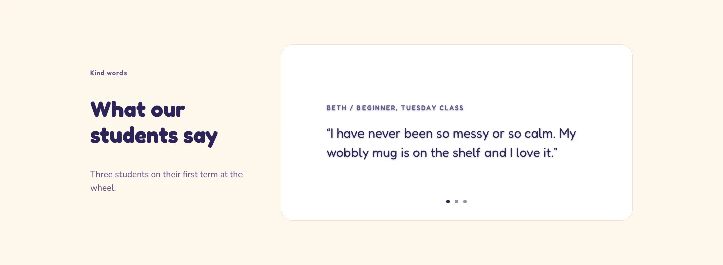
Playful Pottery Class Testimonial Slider Layout for Divi 5: Three Quotes
testimonials · coaching · playful
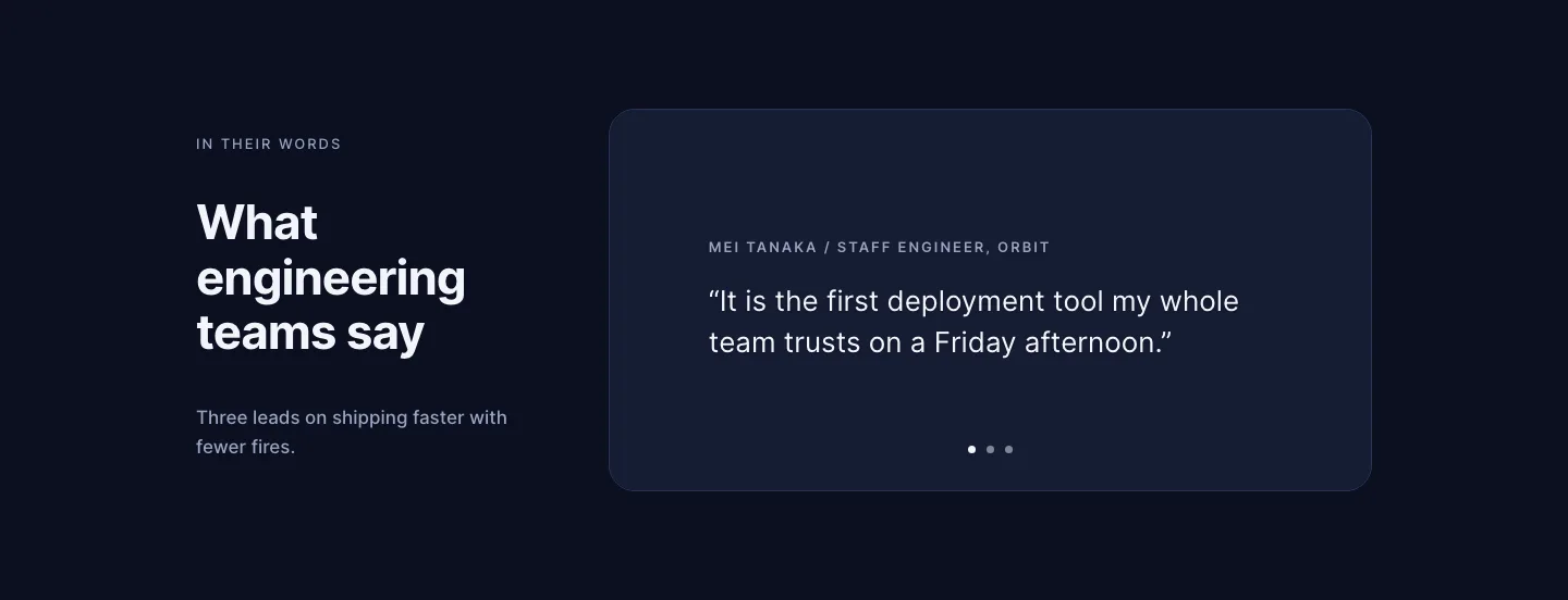
Dark Software Reviews Testimonial Slider Layout for Divi 5: Three Quotes
testimonials · saas · dark
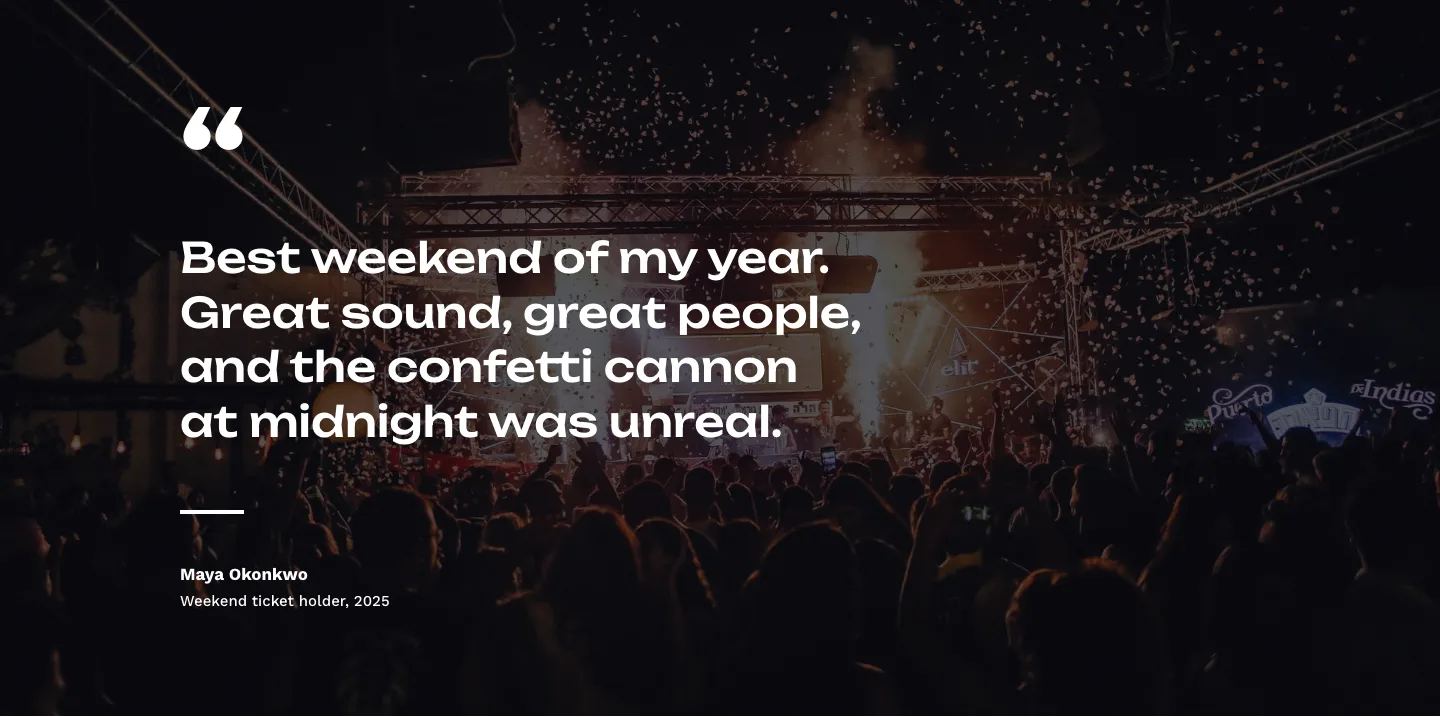
Bold Festival Testimonial Layout for Divi 5: Quote Over Photo
testimonials · events · bold
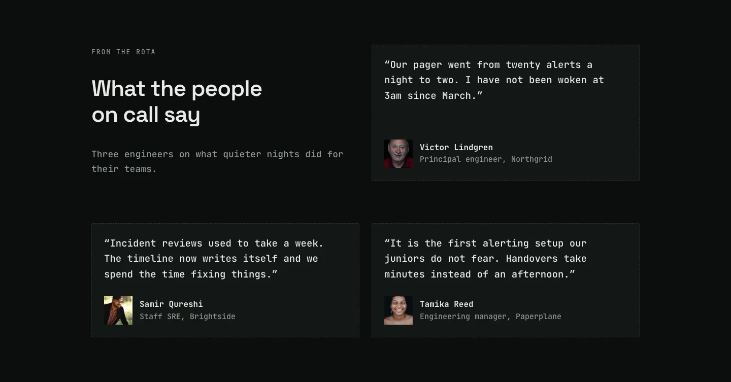
Dark On-Call Engineers Testimonials Layout for Divi 5: Three Avatar Cards
testimonials · saas · dark
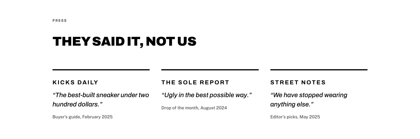
Brutalist Sneaker Brand Press Quotes Layout for Divi 5: Three Publications
testimonials · ecommerce · bold
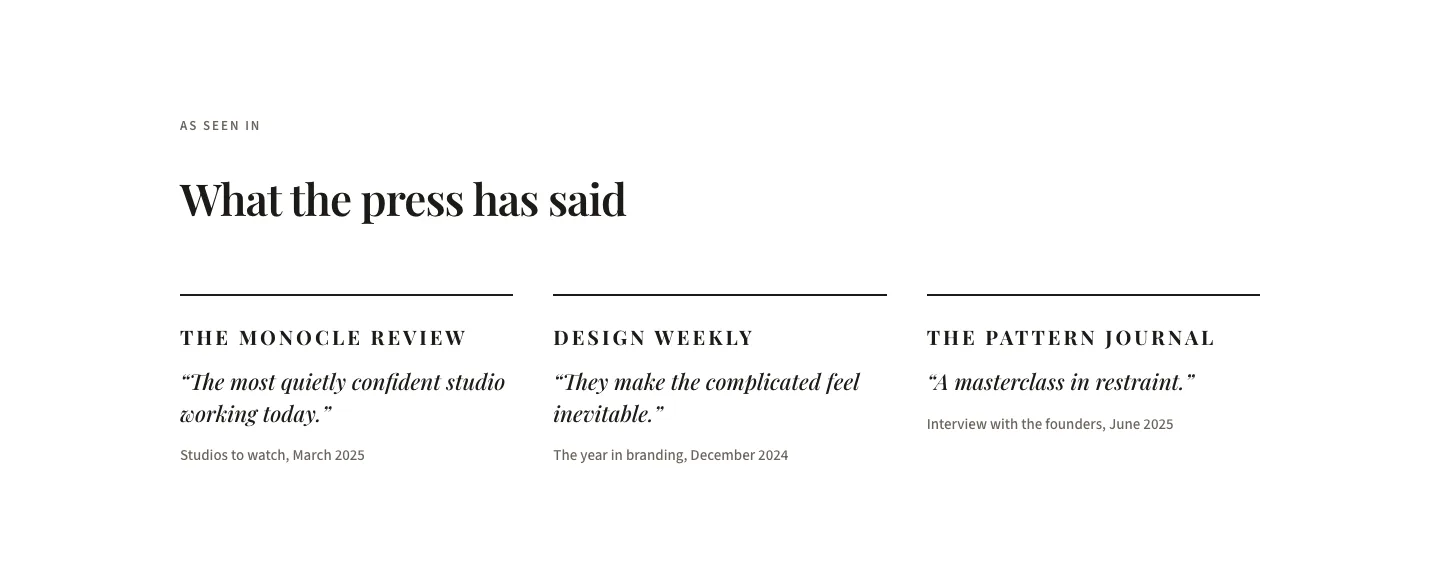
Editorial Studio Press Quotes Layout for Divi 5: Three Publications
testimonials · agency · minimal