
Playful Agency Blog Layout for Divi 5: Studio Journal
A playful, editorial-style Divi 5 blog layout for creative agencies. Sticky intro column, rounded image cards, and punchy essay previews in a bright blue palette.
Rate this element
Download this section, free
- Divi 5 JSON, imports in seconds
- Commercial license included
- No account needed
Click to view the full page
Overview
The layout runs on a 1/3 · 2/3 row that maxes out at 1320px, with a generous 56px column gap and 110px of vertical padding sitting on a soft powder-blue background (#eff6ff). The narrow left column is sticky on desktop, so the intro anchors while readers scroll through the article stack on the right. It opens with an uppercase eyebrow ("The Studio Journal") in bold indigo (#1d4ed8) tracked out at 3px, then a tight 46px heading ("Field notes, lessons, and loud opinions.") with negative letter-spacing and a punchy 1.05 line-height. A 17px slate paragraph follows, and the intro closes with a fully rounded pill button (999px radius) in the same indigo, sending readers to /journal.
The right column holds three article cards. Each card leads with a 940px-wide image at 18px rounded corners and a soft indigo box shadow (preset3, 40px blur, rgba(29,78,216,0.15)): the shadow reads more as a gentle lift than a drop, keeping the mood playful rather than corporate. Below every image sits an uppercase meta line (date · category · read time) in mid-blue #3b82f6 at 12px with 2px letter-spacing, then a 30px article headline in near-black #0f172a, then a 16px excerpt in slate #475569 at 1.6 line-height. Cards are separated by 40px-margin horizontal dividers in pale blue #bfdbfe, which double as visual breath and natural reading rest-points.
The palette is a controlled blue ladder (powder background → indigo button → cornflower meta → frost divider) with slate body copy and near-black headlines doing the contrast work. On phones the row switches to flexDirection: column: the sticky intro releases, both columns expand to full width (flexType 24_24), and the three article cards flow vertically underneath. The 60px horizontal section padding and generous internal margins mean the pill button, cards, and dividers all keep enough room to feel airy on any width rather than crammed.
What’s inside
- Two-column magazine layout: a 1/3 sticky intro column paired with a 2/3 article stack, nowrap on desktop and stacked on phone
- Intro block with uppercase eyebrow, 46px bold headline, 17px lead paragraph, and a fully rounded pill CTA button linking to /journal
- Three article cards, each with a 940px hero image (18px rounded corners, soft indigo box shadow), meta line, 30px headline, and excerpt
- Uppercase meta labels combine date, category, and read time in tracked-out mid-blue caps at 12px
- Pale blue horizontal dividers with 40px vertical margins separating each article card for editorial rhythm
- All-native Divi 5 modules only (section, row, columns, text, heading, image, button, divider) no third-party dependencies
- Controlled blue palette (#eff6ff / #1d4ed8 / #3b82f6 / #bfdbfe) paired with slate body copy and near-black headlines
- 1320px max-width row with 110px vertical section padding and 56px column gap for a roomy, magazine-style feel
Who it’s for
Built for agencies and creative studios that publish essays, case studies, and process notes rather than a high-volume news feed. It's a natural fit for branding studios, design agencies, freelance strategists, content teams, and independent writers who want a considered index page instead of an endless card grid. The playful copy tone assumes a small-studio voice (confessions, field guides, loud opinions) so it also suits editorial-minded consultancies, coaches with a strong point of view, and product teams running a build-in-public journal. The two-column shape (sticky intro on the left, article stack on the right) works best when you have three to six recent posts you want to feature at once; if you need a paginated grid of dozens, this section is better used as a "featured writing" strip sitting above your main archive.
Customization tips
The palette is a single-blue ladder, so the fastest reskin is swapping the four blues (#eff6ff background, #1d4ed8 button and eyebrow, #3b82f6 meta, #bfdbfe divider) for another monochrome family (greens, warm neutrals, plum) while leaving the slate body and near-black headlines alone. Keep the intro heading under about 55 characters (roughly six words) so it stays on two lines at 46px; the lead paragraph reads best at two sentences. Article headlines want roughly 45–65 characters so they wrap to two lines without orphaning, and excerpts sit comfortably at 25–40 words. Source images at 940×650 or larger in landscape, the JSON pulls Pexels at that dpr=2 crop and the 18px radius plus shadow assume a horizontal frame; portrait images will still work but shrink the visual rhythm. If you don't have a real /journal archive yet, point the pill button at your contact page or newsletter signup, or remove it. To add a fourth or fifth post, duplicate one full quartet (image + meta + heading + excerpt + divider) and the sticky intro column will lengthen to match.
How to install this layout
- Download the layout JSON file from this page.
- Open the target page in the Divi 5 builder.
- Open the portability panel (up/down arrows icon) and choose the Import tab.
- Upload the JSON. Tick “replace existing content” only for full-page imports.
- Check the page at desktop and mobile widths, then swap in your copy and images.
Full walkthrough with troubleshooting: How to Import a Divi 5 Layout.
Questions about Playful Agency Blog Layout for Divi 5: Studio Journal
Is the sticky intro column reliable on smaller screens?
The left column uses Divi 5's sticky position on desktop, so it anchors while the right column scrolls past. On phones the row switches to flexDirection: column, which releases the sticky and stacks both columns full-width, mobile visitors read the intro first, then the article cards in order.
Which Divi 5 modules does this section actually use?
Section, row, columns, plus the text, heading, image, button, and divider modules. All native Divi 5. There's no third-party module, custom code block, or child theme required to get the look you see in the preview.
Can I show more than three article cards?
Yes. Duplicate one full card group (image + meta text + heading + excerpt + divider) inside the right (2/3) column and swap the content. The sticky intro column on the left will keep pace with the new column height automatically.
The previews use Pexels imagery, do I need to replace them?
You'll want to. The layout ships with three Pexels placeholders that are fine while you're setting things up, but for a real launch swap them for your own case study photography, studio shots, or illustration work at a similar 940×650 landscape ratio so the 18px radius and shadow still frame cleanly.
What should I edit first after importing?
Rewrite the intro heading, lead paragraph, and pill button label to match your studio's voice, then replace each card's date · category · read time meta line, headline, and excerpt with real posts. Images last. They're the easiest to batch once the copy is locked.
Which Divi version does this layout need?
Divi 5. The layout is generated natively for Divi 5 and validated against its real module structure before publication, so it imports clean into the current builder.
Can I use this layout on client websites?
Yes. Every download includes a commercial license covering unlimited sites you own or build for clients. Only reselling or redistributing the layout file itself is prohibited.
More blog layouts
Browse all blog layouts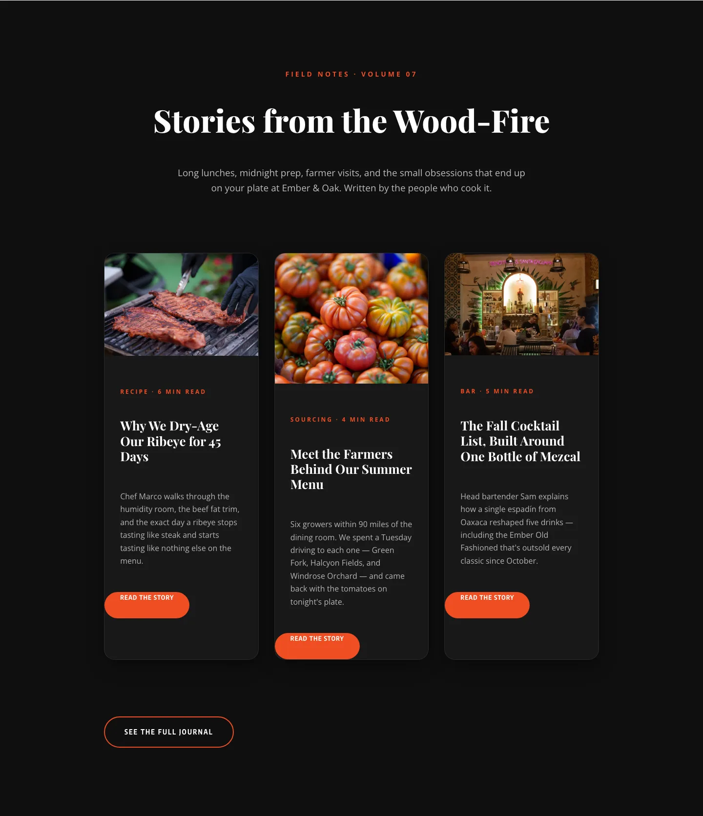
Bold Restaurant Blog Layout for Divi 5: Wood-Fire Journal
blog · restaurant · bold
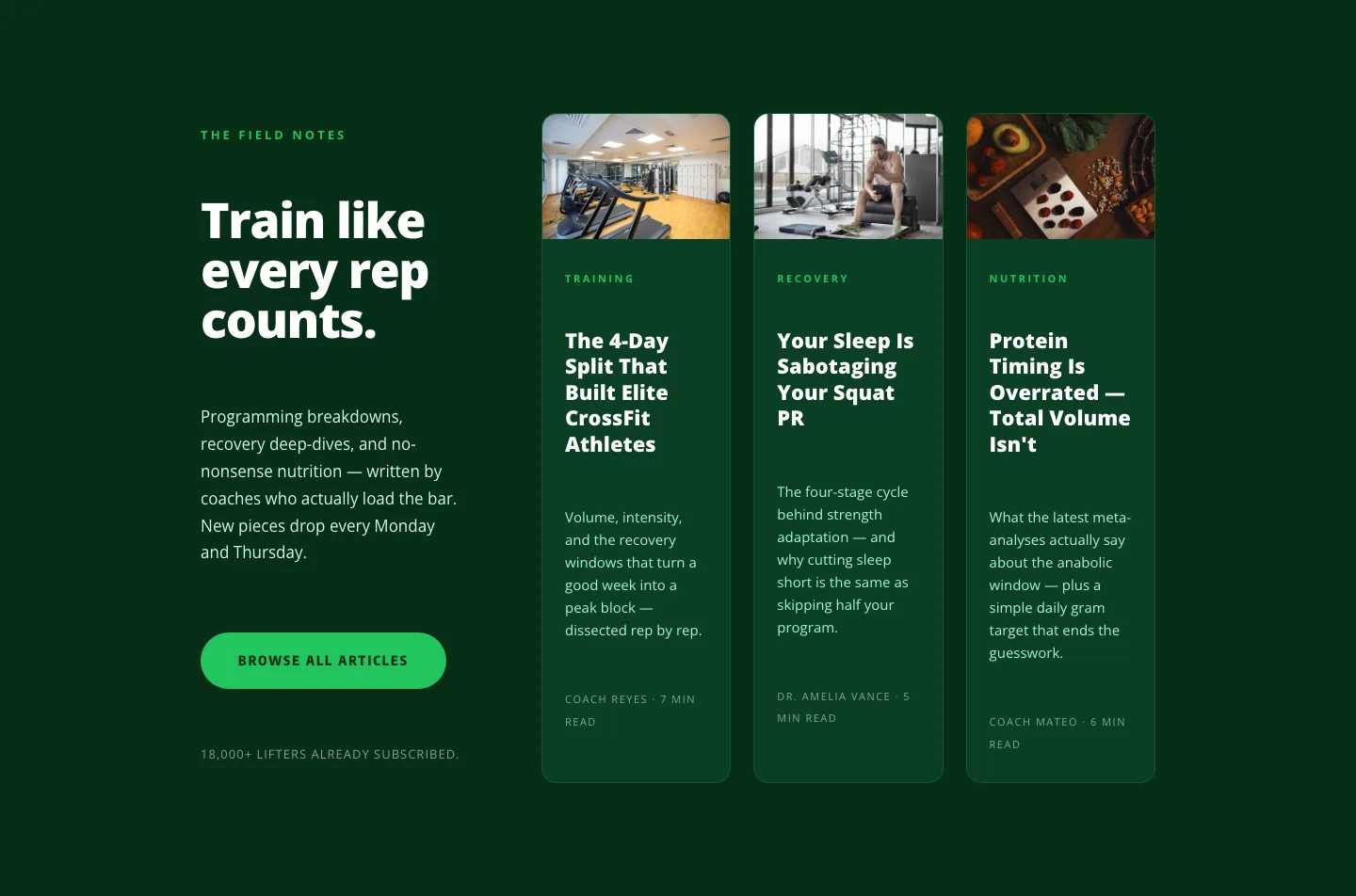
Bold Fitness Blog Layout for Divi 5: Green Asymmetric Split
blog · fitness · bold
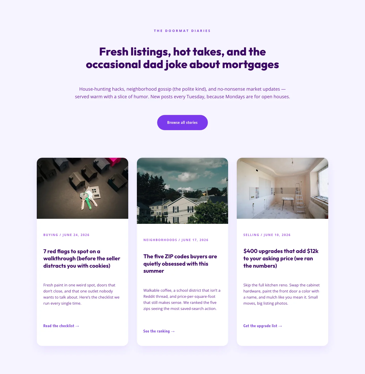
Playful Real Estate Blog Layout for Divi 5 | Divi5Lab
blog · real_estate · playful
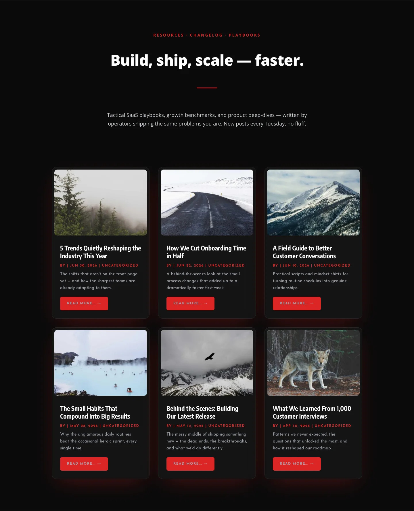
Bold SaaS Blog Layout: Resources & Insights Grid for Divi 5
blog · saas · bold