
Playful Real Estate CTA: Purple Gradient Listing Alert Signup
A playful purple Divi 5 CTA section for real estate agents: gradient background, rounded yellow button, and witty copy that converts late-night scrollers into listing-alert subscribers.
Rate this element
Download this section, free
- Divi 5 JSON, imports in seconds
- Commercial license included
- No account needed
Click to view the full page
Overview
The section runs as one full-width band on a 135° purple gradient (dark royal (#2e1065) fading into translucent violet (rgba(124,58,237,0.85)) and back down (rgba(46,16,101,0.92))) layered on top of a soft Pexels backdrop via the section background's overlaysImage setting. That means copy stays legible on rich color even where the photo goes light. Vertical padding is deliberately generous: 10vw top and bottom on desktop, dialled up to 16vw on phone, so the CTA breathes whether it sits between sections or stands alone above the footer.
Content lives in a single 4_4 column capped at 780px and centered with auto margins, wrapped in 24px of horizontal padding. The column itself is a flex container (column direction, center-aligned, with a fixed 28px row-gap) so the heading, paragraph and button stack with even rhythm no matter how much copy you feed them. The headline (Outfit 800) runs a fluid 4vw on desktop with tight -1px letter-spacing and a purple preset3 text shadow that lifts the white type off the gradient; on phone it locks to 34px so it never overwhelms the viewport.
Under it, the supporting sentence uses the divi/text module in Outfit 400 at 18px with pale lavender (#ede9fe) and a comfortable 1.6em leading. Enough breathing room to hold a two-sentence pitch without wrapping awkwardly inside the narrow column. The anchor is a yellow pill button (#fde047, corners fully rounded at 999px) with dark-purple label text, a purple box-shadow glow (rgba(168,85,247,0.55)) that echoes the gradient behind it, and a hover state that swaps the yellow for solid white: a clean, unmistakable interaction cue.
What’s inside
- Full-width section with a 135° purple gradient (#2e1065 → violet stops) laid over a Pexels background image via `overlaysImage`
- Single centered column capped at 780px, auto-margined, with 24px horizontal padding
- Flex-column stack with a fixed 28px row-gap between heading, paragraph and button
- Native divi/heading in Outfit 800 (4vw desktop, 34px phone) with a purple preset3 text shadow and -1px letter-spacing
- Native divi/text supporting line in Outfit 400, 18px, pale lavender (#ede9fe), 1.6em line-height
- Yellow pill button (#fde047) with fully-rounded 999px corners, purple label (#2e1065) and a white-on-hover state
- Purple box-shadow glow (rgba(168,85,247,0.55)) under the button that echoes the section gradient
- Responsive vw-based section padding (10vw desktop → 16vw phone) plus a phone-locked heading size for tight small-screen fit
Who it’s for
Purpose-built as a "get on the list" CTA for real estate agents and small brokerages who run listing alerts, off-market drops, or new-build releases. The playful copy tone ("Stop scrolling Zillow at 1am") fits agents who market on Instagram Reels and TikTok rather than serif-and-navy corporate brands, and it works equally well for buyer's agents, mortgage brokers courting first-time buyers, or property-search concierges pitching a text-based service. Beyond real estate it drops neatly into any lead-magnet flow that trades one bold promise for an email: a newsletter opt-in, waitlist join, Discord invite, or course pre-launch. Skip it if your brand runs strictly corporate or minimal; the yellow-on-purple contrast and rounded pill button lean firmly playful.
Customization tips
The gradient is defined by two stops on the section background, so a preset-level palette swap only needs those two colors plus the button fill, label color and shadow tint. Everything else already uses white or lavender that reads on most gradients. Swap the Pexels image URL for your own hero shot (any landscape photo works; the overlay hides low-quality corners) or delete it entirely to run a pure gradient. Keep the headline to about 60 characters, the -1px letter-spacing looks best across two lines and starts crowding at three. The supporting paragraph tolerates roughly 30 words before it starts pushing the button below the fold on mobile. If you retint the yellow button, keep contrast against the purple gradient high and update the box-shadow color (currently rgba(168,85,247,0.55)) so the glow reads as intentional rather than leftover. Phone heading is locked at 34px: nudge it up if you shorten the headline, down if you go longer.
How to install this layout
- Download the layout JSON file from this page.
- Open the target page in the Divi 5 builder.
- Open the portability panel (up/down arrows icon) and choose the Import tab.
- Upload the JSON. Tick “replace existing content” only for full-page imports.
- Check the page at desktop and mobile widths, then swap in your copy and images.
Full walkthrough with troubleshooting: How to Import a Divi 5 Layout.
Questions about Playful Real Estate CTA: Purple Gradient Listing Alert Signup
Is this section responsive?
Yes. Section padding is 10vw top/bottom on desktop and scales to 16vw on phone, and the heading switches from a fluid 4vw down to a fixed 34px on phone so it never overflows narrow viewports. Everything else inherits Divi's default fluid behaviour.
Which Divi 5 modules does it use?
Three native modules inside one section/row/column: divi/heading for the H1, divi/text for the supporting sentence, and divi/button for the CTA. No custom code, shortcodes, or third-party modules.
Can I remove the background photo and keep just the gradient?
Yes: the Pexels image sits under the gradient with `overlaysImage` on, so clearing the image URL leaves you with the purple gradient alone. Both look intentional; the photo mainly adds subtle texture.
What should I edit first?
The three copy strings (headline, paragraph, and button label) then repoint the button link to your listing-alerts form or CRM opt-in. Colors, radius and shadow are optional polish on top.
How wide does the content actually get?
The column caps at 780px and centers itself with auto margins, so on wide screens the copy stays readable and doesn't stretch edge-to-edge. The gradient section itself always spans full width.
Does the button have a hover state?
Yes: the yellow fill (#fde047) swaps to solid white on hover while the purple label stays put, giving a clean state change without needing extra CSS.
Which Divi version does this layout need?
Divi 5. The layout is generated natively for Divi 5 and validated against its real module structure before publication, so it imports clean into the current builder.
Can I use this layout on client websites?
Yes. Every download includes a commercial license covering unlimited sites you own or build for clients. Only reselling or redistributing the layout file itself is prohibited.
More call-to-action
Browse all call-to-action
CTA: Portfolio Bold Blue
cta · portfolio · bold
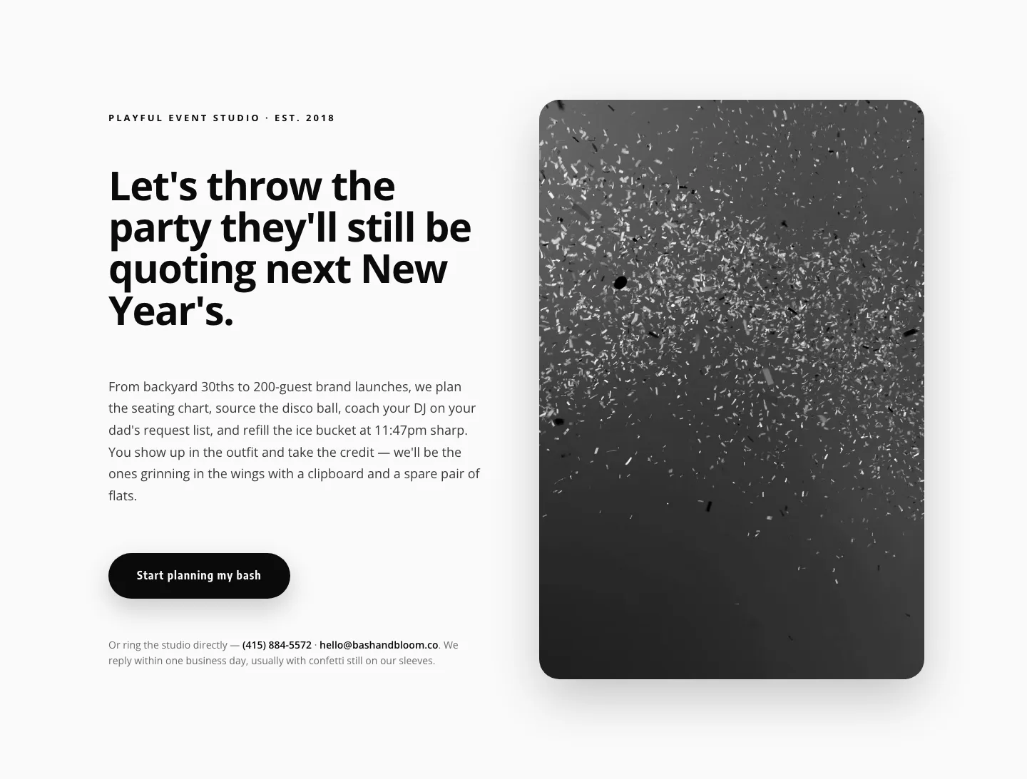
Playful Events CTA Layout for Divi 5: Bash & Bloom
cta · events · playful
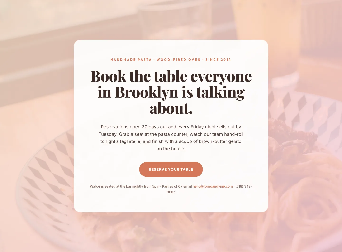
Bold Restaurant Reservation CTA: Divi 5 Layout
cta · restaurant · bold

Bold Purple SaaS CTA Banner: Full-Bleed Divi 5 Layout
cta · saas · bold
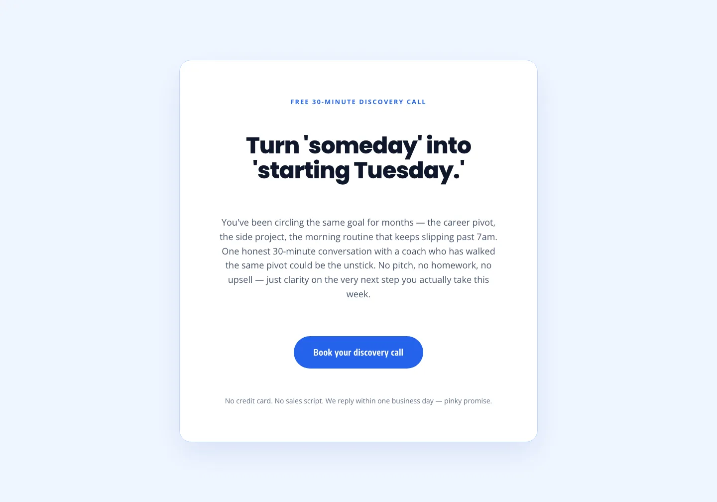
Coaching Discovery Call CTA: Playful Divi 5 Layout
cta · coaching · playful
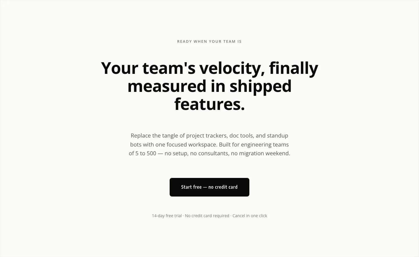
Minimal SaaS CTA: Ship Features Faster
cta · saas · minimal