
Minimal SaaS CTA: Ship Features Faster
A clean, centered SaaS call-to-action section with eyebrow label, bold headline, supporting copy, dark pill button, and trust microcopy. Built for Divi 5.
Rate this element
Download this section, free
- Divi 5 JSON, imports in seconds
- Commercial license included
- No account needed
Click to view the full page
Overview
The section is a single centered column capped at 760px, sitting on a warm off-white background (#fafaf7) with a hair-thin #ececea border that keeps it grounded without turning into a heavy container. Vertical rhythm is generous (9vw top and bottom padding) so the CTA reads as a deliberate pause between denser sections, not a strip you skim past.
Four elements stack in a strict priority order. A small uppercase eyebrow ("Ready when your team is") in tracked-out muted gray sits above a 56px near-black headline with -1px letter-spacing and a 1.1em line-height that lets a two-line statement breathe. Below that, a 19px sub-copy is clamped to 560px so the reading line stays comfortable, then the primary button, then a 14px trust line trailing 24px underneath. Deliberately quiet so it reassures without competing for the click.
Palette is intentionally two-tone: near-black type (#0a0a0a) on cream, with #525252 for body copy and #737373 for the eyebrow and trust text. The solid black button, with a subtle #262626 hover, is the only saturated element in the whole section. Which is exactly why the eye lands on it. On phones the headline drops from 56px to 36px so it stays inside the viewport and keeps its tight tracking, and because horizontal padding uses viewport units (6vw), the column keeps a proportional gutter at every width without needing per-breakpoint overrides.
What’s inside
- Native `divi/section` preset with a #fafaf7 cream background and a 1px #ececea border for subtle definition
- Single centered column capped at 760px, using flex-column + items-center so every module aligns down the axis without manual per-module centering
- Four-part copy stack: uppercase tracked eyebrow, oversized headline, 560px-wide sub-copy, and a 14px trust micro-line under the button
- Responsive type ramp built on `divi/heading` and `divi/text`: 56px → 36px headline, 19px body, 13-14px supporting labels
- Solid-black `divi/button` with 8px radius, 16/32px padding, and a #262626 hover state. The only saturated color in the section
- Viewport-based padding (9vw vertical, 6vw horizontal) so breathing room scales cleanly from mobile to ultra-wide
- Zero images and zero forms, a pure typographic CTA that drops into any page without asset prep or extra plugins
Who it’s for
Purpose-built for SaaS marketing surfaces: landing pages, feature pages, pricing pages, product tours, and end-of-page conversion blocks. The muted palette and typographic focus suit developer tools, project management, analytics, DevOps, and B2B productivity companies whose brand tone leans quiet and confident rather than loud. It also works well as the closing CTA on case studies, changelog pages, and long-form product docs where you want to send readers to a trial without breaking the reading mood. Non-SaaS teams that share the same tonal palette (indie tools, professional services, developer newsletters, technical consultancies) can reuse it verbatim by swapping the headline. It's less suited to bright consumer or lifestyle brands, which usually need bolder color, imagery, and pattern to feel on-brand.
Customization tips
Copy: the headline is sized for two lines at 56px, aim for 8-12 words and no more than about 60 characters, so it doesn't wrap awkwardly or shrink past 36px on phones. The 560px sub-copy fits roughly 25-40 words; anything longer starts pushing the button below the fold on laptops. The trust line is one short sentence broken with middot separators, swap the terms but keep it a single line.
Palette: to rebrand, change the button background from #0a0a0a to your brand color (and set the hover a shade or two lighter), then optionally shift the eyebrow and trust line from #737373 to a tinted version of that brand color. Keep the section background near-white and the headline near-black, the layout's calm comes from that contrast pair.
Images: there are none, and that's the point. If you must add a small badge or a row of partner logos, place them above the eyebrow at around 24px height so they don't disrupt the vertical rhythm.
How to install this layout
- Download the layout JSON file from this page.
- Open the target page in the Divi 5 builder.
- Open the portability panel (up/down arrows icon) and choose the Import tab.
- Upload the JSON. Tick “replace existing content” only for full-page imports.
- Check the page at desktop and mobile widths, then swap in your copy and images.
Full walkthrough with troubleshooting: How to Import a Divi 5 Layout.
Questions about Minimal SaaS CTA: Ship Features Faster
Is this section responsive out of the box?
Yes. The 56px headline drops to 36px on phone (already wired into the heading module), the column stays centered via flex, and horizontal padding uses viewport units (6vw) so it scales smoothly on tablets and ultra-wide displays without extra breakpoints.
Which Divi 5 modules does it use?
Native `divi/section`, `divi/row`, `divi/column`, three `divi/text` blocks (eyebrow, sub-copy, trust line), one `divi/heading`, and one `divi/button`. No third-party modules, no child-theme requirements.
Where should I start editing?
Swap the headline first. It's the loudest element. Then the sub-copy underneath, then the button label and its link URL. The eyebrow ("Ready when your team is") and the trust line can stay verbatim for most SaaS trial funnels.
Are there any images or icons to replace?
No. This is a pure-type section: no background image, no icon set, no illustrations. That's why it drops into any page without asset prep and stays fast on mobile.
How do I widen or narrow the block?
The column has a 760px max-width and the sub-copy is clamped to 560px. Adjust the column max-width to tighten or loosen the whole container, but keep the sub-copy narrower than the column so the reading measure stays comfortable.
Can I place another module beside this one in the same row?
Not without rework. The column uses flex-column with items-center to lock the vertical stack, so adding a sibling column will fight that centering. If you need a side-by-side layout, duplicate the section and rebuild the row structure.
Which Divi version does this layout need?
Divi 5. The layout is generated natively for Divi 5 and validated against its real module structure before publication, so it imports clean into the current builder.
Can I use this layout on client websites?
Yes. Every download includes a commercial license covering unlimited sites you own or build for clients. Only reselling or redistributing the layout file itself is prohibited.
More call-to-action
Browse all call-to-action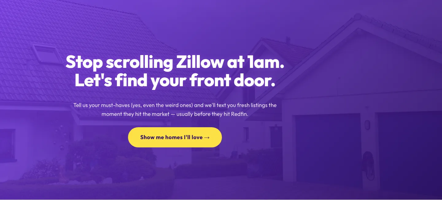
Playful Real Estate CTA: Purple Gradient Listing Alert Signup
cta · real_estate · playful
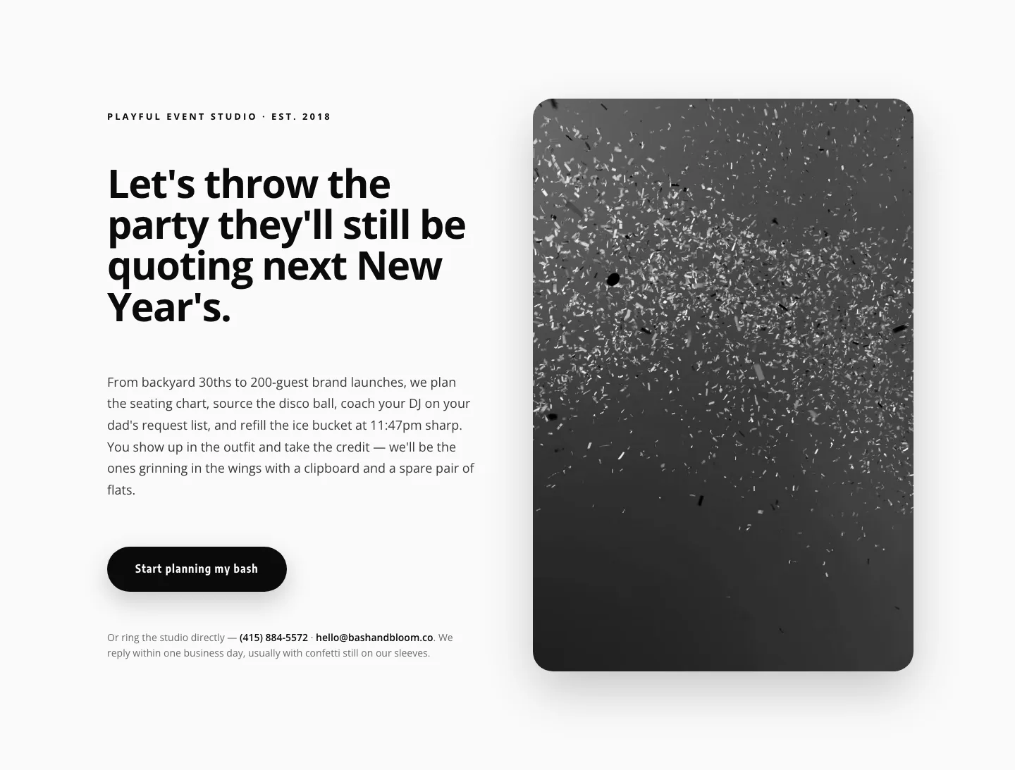
Playful Events CTA Layout for Divi 5: Bash & Bloom
cta · events · playful
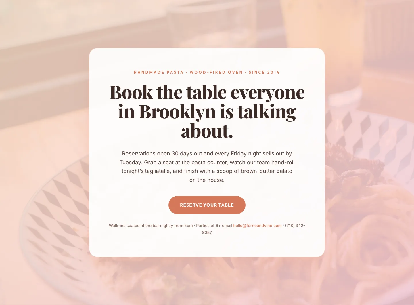
Bold Restaurant Reservation CTA: Divi 5 Layout
cta · restaurant · bold

Bold Purple SaaS CTA Banner: Full-Bleed Divi 5 Layout
cta · saas · bold
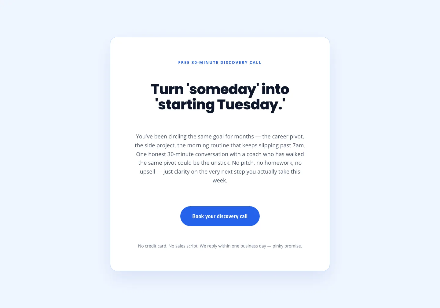
Coaching Discovery Call CTA: Playful Divi 5 Layout
cta · coaching · playful

CTA: Portfolio Bold Blue
cta · portfolio · bold