
Coaching Discovery Call CTA: Playful Divi 5 Layout
A warm, playful Divi 5 CTA card that turns hesitant browsers into booked discovery calls for coaches: soft blue palette, rounded card, friendly microcopy.
Rate this element
Download this section, free
- Divi 5 JSON, imports in seconds
- Commercial license included
- No account needed
Click to view the full page
Overview
A single-card CTA section that floats on a pale blue #eff6ff background. The section breathes with 120px vertical padding on desktop, stepping down to 80px on tablet and 60px on phone, so the card is never crowded. The row is capped at 720px so the eye has a short line to travel, and on phone the row switches to a flex-column layout so the card takes the full width inside a 16px gutter.
The card itself is where the design earns its keep. Pure white background, 24px rounded corners on all four sides, a 1px #bfdbfe soft-blue border, and a diffused shadow tinted rgba(30,64,175,0.12) with a 60px blur to lift it just enough to read as tappable without turning glossy. Padding steps down cleanly across breakpoints (72px on desktop, 56/48 on tablet, 40/28 on phone) so the interior rhythm holds together on any screen.
Inside the card, hierarchy runs top to bottom: an uppercase eyebrow in tracked #2563eb (13px, 2px letter-spacing, weight 700), a Poppins headline in near-black #0f172a that scales 46px → 36px → 30px with a tight -1px letter-spacing and 800 weight, an 18px slate body paragraph in #475569 with 1.6em line-height, then the pill button, then a 14px #64748b reassurance line. Everything is centered, so the eye lands on the button without side-quests. The button is the loudest element on the page: solid #2563eb, 999px pill radius, 40px horizontal padding, and a 24px blue-glow drop shadow that deepens to #1e40af on hover.
What’s inside
- Uppercase eyebrow text module in tracked blue (#2563eb, 2px letter-spacing) for the offer label
- Poppins headline module scaling 46px → 36px → 30px across desktop, tablet, and phone
- Centered 18px slate body paragraph with 1.6em line-height sized for a 55–65 word pitch
- Pill-shaped primary button (999px radius) with #2563eb background, blue-glow shadow, and #1e40af hover state
- Small 14px reassurance microcopy line beneath the button for objection handling
- Rounded 24px white card with 1px #bfdbfe border and elevated preset3 blue-tinted shadow
- Blue-wash section background (#eff6ff) with responsive 120/80/60px vertical padding
- 720px max-width row and single-column layout that reflows to full width on phone
Who it’s for
Coaches selling free discovery calls (career, life, executive, mindset, fitness, and business coaches) where the offer needs to feel like a soft invitation rather than a hard sell. It also fits therapists and counselors booking initial consults, freelance consultants qualifying inbound leads, and course creators offering clarity calls before enrollment. The playful copy voice reads well for solo practitioners and personal brands, less so for enterprise B2B. Drop it in as a closing block above the footer of a coaching landing page, as a mid-page conversion break between testimonials and pricing, or as a standalone booking page linked from ads, newsletters, and email signatures. It sits comfortably above a Calendly, Cal.com, or TidyCal embed.
Customization tips
The palette is a plain blue-and-slate system. Swap #2563eb everywhere it appears (eyebrow, button background, hover, and shadow tint) to reskin the whole card in about two minutes. For a warmer brand, try amber (#f59e0b with #b45309 hover) on a cream section (#fffbeb) and the card reads friendly instead of corporate. Keep the headline under 40 characters so it stays on two lines on phone at 30px; the current line runs 41. Body copy is tuned for 55–65 words, go longer and the button starts pushing below the fold on smaller phones at 1.6em line-height. The button label is text only, so short verb-object phrases like "Book your call" or "Grab a slot" preserve the pill shape; anything past ~24 characters begins to wrap. There are no images in this layout, so you don't need to prep any assets. It's a text-and-button block designed to drop into any page without art direction work.
How to install this layout
- Download the layout JSON file from this page.
- Open the target page in the Divi 5 builder.
- Open the portability panel (up/down arrows icon) and choose the Import tab.
- Upload the JSON. Tick “replace existing content” only for full-page imports.
- Check the page at desktop and mobile widths, then swap in your copy and images.
Full walkthrough with troubleshooting: How to Import a Divi 5 Layout.
Questions about Coaching Discovery Call CTA: Playful Divi 5 Layout
How does the card behave on phone?
Section padding drops from 120px to 60px vertical and 16px horizontal, and card padding drops from 72px to 40px top-bottom / 28px sides. The heading scales from 46px to 30px, and the row switches to a flex-column so the card takes the full available width inside the phone gutter.
Which Divi 5 modules make up the layout?
A section wrapping a single-column row, then, in order: text (eyebrow label), heading, text (body paragraph), button, and text (reassurance microcopy). Five modules total, all native Divi 5. No third-party add-ons required.
Where does the button link by default?
Nowhere, the button module has no URL set. Open the Button module in the Divi 5 editor and paste your Calendly, Cal.com, TidyCal, or contact-page link into the button link field before publishing. This is the single most important edit.
Can I add a coach headshot or illustration?
The layout ships text-only. To add imagery, insert an Image module above the eyebrow inside the same column. A 96×96 circular avatar works well with the card's 24px rounded corners and the tight vertical rhythm without breaking the centered hierarchy.
What should I edit first?
The eyebrow, the headline, and the button label. "Turn 'someday' into 'starting Tuesday.'" is intentionally playful; if your brand is more clinical, swap in something like "Book your free discovery call" and change the eyebrow to reflect the actual duration and format of your offer.
Is there a form built in?
No, this is a CTA card that hands off to a scheduler or contact page via the button link. If you'd rather capture leads in place, delete the button and drop a Divi 5 Contact Form or Email Optin module in its place; the centered column will hold either without layout changes.
Which Divi version does this layout need?
Divi 5. The layout is generated natively for Divi 5 and validated against its real module structure before publication, so it imports clean into the current builder.
Can I use this layout on client websites?
Yes. Every download includes a commercial license covering unlimited sites you own or build for clients. Only reselling or redistributing the layout file itself is prohibited.
More call-to-action
Browse all call-to-action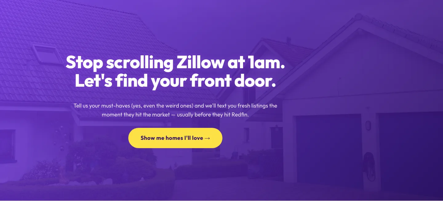
Playful Real Estate CTA: Purple Gradient Listing Alert Signup
cta · real_estate · playful
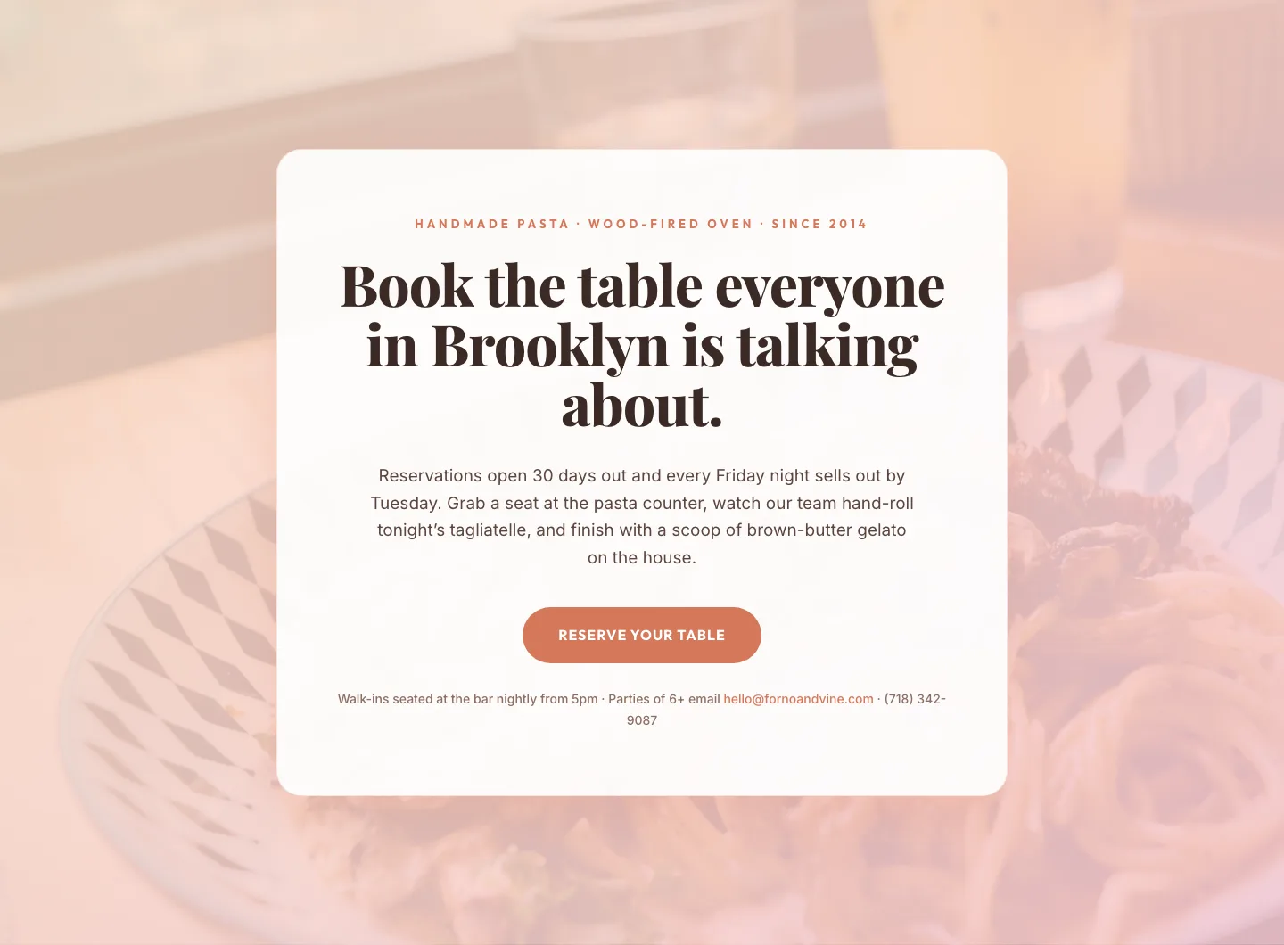
Bold Restaurant Reservation CTA: Divi 5 Layout
cta · restaurant · bold

Bold Purple SaaS CTA Banner: Full-Bleed Divi 5 Layout
cta · saas · bold

CTA: Portfolio Bold Blue
cta · portfolio · bold
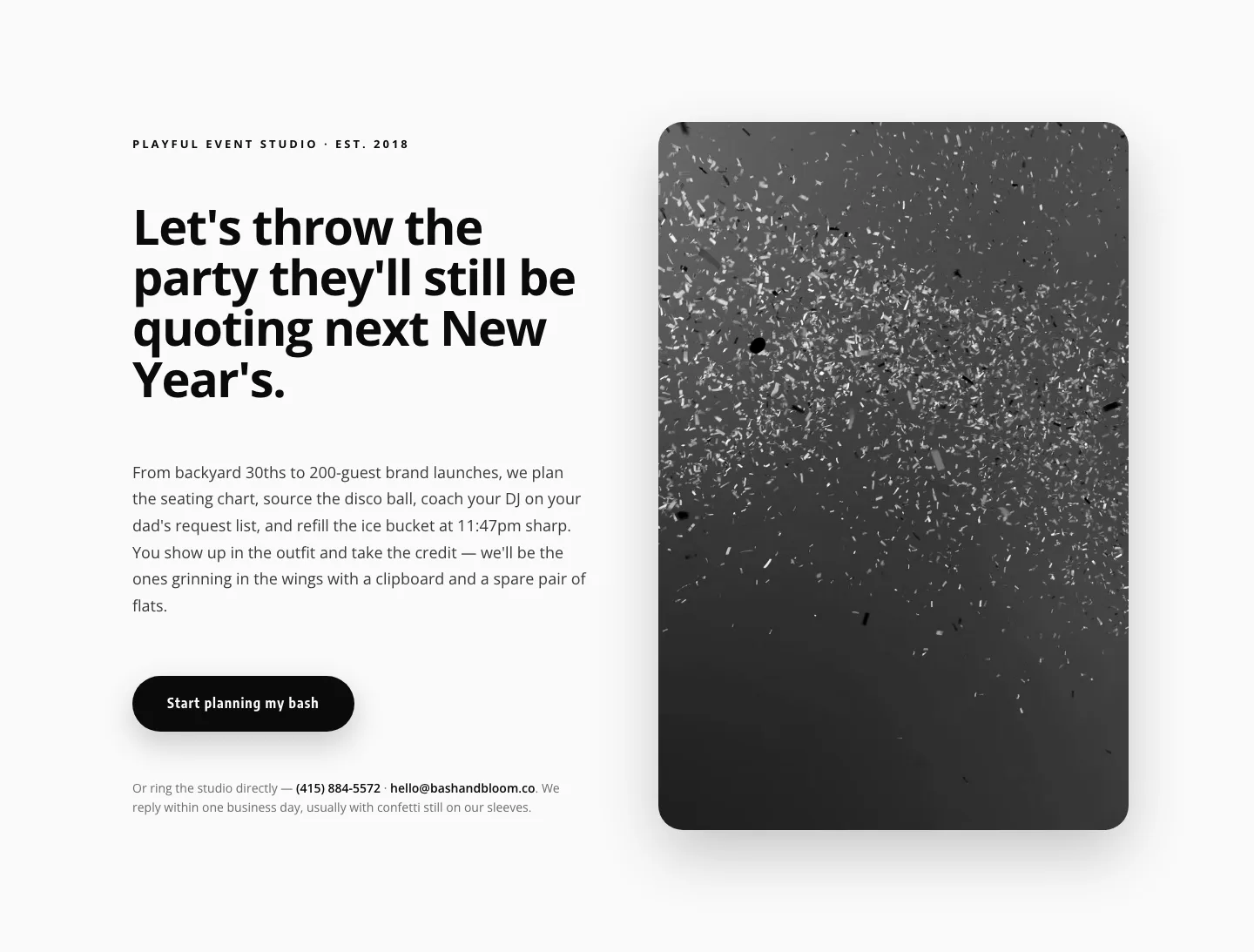
Playful Events CTA Layout for Divi 5: Bash & Bloom
cta · events · playful
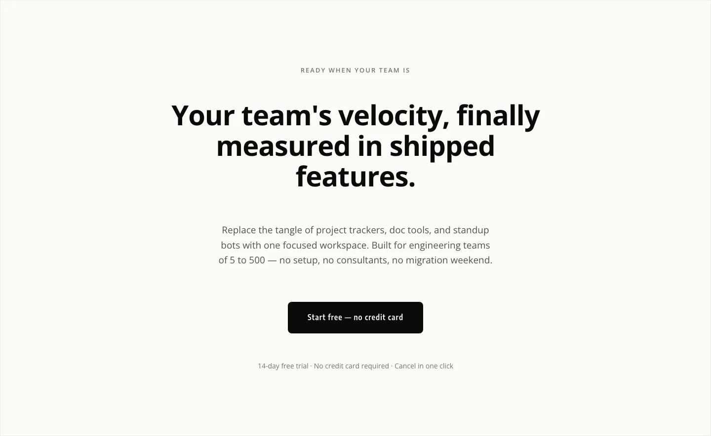
Minimal SaaS CTA: Ship Features Faster
cta · saas · minimal