
Playful Events CTA Layout for Divi 5: Bash & Bloom
A playful Divi 5 CTA section for event planners and party studios. Two-column layout with bold headline, warm copy, pill button, and confetti-shower image.
Rate this element
Download this section, free
- Divi 5 JSON, imports in seconds
- Commercial license included
- No account needed
Click to view the full page
Overview
The layout is a two-column CTA sized to a 1240px max-width row, with the copy stack on the left and a rounded hero image on the right. The section sits on a warm off-white (#FAFAFA) and breathes with 140px of vertical padding on desktop, tapering to 90px on tablet and 60px on phone. Enough space for the near-black headline (#0A0A0A) to feel like the loudest thing in the room without ever crowding the edges. A short uppercase eyebrow ('Playful event studio · Est. 2018') at 13px with 3px letter-spacing sets tone before the display line lands.
Hierarchy is deliberate and tight. The Heading anchors at 56px on desktop with a -1.5px tracking pull and a 1.04em line height, drops to 42px on tablet, then 34px on phone with a slightly looser 1.1em so long lines stay readable at small widths. Body copy runs 18px on a generous 1.7em line height in graphite (#3A3A3A), and beneath it a pill CTA (fully rounded (999px radius), black on cream, 20×40px padding) carries a preset drop shadow that deepens and lifts 3px on hover. A 14px micro-line in #6B6B6B follows with phone and email fallbacks so keyboard-first visitors have an out.
On the right, a single Image module holds the hero shot inside a 28px radius with a 72px-blur shadow at ~24% opacity, giving it that floating-poster feel. A saturate(0%) filter renders the photo in mono by default and restores 20% color on hover, echoing the playful-but-composed voice of the copy. The row uses column-gap: 72px on desktop and switches to flex-direction: column on phone, so the image slots neatly beneath the text at narrow widths instead of shrinking into an unreadable thumbnail.
What’s inside
- Two-column 1_2 / 1_2 row (max-width 1240px, 72px column gap) that collapses to a single stacked column on phone
- Uppercase eyebrow Text module at 13px with 3px letter-spacing for a tagline, established-year, or category line
- Responsive Heading module scaling 56 → 42 → 34px with tuned letter-spacing and line-height per breakpoint
- Body Text module at 18px on a 1.7em line height in muted graphite (#3A3A3A)
- Fully rounded pill Button module (999px radius) with a preset drop shadow and a 3px lift + shadow deepen on hover
- Micro-copy Text module beneath the button with styled tel: and mailto: links and a hover color state
- Rounded Image module (28px radius) with preset3 large drop shadow and a desaturate-to-color hover filter
- Neutral palette locked to three text tones (#0A0A0A, #3A3A3A, #6B6B6B) on a warm #FAFAFA section background
Who it’s for
Event planners, party stylists, wedding studios, corporate event teams, DJs, catering companies, floral designers, and venue owners will feel most at home here. The playful copy (backyard 30ths, 200-guest brand launches, disco balls at 11:47pm) leans social, but the muted palette and grown-up typography keep it usable for wedding coordinators, retreats, gala fundraisers, and milestone celebration boutiques that want personality without cartoon energy. It also works as a warm 'book a call' closer on studio homepages for photographers, art directors, and any creative service that would rather offer a handshake than a hard sell.
Customization tips
Recolor with two swaps: the button/heading black (#0A0A0A) and the section background (#FAFAFA). If you push the background to a saturated brand tone, keep the button dark or flip it to white and raise the shadow color's alpha so the pill doesn't wash out. The pill button carries 40px of horizontal padding, so keep the label to about 3–4 words ('Book a tasting', 'Start planning') to avoid wrapping on phone. The headline is engineered for roughly two lines of ~40 characters on desktop; anything past three lines will crowd the image once you hit the 42px tablet size. For the hero image, aim for a landscape crop around 940×650 (the placeholder's dimensions). Portrait images will over-tall the column and break the vertical centering. If the desaturate-on-load feels too moody for your brand, set the saturate filter to 100% and remove the hover swap; the border radius and drop shadow are already doing most of the work.
How to install this layout
- Download the layout JSON file from this page.
- Open the target page in the Divi 5 builder.
- Open the portability panel (up/down arrows icon) and choose the Import tab.
- Upload the JSON. Tick “replace existing content” only for full-page imports.
- Check the page at desktop and mobile widths, then swap in your copy and images.
Full walkthrough with troubleshooting: How to Import a Divi 5 Layout.
Questions about Playful Events CTA Layout for Divi 5: Bash & Bloom
How does this CTA behave on mobile?
The row flips from row to column at the phone breakpoint, so the hero image slots beneath the text stack. Section padding drops from 140px to 60px vertically, the heading scales from 56px to 34px with a slightly looser 1.1em line height, and the column gap tightens from 72px to 32px so the two blocks feel connected instead of drifting apart.
What Divi modules does it actually use?
Native Divi 5 only: one Section → one Row → two Columns. The left column stacks a Text (eyebrow), Heading, Text (body paragraph), Button, and Text (phone/email micro-copy). The right column holds a single Image module. No child theme, no custom code.
Why is the hero photo desaturated?
The Image module has a saturate(0%) filter applied by default, with a hover state that restores 20% saturation for a subtle color reveal. It ties the shot to the neutral palette without asking you to reprocess assets. Delete the filters block on the Image module if you'd rather show your image in full color.
What should I edit first when I drop it in?
Swap five things in order: the eyebrow tagline, the headline, the body paragraph, the tel: / mailto: links in the micro-copy, and the placeholder Pexels image URL. The button label is the last quick change. Padding, radii, shadows, and the responsive breakpoints are already tuned. You shouldn't need to touch them.
Can I add a second CTA button next to the first?
Yes. Duplicate the Button module and place it inline. You'll want to trim the horizontal padding from 40px down to ~28px so two pills fit comfortably on desktop, and consider setting one to an outline style (transparent background, 1px #0A0A0A border) so the hierarchy between primary and secondary stays clear.
Which Divi version does this layout need?
Divi 5. The layout is generated natively for Divi 5 and validated against its real module structure before publication, so it imports clean into the current builder.
Can I use this layout on client websites?
Yes. Every download includes a commercial license covering unlimited sites you own or build for clients. Only reselling or redistributing the layout file itself is prohibited.
More call-to-action
Browse all call-to-action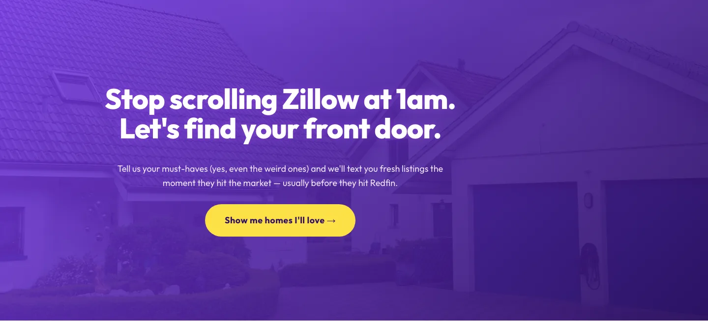
Playful Real Estate CTA: Purple Gradient Listing Alert Signup
cta · real_estate · playful
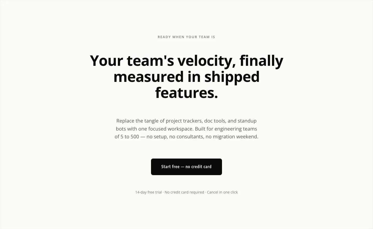
Minimal SaaS CTA: Ship Features Faster
cta · saas · minimal
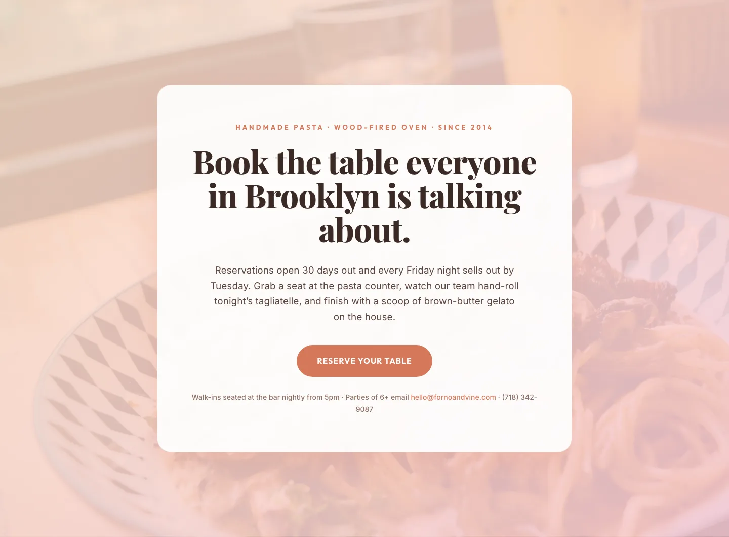
Bold Restaurant Reservation CTA: Divi 5 Layout
cta · restaurant · bold

Bold Purple SaaS CTA Banner: Full-Bleed Divi 5 Layout
cta · saas · bold
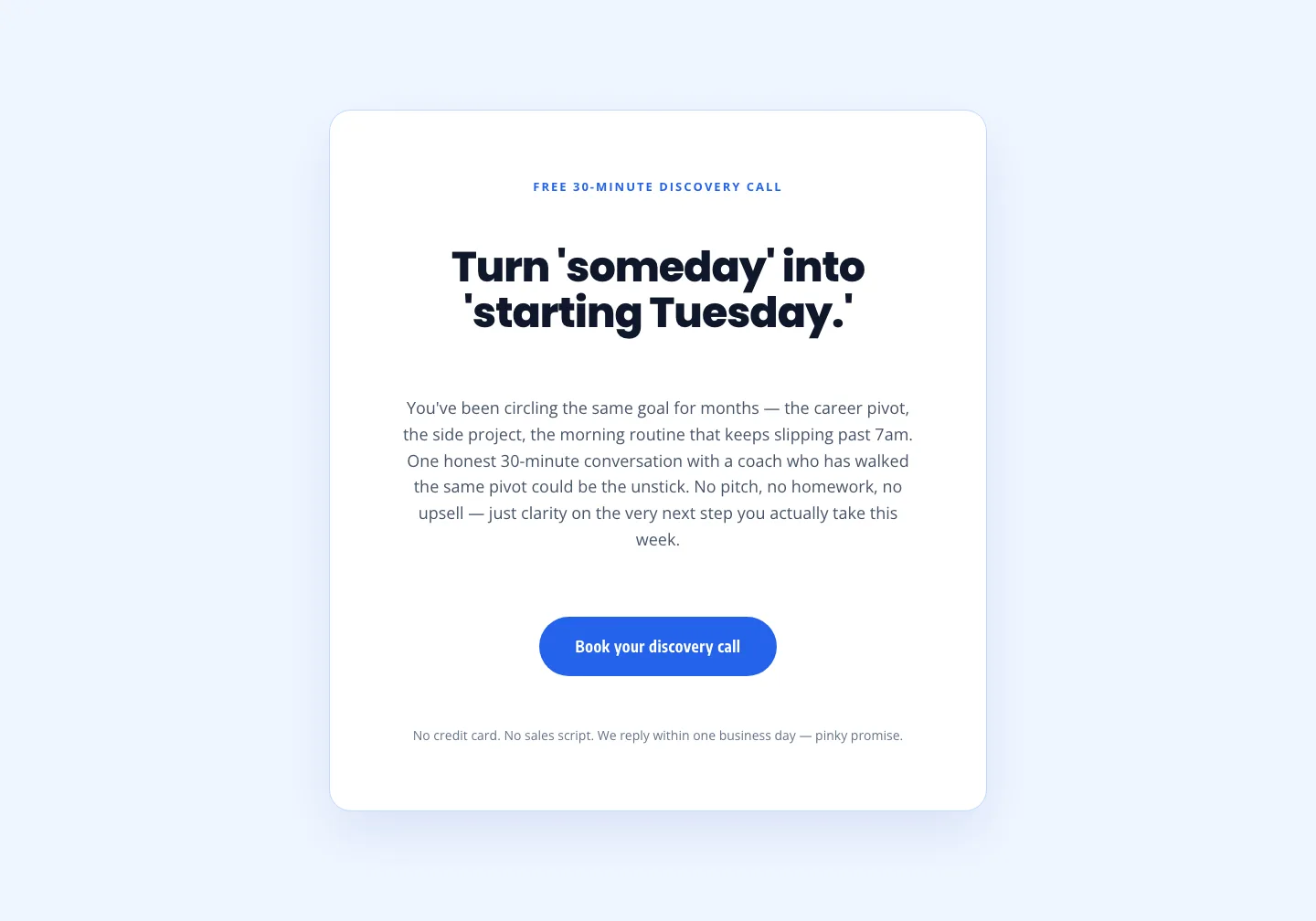
Coaching Discovery Call CTA: Playful Divi 5 Layout
cta · coaching · playful

CTA: Portfolio Bold Blue
cta · portfolio · bold