
CTA: Portfolio Bold Blue
Bold, dark-blue Divi 5 CTA section for portfolio sites. Oversized serif headline, uppercase eyebrow, and pill-shaped button drive booking conversions.
Rate this element
Download this section, free
- Divi 5 JSON, imports in seconds
- Commercial license included
- No account needed
Click to view the full page
Overview
This CTA sits on a deep navy field (#0B1E3F) blended with a 135° gradient and a Pexels photo overlay at 92–96% opacity, so the imagery reads as texture rather than a distraction. All content lives inside a single 860px-wide row, centered on the page, which gives the section the composure of a print advert rather than a busy web block. Vertical padding is generous (140px top and bottom on desktop, easing to 100px on tablet and 72px on phones) so the CTA never feels crammed even at the fold.
The hierarchy is deliberately three-step. A small uppercase eyebrow in accent blue (#7FB3FF, 14px Inter with 4px letter-spacing) sets a scarcity cue at the top. Beneath it, a 64px Playfair Display headline in white anchors the section. The serif is the only decorative choice on the page and it does the heavy lifting for tone. A 19px Inter paragraph in muted white (rgba 226,236,255 / 0.82) follows at a 640px max-width, keeping line length under about 75 characters at a 1.7 line-height so the reading rhythm stays calm.
The button closes the section with a full pill (999px radius), a saturated #3D8BFF fill, dark navy label text, and a soft 40px blur shadow tinted in the same blue. A glow that reinforces the accent without competing with the headline. On hover the fill shifts to the lighter #7FB3FF and the shadow lifts and softens further.
On phones the headline scales to 36px (48px on tablet), horizontal padding drops to 20px, and the column stack becomes a single flex-column so nothing crowds the edges. Everything is centered, so there's no reflow risk when your copy runs shorter or longer than the placeholder.
What’s inside
- Full-width Divi Section with a 135° navy gradient stacked over a Pexels background image
- Single 860px max-width Row, centered, containing one 4_4 Column: a clean, symmetric stack
- Divi Text module for the uppercase eyebrow line (Inter 14px, 4px tracking, accent blue)
- Divi Heading module in Playfair Display, responsive 64 / 48 / 36px scale
- Divi Text module for the supporting paragraph, capped at 640px for readable line length
- Divi Button module with pill radius, glow shadow, and hover recolor to a lighter blue
- Three explicit responsive padding tiers (140 / 100 / 72px vertical) tuned for real devices
- All native Divi 5 modules: no third-party plugins, no custom code, no shortcodes
Who it’s for
Freelance portfolio owners (designers, developers, photographers, illustrators, creative directors) who need a closing CTA on a case-study, services, or about page. Studios and small creative agencies pitching a fixed-scope offer (portfolio audits, rebuilds, retainers) will get mileage from the scarcity eyebrow and the single-action button. It also works for coaches who sell portfolio reviews, career consultants running interview prep, and bootcamp mentors offering 1:1 sessions. The dark palette and serif headline lean premium, so it suits higher-ticket offerings more than mass-market products; if your brand is playful, pastel, or light-mode-first, plan to retint before shipping.
Customization tips
Palette is the fastest lever. In the Section's background settings, swap the two gradient stops (currently #0B1E3F fading toward near-black) for any brand pair; the button and eyebrow use #3D8BFF and #7FB3FF respectively, so retinting those two colors on the Button module and eyebrow Text module carries the whole section. The background image is a Pexels URL: drop in your own JPG or WebP, landscape at roughly 1600–1920px wide; darker, atmospheric shots keep the white headline legible.
Copy has natural limits. The headline reads best at 10–14 words across two lines; go longer and you'll want to drop the 64px size to 56px. The paragraph sits inside a 640px cap, so keep it to two or three sentences. The eyebrow is a single short line: swap the booking cue for a launch date, city, or category tag.
How to install this layout
- Download the layout JSON file from this page.
- Open the target page in the Divi 5 builder.
- Open the portability panel (up/down arrows icon) and choose the Import tab.
- Upload the JSON. Tick “replace existing content” only for full-page imports.
- Check the page at desktop and mobile widths, then swap in your copy and images.
Full walkthrough with troubleshooting: How to Import a Divi 5 Layout.
Questions about CTA: Portfolio Bold Blue
How does this CTA behave on tablet and mobile?
The section defines three explicit breakpoints. Vertical padding steps from 140px on desktop down to 100px on tablet and 72px on phone; the headline scales from 64px to 48px to 36px on the same tiers; and horizontal padding tightens from 24px to 20px on phone. The Row also switches to a flex-column stack on phone so the single column fills the width cleanly.
Which Divi 5 modules are actually used?
One Section, one Row, one Column (4_4), and then a stack of: Text (eyebrow), Heading (main title), Text (body paragraph), and Button. That's it: four content modules, all native Divi 5, no shortcodes or third-party dependencies.
Can I drop the background photo and keep just the gradient?
Yes. Open the Section's background settings and clear the image URL. The 135° navy gradient will render on its own. The overlaysImage flag stays on but has nothing to overlay, so it becomes a no-op. No side effects.
What should I edit first when I import this?
Start with the headline and the button label, those are the two elements a visitor will actually read and act on. Then replace the Pexels background image with something on-brand, and finally adjust the two blue accents (#3D8BFF and #7FB3FF) to match your palette. The rest is safe to leave alone.
What background image works best behind the gradient?
Landscape 16:9 or 3:2 in the 1600–1920px range. The image sits behind a 92–96% opacity gradient, so heavy detail is lost either way: pick something atmospheric (studio texture, soft light, blurred workspace) rather than a portrait or product shot that needs to stay recognizable.
Is the button hover state already set up?
Yes. The base state is a #3D8BFF fill with a 40px blue-tinted glow; on hover the fill lifts to the lighter #7FB3FF and the shadow deepens to a 52px blur. You only need to touch it if you change the palette.
Which Divi version does this layout need?
Divi 5. The layout is generated natively for Divi 5 and validated against its real module structure before publication, so it imports clean into the current builder.
Can I use this layout on client websites?
Yes. Every download includes a commercial license covering unlimited sites you own or build for clients. Only reselling or redistributing the layout file itself is prohibited.
More call-to-action
Browse all call-to-action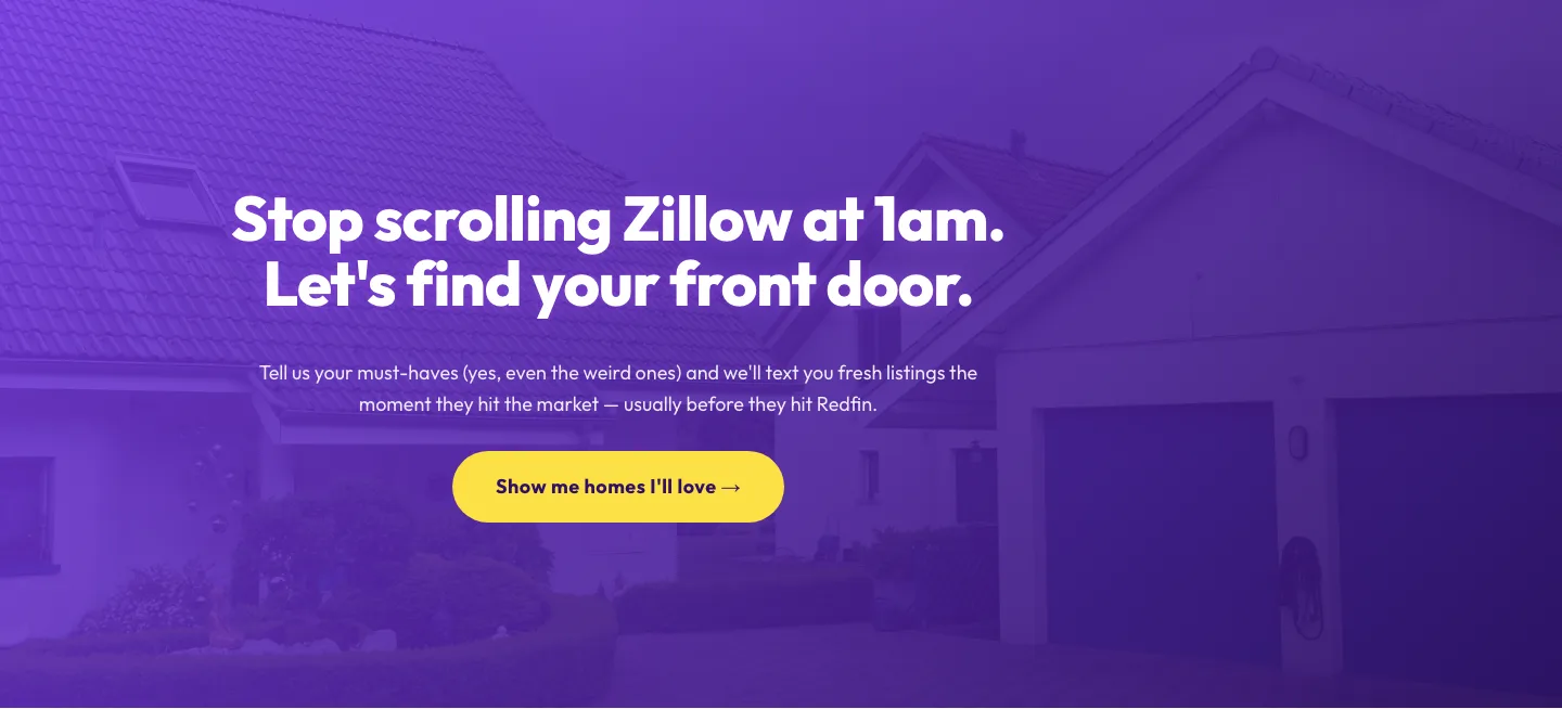
Playful Real Estate CTA: Purple Gradient Listing Alert Signup
cta · real_estate · playful
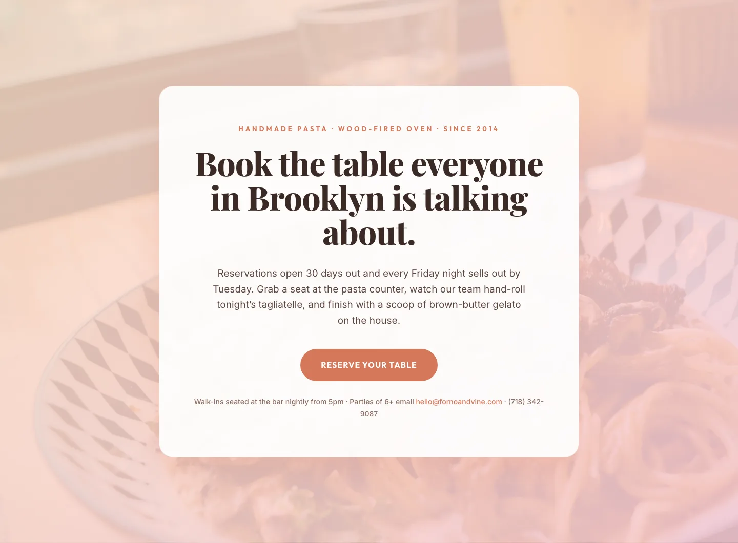
Bold Restaurant Reservation CTA: Divi 5 Layout
cta · restaurant · bold

Bold Purple SaaS CTA Banner: Full-Bleed Divi 5 Layout
cta · saas · bold
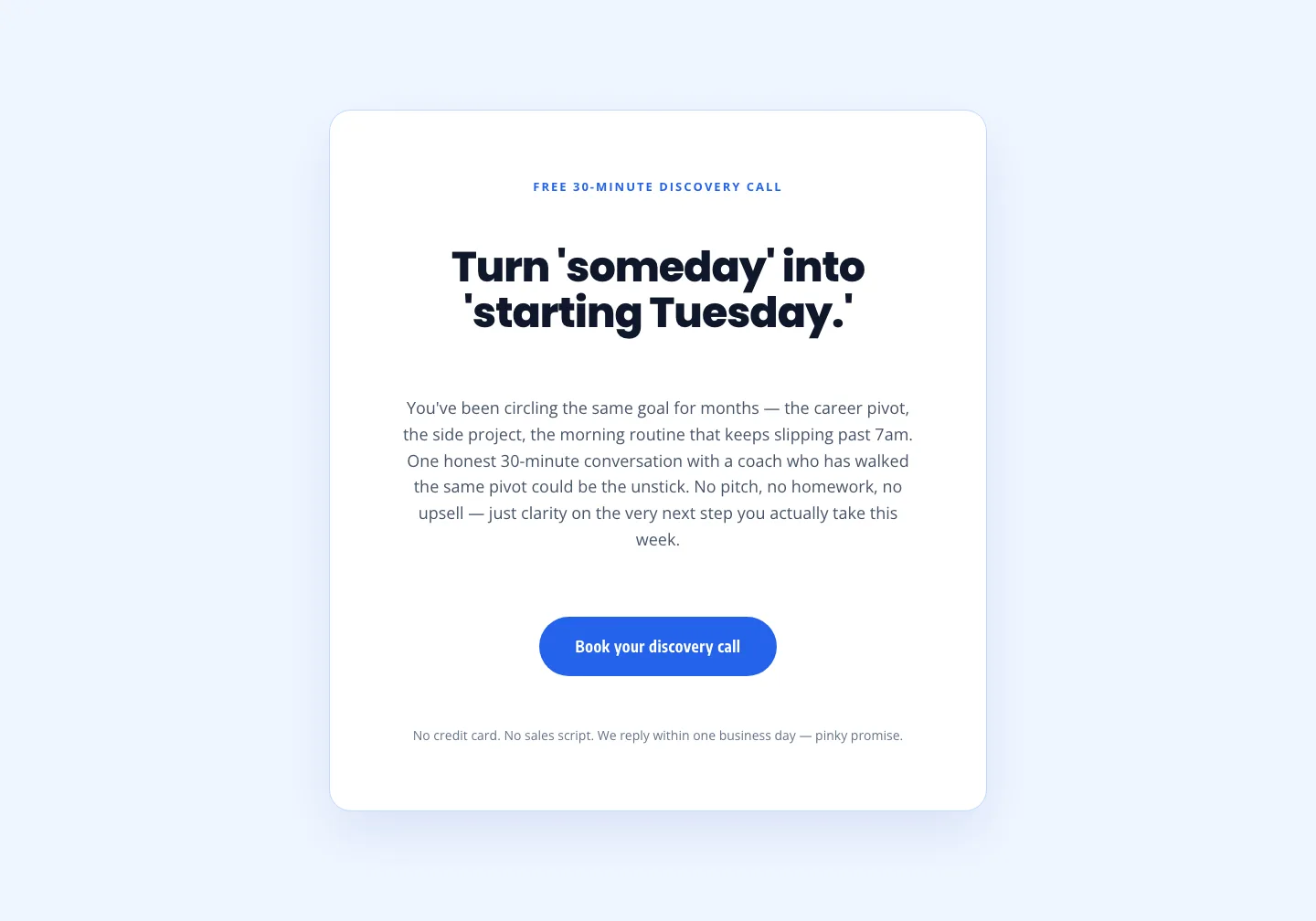
Coaching Discovery Call CTA: Playful Divi 5 Layout
cta · coaching · playful
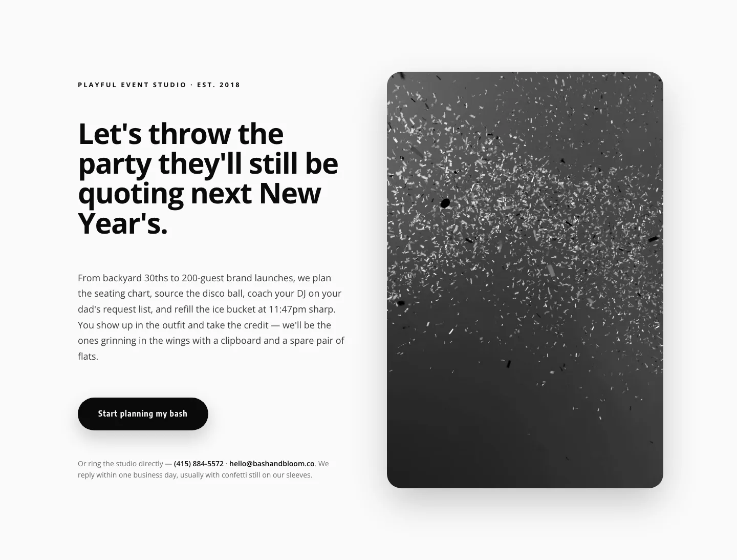
Playful Events CTA Layout for Divi 5: Bash & Bloom
cta · events · playful
Minimal SaaS CTA: Ship Features Faster
cta · saas · minimal