
Bold Fitness CTA: Free Week Trial Divi 5 Layout
High-impact Divi 5 CTA section for gyms and fitness studios. Bold dark green palette, lime accent button, social proof, and a free-trial offer that converts.
Rate this element
Download this section, free
- Divi 5 JSON, imports in seconds
- Commercial license included
- No account needed
Click to view the full page
Overview
This is a single-section CTA built on a two-column row (1/2 + 1/2), designed to convert cold visitors into free-trial signups in one screen. The left column carries the whole argument, a lime-green all-caps kicker ("7 Days. Zero Excuses. One Stronger You."), a heavy 900-weight display heading with negative letter-spacing that sets the confrontational tone, a short benefit paragraph, a solid lime CTA button, and a compact trust line beneath it. The right column holds a single rounded image with a lime-tinted box shadow that quietly ties the photo back to the button color, so the eye bounces between them.
The palette does specific jobs: deep forest green (#0f3d2e) as the section background sets a serious, gym-floor mood; lime (#84cc16 → #a3e635 on hover) is reserved exclusively for the kicker, the button, and the image glow, so lime always means "take action"; two mint tints (#d1fae5 for body, #86efac for the trust line) keep secondary text legible against the dark background without competing with the CTA. Vertical rhythm is tight and intentional: the kicker sits 16px above the display heading, the heading has 24px of breathing room before the paragraph, the paragraph pushes 36px down to the button, and the trust line hangs 24px below.
On desktop the row runs at 110px vertical padding with a 56px column gap and center-aligned items so the photo lines up visually with the middle of the copy. On tablet the section pads down to 70px and the display heading drops from a fluid 3.6vw to a fixed 38px; on phone it becomes 32px, the column right-padding is stripped so copy uses the full width, and the row's flexWrap: wrap stacks the image below the CTA. Meaning the button and trust badge land above the fold before the photo scrolls into view.
What’s inside
- Two-column split row (1/2 + 1/2) with vertical center alignment, 56px column gap, and flex-wrap for clean mobile stacking
- Kicker heading module styled as a lime uppercase eyebrow (14px, 800 weight, 3px letter-spacing) that reads like a promise, not a label
- Display headline heading module using fluid 3.6vw sizing with tablet (38px) and phone (32px) overrides, no clipped text on any viewport
- Body paragraph text module with a bolded objection-buster line ("No contracts. No initiation fees. No judgment.") baked into the copy
- Solid lime CTA button with dark-green label, uppercase 2px letter-spacing, 18px/36px padding, and a lighter-lime hover state
- Trust-signal text module under the button (member count + Google review rating) styled in muted mint uppercase micro-copy
- Image module with 14px corner radius, 560px max-width, centered via auto margins, and a lime-tinted preset3 box shadow for depth
- Section-level padding that halves on tablet (110px → 70px) so the CTA doesn't hog the fold on smaller screens
Who it’s for
Built for gyms, CrossFit boxes, strength-and-conditioning studios, martial arts academies, bootcamps, and personal-training brands that lead with a free trial or intro offer. The tone ("Zero Excuses," "Train Like You Mean You") skews toward serious-athlete positioning (Ironclad-style barbell gyms, hybrid athlete programs, powerlifting clubs) rather than boutique wellness or yoga. It also works well as the final CTA block on a fitness landing page, a paid-ads landing page for a 7-day pass, a challenge or transformation program opt-in, or a supplement/apparel brand pushing a limited-time offer. If your brand is soft, pastel, or spa-adjacent, the palette will fight you; if it's bold and performance-first, this section carries its weight.
Customization tips
Swap the palette at the preset level: change the section background to your brand's dark tone and update the four lime/mint values (#a3e635, #84cc16, #d1fae5, #86efac) together so the kicker, button, image glow, and trust line stay visually linked. Keep the kicker under about 42 characters, the 3px letter-spacing eats space fast. The display heading is tuned for 8–12 words on two lines; longer and the 3.6vw sizing will wrap awkwardly on tablet. The body paragraph should stay around 40–55 words, and keep one bolded objection-buster phrase to hold the eye. Button label works best at 3–5 words in uppercase. For the image, use a landscape photo at roughly 3:2 (the source is 940×650) with the subject on the left third so the right-side crop doesn't cut off action; avoid busy backgrounds that fight the lime glow. If you're not a gym, drop the trust line or replace it with a guarantee/badge. Don't leave it empty.
How to install this layout
- Download the layout JSON file from this page.
- Open the target page in the Divi 5 builder.
- Open the portability panel (up/down arrows icon) and choose the Import tab.
- Upload the JSON. Tick “replace existing content” only for full-page imports.
- Check the page at desktop and mobile widths, then swap in your copy and images.
Full walkthrough with troubleshooting: How to Import a Divi 5 Layout.
Questions about Bold Fitness CTA: Free Week Trial Divi 5 Layout
How does the two-column layout behave on mobile?
The row uses `flexWrap: wrap`, so on phone the columns stack vertically, copy and CTA first, image below. The column's right padding is also stripped on phone so text uses the full width, and the display heading resizes from fluid 3.6vw to a fixed 32px.
Which Divi 5 modules are actually used?
Six native modules: two Heading modules (kicker + display headline), two Text modules (body paragraph + trust line), one Button module, and one Image module. All inside a standard Section → Row → two Columns structure. No third-party modules, no code blocks.
Where does the image come from and can I replace it?
It's a Pexels placeholder of an athlete lifting. Replace the Image module's `src` with your own photo, aim for landscape at roughly 3:2 with the subject positioned toward the left so it reads well next to the copy. Keep the 14px corner radius and the lime box shadow to preserve the depth effect.
What should I edit first after import?
In order: the display heading, the trust line (member count and star rating are hard-coded to a fake gym), the button label and link, the body paragraph, and finally the image. The kicker can usually stay generic while you A/B test offers.
Can I remove the trust line under the button?
Yes. It's a separate Text module, so delete it cleanly without breaking spacing. If you keep it but have no reviews yet, swap it for a guarantee ("Cancel anytime · No card required") in the same muted mint uppercase style so the visual balance stays intact.
Why is the button lime instead of a more common orange or red?
Lime is the only high-saturation color in the palette (every other element is deep green, white, or muted mint) so the button is guaranteed to be the highest-contrast object on the screen. Switching to orange/red works, but re-tint the image box shadow to match or the CTA and photo will stop feeling linked.
Which Divi version does this layout need?
Divi 5. The layout is generated natively for Divi 5 and validated against its real module structure before publication, so it imports clean into the current builder.
Can I use this layout on client websites?
Yes. Every download includes a commercial license covering unlimited sites you own or build for clients. Only reselling or redistributing the layout file itself is prohibited.
More call-to-action
Browse all call-to-action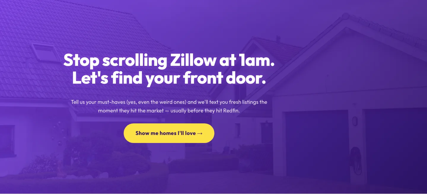
Playful Real Estate CTA: Purple Gradient Listing Alert Signup
cta · real_estate · playful
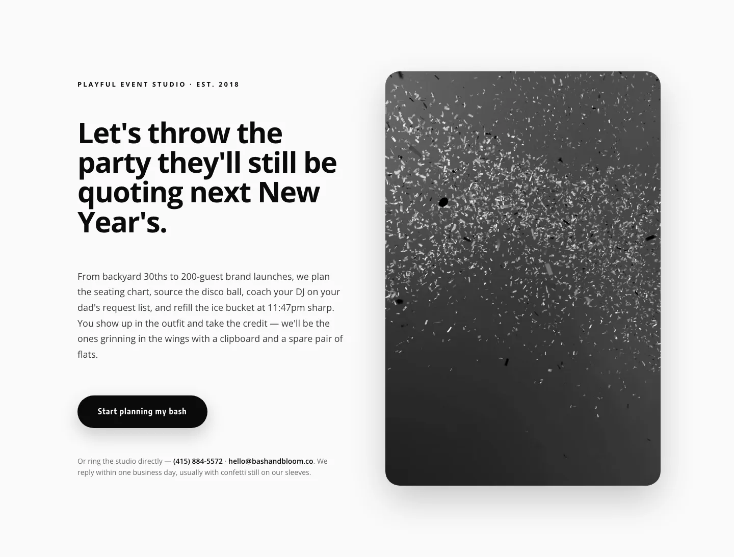
Playful Events CTA Layout for Divi 5: Bash & Bloom
cta · events · playful
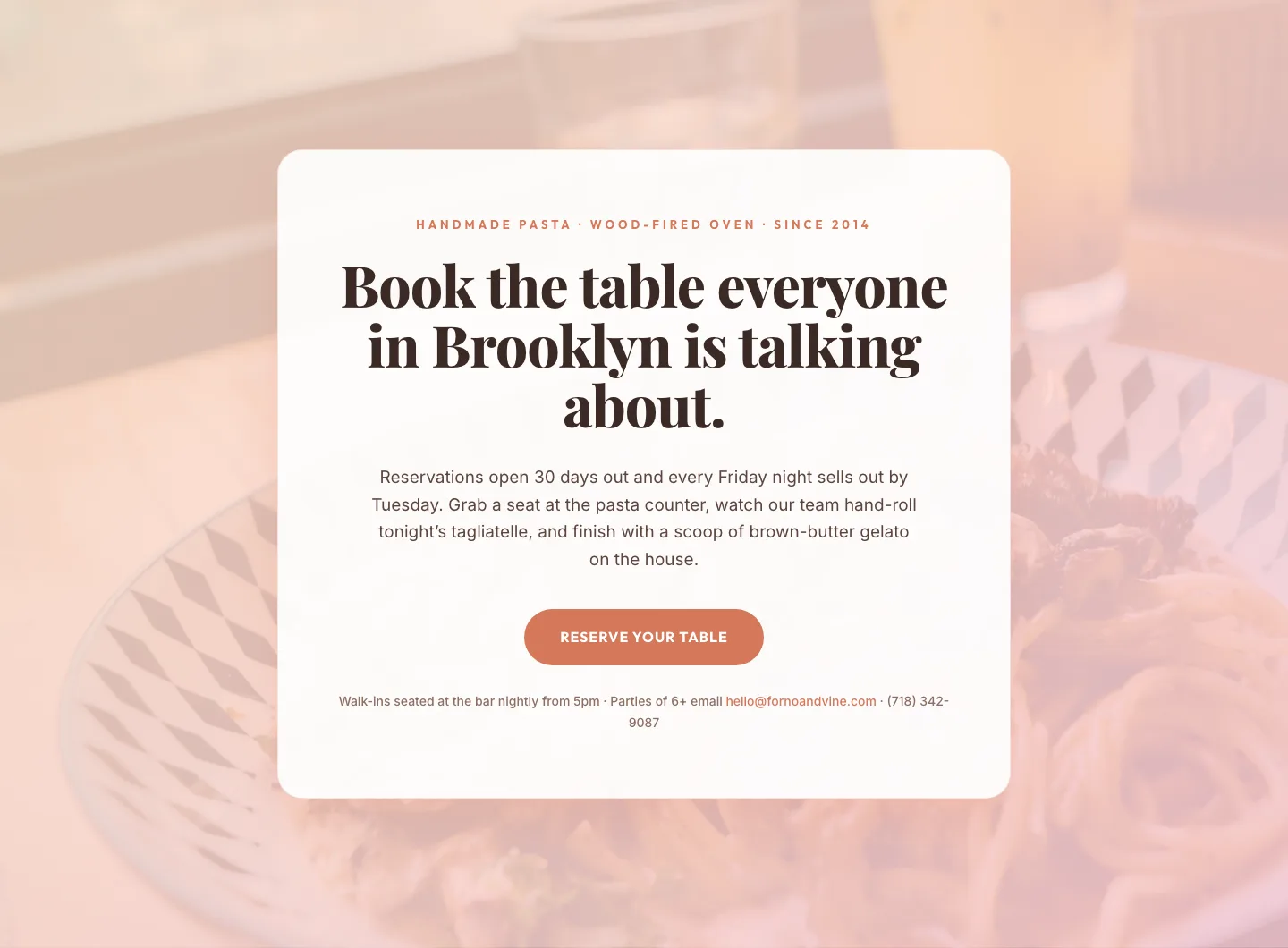
Bold Restaurant Reservation CTA: Divi 5 Layout
cta · restaurant · bold

Bold Purple SaaS CTA Banner: Full-Bleed Divi 5 Layout
cta · saas · bold
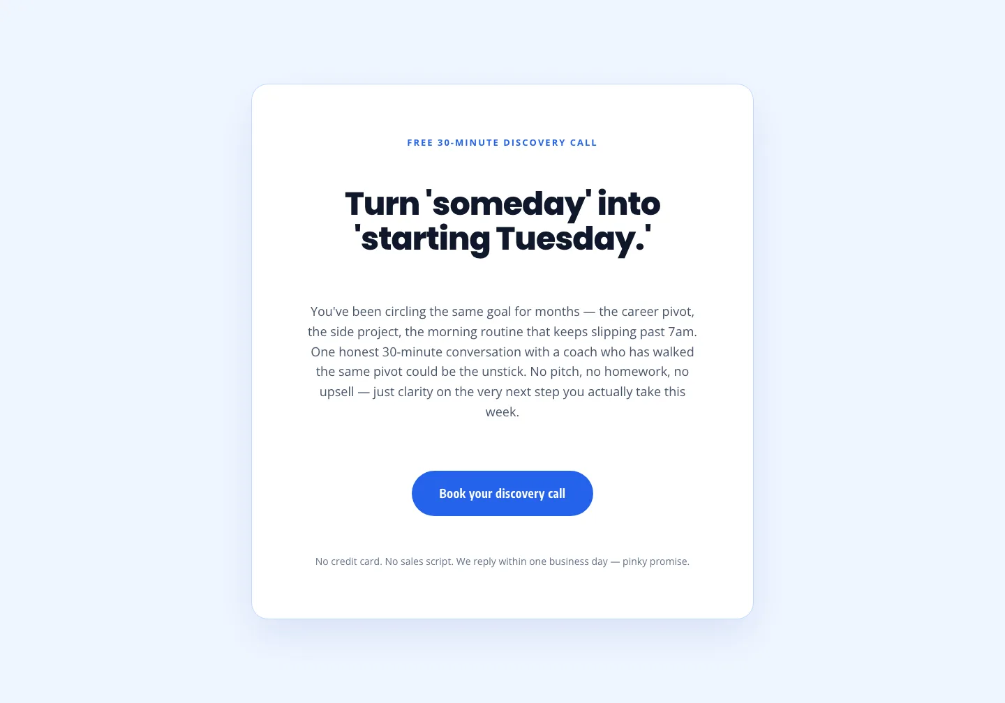
Coaching Discovery Call CTA: Playful Divi 5 Layout
cta · coaching · playful

CTA: Portfolio Bold Blue
cta · portfolio · bold