
Playful Coaching CTA: Free Pep Talk Booking Block
A warm, playful Divi 5 CTA layout for coaches: pastel gradient card, rounded pink button, and a free 25-minute call offer that turns hesitant visitors into booked sessions.
Rate this element
Download this section, free
- Divi 5 JSON, imports in seconds
- Commercial license included
- No account needed
Click to view the full page
Overview
This is a single centered CTA card floating over a soft coral-to-lavender gradient (rgba(255,217,201,0.85) → rgba(201,182,228,0.85) at 135°) layered on a warm image backdrop. The section pads out to 10vw top/bottom on desktop and expands to 18vw on phones, so the card gets breathing room without feeling stranded on wide screens. The row is capped at 820px and auto-margined, keeping the focal point tight even on 1440px displays.
Inside the row sits a single translucent white column (rgba(255,255,255,0.62)) with a 36px radius, a hairline 1px white border, and a soft preset3 shadow (0 24px 60px rgba(74,59,92,0.18)) that gives it a pillowy, sticker-like lift. The internal padding runs 64px/56px on desktop and eases down to 36px/24px on phone so the card never crowds smaller viewports. Content is stacked with flexDirection: column and alignItems: center, so the eyeflow moves cleanly from eyebrow → headline → subhead → button without any horizontal tug.
The hierarchy is deliberately playful but disciplined: a 13px uppercase Quicksand-adjacent eyebrow in #7A5C8E with 3px letter-spacing announces the offer, a 54px Quicksand headline in #4A3B5C (dropping to 34px on phones) carries the emotional hook, and a 19px supporting paragraph at 1.7em line-height keeps the pitch scannable. The pill button (999px radius) uses a candy #FFB7C5 fill with a #FF9AA2 hover: the only saturated color in the composition, so the click target is unmissable.
What’s inside
- One full-width section with a Pexels background image overlaid by a 135° coral-to-lavender gradient at 85% opacity
- Constrained 820px centered row so the CTA never sprawls on wide monitors
- Frosted white card column (62% white fill, 1px white border, 36px radius, preset3 soft shadow) for a sticker-lift feel
- Four stacked modules: uppercase eyebrow Text, oversized Heading, supporting Text paragraph, pill Button
- Quicksand 54px headline with a responsive 34px phone override and -0.5px letter-spacing
- Fully rounded 999px pill button with a #FFB7C5 → #FF9AA2 hover color swap
- Responsive padding baked in: 10vw → 18vw section padding, 64px → 36px card padding on phone
- Column flex layout centers every child, so re-ordering or adding a trust line stays clean
Who it’s for
Life, mindset, career, and wellness coaches who sell a low-friction discovery call and want their site to feel warm rather than corporate. It slots perfectly into a homepage bottom-of-page CTA, a services page footer, or a dedicated "Book a call" landing page. The pastel palette and rounded pill button also translate well for creative therapists, yoga and pilates instructors, nutrition coaches, journaling and habit-building apps, birth doulas, and student-success mentors. Anyone offering a free intro conversation. It is less appropriate for buttoned-up B2B consultancies, legal or financial advisors, or luxury-tier programs where the playful copy tone and candy-pink accent would undercut the price positioning.
Customization tips
Swap the whole feel by editing four color values: the two gradient stops on the section background, the card fill (rgba(255,255,255,0.62)), and the button background/hover pair. Drop the image URL to lean fully on the gradient, or replace the Pexels asset with a 1600×900+ JPG for crisper large displays. Copy limits: keep the eyebrow under ~28 characters so the 3px letter-spacing doesn't wrap, the headline to two lines max (roughly 60 characters) so 54px stays punchy, and the subhead to ~2 sentences so the button stays above the fold on laptops. If you add a second CTA or a trust line, keep them inside the same column. The flex-column centering will handle spacing. On phones, the section padding jumps to 18vw, so avoid adding tall modules that would push the button below the initial viewport.
How to install this layout
- Download the layout JSON file from this page.
- Open the target page in the Divi 5 builder.
- Open the portability panel (up/down arrows icon) and choose the Import tab.
- Upload the JSON. Tick “replace existing content” only for full-page imports.
- Check the page at desktop and mobile widths, then swap in your copy and images.
Full walkthrough with troubleshooting: How to Import a Divi 5 Layout.
Questions about Playful Coaching CTA: Free Pep Talk Booking Block
How does the card behave on phones?
The section padding scales from 10vw to 18vw, the card's internal padding drops from 64px/56px to 36px/24px, and the headline shrinks from 54px to 34px. The row is already set to flexDirection: column on phone, so the single centered stack just tightens up without any layout reflow.
Which Divi 5 modules are used?
Only four native modules inside one section/row/column: divi/text for the uppercase eyebrow, divi/heading for the main line, a second divi/text for the supporting paragraph, and divi/button for the pill CTA. No third-party add-ons, no code modules.
Can I remove the background image and keep just the gradient?
Yes, open the section background settings and clear the image URL. The gradient stops (coral #FFD9C9 to lavender #C9B6E4 at 135°) are set with overlaysImage: on and enableColor: off, so once the image is gone the gradient renders as a clean two-tone wash.
What should I edit first after importing?
The button URL (currently #book), the headline copy, and the Pexels background image. After that, tweak the eyebrow label and the two gradient stops to match your brand palette. Those four changes reskin the whole block.
Does the frosted card actually blur what's behind it?
No: it uses a 62% white fill, not a CSS backdrop-filter, so it only softens the underlying image with translucency. If you want a real blur, add backdrop-filter: blur(12px) via the column's custom CSS. The current approach was chosen for broader browser support and zero performance cost.
How wide does the CTA card get on large screens?
The row is capped at maxWidth: 820px with auto left/right margins, so on a 1440px or 4K display the card stays a comfortable reading width instead of stretching edge-to-edge. Raise that maxWidth if you plan to add a two-column trust bar under the button.
Which Divi version does this layout need?
Divi 5. The layout is generated natively for Divi 5 and validated against its real module structure before publication, so it imports clean into the current builder.
Can I use this layout on client websites?
Yes. Every download includes a commercial license covering unlimited sites you own or build for clients. Only reselling or redistributing the layout file itself is prohibited.
More call-to-action
Browse all call-to-action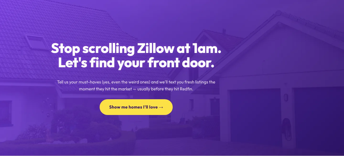
Playful Real Estate CTA: Purple Gradient Listing Alert Signup
cta · real_estate · playful
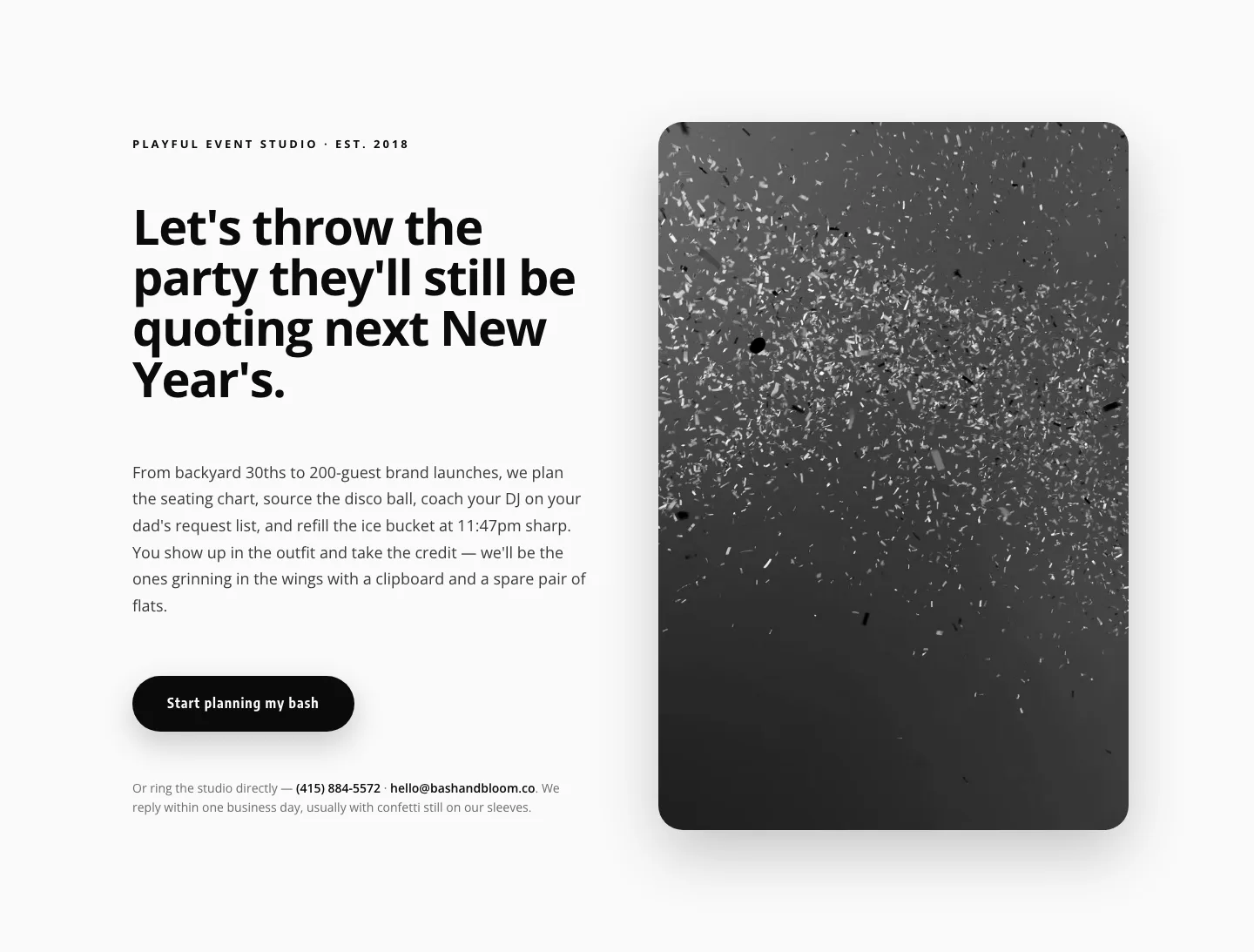
Playful Events CTA Layout for Divi 5: Bash & Bloom
cta · events · playful
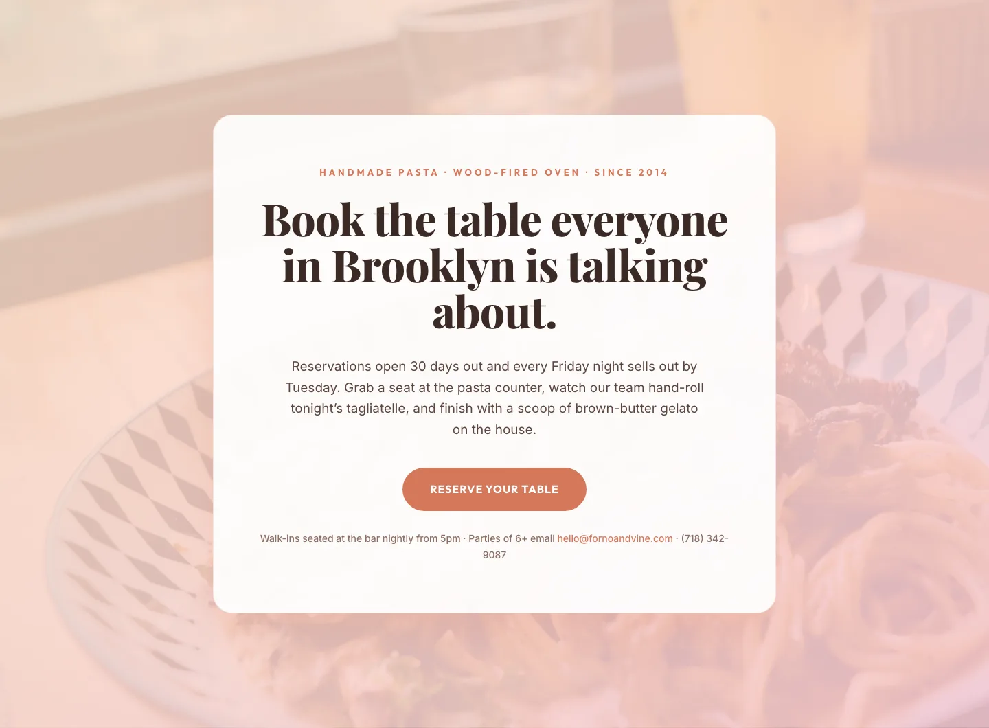
Bold Restaurant Reservation CTA: Divi 5 Layout
cta · restaurant · bold

Bold Purple SaaS CTA Banner: Full-Bleed Divi 5 Layout
cta · saas · bold
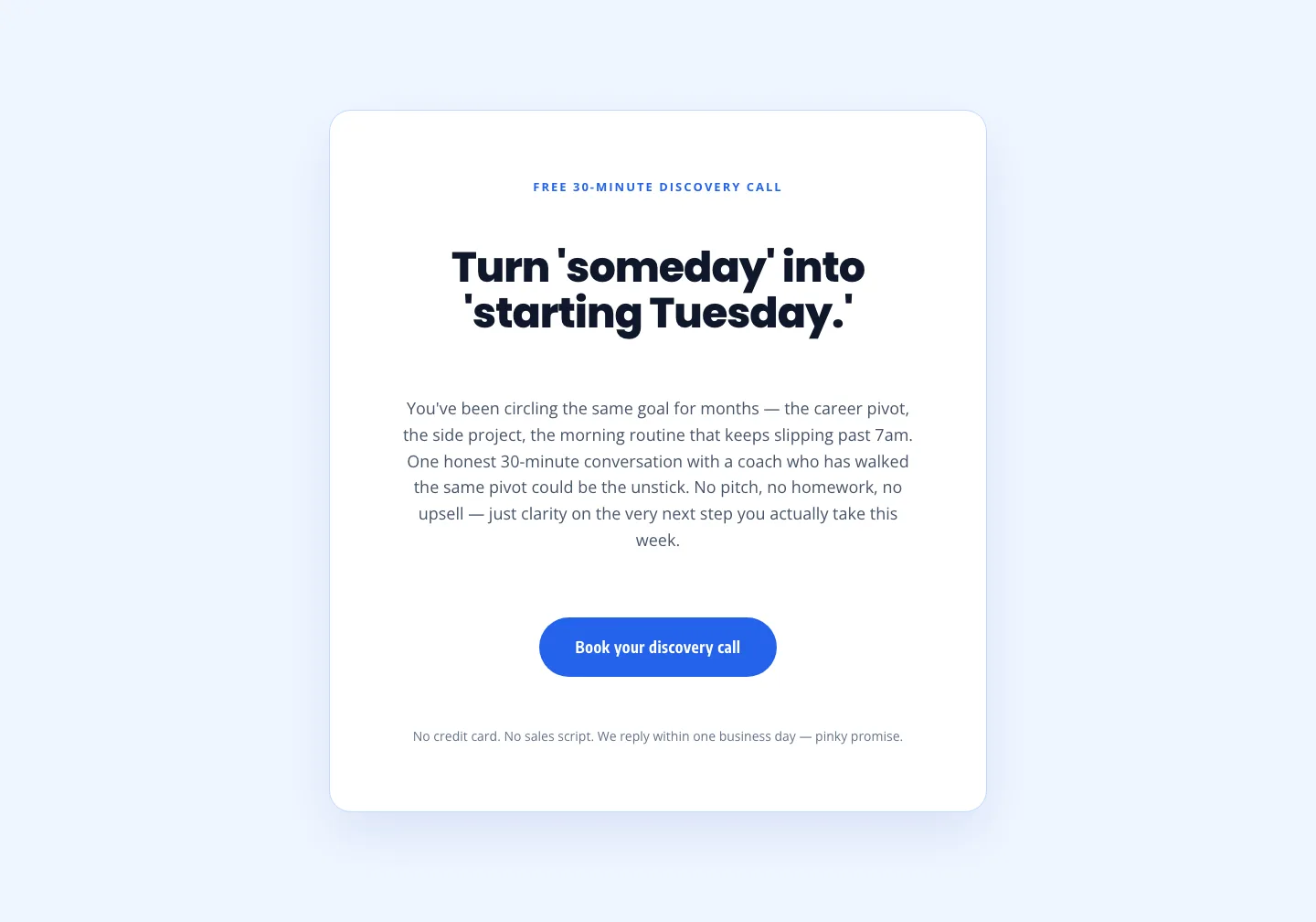
Coaching Discovery Call CTA: Playful Divi 5 Layout
cta · coaching · playful

CTA: Portfolio Bold Blue
cta · portfolio · bold