
Playful Real Estate CTA Section for Divi 5: Happy-Dance Home
Bold purple-and-gold playful CTA section for real estate websites. Drop this Divi 5 layout into your site to book weekend home tours and convert browsers into buyers.
Rate this element
Download this section, free
- Divi 5 JSON, imports in seconds
- Commercial license included
- No account needed
Click to view the full page
Overview
This is a single-section, single-column CTA band designed to stop scroll and push one clear action. The whole section rides on a 135° purple gradient (from #a855f7 down to #5b21b6 over a #6d28d9 base), with generous 9vw top and bottom padding so the message gets room to breathe on both large desktops and phones. Inside, a centered column stacks two elements: a big, playful Outfit headline in white and a rounded pill button in amber-gold. Nothing else competes with the ask.
The hierarchy is deliberately blunt. The heading is set at 56px, weight 800, with -1px letter-spacing and a tight 1.1em line-height, capped at an 820px max-width so the copy wraps into two friendly lines instead of a single long ribbon. A 36px bottom margin separates it from the button, which sits centered directly beneath. The button uses #FBBF24 amber against deep-purple #4c1d95 label text (high contrast, warm against cool) and a fully rounded 999px radius that reinforces the playful, non-corporate tone. On hover the button flips to white, keeping the purple label legible without needing a second color.
On mobile, the row's flex direction switches to column and the column becomes full-width (24_24), so the padding shrinks proportionally with the vw unit and the headline collapses onto more lines while staying centered. Because the section is one column with alignItems: center, nothing needs to be re-aligned by hand at smaller breakpoints. The built-in stack just works. The result is a compact, opinionated conversion block you can drop at the bottom of a home page, a neighborhood page, or a listing article without wiring up extra rows.
What’s inside
- One Divi 5 section with a 135° purple gradient background (`#a855f7 → #5b21b6`) and `9vw` vertical padding
- Single centered column (4_4) with 20px inner padding and flex alignment set to center
- Outfit heading module at 56px / weight 800 / `-1px` letter-spacing, capped at 820px max-width
- Rounded pill button (`999px` radius) in amber `#FBBF24` with deep-purple `#4c1d95` label text
- Built-in hover state that flips the button background to white while keeping the purple label
- Mobile flex-direction switch to `column` and full-width column so the stack reflows without manual tweaks
- Uses only native Divi 5 modules (Section, Row, Column, Heading, Button) no third-party add-ons
Who it’s for
This CTA fits real-estate brands that want to feel human instead of corporate: independent agents, boutique brokerages, new-development microsites, neighborhood guides, and property-search landing pages that need a warm, confident push toward a tour, a valuation, or a saved-search signup. The playful tone also translates well to adjacent lifestyle categories: interior designers, home stagers, moving concierge services, mortgage brokers who want to sound approachable, and vacation-rental hosts. Use it as the closing band on a home page, above the footer on a listings page, or as a standalone conversion block between sections of a longer landing page. Skip it if your brand voice is strictly formal or luxury-minimal, the gradient and pill button lean informal by design.
Customization tips
Swap the palette at the Section level first: edit the gradient stops to keep the same 135° angle but use your brand's two-color pair, then re-color the button background and hover state so contrast against the new gradient stays high. Aim to keep the headline under about 60 characters: the 820px max-width and 56px size are tuned for two lines, and much longer copy will spill to three and crowd the button. Button text works best at three to four words (Tour Homes This Weekend is the reference length); anything longer breaks the pill shape at narrow widths. The layout has no image module, so there's no aspect ratio to worry about, but if you replace the gradient with a photo background, add a dark overlay at 30–45% so the white heading stays readable. Outfit can be swapped for any geometric sans (Manrope, Inter, Sora) without re-tuning the sizes.
How to install this layout
- Download the layout JSON file from this page.
- Open the target page in the Divi 5 builder.
- Open the portability panel (up/down arrows icon) and choose the Import tab.
- Upload the JSON. Tick “replace existing content” only for full-page imports.
- Check the page at desktop and mobile widths, then swap in your copy and images.
Full walkthrough with troubleshooting: How to Import a Divi 5 Layout.
Questions about Playful Real Estate CTA Section for Divi 5: Happy-Dance Home
What exact colors ship with the layout?
The section gradient runs from `#a855f7` to `#5b21b6` over a `#6d28d9` base at 135°. The heading is `#FFFFFF`, the button is `#FBBF24` with `#4c1d95` label text, and the button hover state is `#FFFFFF`. Change these at the module level to re-skin it to any brand.
How does it behave on mobile?
The row's phone flex-direction is set to `column` and the column expands to full width (`24_24`), so the heading and button stack cleanly. Because the section padding uses `vw` units, the vertical breathing room scales down proportionally on smaller screens without you touching a thing.
Which Divi 5 modules are used?
Just four: Section, Row, Column, Heading, and Button. There are no images, icons, or third-party modules, so the layout is lightweight and easy to duplicate across pages.
What should I edit first?
The headline copy and the button label, those two strings carry the entire section. After that, re-color the gradient to your brand and confirm the button contrast is still high against the new background.
Can I add a supporting subheadline or trust line?
Yes. Insert a Text module between the Heading and the Button inside the same column. Keep it short (one sentence) and give it a `24px` bottom margin so the button still reads as the primary action.
Can I use a photo background instead of the gradient?
Yes, turn off the gradient on the Section's Background settings and add a background image. Add a dark overlay at roughly 30–45% opacity so the white heading and colored button still meet contrast.
Which Divi version does this layout need?
Divi 5. The layout is generated natively for Divi 5 and validated against its real module structure before publication, so it imports clean into the current builder.
Can I use this layout on client websites?
Yes. Every download includes a commercial license covering unlimited sites you own or build for clients. Only reselling or redistributing the layout file itself is prohibited.
More call-to-action
Browse all call-to-action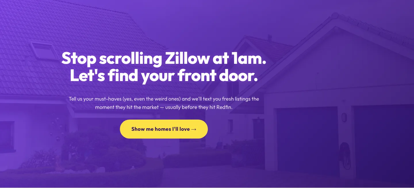
Playful Real Estate CTA: Purple Gradient Listing Alert Signup
cta · real_estate · playful
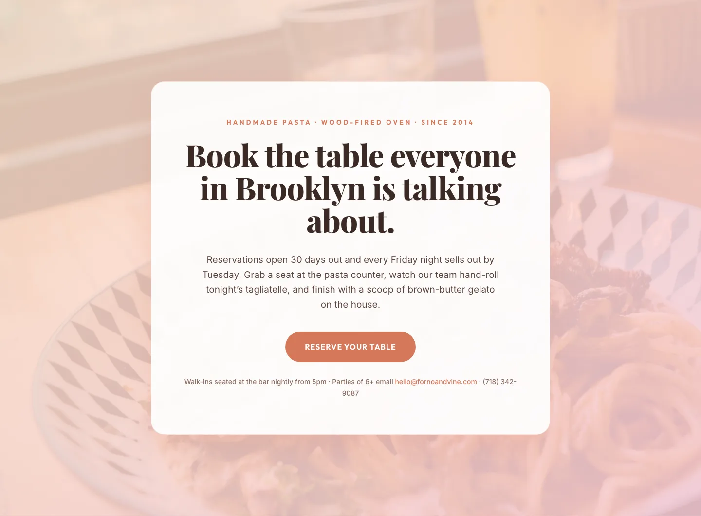
Bold Restaurant Reservation CTA: Divi 5 Layout
cta · restaurant · bold

Bold Purple SaaS CTA Banner: Full-Bleed Divi 5 Layout
cta · saas · bold
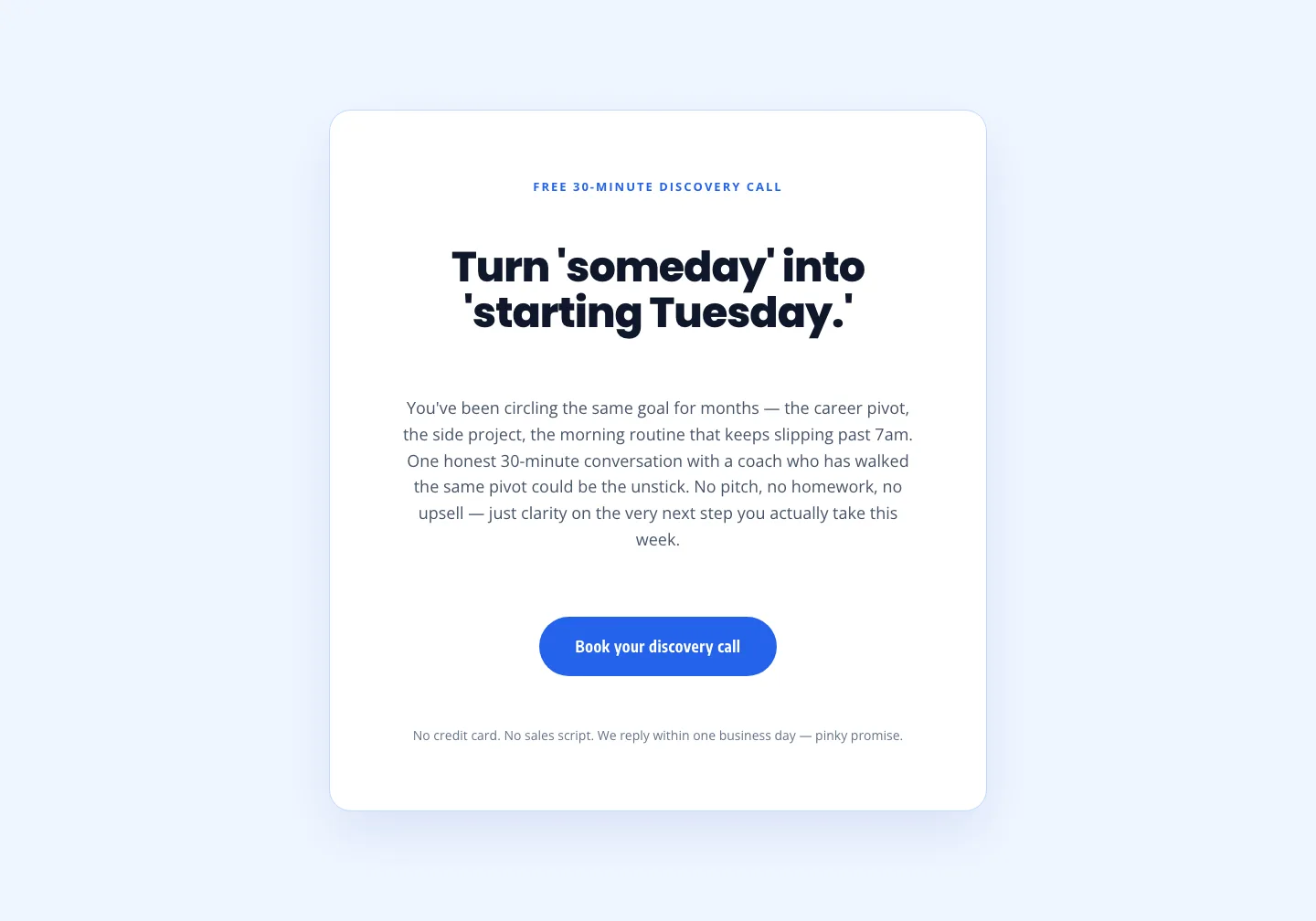
Coaching Discovery Call CTA: Playful Divi 5 Layout
cta · coaching · playful
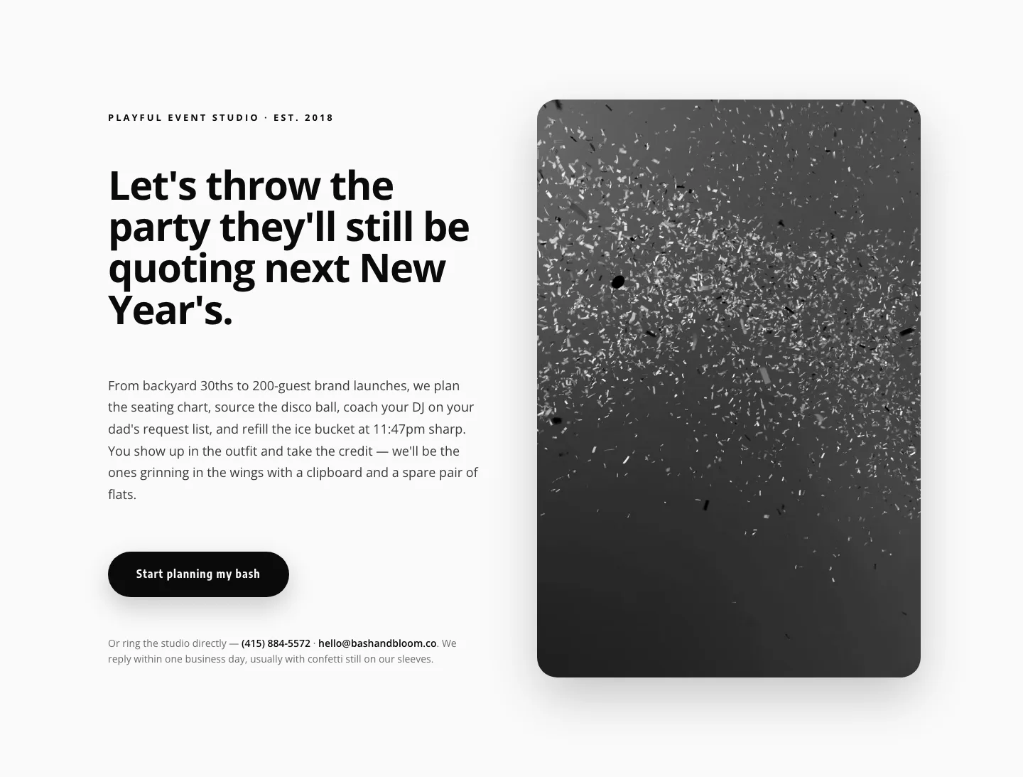
Playful Events CTA Layout for Divi 5: Bash & Bloom
cta · events · playful

CTA: Portfolio Bold Blue
cta · portfolio · bold