
Bold Fitness CTA Layout for Divi 5: Start Training Today
High-impact Divi 5 CTA section for gyms and fitness brands. Bold dark-green design with headline, benefit checklist, and free-trial button to drive sign-ups.
Rate this element
Download this section, free
- Divi 5 JSON, imports in seconds
- Commercial license included
- No account needed
Click to view the full page
Overview
This is a single conversion-focused section, split into a 50/50 two-column row with the pitch on the left and a bordered lifestyle photo on the right. Section padding runs 100px top and bottom on desktop and shrinks to 60px on phone, with horizontal insets of 6% / 5%, so the block breathes on wide screens without cramming on narrow ones. Inside the left column, the type stack flows through four deliberate steps: a small all-caps eyebrow ("No Excuses. Only Results.") sets tone in one line, then a 56px display heading anchors the offer at weight 900 with a tight -1px letter-spacing, followed by an 18px supporting paragraph and a three-line checklist of proof points at 2em line-height.
Palette-wise, everything sits on a near-black forest green (#052e16) that reads athletic without shouting. Signal green (#22c55e) does the heavy lifting (it colors the eyebrow, the image border, and the primary button) while two softer greens (#d1fae5 body copy, #86efac benefit copy) keep the hierarchy readable against the dark ground. The button flips the palette: dark green text on a bright green fill with an uppercase, 2px-letter-spaced label and a darker #16a34a hover state.
The right column is a single Image module wrapped in a 2px green border, a 12px radius, and a preset3 box shadow offset 12px/12px in a deeper green: a printed-poster effect that gives the block a physical, weight-room feel. On phone, the row collapses to a stacked column with a 40px row gap, the heading scales down from 56px to 36px, and the image sits below the pitch instead of beside it, so the copy still leads the fold on small screens.
What’s inside
- Two-column 50/50 row that stacks vertically on phone with a 40px row gap and centered vertical alignment on desktop
- Uppercase eyebrow Text module in signal green (#22c55e) at 14px with 4px letter-spacing for the tone-setting first line
- 56px display Heading module (auto-scales to 36px on phone) at weight 900 with -1px letter-spacing and a 1.05em line-height
- 18px body paragraph plus a separate checkmark-style benefit Text module at 16px / weight 600 / 2em line-height
- Native Divi 5 Button module with uppercase 800-weight label, 4px radius, 20×40 padding, and a darker #16a34a hover fill
- Image module framed by a 2px green border, 12px radius, and an offset preset3 box shadow in deeper green (#16a34a)
- Dark forest-green Section (#052e16) with responsive vertical padding baked in (100px desktop → 60px phone)
- Phone-specific overrides for flex direction, column gap, row gap, and heading size. No post-import fiddling
Who it’s for
This section is built for fitness businesses that need to move visitors from browsing to signing up in one screen. Boutique gyms, CrossFit boxes, personal trainers, strength coaches, yoga studios, and online fitness memberships will find the tone and structure a natural fit: the "join X members" social-proof line, the free-trial checklist, and the single-choice CTA map directly to how gym landing pages actually convert. It also works well for adjacent verticals with the same customer psychology: martial arts studios, climbing gyms, running clubs, HIIT programs, or nutrition-coaching offers. Drop it above the fold on a fitness homepage, use it as the closer on a class-detail page, or bolt it onto a paid-ads landing page.
Customization tips
Repalette in minutes: swap the two greens (#22c55e and #052e16) for your brand colors (pink and black for a boutique studio, red and charcoal for combat sports, orange and navy for high-energy HIIT) and the rest of the hierarchy still holds because contrast is handled at the text-color level. Keep the heading to four to six words so it doesn't wrap awkwardly at 56px, and hold the body paragraph to around 40 words so it stays a single visual block. The checklist reads best at exactly three items; four still works but you'll lose some vertical rhythm. Replace the Pexels photo with your own gym shot at roughly a 3:2 aspect ratio (around 940×650) so the border and offset shadow frame it correctly, and keep the subject centered because the image doesn't crop responsively. If your button label is longer than "Claim Your Free Week," drop the button padding from 40px to 30px so it doesn't outgrow the column.
How to install this layout
- Download the layout JSON file from this page.
- Open the target page in the Divi 5 builder.
- Open the portability panel (up/down arrows icon) and choose the Import tab.
- Upload the JSON. Tick “replace existing content” only for full-page imports.
- Check the page at desktop and mobile widths, then swap in your copy and images.
Full walkthrough with troubleshooting: How to Import a Divi 5 Layout.
Questions about Bold Fitness CTA Layout for Divi 5: Start Training Today
Does the layout stay two columns on mobile?
No: the row flips to flex-direction: column on phone with a 40px row gap, so the pitch stacks above the image on small screens. The heading also drops from 56px to 36px automatically, and section padding tightens from 100px to 60px.
What modules does the section actually use?
One Section, one Row, two Columns, three Text modules (eyebrow, body paragraph, benefit checklist), one Heading, one Button, and one Image: all native Divi 5 modules, no third-party plugins required.
How do I swap the Pexels photo for my own?
Open the Image module in the right column and replace the source. Aim for around 940×650 (roughly 3:2), keep the subject centered, and remember the 12px border-radius plus 2px green border will frame whatever you upload.
Where does the CTA button point?
The button ships with a placeholder link: open the Button module and set the URL to your sign-up form, checkout, or lead-capture page. The hover fill is already wired to a darker green (#16a34a) so the interaction feels finished on day one.
What should I edit first?
Swap the gym name and member count in the body paragraph, retarget the heading and eyebrow to your offer's actual promise, and update the three checklist lines to match what you deliver in a free trial. Then replace the image and the button URL.
Can I flip the image to the left side?
Yes: the row is a straightforward 1_2, 1_2 structure with flex-direction: row on desktop, so reordering the columns in the Divi visual builder is a drag-and-drop change with no CSS edits.
Which Divi version does this layout need?
Divi 5. The layout is generated natively for Divi 5 and validated against its real module structure before publication, so it imports clean into the current builder.
Can I use this layout on client websites?
Yes. Every download includes a commercial license covering unlimited sites you own or build for clients. Only reselling or redistributing the layout file itself is prohibited.
More call-to-action
Browse all call-to-action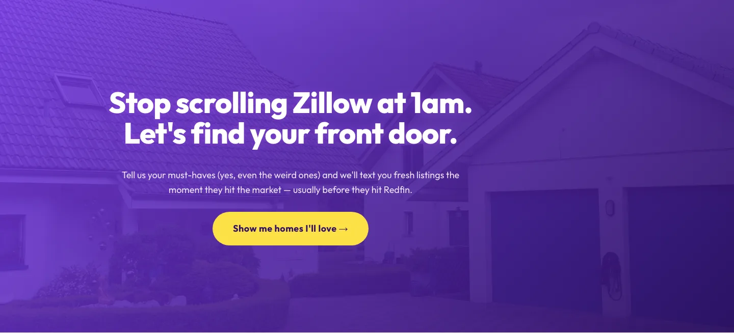
Playful Real Estate CTA: Purple Gradient Listing Alert Signup
cta · real_estate · playful
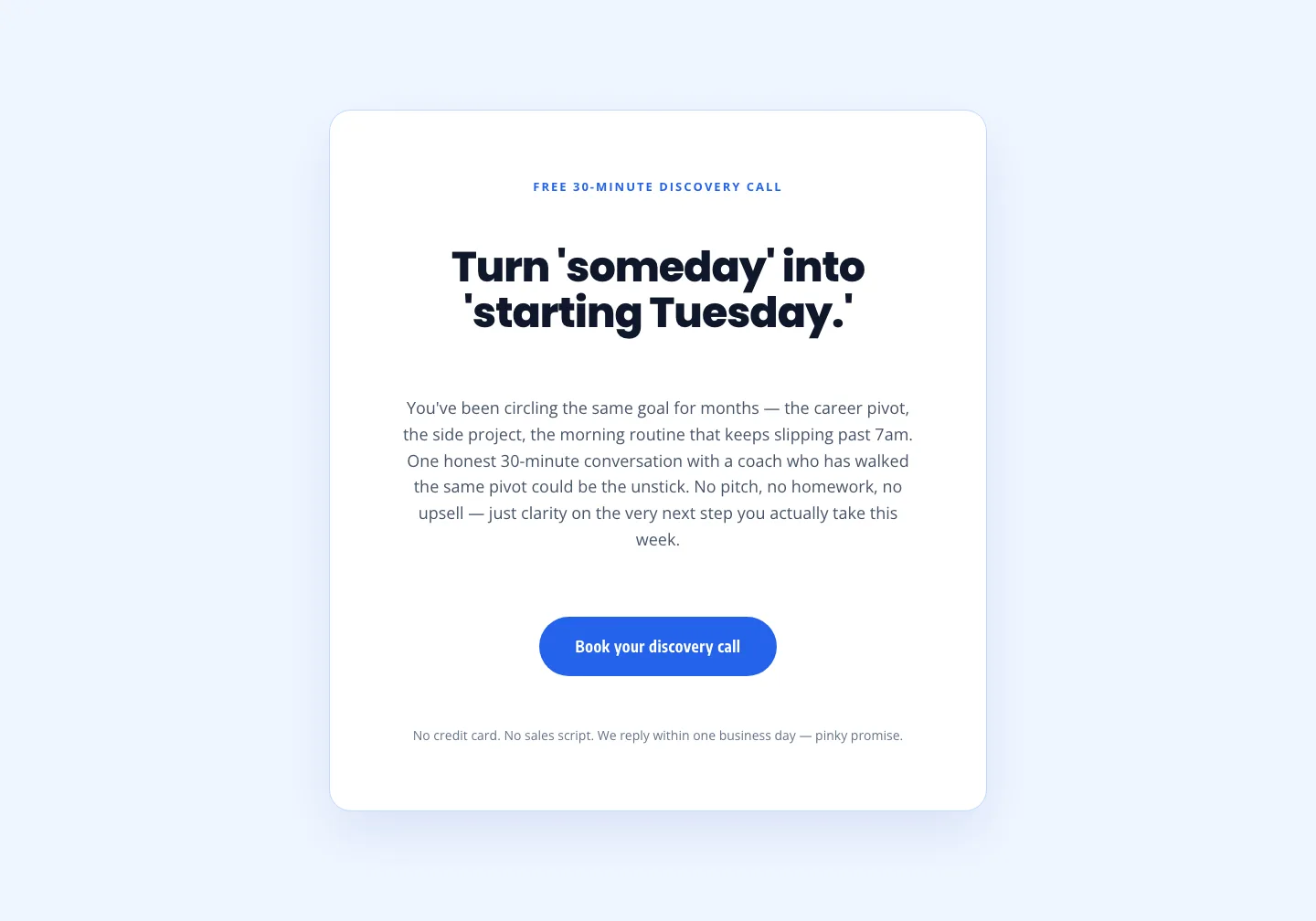
Coaching Discovery Call CTA: Playful Divi 5 Layout
cta · coaching · playful
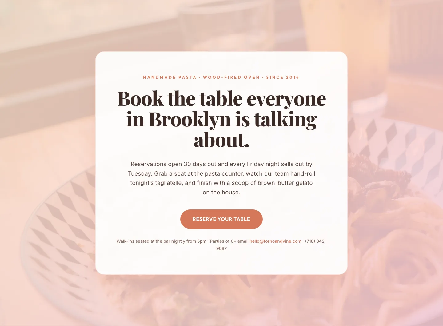
Bold Restaurant Reservation CTA: Divi 5 Layout
cta · restaurant · bold

Bold Purple SaaS CTA Banner: Full-Bleed Divi 5 Layout
cta · saas · bold
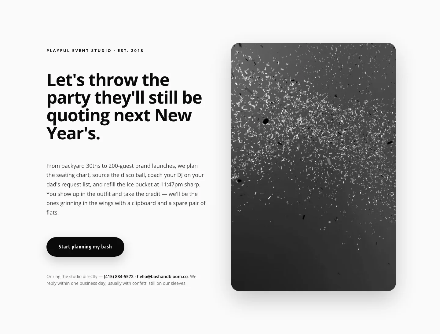
Playful Events CTA Layout for Divi 5: Bash & Bloom
cta · events · playful

CTA: Portfolio Bold Blue
cta · portfolio · bold