
Minimal Nonprofit Donation CTA: Divi 5 Layout
Clean, centered donation call-to-action for nonprofit sites: bold impact headline, trust-building copy, rounded green donate button, and tax-deductible reassurance line. Divi 5 JSON download.
Rate this element
Download this section, free
- Divi 5 JSON, imports in seconds
- Commercial license included
- No account needed
Click to view the full page
Overview
A single-column, centered section built for one job: turn a visitor into a monthly donor. Four native Divi 5 modules stack inside a 760px row on a warm off-white canvas (#FAFAF7) (a small green eyebrow, a 54px conviction headline, a 19px paragraph, and a pill button) with 140px of vertical padding above and below on desktop. The block sits in the middle of the viewport without a divider or image, so it reads as the clear next step rather than another section to scroll past.
The palette is deliberately restrained. A deep, quiet green (#1F6F54) carries the brand and appears in exactly three places: the uppercase eyebrow, the button, and the inline link in the trust row. The headline stays near-black (#161616) and the body copy sits in a muted slate (#55605B) at 1.7 line-height, so the hierarchy is entirely typographic: no boxes, no borders, no card. The eyebrow uses 13px type with 3px letter-spacing to flag the campaign name ("The Neighborhood Table"); the headline delivers a dollar-anchored ask ("$25 puts a week of groceries on a neighbor's table.") at 54px with -1px letter-spacing; the paragraph carries the proof point about 94¢-on-the-dollar and 1,200 monthly givers.
The button is a fully rounded (100px radius) pill with 18px/44px padding and a soft preset3 green shadow that deepens on hover, so the CTA reads as the clear action without shouting. A 15px muted line below it ("Tax-deductible · Cancel anytime · Prefer a one-time gift?") handles the three objections that stop first-time recurring donors, with the alternative-gift link inline. On tablet the headline drops to 42px and the section pads down to 96px; on phone it steps to 32px with 72px padding and the row shifts to a flex column, so the ask stays comfortable at any width without a horizontal scroll.
What’s inside
- Centered single-column layout capped at a 760px row so the ask never competes with a sidebar or a second column
- Uppercase eyebrow (13px, 3px letter-spacing, 700 weight) sized for a campaign name or program tag
- 54px conviction headline with -1px letter-spacing that steps down to 42px on tablet and 32px on phone
- 19px supporting paragraph at 1.7 line-height, capped at a 560px measure for comfortable reading
- Fully rounded pill button (100px radius, 18px/44px padding) with a soft green box-shadow that deepens on hover
- 15px muted trust line under the button with an inline link ready for a one-time-gift alternative
- Warm off-white (#FAFAF7) section background with 140 / 96 / 72px vertical padding across desktop, tablet, and phone
- Built entirely from native Divi 5 modules (Section, Row, Column, Heading, Text, Button) no third-party dependencies
Who it’s for
This section is tuned for nonprofits with a specific, tangible ask: food banks, community pantries, mutual-aid groups, animal rescues, youth programs, arts councils, and mission-driven organizations that want to convert warm traffic into recurring donors. It also works as a campaign block on a homepage or landing page for church tithing appeals, school PTA fundraisers, disaster-relief drives, alumni giving days, and crowdfunds where a single dollar-anchored ask does more than a long story. Because the palette and typography stay restrained, it drops cleanly under a hero, between a story block and a stewardship report, or at the bottom of an "About our work" page without demanding a full redesign around it.
Customization tips
Swap the green (#1F6F54) for your brand color by editing the section preset: the eyebrow, button, and inline link all share it, so one change updates the whole accent. Keep the button hover roughly 20% darker than the base for the same tactile feel. The headline is capped at a 680px max-width and 54px font size, so aim for 10–14 words with a concrete number in it; longer copy makes the -1px letter-spacing feel tight on phone. Body copy sits inside a 560px measure, 30–45 words is the sweet spot. If you want a photo behind the section, add it as a section background image (16:9, ~2000px wide, ~150KB WebP) and layer an off-white overlay at 85–90% opacity so the headline stays legible. The trust line under the button is prime real estate: swap the three items for your tax status, cancel language, and strongest secondary CTA.
How to install this layout
- Download the layout JSON file from this page.
- Open the target page in the Divi 5 builder.
- Open the portability panel (up/down arrows icon) and choose the Import tab.
- Upload the JSON. Tick “replace existing content” only for full-page imports.
- Check the page at desktop and mobile widths, then swap in your copy and images.
Full walkthrough with troubleshooting: How to Import a Divi 5 Layout.
Questions about Minimal Nonprofit Donation CTA: Divi 5 Layout
How does the section behave on tablet and phone?
The headline scales from 54px on desktop to 42px on tablet and 32px on phone, and section padding steps down from 140px to 96px to 72px. The row is set to flex-column on phone, so the eyebrow, headline, body, button, and trust line stack cleanly with no horizontal scroll.
Which Divi 5 modules does it use?
Only native ones: Section, Row, Column, one Heading, three Text modules (eyebrow, body paragraph, and trust line), and one Button. No third-party modules, no code blocks, no add-on plugins beyond Divi 5 itself.
Are there any images to swap out?
No, this is a pure type-and-button section on a solid #FAFAF7 background. That keeps it fast and accessible and lets it drop under any hero or story block without fighting for attention. If you want a photo, add it as a section background image and pull opacity back so the headline stays readable.
What should I edit first?
Three things: the eyebrow text ("The Neighborhood Table") to your campaign or program name, the headline to your own dollar-anchored ask, and the button label plus link to your donation processor. Then update the trust line with your real tax status, cancel language, and secondary-gift link.
Does the button link anywhere by default?
The button ships without a destination, so you'll wire it to your donation form, Stripe or PayPal checkout, Donorbox, GiveWP, or wherever you collect gifts. The inline "Prefer a one-time gift?" link in the trust row is also empty and ready for your one-off giving page.
Which Divi version does this layout need?
Divi 5. The layout is generated natively for Divi 5 and validated against its real module structure before publication, so it imports clean into the current builder.
Can I use this layout on client websites?
Yes. Every download includes a commercial license covering unlimited sites you own or build for clients. Only reselling or redistributing the layout file itself is prohibited.
More call-to-action
Browse all call-to-action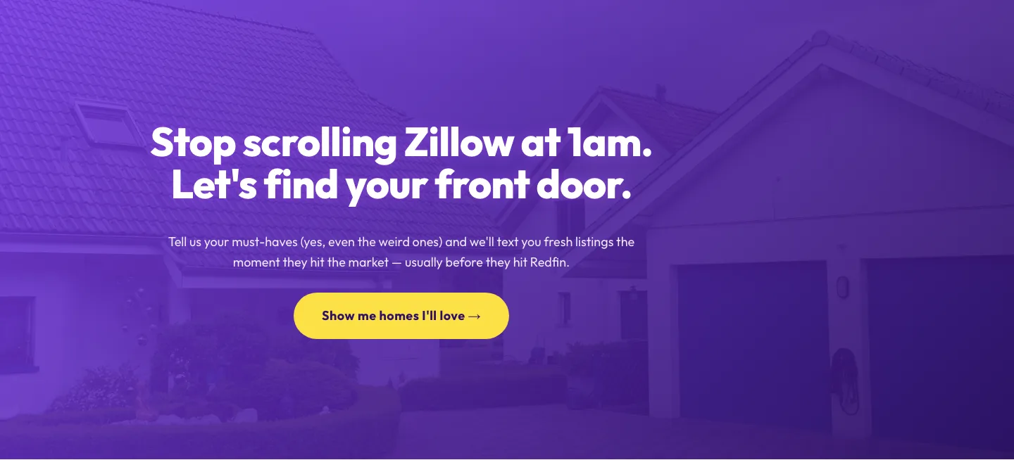
Playful Real Estate CTA: Purple Gradient Listing Alert Signup
cta · real_estate · playful
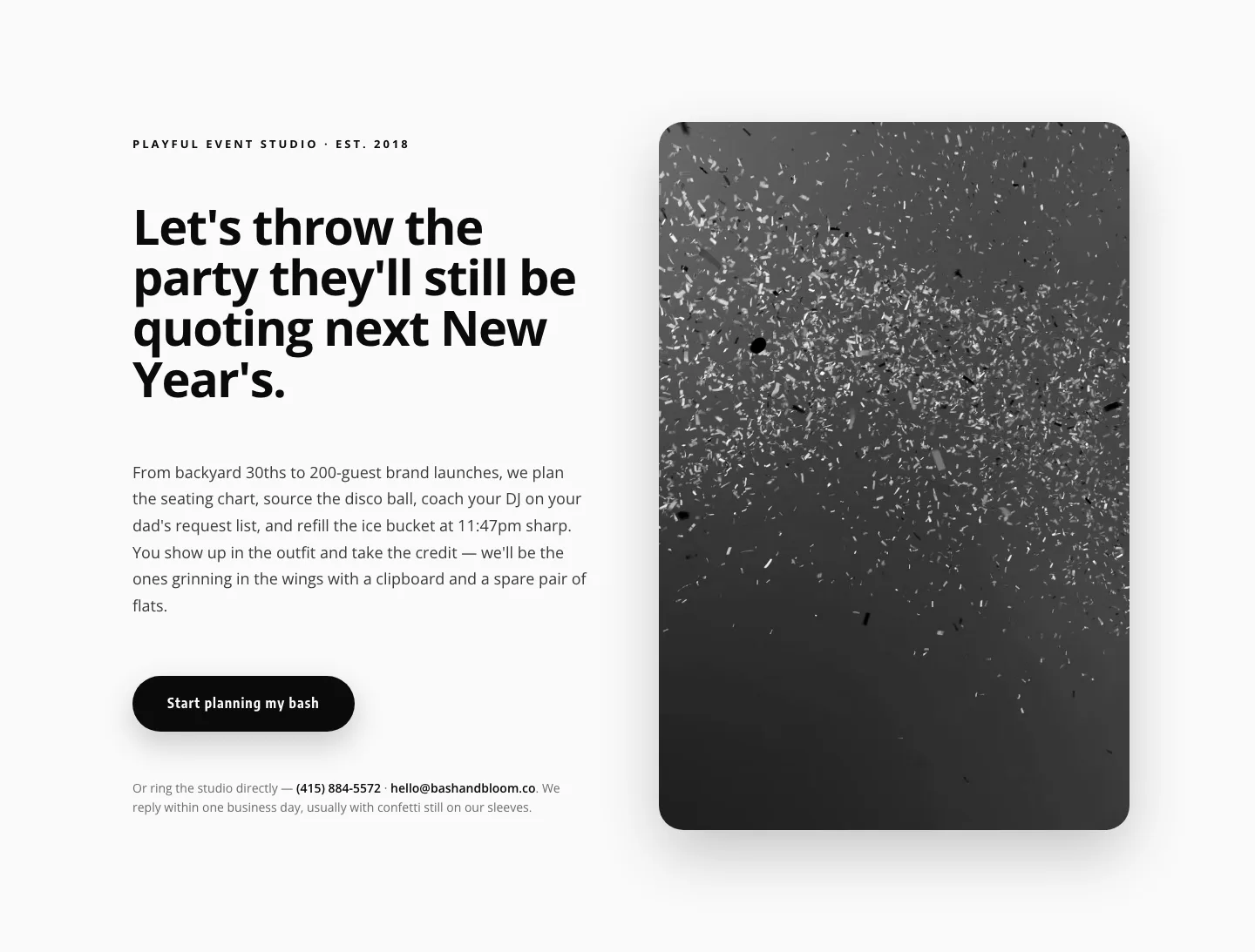
Playful Events CTA Layout for Divi 5: Bash & Bloom
cta · events · playful
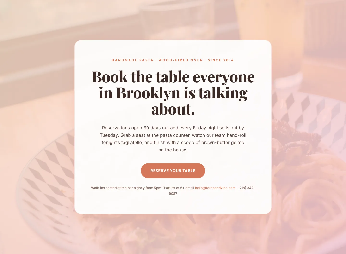
Bold Restaurant Reservation CTA: Divi 5 Layout
cta · restaurant · bold

Bold Purple SaaS CTA Banner: Full-Bleed Divi 5 Layout
cta · saas · bold
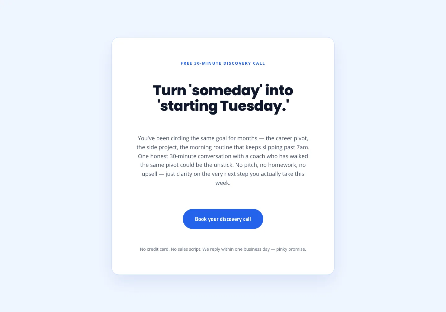
Coaching Discovery Call CTA: Playful Divi 5 Layout
cta · coaching · playful

CTA: Portfolio Bold Blue
cta · portfolio · bold