
Nonprofit Divi 5 Layouts
Nonprofit websites carry a heavier ask than most: convince a stranger to trust you with their money, time, or story in under a minute. The layouts in this niche are built around that emotional arc: from mission clarity to a single, obvious next step. Every section here is validated Divi 5 structure, ready to download and adapt.
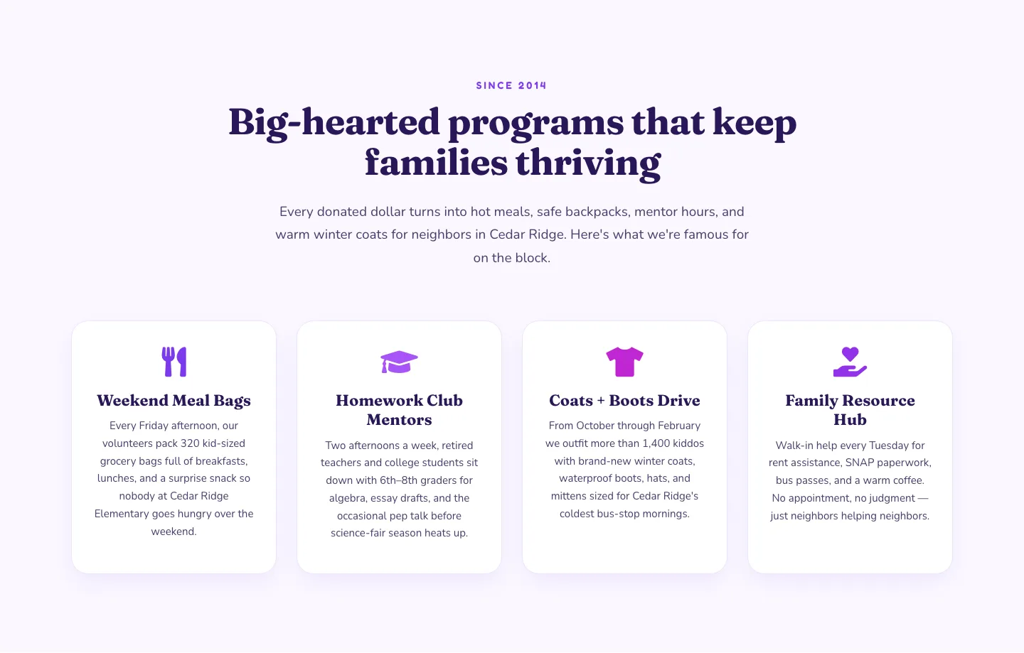
Playful Nonprofit Features Section: Four-Column Icon Cards for Divi 5
features · nonprofit · playful

Ruby Readers Nonprofit Hero: Playful Divi 5 Layout
hero · nonprofit · playful
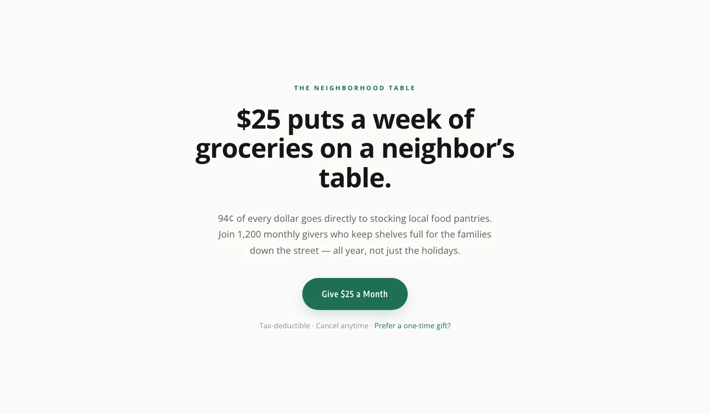
Minimal Nonprofit Donation CTA: Divi 5 Layout
cta · nonprofit · minimal
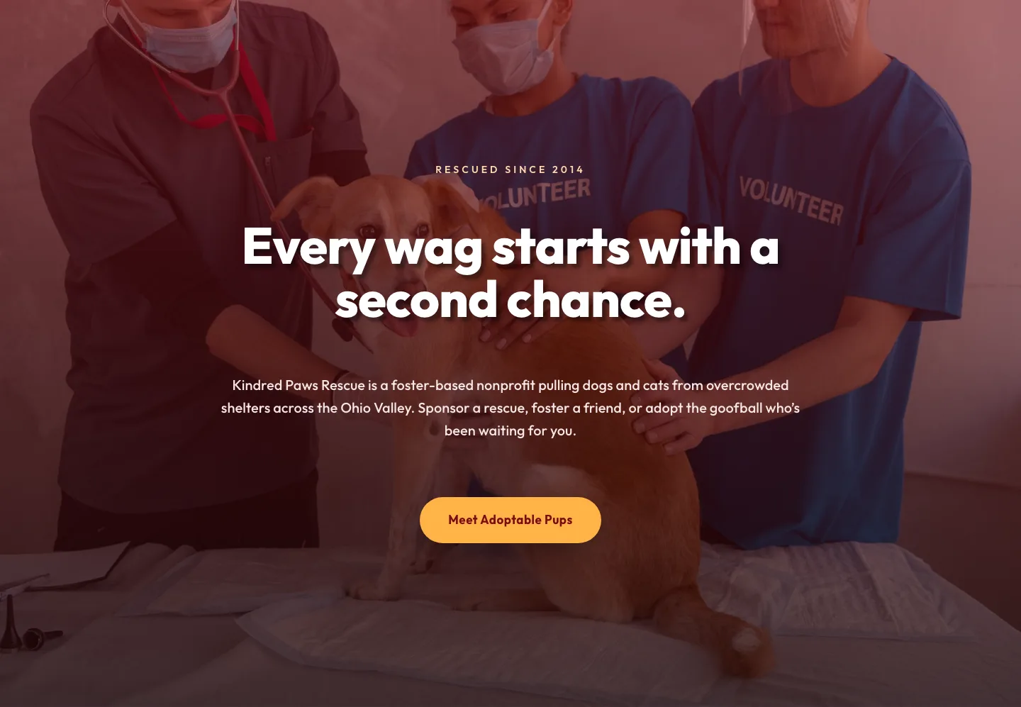
Playful Nonprofit Hero Layout: Kindred Paws Rescue | Divi 5
hero · nonprofit · playful
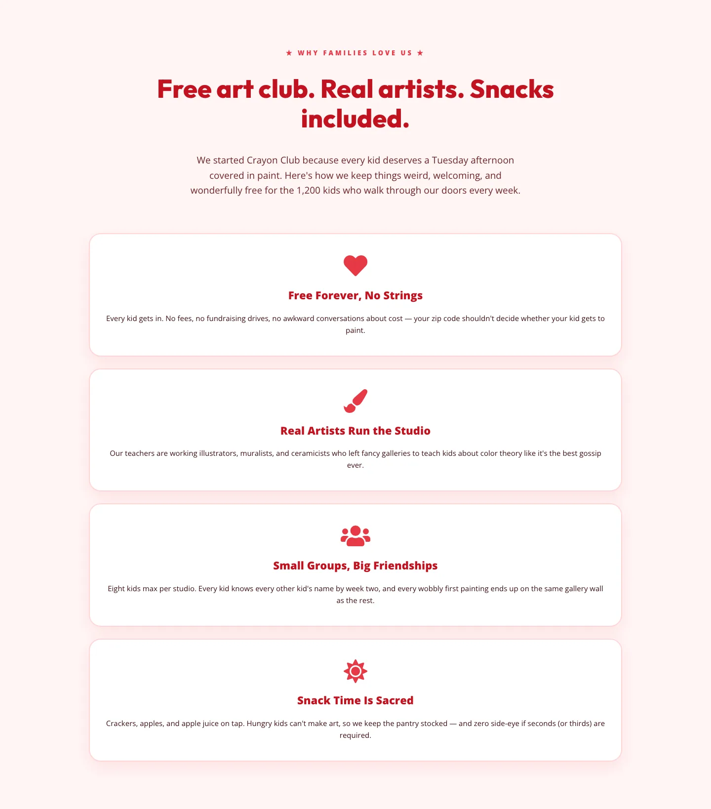
Playful Nonprofit Features Section: 4-Column Crayon Club Layout
features · nonprofit · playful
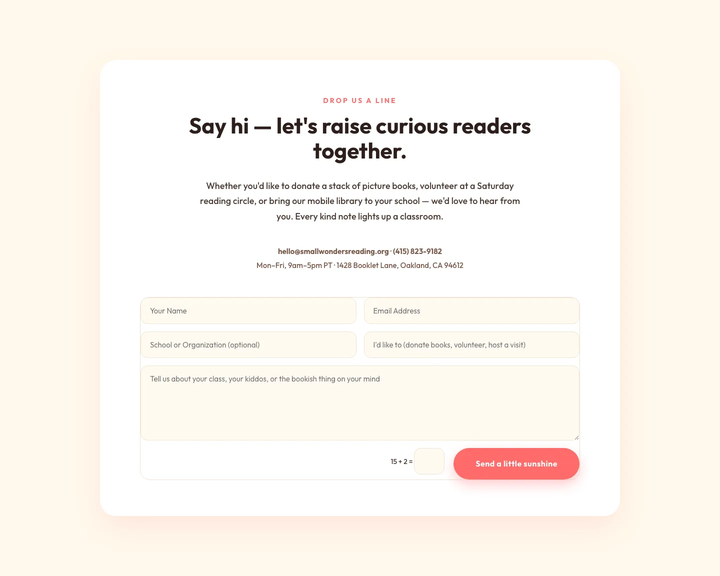
Playful Nonprofit Contact Page Layout for Divi 5: Small Wonders
contact · nonprofit · playful
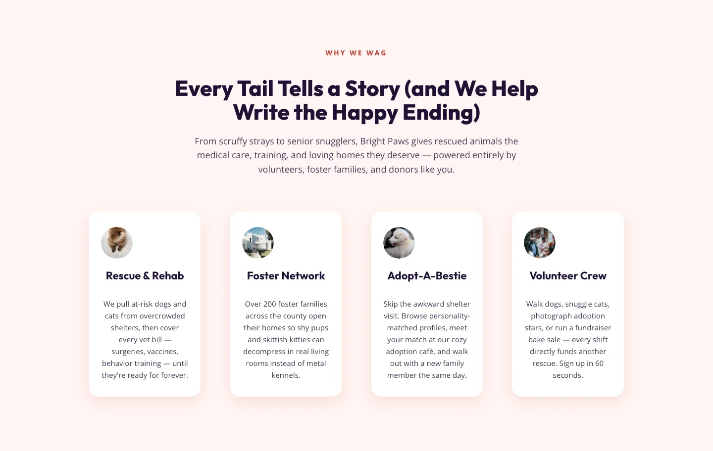
Playful Nonprofit Features Section for Divi 5: Animal Rescue Layout
features · nonprofit · playful
What makes a good nonprofit layout
A great nonprofit page doesn't lead with the organization, it leads with the person it exists to help. The hero shows a real face or a specific outcome, the sub-headline names the problem in plain language, and the primary CTA (donate, volunteer, sign the petition) is impossible to miss on any screen. Below the fold, the page earns trust before it asks: program outcomes as concrete numbers, one story told with real weight, transparency about where dollars go, and endorsements from the people you already serve.
Structurally, the layouts in this category favor generous whitespace, warm photography, and a two-tone accent palette. Usually a grounded neutral plus one hopeful color that gets reserved for the donate button. Sections tend to alternate rhythm: full-bleed image, then a tight text block, then a stat strip, then a story card. That cadence keeps a long page from feeling like a wall.
Who these are for
Board-run charities that need a site in a weekend. Fundraising leads spinning up a campaign microsite. Freelancers building for a food bank, animal rescue, community clinic, faith community, or grassroots advocacy group. Anyone who needs a page that respects the reader's attention and converts without feeling like a sales funnel.
Customizing one in Divi 5
Start by opening the preset library: every module in these layouts uses Divi 5 presets, so recoloring the CTA button once updates it site-wide. Swap the palette in the theme builder's global colors: change the accent to your brand's donation color, and the neutral to match your printed materials. Replace the hero image with a real photo from your programs (stock people undermine the whole point). For the impact-numbers section, edit the counters in place: keep them specific ("1,247 meals served in June") rather than rounded.
Copy is where nonprofit layouts live or die. Rewrite the story block to name a single person, one moment, and one outcome. Cut adjectives. Keep the donate CTA to two or three words. If you're running a capital campaign, duplicate the pricing-style section and repurpose it as giving tiers with named levels.
Every layout here is a free download behind an email capture, ships with a commercial license for client work, and has been validated against Divi 5's structure so it imports cleanly the first time.