
Ruby Readers Nonprofit Hero: Playful Divi 5 Layout
Warm, playful Divi 5 hero for youth literacy and nonprofit sites: bold headline, sponsor CTA, and contact details on a red gradient background.
Rate this element
Download this section, free
- Divi 5 JSON, imports in seconds
- Commercial license included
- No account needed
Click to view the full page
Overview
The section stacks vertically inside a 920px centered row over a full-bleed Pexels photograph, then washes the image with a top-to-bottom red gradient (from rgba(176,30,46,0.82) to rgba(48,8,14,0.94)) so the photo stays visible but the copy always wins the contrast fight. Padding runs a generous 160px top and bottom on desktop, tapering to 110px on tablet and 90px on phone, which keeps the hero cinematic on big screens without eating a phone's entire viewport.
Hierarchy is deliberately five-step: a small 13px letter-spaced Outfit eyebrow ("SINCE 2014 - A YOUTH LITERACY NONPROFIT"), a display headline set at 72/52/38px across desktop, tablet, and phone with a tight 1.05em line-height and an 800 weight, a 20px supporting paragraph capped at 720px so lines never sprawl, a rounded pill CTA (999px radius) in white on ruby red, and a final 14px fine-print block for the story-hour address, phone, and an inline email link. Every text module is centered by explicit textAlign and lives inside a single flex column with alignItems: center, so nothing needs Divi row-column gymnastics to stay put.
The palette is intentionally monochromatic-red: deep ruby dominates the background, warm pink tints (#FFD9DE, #FFEDEF) carry the eyebrow and body so smaller copy feels warm rather than washed out, and pure white anchors both the display headline and the CTA. On phone the column flex-direction stays column and the padding drop protects the hero from feeling cramped: realistically the buyer only has to swap the photo, the words, and the button link before this is a live nonprofit landing hero.
What’s inside
- Full-bleed background image with a 180° ruby-to-crimson gradient overlay (82–94% opacity) applied on the section itself
- Letter-spaced 13px Outfit eyebrow heading for a "since / est." credit line above the display type
- Responsive display headline stepped 72 / 52 / 38px across desktop, tablet, and phone with 1.05em line-height and 800 weight
- Supporting paragraph module capped at a 720px max-width so lines break at a comfortable reading measure
- Pill-shaped CTA button (999px border-radius) with a preset-2 box-shadow that deepens on hover
- 14px fine-print Text module with a styled `<a>` link (white → soft pink on hover) for phone + email
- 920px centered row with tapered section padding, 160px / 110px / 90px across desktop / tablet / phone
- Single flex column with `alignItems: center`, every module is centered without extra sub-rows
Who it’s for
This is calibrated for warm, mission-driven organizations that want a hero that feels bright rather than corporate. It's especially at home for youth literacy programs, mentoring and after-school groups, community book drives, and family services nonprofits. Anything that wants a big warm headline and one clear donate or sign-up ask. The playful ruby palette also translates well for church outreach, food banks, small foundations, and grassroots campaigns launching a landing page or a one-off donation drive. Because the fine-print module already accommodates a phone number, email, and physical location, it fits organizations that still take walk-ins or run live programming (story hours, tutoring sessions, drop-in centers), not just online-only nonprofits.
Customization tips
Swap the Pexels URL on the section background for your own photo, landscape 940×650 or larger works cleanly; anything portrait-oriented will crop unevenly on desktop. Because the red gradient runs at 82–94% opacity, busy or low-contrast photos still read well, so you can be generous with what you upload. To rebrand quickly, edit the two gradient stops in the section background: change #B01E2E and #30080E to your primary and its darker sibling, then update the button's text color to match the new primary. The headline hits its rhythm at roughly 40–60 characters, much longer and the tight 1.05em line-height starts to feel dense. Keep the supporting paragraph under ~240 characters so the 720px max-width still breaks into two comfortable lines. The button label is snug at ~26 characters ("SPONSOR A READER - $18/MO" fills the pill exactly); longer copy will bulge the shape. The fine-print module is the natural place to drop office hours, a second contact, or a legal line without competing with the CTA.
How to install this layout
- Download the layout JSON file from this page.
- Open the target page in the Divi 5 builder.
- Open the portability panel (up/down arrows icon) and choose the Import tab.
- Upload the JSON. Tick “replace existing content” only for full-page imports.
- Check the page at desktop and mobile widths, then swap in your copy and images.
Full walkthrough with troubleshooting: How to Import a Divi 5 Layout.
Questions about Ruby Readers Nonprofit Hero: Playful Divi 5 Layout
How does the ruby background photo behave on smaller screens?
The Pexels image is set on the section itself, so it scales with the viewport rather than being tied to a fixed height. The 82–94% red gradient overlay stays put across breakpoints, which keeps the text readable even if the image reframes on mobile. If your photo has a critical subject on one side, favor something centered. No focal-point control is set on this module.
Can I move the fine-print block above the button instead of below?
Yes: inside the column, drag the second Text module above the Button module. The layout is a single flex column with everything centered, so reordering doesn't break the spacing. You'll want to trim the bottom margin on whichever module now ends the stack so the section doesn't feel bottom-heavy.
What Divi modules is this actually built from?
Two Heading modules (the eyebrow and the display headline), two Text modules (the supporting paragraph and the fine-print block with a mailto link), and one Button module. All inside a single one-column Row and one Section. No third-party plugins or custom code.
The headline breaks awkwardly on small phones, what do I edit?
The phone size is already stepped down to 38px, but the sweet spot depends on your copy. Either shorten the headline (aim for ~40–50 characters), lower the phone font-size further on the Heading module, or nudge the phone section padding from 20px down toward 16px to give the words more horizontal room.
What should I edit first before showing this to a client?
Four things in order: the section background image URL, the eyebrow tag copy, the headline and paragraph, and the button label plus its link. Everything else (palette, spacing, hierarchy) will hold up while you're iterating on messaging.
Which Divi version does this layout need?
Divi 5. The layout is generated natively for Divi 5 and validated against its real module structure before publication, so it imports clean into the current builder.
Can I use this layout on client websites?
Yes. Every download includes a commercial license covering unlimited sites you own or build for clients. Only reselling or redistributing the layout file itself is prohibited.
More hero sections
Browse all hero sections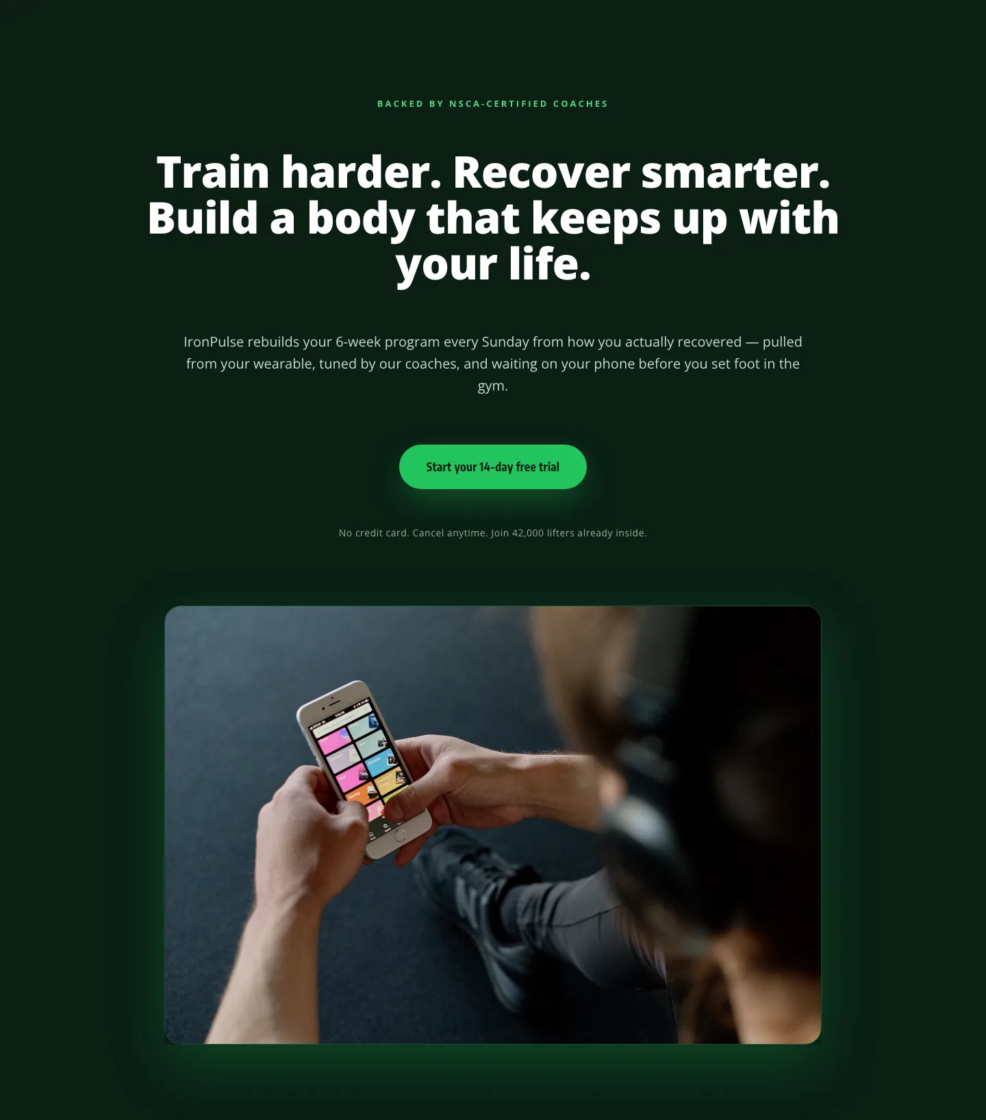
Bold Fitness App Hero Layout for Divi 5: IronPulse Adaptive Training
hero · fitness · bold
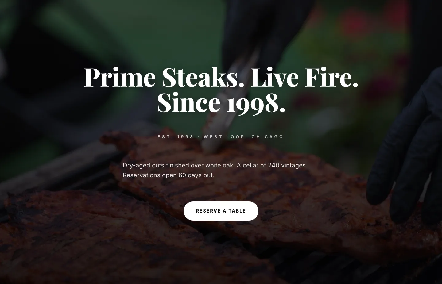
Prime Steaks Hero Section: Bold Monochrome Restaurant Layout for Divi 5
hero · restaurant · bold
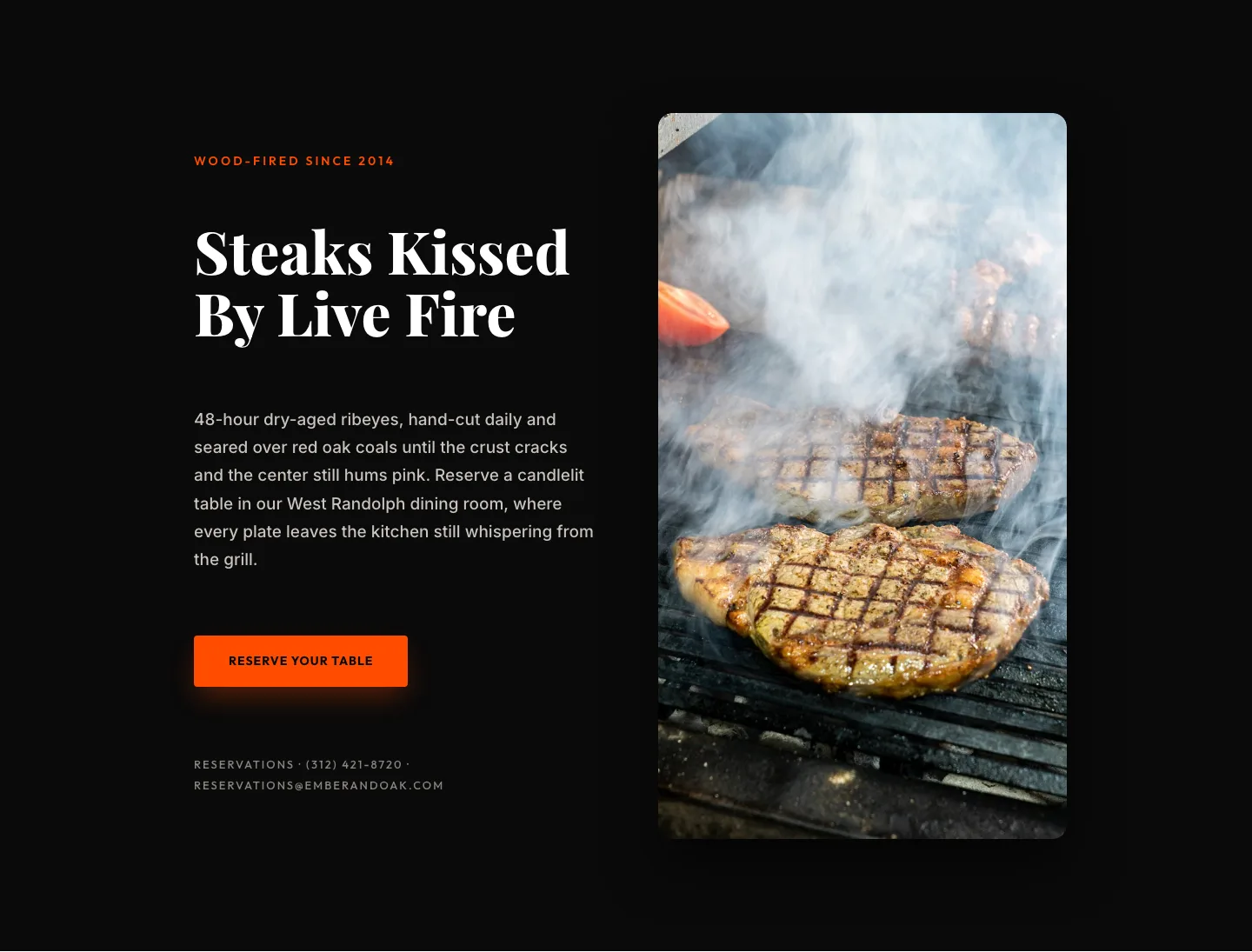
Wood-Fired Steakhouse Hero Layout for Divi 5: Bold Restaurant Template
hero · restaurant · bold
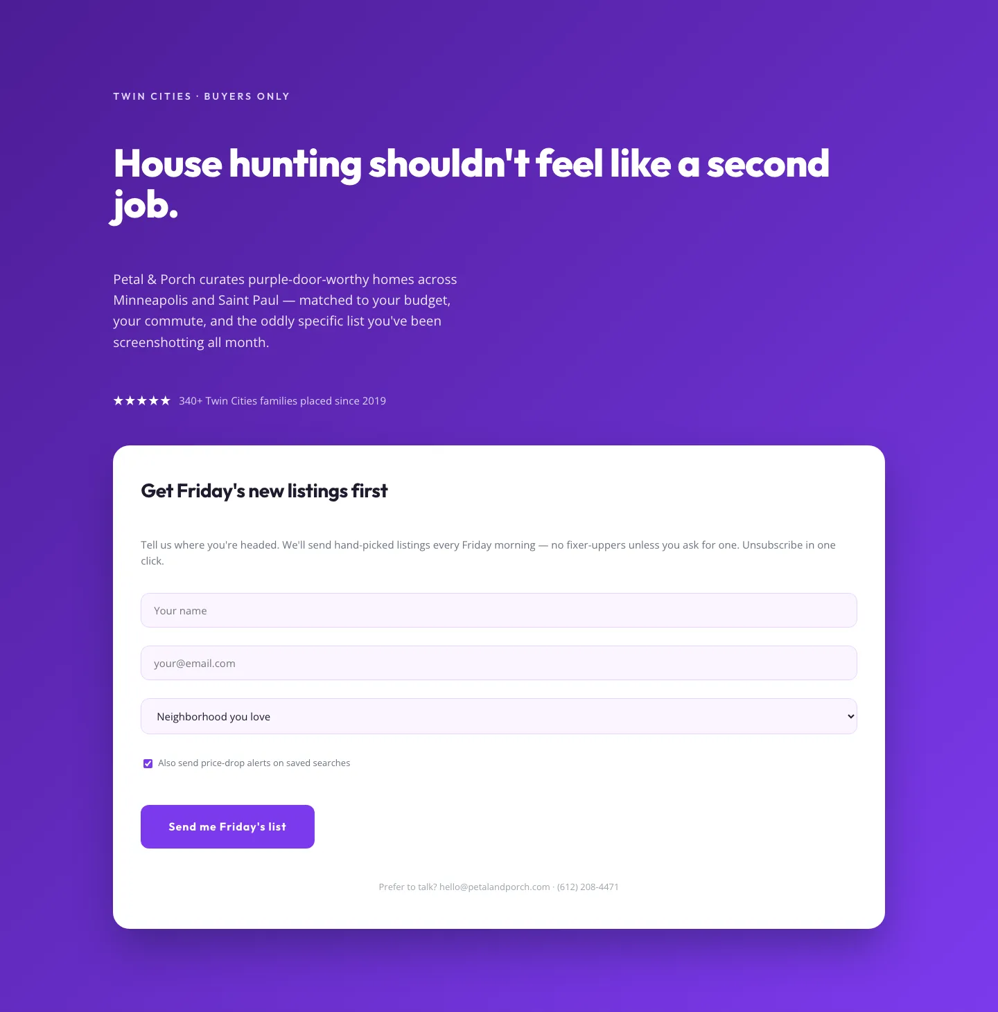
Playful Real Estate Hero with Weekly Listings Signup: Divi 5 Layout
hero · real_estate · playful
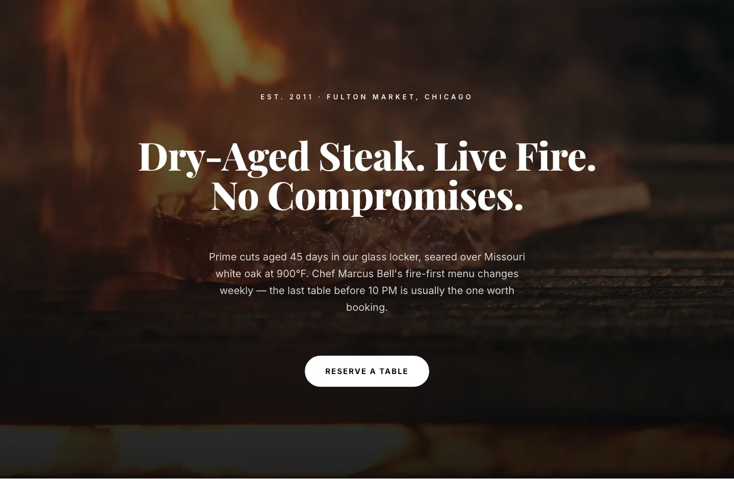
Bold Steakhouse Hero Layout for Divi 5: Fire & Dry-Aged
hero · restaurant · bold
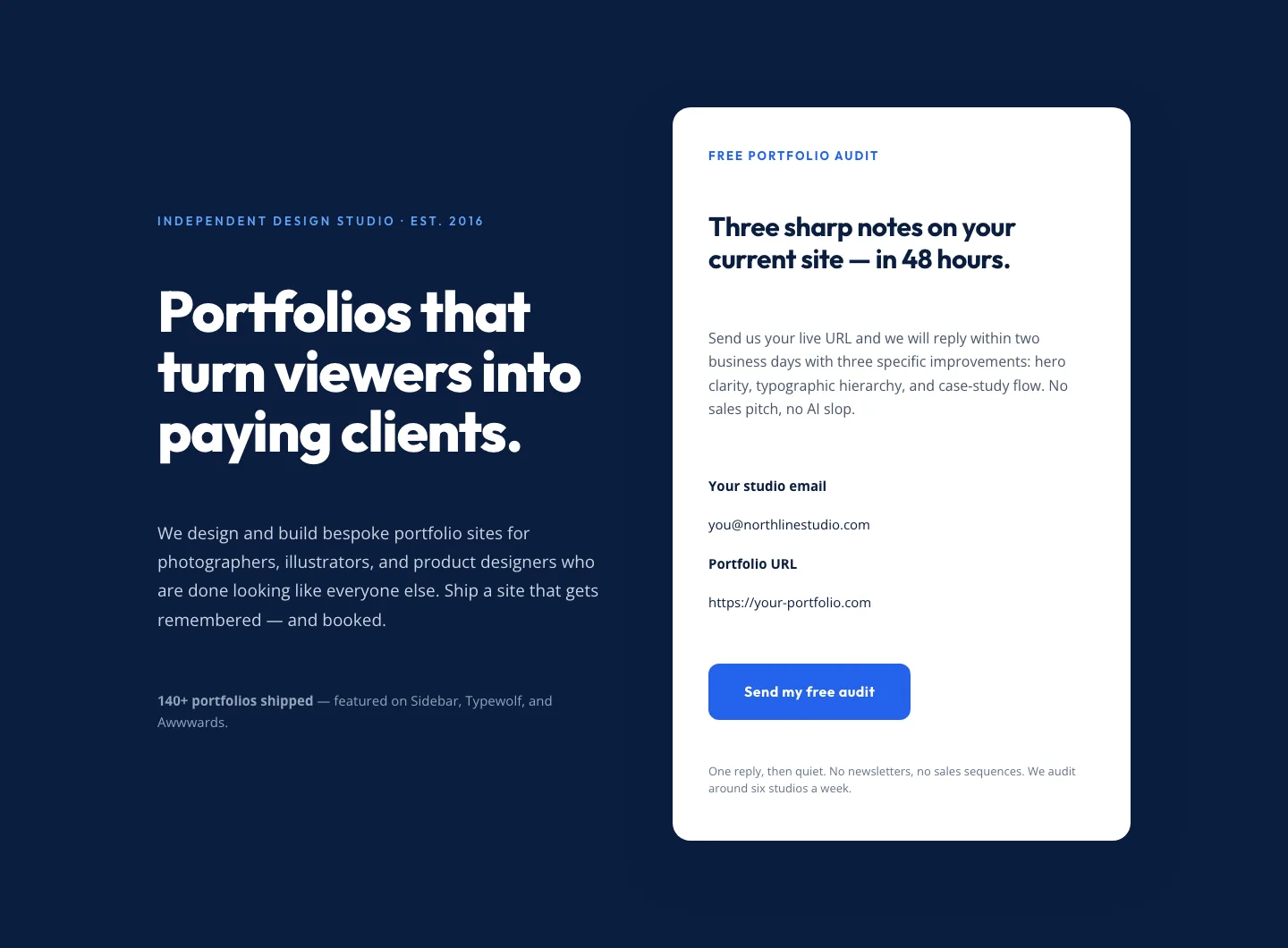
Bold Portfolio Hero with Free Audit Sign-up: Divi 5 Layout
hero · portfolio · bold