
Bold Portfolio Hero with Free Audit Sign-up: Divi 5 Layout
Bold split-screen Divi 5 portfolio hero pairing a confident studio headline with a free audit sign-up card. Perfect for designers, photographers, and creative agencies.
Rate this element
Download this section, free
- Divi 5 JSON, imports in seconds
- Commercial license included
- No account needed
Click to view the full page
Overview
A split hero built around a single conversion moment: the left half sells the studio, the right half captures the lead. The section sits on a deep navy (#0b1e3f) with a generous 120px top-and-bottom pad, so it reads as a full first screen without wasting vertical space on decoration. The row is capped at 1200px and centered, with a 64px column gap that keeps the two halves feeling like distinct panels rather than a crowded form.
On the left, the hierarchy is deliberate and tight: a small blue eyebrow (#60a5fa, uppercase, 3px letter-spacing) establishes category, an 800-weight 64px Outfit headline (-1.5px tracking, 1.05 line-height) delivers the promise, and a 19px paragraph in cool gray (#cbd5e1) at 1.7 line-height carries the pitch without shouting. A final muted credibility line in #94a3b8 closes the block. Every step down in size is matched by a step down in weight and contrast, so the eye lands on the headline first and the CTA card second.
The right column is a white card with a 20px radius and a soft, dark-tinted drop shadow (rgba(11,30,63,0.35), 24px vertical, 60px blur) that lifts it off the navy without going glossy. Inside, the same eyebrow → headline → body rhythm repeats at smaller scale (30px headline in #0b1e3f), followed by two form-field labels and a solid blue button (#2563eb, hover #1d4ed8, 12px radius) that inherits the accent color from the left column's eyebrow. The palette does the color-tying work.
On phone, the row's flexDirection flips to column and both columns stretch to full width (24_24), so the pitch stacks above the audit card in reading order. The 32px horizontal row padding keeps the white card from touching the screen edge on small viewports, and the 48px row gap gives the stacked layout breathing room.
What’s inside
- Two-column split hero at 1_2 / 1_2, capped at 1200px and centered on the page
- Left column: uppercase eyebrow, 64px headline, 19px body paragraph, and a bolded credibility line
- Right column: a white card with 20px radius and a dark-tinted preset-3 shadow (24px offset, 60px blur)
- Inline sign-up card with an eyebrow, a 30px prompt headline, a 48-hour promise paragraph, and two field labels
- One solid blue CTA button (`#2563eb` → hover `#1d4ed8`, 12px radius, Outfit 700) as the single action
- Reassurance micro-copy under the button explaining the reply cadence: no newsletter, no sequence
- Navy `#0b1e3f` section background with a blue `#2563eb` / `#60a5fa` accent shared across both columns
- Mobile behavior: row flips to `flexDirection: column`, both columns become full-width (`24_24`)
Who it’s for
Independent studios and freelancers whose homepage needs to do two jobs at once: introduce the practice and open a lightweight conversation. It fits portfolio-driven services best (design studios, photographers, illustrators, product and motion designers, brand consultants, and small architecture or interiors practices) where a "free audit," "portfolio review," or "discovery call" is the natural first step. It also works for coaches, copywriters, and boutique agencies that pitch a specific short-form deliverable (a teardown, a critique, a strategy note) instead of a generic contact form. If you sell taste and turnaround, the split layout gives you room to prove one on the left and offer the other on the right.
Customization tips
Change the palette at the section and card level: swap #0b1e3f on the section background for your brand's dark tone, and update the two blues (#60a5fa eyebrow on the left, #2563eb eyebrow + button on the right) together so the accent still ties the two columns. The white card reads well on any dark base: if you go lighter than navy, deepen the shadow color so it still lifts. Copy limits matter here: keep the main headline under ~55 characters so it stays on two lines at 64px, hold the left paragraph to two sentences, and keep the card headline to a single line at 30px. The audit description reads best around 30–40 words. The button label works up to about 22 characters before it wraps. There are no images in this section, so most of your work is typographic: if you want a portrait or logo, add it above the eyebrow in the left column with a small bottom margin. On phone, test the stacked order: the pitch should feel complete before the card appears.
How to install this layout
- Download the layout JSON file from this page.
- Open the target page in the Divi 5 builder.
- Open the portability panel (up/down arrows icon) and choose the Import tab.
- Upload the JSON. Tick “replace existing content” only for full-page imports.
- Check the page at desktop and mobile widths, then swap in your copy and images.
Full walkthrough with troubleshooting: How to Import a Divi 5 Layout.
Questions about Bold Portfolio Hero with Free Audit Sign-up: Divi 5 Layout
Does the sign-up card actually collect emails?
Not on its own: the card uses styled text blocks to render the field labels and a Divi Button, so the visual is production-ready but you'll need to wire it to a real form (Bloom, a Divi contact form module, Fluent Forms, ConvertKit, etc.) by replacing the two label text modules and the button with your form of choice. The layout gives you the frame; you bring the plumbing.
How does the two-column split behave on tablet and phone?
The row is set to wrap and centers its items, so on narrow tablets the two halves stay side-by-side until they can't fit, then reflow. On phone the row explicitly switches to `flexDirection: column`, and both columns snap to `24_24` (full width) so the pitch stacks above the white card in reading order with a 48px gap between them.
What should I edit first?
In order: the left headline, the left paragraph, the card headline ("Three sharp notes…"), the audit description, and the button label. Then the two eyebrows and the credibility line under the paragraph. The colors and spacing are already tuned to work together, most sites can ship with only copy changes and a palette swap.
Are there any images or icons in this section?
No. It's a pure typographic hero. That's intentional: the white card carries the visual weight against the navy background, and there's no photo to art-direct or replace. If you want to add a portrait, logo lockup, or client-logo strip, the left column has room above the eyebrow or below the credibility line.
Why is the CTA card so large, can I make it a simple button instead?
The card is doing the job of an inline lead-capture form, so it's sized to compete with the headline for attention rather than sit beside it as a secondary action. If you'd rather link out to a dedicated audit or booking page, delete the two label text modules and shorten the description; the card will collapse to a compact CTA panel without breaking the split layout.
Which Divi version does this layout need?
Divi 5. The layout is generated natively for Divi 5 and validated against its real module structure before publication, so it imports clean into the current builder.
Can I use this layout on client websites?
Yes. Every download includes a commercial license covering unlimited sites you own or build for clients. Only reselling or redistributing the layout file itself is prohibited.
More hero sections
Browse all hero sections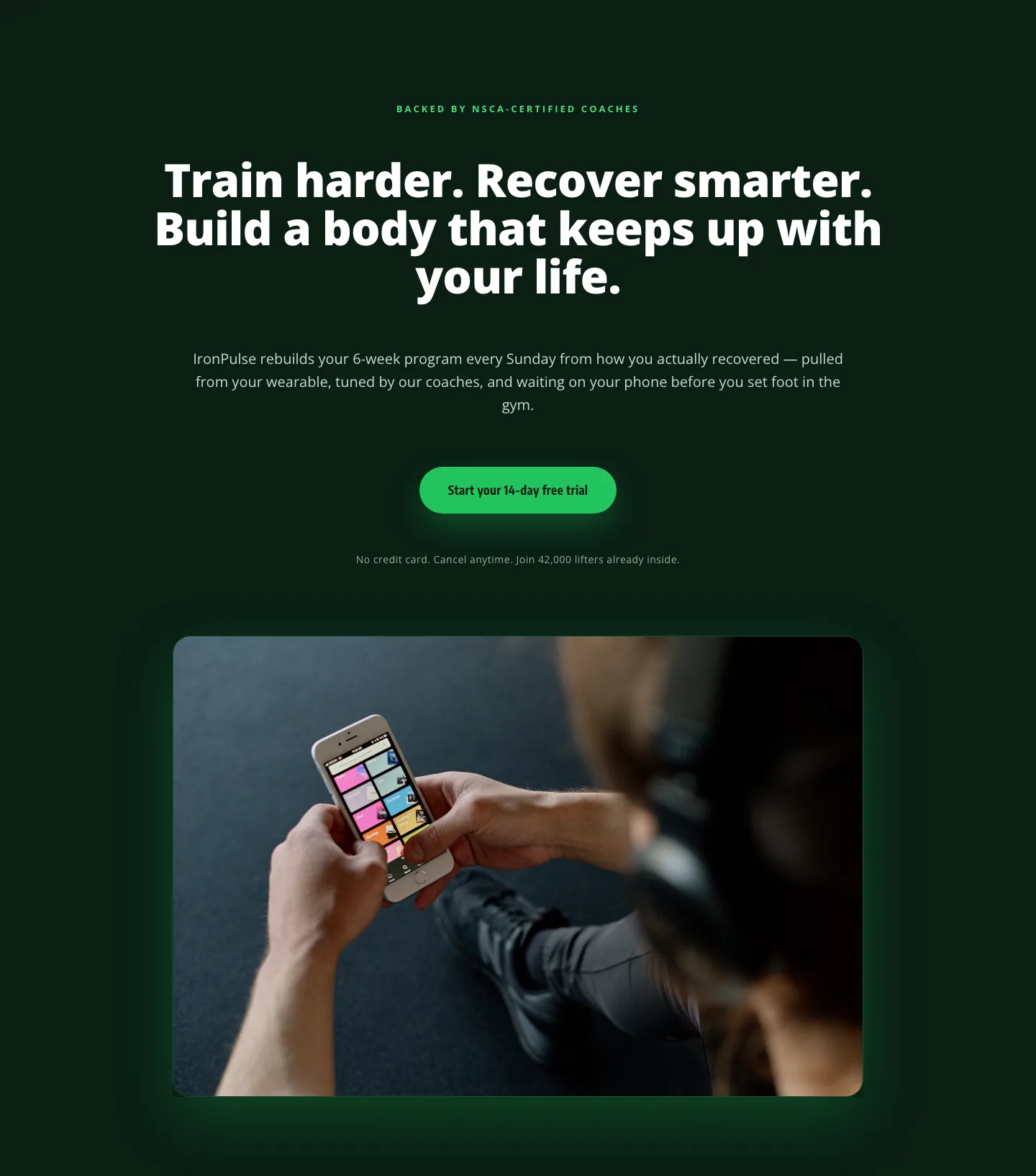
Bold Fitness App Hero Layout for Divi 5: IronPulse Adaptive Training
hero · fitness · bold
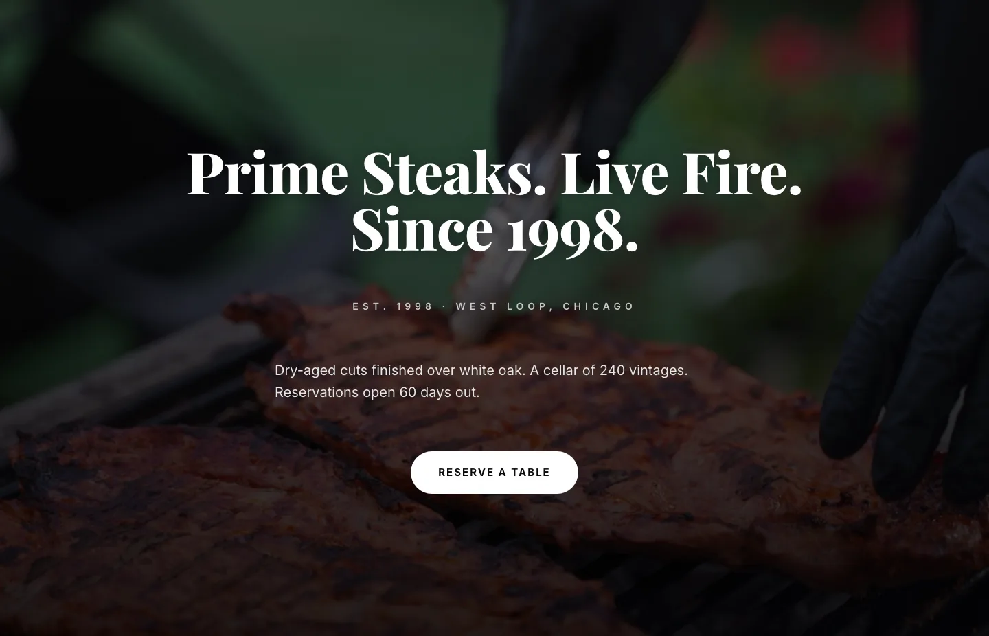
Prime Steaks Hero Section: Bold Monochrome Restaurant Layout for Divi 5
hero · restaurant · bold
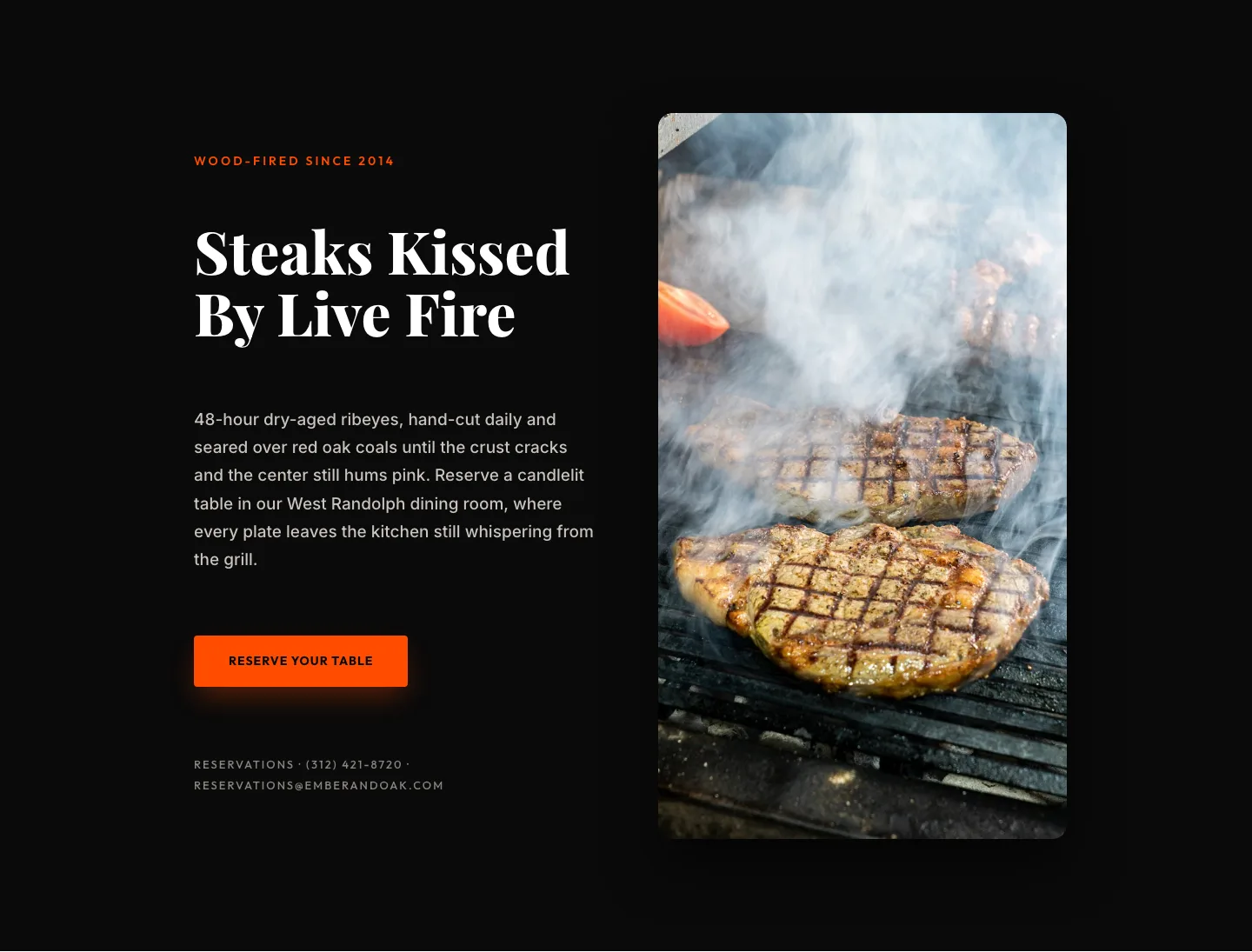
Wood-Fired Steakhouse Hero Layout for Divi 5: Bold Restaurant Template
hero · restaurant · bold
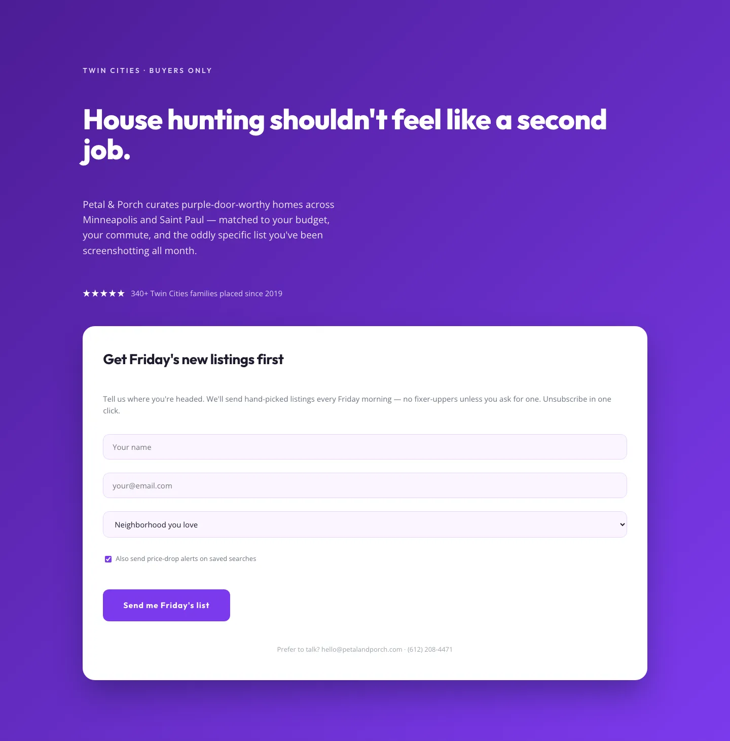
Playful Real Estate Hero with Weekly Listings Signup: Divi 5 Layout
hero · real_estate · playful
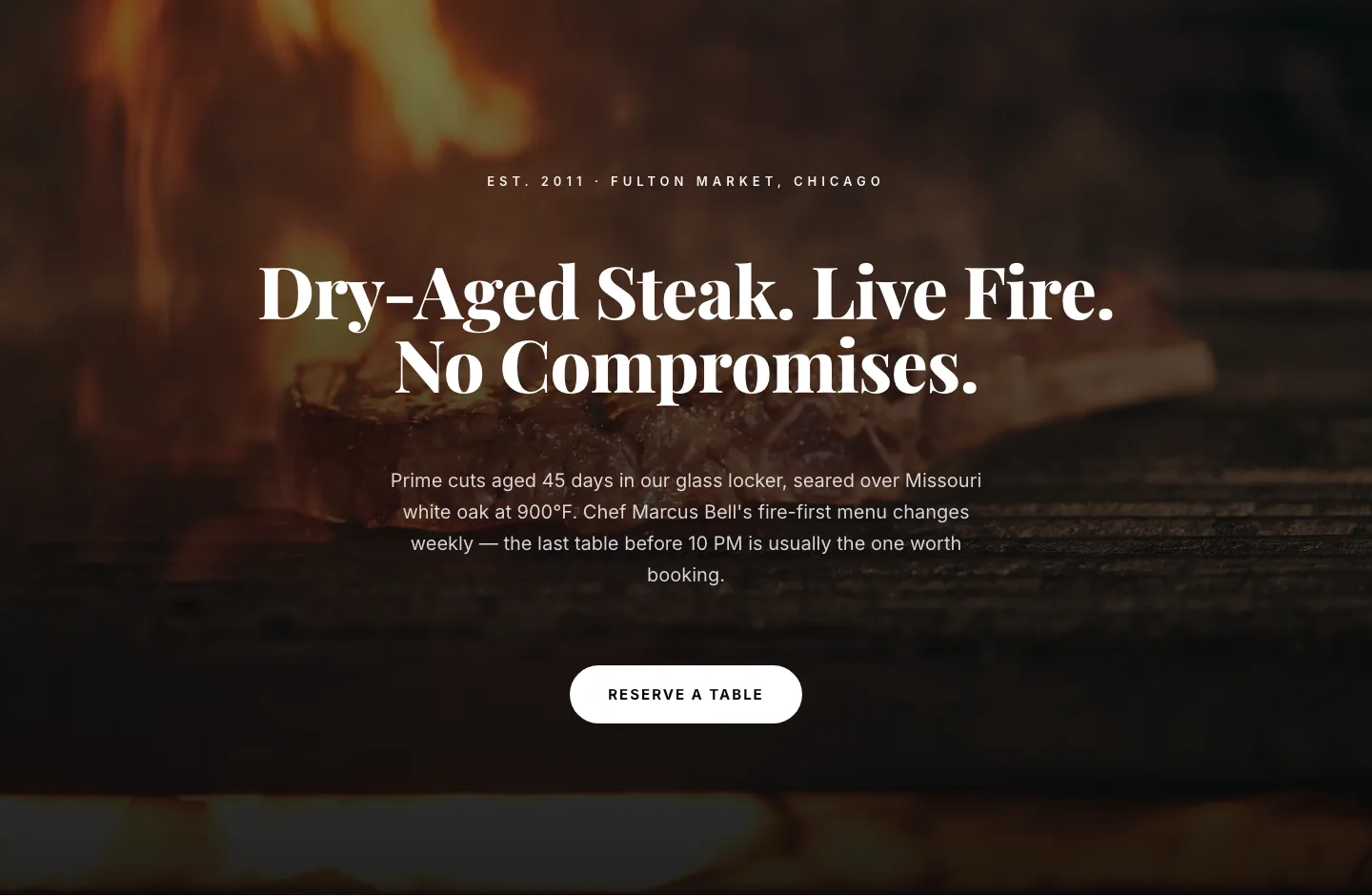
Bold Steakhouse Hero Layout for Divi 5: Fire & Dry-Aged
hero · restaurant · bold
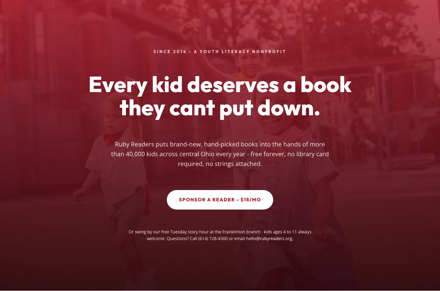
Ruby Readers Nonprofit Hero: Playful Divi 5 Layout
hero · nonprofit · playful