
Bold Fitness App Hero Layout for Divi 5: IronPulse Adaptive Training
High-impact Divi 5 hero section for fitness apps and coaching brands. Bold green-on-dark design with headline, trust badge, CTA, and app screenshot.
Rate this element
Download this section, free
- Divi 5 JSON, imports in seconds
- Commercial license included
- No account needed
Click to view the full page
Overview
This is a single-column, centered hero built on a deep forest-green canvas (#0a1f14) with a neon-lime accent (#22c55e on the button, #4ade80 on the eyebrow, #c9dcd0 on the sub-headline). The section runs 140px of top padding and 110px of bottom padding on desktop, collapsing to 80/64px on phone, so it breathes on large screens without eating the fold on mobile. The row is capped at 1120px so the layout stays readable on ultrawide displays.
Hierarchy is deliberate and tight. A 13px uppercase eyebrow in lime with 3px letter-spacing (Backed by NSCA-certified coaches) sets credibility, followed by an 800-weight, 64px white headline with a -1px tracked, 1.05 line-height: the kind of dense, punchy display type the fitness category expects. On phone the headline drops cleanly to 38px / 1.1 line-height, and the sub-headline steps from 20px to 17px and loses its 8% side padding so the copy fills the viewport. Below the copy sits a pill-shaped CTA (fully 999px radius) with a soft green glow (0px 18px 48px rgba(34,197,94,0.35)), a 14px reassurance line (No credit card. Cancel anytime.), and a rounded, framed hero image capped at 960px wide with a matching green shadow.
On mobile the row switches to flexDirection: column, everything center-aligns from the parent column's flex settings, and the image scales down inside its 24px rounded border. It's a single-viewport composition (no columns to reflow, no floats to break) which is why it holds up on narrow screens without extra rules.
What’s inside
- Native Divi 5 blocks only: Section → Row → Column with Text, Heading, Button and Image modules. No third-party plugins or shortcodes
- Uppercase eyebrow credibility line (13px, 3px letter-spacing) styled for badges like certifications, awards or press mentions
- Display headline preset at 64px / 800 weight desktop, auto-scaling to 38px on phone with tightened line-height
- Sub-headline text module with 8% horizontal padding on desktop that resets to 0% on phone for full-width readability
- Pill-shaped primary CTA (999px radius) with hover color swap and a soft green box-shadow glow
- Micro-reassurance text slot beneath the CTA for social proof or risk-reversal copy
- Rounded hero image (24px radius) with a thin lime border and a large green drop-shadow, capped at 960px
- Column-level flex centering plus a `flexDirection: column` phone override so the stack behaves on any width
Who it’s for
Built for fitness and performance brands that need to look energetic without feeling loud: training apps, coaching platforms, gym franchises, hybrid trainers, nutrition programs, recovery services and wearable-adjacent products. The dark forest base with a lime accent reads as premium-athletic rather than budget-gym, so it fits SaaS-style fitness products, subscription coaching, PT businesses opening waitlists, and creators launching an app or program. It also works as a jumping-off point for any dark-mode landing page in the wellness, sports nutrition, endurance-training, or outdoor-gear space where you want a single centered message, one clear CTA, and a hero product shot: the composition is generic enough to re-skin for cycling, running, martial arts or CrossFit brands with a palette swap.
Customization tips
Start with the palette. The section background (#0a1f14), button fill (#22c55e), eyebrow (#4ade80) and sub-headline (#c9dcd0) are the four colors doing the work. Swap them at the module level and the whole hero re-skins in a minute (try a charcoal + orange or navy + cyan variant). Keep the headline to two lines on desktop; more than about 70 characters and the 64px display type wraps into a third line and loses impact. The sub-headline reads best at 25–40 words. Button label should stay under ~28 characters so the pill doesn't stretch awkwardly. The hero image is set to 960px max-width with a 24px radius: feed it a 16:11 or 3:2 landscape shot (app screenshot, product photo, or an action image) at least 1600px wide for retina. If you drop the image entirely, remove the 64px bottom margin from the reassurance text so the section doesn't leave a gap.
How to install this layout
- Download the layout JSON file from this page.
- Open the target page in the Divi 5 builder.
- Open the portability panel (up/down arrows icon) and choose the Import tab.
- Upload the JSON. Tick “replace existing content” only for full-page imports.
- Check the page at desktop and mobile widths, then swap in your copy and images.
Full walkthrough with troubleshooting: How to Import a Divi 5 Layout.
Questions about Bold Fitness App Hero Layout for Divi 5: IronPulse Adaptive Training
What Divi 5 modules does this hero actually use?
Five native modules inside one Section/Row/Column: a Text block for the eyebrow, a Heading, a Text block for the sub-headline, a Button, a small Text block for the reassurance line, and an Image. Everything is stock Divi 5: no code modules, no third-party dependencies.
How does the layout behave on mobile?
The row switches to `flexDirection: column` on phone, section padding drops from 140/110px to 80/64px, the headline steps from 64px to 38px with tighter line-height, the sub-headline goes from 20px to 17px and loses its 8% side padding, and the hero image scales inside its rounded frame. Everything stays center-aligned.
Can I remove the hero image and use just text?
Yes, delete the Image module and reduce the reassurance text's 64px bottom margin to about 20px so the section closes cleanly. The centered column keeps working with copy alone; you may also want to bump the sub-headline width by lowering the 8% left/right padding.
What should I edit first to make it mine?
Three things: the eyebrow (make it your credibility hook, a certification, press quote or user count), the headline (two-line max on desktop), and the button label plus destination. After that, swap the Pexels hero image for your own product shot or lifestyle photo.
What image size and aspect ratio should I use?
The Image module is capped at 960px wide with a 24px border-radius. A 16:11 or 3:2 landscape photo works best. Upload at 1600–1920px wide so it stays crisp on retina, and keep the subject centered. The rounded corners crop the frame slightly.
Does the green glow under the button and image work on light backgrounds?
It's tuned for the dark forest section background. If you re-skin the hero to a light palette, the `rgba(34,197,94,0.35)` glows will look muddy. Drop the box-shadow opacity to around 0.15 or switch to a neutral drop-shadow so the effect stays subtle.
Which Divi version does this layout need?
Divi 5. The layout is generated natively for Divi 5 and validated against its real module structure before publication, so it imports clean into the current builder.
Can I use this layout on client websites?
Yes. Every download includes a commercial license covering unlimited sites you own or build for clients. Only reselling or redistributing the layout file itself is prohibited.
More hero sections
Browse all hero sections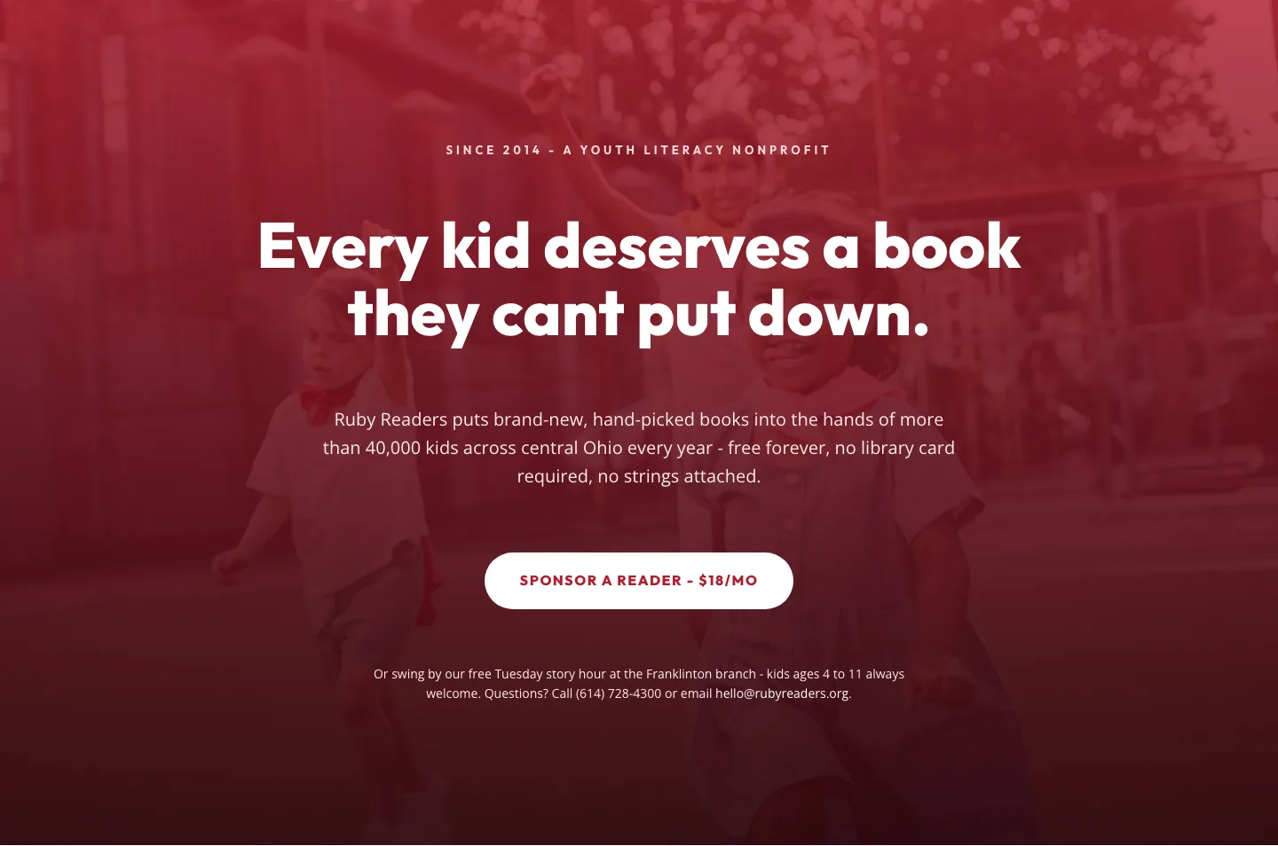
Ruby Readers Nonprofit Hero: Playful Divi 5 Layout
hero · nonprofit · playful
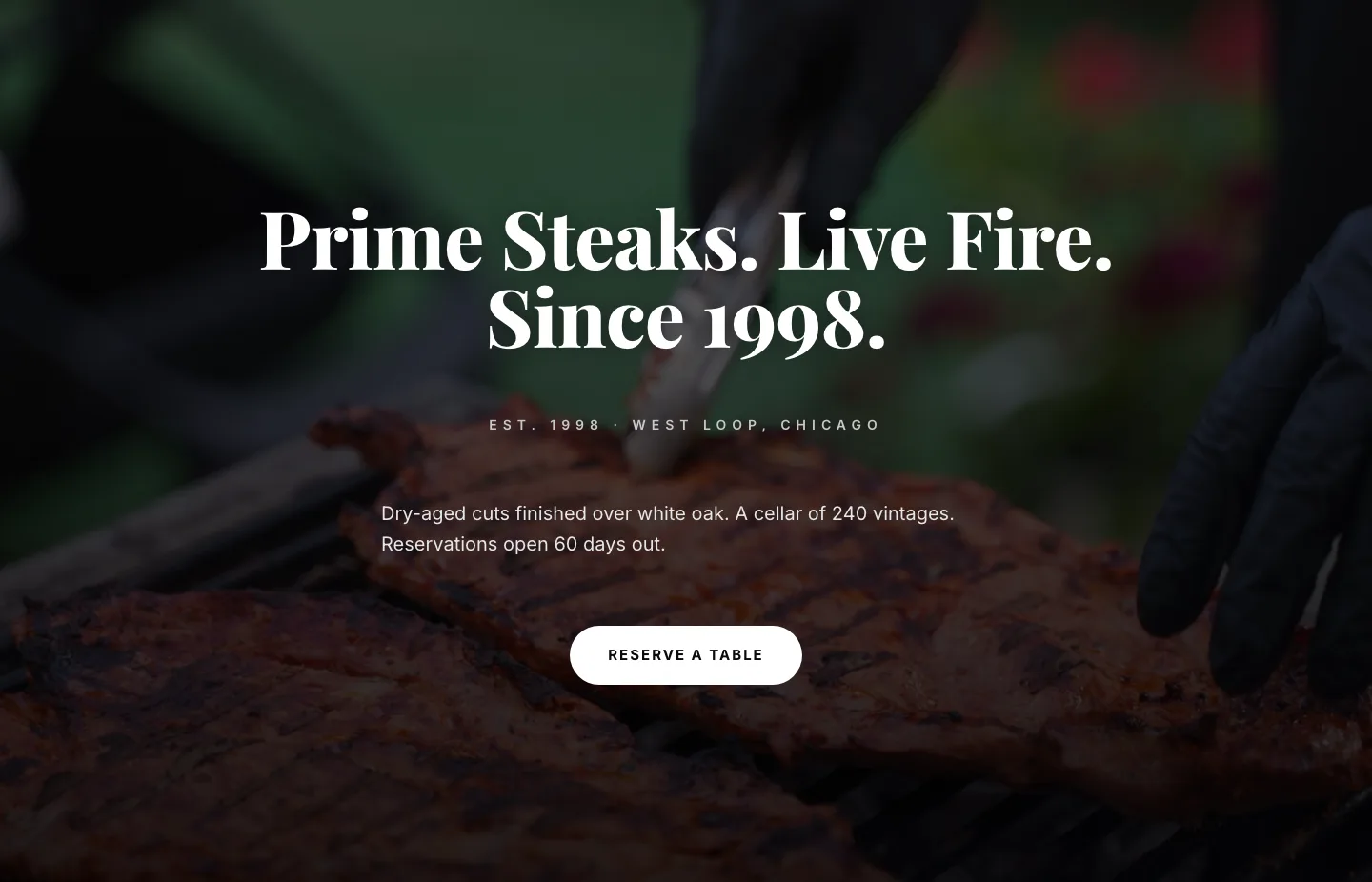
Prime Steaks Hero Section: Bold Monochrome Restaurant Layout for Divi 5
hero · restaurant · bold
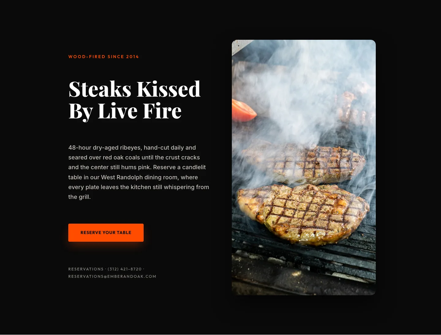
Wood-Fired Steakhouse Hero Layout for Divi 5: Bold Restaurant Template
hero · restaurant · bold
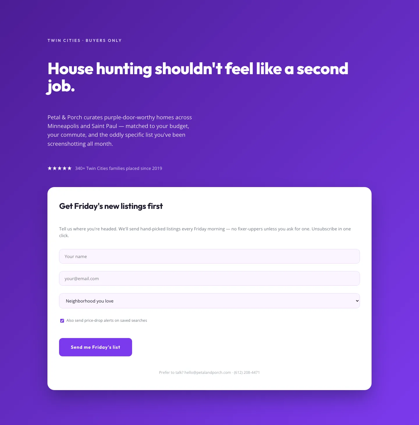
Playful Real Estate Hero with Weekly Listings Signup: Divi 5 Layout
hero · real_estate · playful
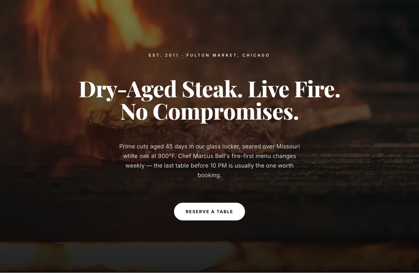
Bold Steakhouse Hero Layout for Divi 5: Fire & Dry-Aged
hero · restaurant · bold
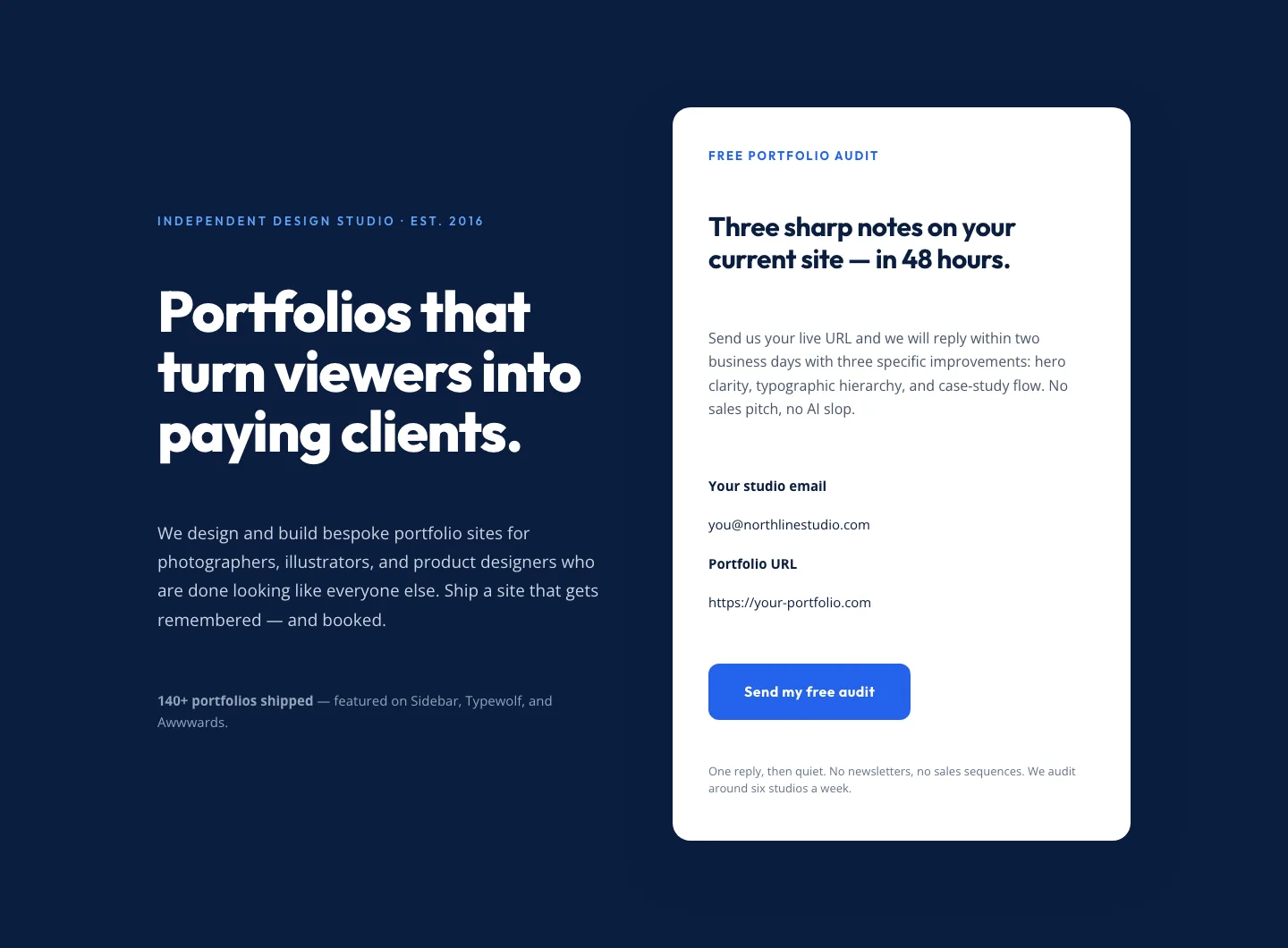
Bold Portfolio Hero with Free Audit Sign-up: Divi 5 Layout
hero · portfolio · bold