
Bold Steakhouse Hero Layout for Divi 5: Fire & Dry-Aged
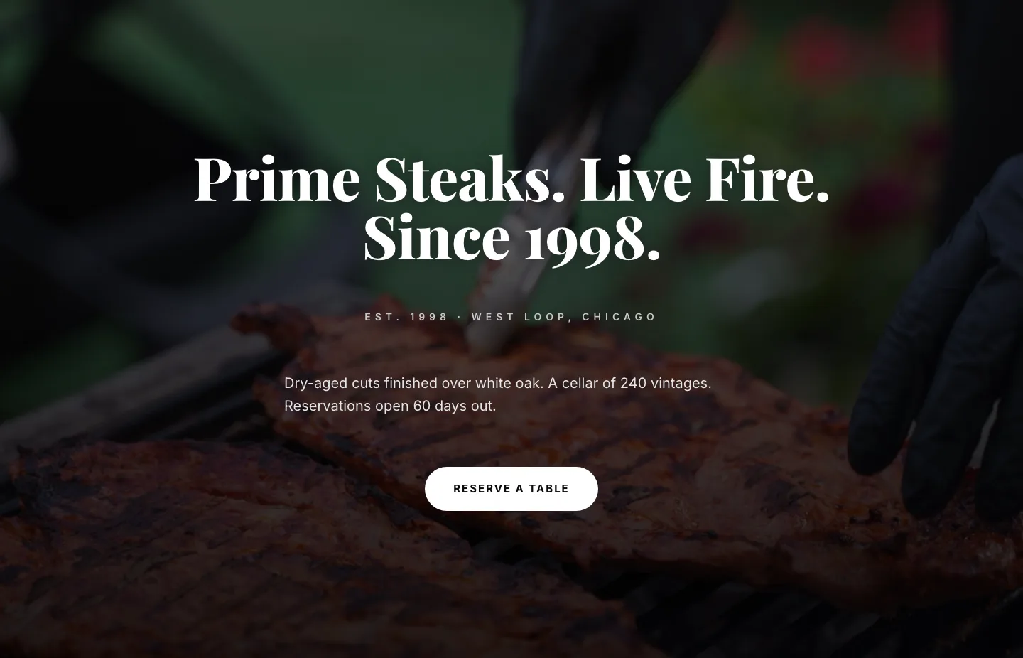
Bold, cinematic Divi 5 restaurant hero: dry-aged steak, live-fire imagery, centered headline, pill CTA. Drop-in section for steakhouses and chef-driven concepts.
Rate this element
Download this section, free
- Divi 5 JSON, imports in seconds
- Commercial license included
- No account needed
Click to view the full page
Overview
The hero centers everything inside a 960px max-width row set over a full-bleed live-fire photograph. A section-level vertical gradient (55% black at the top, 90% at the bottom) sits above the image so the copy stays legible while the flames still read through. The stack runs eyebrow → oversized headline → supporting paragraph → single pill button, each with deliberate breathing room: 24px below the eyebrow, 28px below the H1, 48px above the CTA.
Typography does the heavy lifting. The eyebrow is a 13px uppercase Inter caption with 5px tracking and an off-white color (#f5f5f5). The headline is Playfair Display 800 at 76px with a tight -1px letter-spacing and 1.02em line-height, display type sized to fill the frame without wrapping. Body copy switches to Inter 20px at 82% white for contrast without shouting, and is capped to a 640px measure so lines break at a comfortable ~65 characters. The palette is a near-pure black (#0a0a0a) and white (#ffffff), which lets the fire photograph supply the only real color in the composition.
Every spacing and type token has explicit tablet and phone overrides. Section padding steps down 180 → 120 → 96px vertical as the viewport narrows, the headline scales 76 → 54 → 38px with line-height opening slightly at each break, body copy tightens from 20px to 17px on phone, and the row switches to a column flex direction at phone widths so the centered stack keeps its rhythm inside 20px side gutters. The pill button (999px radius, 44px horizontal padding, preset3 drop shadow) holds its shape across all breakpoints, and its hover state deepens the shadow rather than shifting the button.
What’s inside
- Single-column centered hero built from four native Divi 5 modules (two Heading blocks, one Text block, one Button) inside a 960px max-width Row
- Full-bleed background image slot pre-wired with a two-stop dark gradient overlay (10,10,10 at 55% → 90%) tuned for legibility over any moody photo
- Uppercase eyebrow line with 5px letter-spacing for a location, est-date, or tagline sitting above the H1
- Playfair Display 800 display headline sized 76 / 54 / 38 px with tight tracking already dialed in for desktop, tablet, and phone
- Inter body paragraph capped at a 640px measure at 82% white for a clean two-tier hierarchy against the headline
- Pill CTA (999px radius, 44px horizontal padding, uppercase Inter 700 with 2px tracking) and a preset3 drop shadow that deepens on hover
- Section padding tokens set per breakpoint (180 / 120 / 96 px vertical) so the hero never feels cramped or over-scaled
- Phone-safe layout: Row flex-direction switches to column at phone widths and every font size has an explicit responsive override
Who it’s for
This hero is built for hospitality brands where atmosphere is the pitch and the CTA is a reservation. It's an obvious fit for steakhouses, chophouses, live-fire and wood-oven concepts, whiskey and cocktail bars, private-dining rooms, and chef-led tasting menus. The dark palette and Playfair display face also carry cleanly into fine dining, boutique hotels, wine-focused restaurants, distilleries, private clubs, cigar lounges, and destination supper clubs. Because the entire hero is one eyebrow, one line, one paragraph, and one button, it also works as a standalone reservation landing page for pop-up dinners, chef residencies, wine dinners, or seasonal menus. Anywhere the goal is a single booking action rather than menu browsing.
Customization tips
Swap the background image first. The gradient does most of the legibility work, so any moody photo with darker regions at the bottom third will look right at 940×650 or larger; aim for 16:9 or 3:2. Squarer crops get tight at desktop. To rebrand without redesigning, keep the two-stop gradient and just recolor the stops (a deep burgundy or forest-green sits under the same math). Headline copy is happiest at 4–7 words across one or two lines: the block is sized for a single strong sentence, not a paragraph; past ~9 words the 1.02em line-height will start to feel dense. The eyebrow reads best around 25–35 characters (a location, an est. date, or a tagline). Body copy has room for roughly 25–40 words before the 640px measure adds a fourth line at phone widths. Change the button label freely but keep it to 2–3 words so the pill stays balanced. If you're moving away from a serif brand, swap Playfair for a condensed sans and drop the headline letter-spacing to 0.
How to install this layout
- Download the layout JSON file from this page.
- Open the target page in the Divi 5 builder.
- Open the portability panel (up/down arrows icon) and choose the Import tab.
- Upload the JSON. Tick “replace existing content” only for full-page imports.
- Check the page at desktop and mobile widths, then swap in your copy and images.
Full walkthrough with troubleshooting: How to Import a Divi 5 Layout.
Questions about Bold Steakhouse Hero Layout for Divi 5: Fire & Dry-Aged
How do I replace the background image without breaking the overlay?
The overlay is a section-level gradient with fixed opacity stops (55% at the top, 90% at the bottom), so it renders over whatever image you drop in. Upload your photo to Section → Background → Image, keep size on "cover" and position on "center center", and pick a shot with a naturally darker lower third. That's where the CTA and paragraph sit.
What headline length is this sized for?
The H1 is Playfair Display 800 at 76px with a -1px letter-spacing and a 1.02em line-height. It's designed for 4–7 words across one or two lines, something in the beat of "Dry-Aged Steak. Live Fire. No Compromises." Push past nine words and the tight line-height will start to feel crowded on desktop.
Does it adapt to tablet and phone on its own?
Yes. Section padding steps 180 → 120 → 96px vertical, the headline scales 76 → 54 → 38px, body copy drops from 20px to 17px on phone, and the Row switches to a column flex direction at phone widths. Every override is pre-set on the modules, you don't need to add responsive rules yourself.
Which modules should I edit first?
In order: (1) the section background image, (2) the H1 heading, (3) the eyebrow above it (your location, est. date, or tagline), (4) the paragraph, (5) the button label and link URL. Spacing, type sizes, gradient stops, and the button shadow can stay as-is.
Can I use this without a photograph, on a solid dark background?
Yes. Remove the image URL from the Section background and leave the gradient on for a subtle black-on-black vignette. For a completely flat look, disable the gradient too and let the base #0a0a0a color carry the section. The white type and pill CTA still hold up on their own.
Which Divi version does this layout need?
Divi 5. The layout is generated natively for Divi 5 and validated against its real module structure before publication, so it imports clean into the current builder.
Can I use this layout on client websites?
Yes. Every download includes a commercial license covering unlimited sites you own or build for clients. Only reselling or redistributing the layout file itself is prohibited.
More hero sections
Browse all hero sections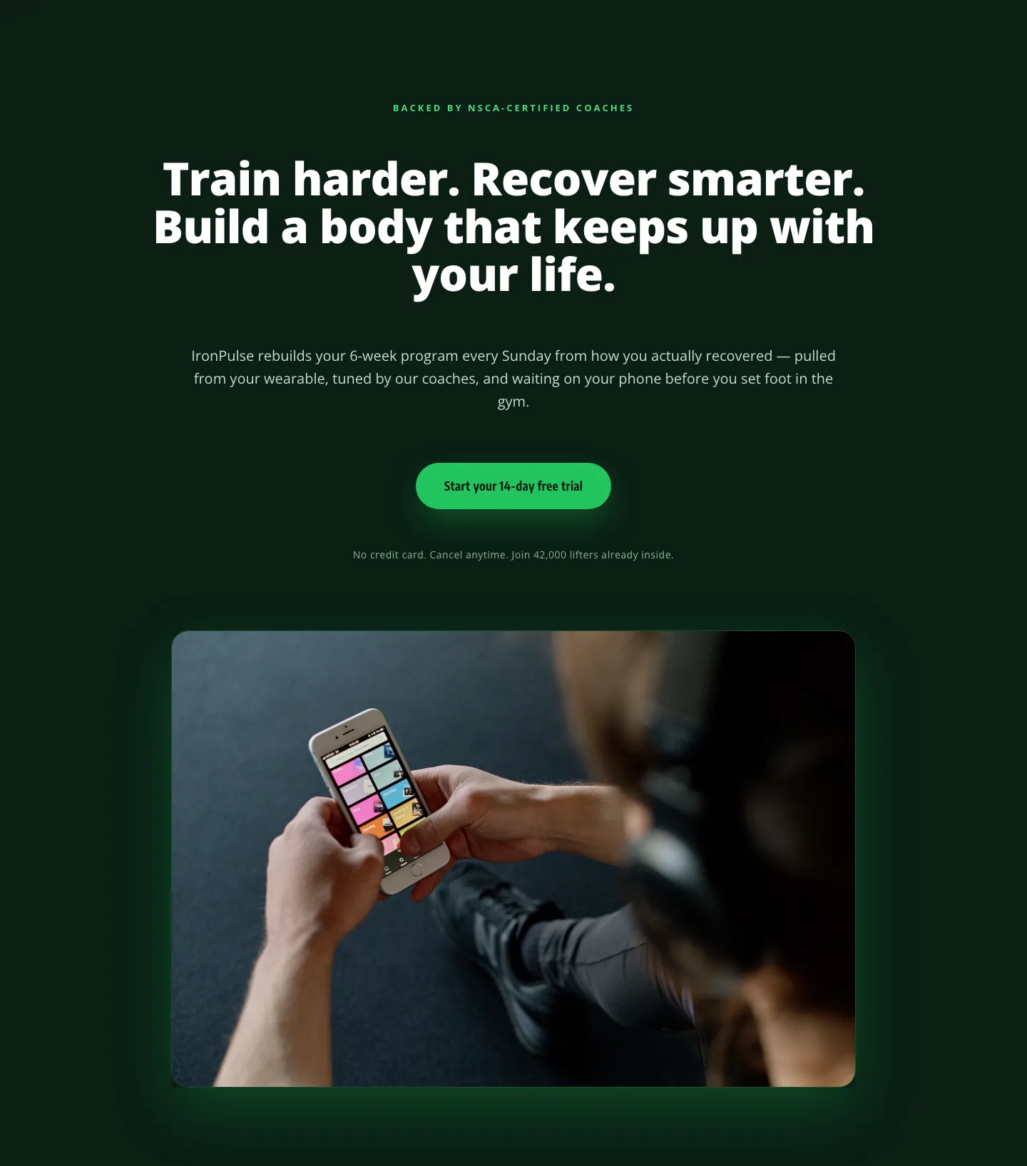
Bold Fitness App Hero Layout for Divi 5: IronPulse Adaptive Training
hero · fitness · bold
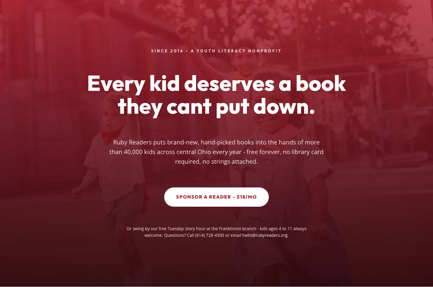
Ruby Readers Nonprofit Hero: Playful Divi 5 Layout
hero · nonprofit · playful
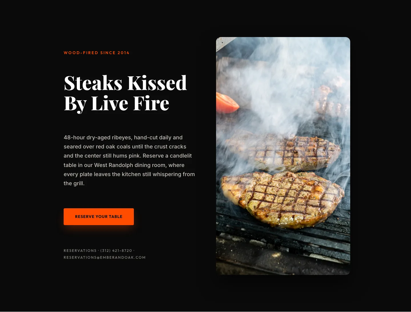
Wood-Fired Steakhouse Hero Layout for Divi 5: Bold Restaurant Template
hero · restaurant · bold
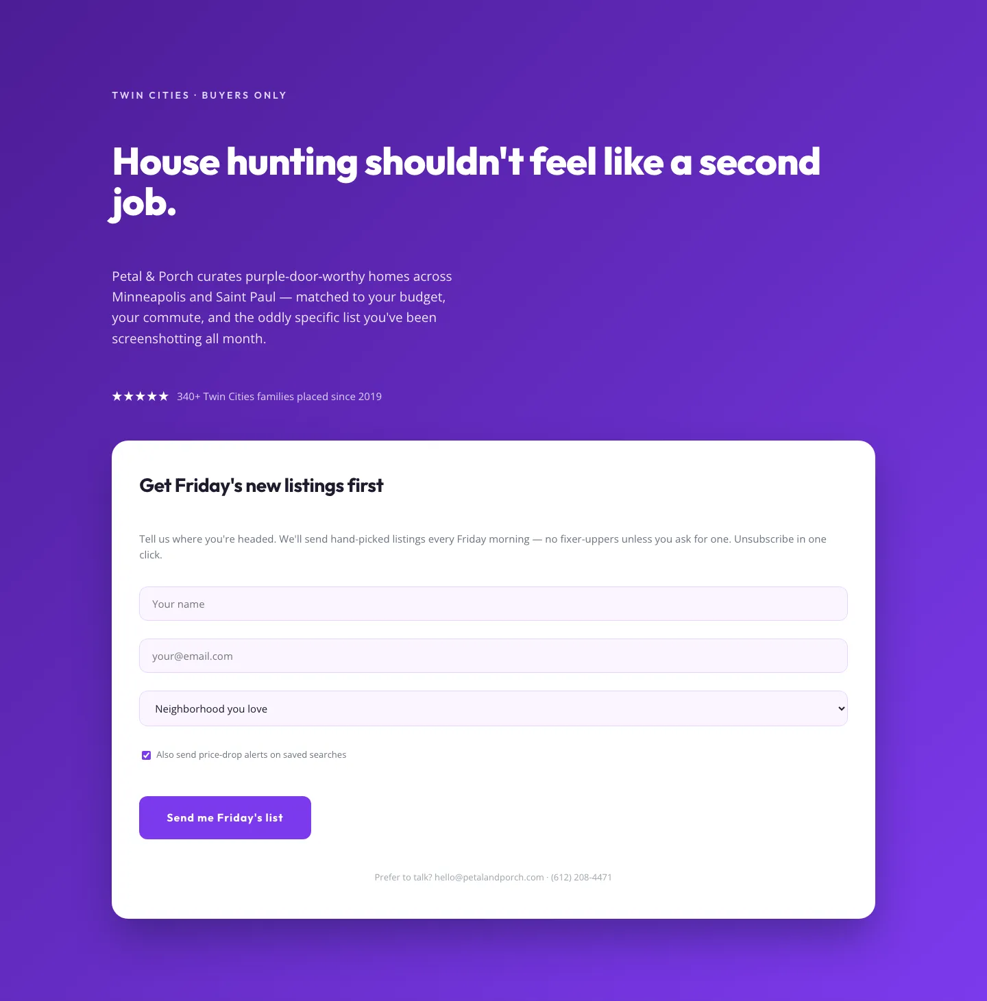
Playful Real Estate Hero with Weekly Listings Signup: Divi 5 Layout
hero · real_estate · playful
Prime Steaks Hero Section: Bold Monochrome Restaurant Layout for Divi 5
hero · restaurant · bold
Bold Portfolio Hero with Free Audit Sign-up: Divi 5 Layout
hero · portfolio · bold