
Prime Steaks Hero Section: Bold Monochrome Restaurant Layout for Divi 5
A bold, full-bleed monochrome hero section for steakhouses and fine-dining restaurants. Centered headline, uppercase eyebrow, and pill CTA over a dark parallax image.
Rate this element
Download this section, free
- Divi 5 JSON, imports in seconds
- Commercial license included
- No account needed
Click to view the full page
Overview
A single, full-bleed hero section built on a 960px-wide centered column, framed by a near-black backdrop (#0a0a0a) with a 180deg gradient that darkens from 55% to 85% opacity over a warm-tone food photograph. Parallax is enabled, so the image drifts as visitors scroll, while the gradient keeps type readable no matter what photo you swap in. Vertical padding is intentionally generous (180px top and bottom on desktop, 120px on tablet, 96px on phone) which gives the copy room to breathe against the imagery and reads as premium rather than cramped.
The content stack is deliberately spare: a serif display headline in Playfair Display 800 at 84px (scaling to 56px on tablet and 40px on phone), a small Inter eyebrow in uppercase 6px-tracked caps sitting beneath it, a 640px-wide Inter body paragraph at 20px, and a single pill CTA. Everything centers on the column axis, and the eyebrow's warm grey (#c9c9c9) pairs with the body's off-white (#e6e6e6) to give the monochrome palette three subtle temperature stops rather than a flat black-and-white. A preset3 text shadow lifts the big headline off the image so it holds contrast even on busy photography.
The 'Reserve a Table' button is a fully rounded (999px) pill on pure white with a black Inter 700 label, 2px letter-spacing, and a preset2 drop shadow that deepens on hover: the only interactive affordance on the section, so it can't be missed. On phones the column falls into a flex column layout, the section padding tightens, and the body type steps down to 17px so the headline still wins the fold. Every element is a native divi/heading, divi/text or divi/button module, so you can restyle the whole thing from Divi 5's preset system without touching CSS.
What’s inside
- Full-bleed divi/section with a layered background: solid #0a0a0a base, 180deg 55%→85% gradient overlay, and a parallax cover image
- Centered row capped at 960px with a single flex column that stacks cleanly on phones
- Two divi/heading modules, an 84px Playfair Display display line and a 14px uppercase Inter eyebrow with 6px letter-spacing
- Responsive type scale baked in: headline 84 → 56 → 40px, body 20 → 17px, section padding 180 → 120 → 96px
- 640px-max divi/text paragraph for a one-sentence value promise that never overruns a comfortable measure
- Single pill divi/button ('Reserve a Table') with 999px radius, white fill, preset2 shadow, and hover-lift box-shadow
- Monochrome palette hard-coded end-to-end (#0a0a0a → #c9c9c9 → #e6e6e6 → #FFFFFF) so brand recoloring is a four-token swap
- Preset3 text shadow on the headline keeps type legible against any hero photograph you drop in
Who it’s for
Purpose-built for steakhouses, chef-driven restaurants, wine bars and cocktail lounges: any hospitality brand whose voice is craft, restraint and expensive-looking silence. The monochrome palette and serif display type also translate cleanly to butcher shops, whisky brands, boutique hotels, private clubs and destination bakeries, where a single, confident above-the-fold statement matters more than a busy homepage. Photographers, filmmakers and creative-director portfolios can reuse the same structure by dropping in a still or short-film frame: the section is really a poster: one hero image, one headline, one sentence, one call to action. Skip it if your brand relies on color, illustration, playfulness or a busy top-of-page navigation strategy: this layout is built to feel quiet, not to entertain.
Customization tips
Swap the palette first. All four monochrome tokens (#0a0a0a, #c9c9c9, #e6e6e6, #FFFFFF) are set directly on the heading, text and button. Search-and-replace them for your own two-tone brand and the section reshades in seconds. Keep the headline short: two to five words fills the 84px Playfair display line without wrapping, and the -1px tracking assumes a tight phrase. The eyebrow is designed for a single line of caps at 6px letter-spacing, anything over ~40 characters will break awkwardly on tablet. The body paragraph is capped at 640px and reads best at one to two sentences (roughly 12–24 words). Replace the background image with your own landscape shot; the section is set to cover / center-center with parallax on, so aim for at least 2400×1600px with the subject dead center. To flatten the look, disable parallax and drop the button's preset2 shadow. The gradient overlay alone still carries the type.
How to install this layout
- Download the layout JSON file from this page.
- Open the target page in the Divi 5 builder.
- Open the portability panel (up/down arrows icon) and choose the Import tab.
- Upload the JSON. Tick “replace existing content” only for full-page imports.
- Check the page at desktop and mobile widths, then swap in your copy and images.
Full walkthrough with troubleshooting: How to Import a Divi 5 Layout.
Questions about Prime Steaks Hero Section: Bold Monochrome Restaurant Layout for Divi 5
How does this hero behave on tablet and phone?
Section padding steps from 180px down to 120px on tablet and 96px on phone, the headline scales from 84px to 56px to 40px, and the body paragraph drops to 17px on phone. The single column already stacks vertically, so nothing needs to be rearranged. The phone breakpoint values ship with the layout.
Do I have to keep the background image?
No. The section has a solid #0a0a0a base beneath the image and gradient, so if you clear the image URL you get a clean black hero with the gradient still lifting the type. If you want to keep an image but disable the drift, turn parallax off on the section background. The composition still holds.
Which module should I edit first?
The Playfair Display headline. It's the only element visitors read from six feet away, and its size and tracking are tuned to short phrases. Change the words there, then the eyebrow (city, tagline or year established), then the button label. The 640px body paragraph is the last thing to touch and can stay generic the longest.
What image dimensions work best?
Landscape, at least 2400×1600px, with the focal point roughly centered. The section uses background-size: cover with center/center positioning and parallax on, so subjects placed in the corners will get cropped on wide monitors and shifted on scroll.
Can I add a second button or a phone number under the CTA?
Yes. The column is a flex column with centered alignment, so dropping another divi/button or divi/text module inside it will center automatically. Give the new module a small top margin so it doesn't kiss the pill button above.
Which Divi version does this layout need?
Divi 5. The layout is generated natively for Divi 5 and validated against its real module structure before publication, so it imports clean into the current builder.
Can I use this layout on client websites?
Yes. Every download includes a commercial license covering unlimited sites you own or build for clients. Only reselling or redistributing the layout file itself is prohibited.
More hero sections
Browse all hero sections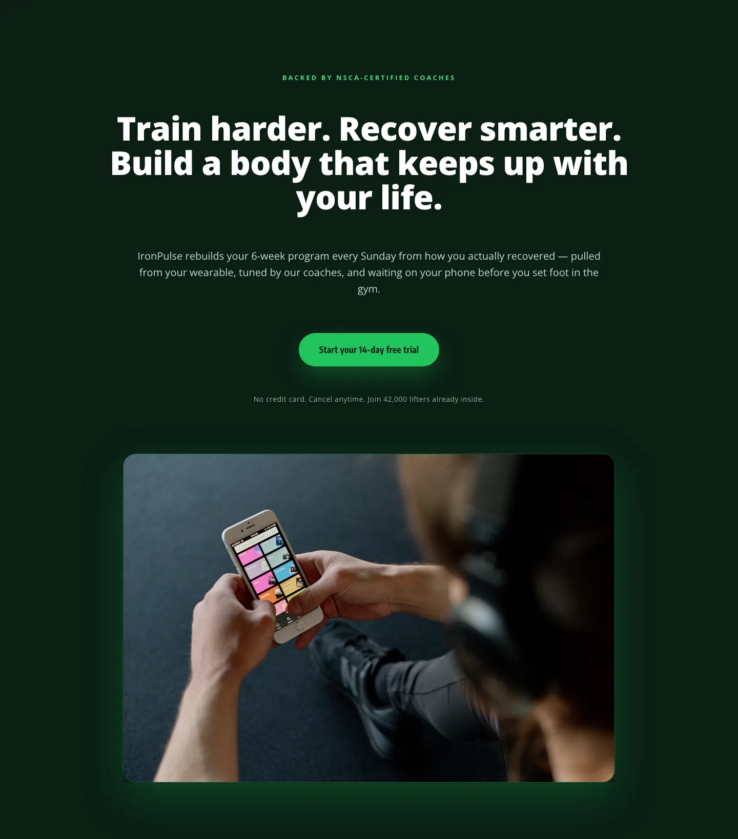
Bold Fitness App Hero Layout for Divi 5: IronPulse Adaptive Training
hero · fitness · bold
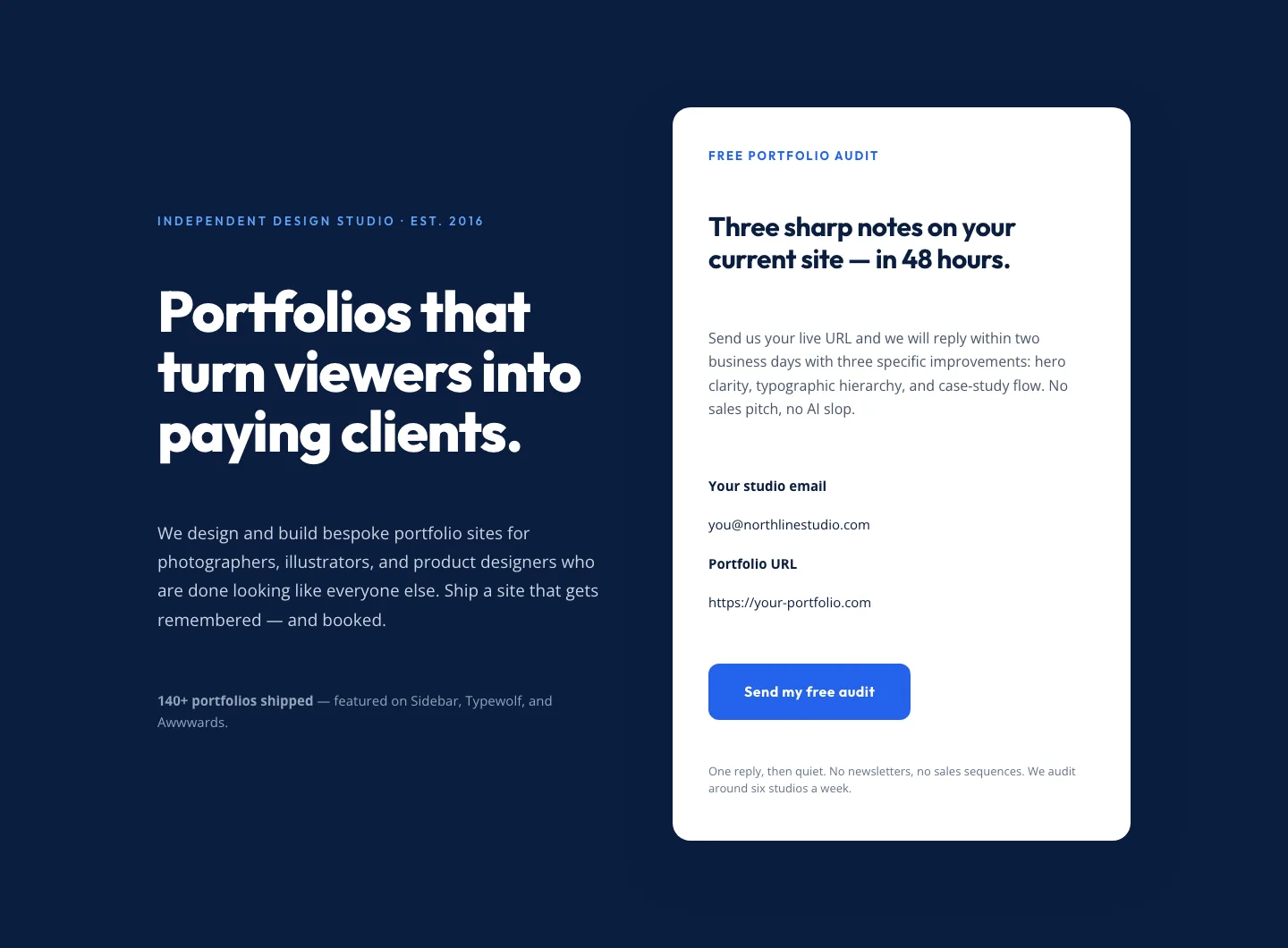
Bold Portfolio Hero with Free Audit Sign-up: Divi 5 Layout
hero · portfolio · bold
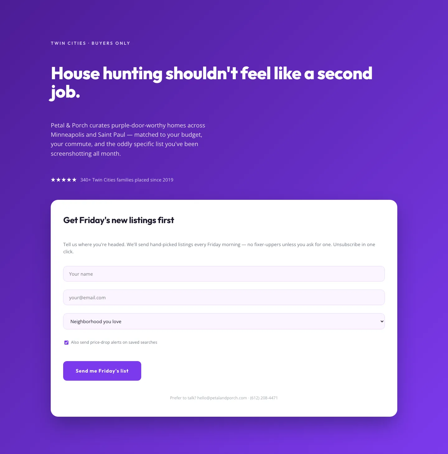
Playful Real Estate Hero with Weekly Listings Signup: Divi 5 Layout
hero · real_estate · playful
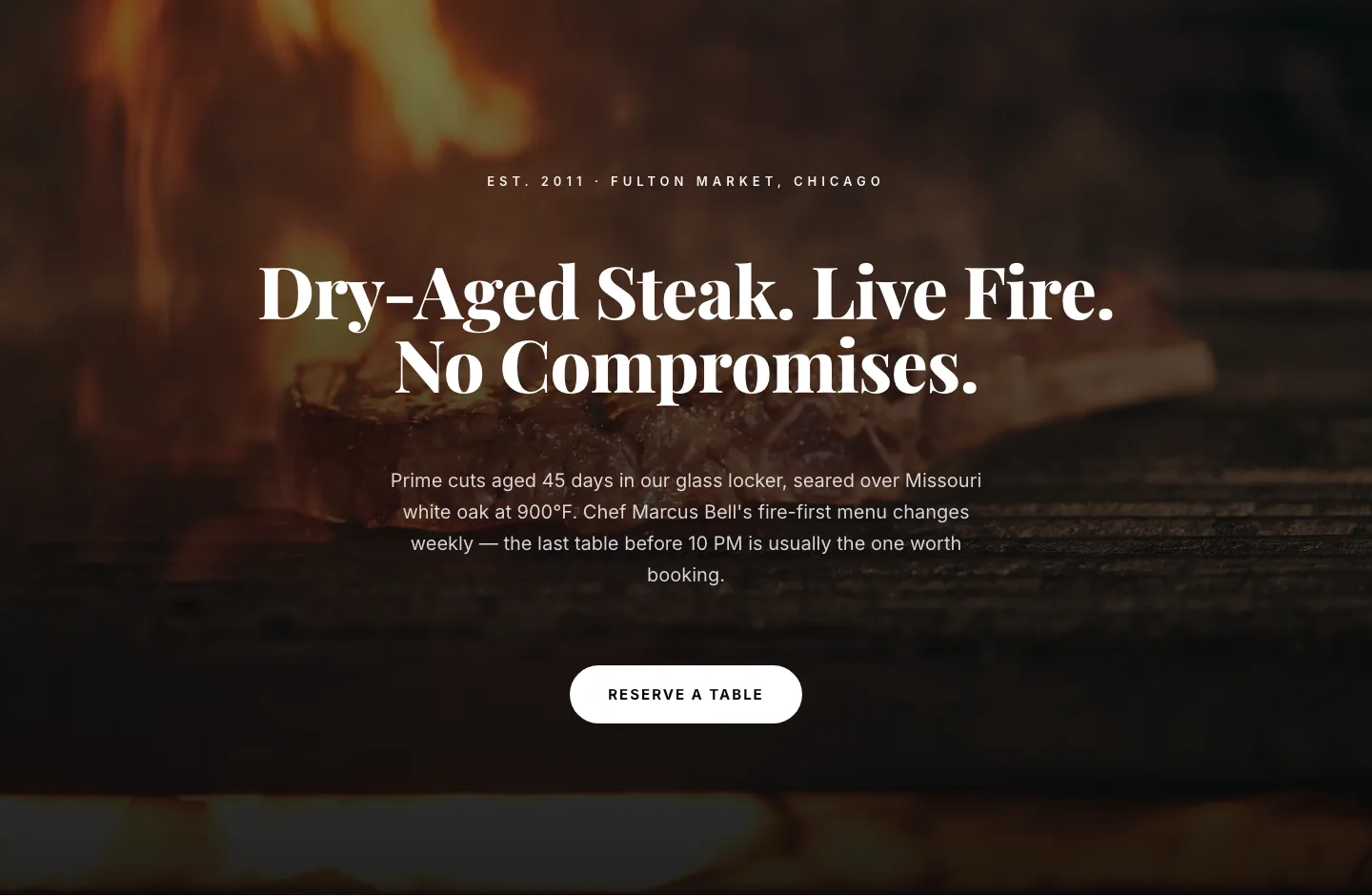
Bold Steakhouse Hero Layout for Divi 5: Fire & Dry-Aged
hero · restaurant · bold
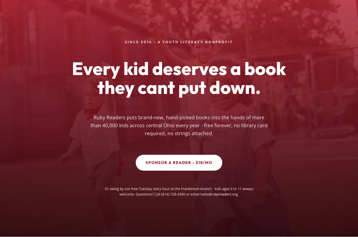
Ruby Readers Nonprofit Hero: Playful Divi 5 Layout
hero · nonprofit · playful
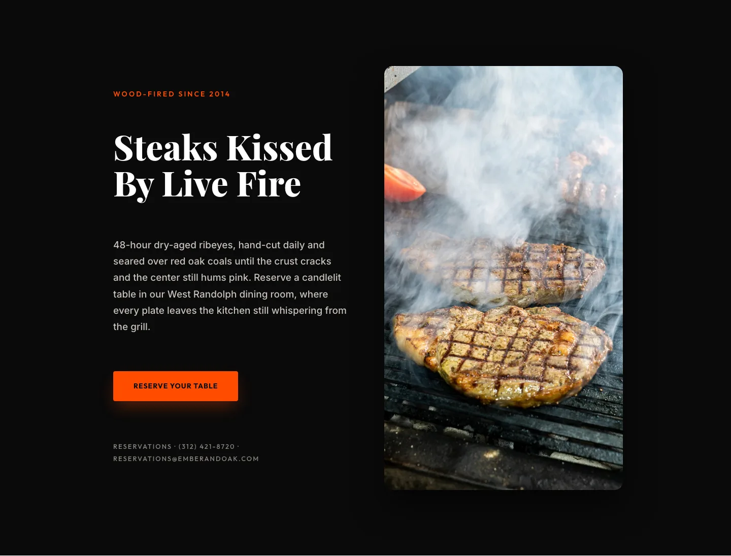
Wood-Fired Steakhouse Hero Layout for Divi 5: Bold Restaurant Template
hero · restaurant · bold