
Wood-Fired Steakhouse Hero Layout for Divi 5: Bold Restaurant Template
5.0 (1)Bold, dark-mode Divi 5 hero section for wood-fired steakhouses and chophouses. Playfair Display headline, ember-orange CTA, and reservation callout. Ready to import.
Rate this element
Download this section, free
- Divi 5 JSON, imports in seconds
- Commercial license included
- No account needed
Click to view the full page
Overview
A 60/40 split row anchors this hero on desktop: the left three-fifths carries an uppercase eyebrow, an oversized serif headline, a lead paragraph, the primary reservation button, and a small line for phone and email; the right two-fifths holds a single tall food photograph. The section sits on a near-black #0a0a0a canvas so the ember-orange #ff4d00 accent (used on the eyebrow, the button fill, and the button glow) reads as coals against the darkness. Playfair Display drives the 68px headline at weight 800 with a tight 1.05em line-height, while Outfit handles the uppercase eyebrow and button label at 14px with 3px letter-spacing. Body copy is set in Inter at 19px / 1.7em in a warm bone #c9c4bd, capped to a 560px maxWidth so the paragraph never outruns the headline above it.
The button carries a soft ember glow (a preset-3 box shadow tinted rgba(255,77,0,0.35) that deepens to 0.5 on hover, when the fill also swaps from orange to white) which pulls the eye through the hierarchy toward the Reserve Your Table CTA. Below it, a muted stone-grey #8a857e contact line in 13px Outfit uppercase gives guests who prefer to phone in a secondary path. The image column pairs a 1200×1400 vertical photograph with a 16px border radius and a deep preset-4 drop shadow, lifting the plate off the page.
Spacing is fluid: section padding uses viewport-relative values of 9vw top/bottom on desktop, 14vw on tablet, and 18vw on phone, so the hero breathes generously without hard-coded pixel jumps. On phone the row flips from row to column in its flex settings, both columns become full width (flexType: 24_24), the desktop 64px column gap gives way to a 40px row gap, and the headline steps down from 68px → 52px → 40px with a slightly looser 1.1em line-height so the two-word title stays balanced on narrow screens.
What’s inside
- Two-column 3_5 / 2_5 desktop row that flips to a stacked flex-column on phone, both columns going full width
- Responsive Playfair Display headline at 68px → 52px → 40px with weight 800 and a tight 1.05em line-height
- Outfit uppercase eyebrow module with 3px letter-spacing in ember-orange `#ff4d00` above the main title
- Inter body paragraph at 19px / 1.7em capped to a 560px max-width for a comfortable reading measure
- Primary CTA button with a preset-3 ember-orange glow shadow and a hover state that swaps the fill to white
- Secondary phone + email microcopy line in 13px Outfit uppercase `#8a857e` beneath the button
- Native Divi 5 image module with 16px rounded corners and a preset-4 drop shadow lifting the photo off the dark canvas
- Fluid section padding in vw units (9vw / 14vw / 18vw) so vertical rhythm scales with the viewport
Who it’s for
Steakhouses, chophouses, and open-fire grill restaurants that want a homepage top-fold matching the drama of their kitchen. The near-black canvas and ember-orange accent read as smoke and coals, so it also fits BBQ joints, wood-fired pizzerias, whiskey bars, cigar lounges, and hotel restaurants with a bold house identity. Because the layout leads with a phone number and a Reserve Your Table button rather than an online-order flow, it suits reservation-first venues over quick-service ones. It also works for private dining rooms, chef's-table experiences, and craft butcher shops that trade on provenance and heat: anywhere the story is "we do one thing over live fire, and we do it seriously."
Customization tips
Swap the ember-orange (#ff4d00) for another warm accent (clay, ember red, saffron) by editing the eyebrow heading color, the button background, and the button glow shadow; the palette hinges on that one hue. The Playfair Display headline sits cleanly at two lines up to about 34 characters per line; longer copy will push into a third line and eat the button's breathing room. Keep the body paragraph under roughly 240 characters so it stays within the 560px max-width. The photo is a 1200×1400 vertical portrait: replace it with any close-up food, interior, or chef shot in a similar 6:7 ratio to preserve the column balance. If you drop the phone number, delete the second small-text module rather than emptying it, so the button keeps its 28px bottom margin as the final spacing anchor. To lighten the whole hero, swap #0a0a0a for a warm charcoal like #1a1512 and lift the body text to #e6e0d8.
How to install this layout
- Download the layout JSON file from this page.
- Open the target page in the Divi 5 builder.
- Open the portability panel (up/down arrows icon) and choose the Import tab.
- Upload the JSON. Tick “replace existing content” only for full-page imports.
- Check the page at desktop and mobile widths, then swap in your copy and images.
Full walkthrough with troubleshooting: How to Import a Divi 5 Layout.
Questions about Wood-Fired Steakhouse Hero Layout for Divi 5: Bold Restaurant Template
How does this hero behave on mobile?
The row switches from a horizontal 3_5 / 2_5 split to a stacked flex-column at the phone breakpoint. Both columns become full width, the column gap tightens from 64px to a 32px column gap plus 40px row gap, section padding grows from 9vw to 18vw top and bottom, and the headline steps down from 68px to 40px with a looser 1.1em line-height so the two-word title stays balanced on narrow screens.
What Divi 5 modules are actually inside the layout?
A single section holds one row. The left column contains two heading modules (uppercase eyebrow and main title), a text module for the body paragraph, a button module, and a second small text module for the phone number and email. The right column holds one image module. All native Divi 5, no third-party dependencies.
Which pieces should I edit first when I drop in my brand?
Start with the eyebrow heading ("Wood-Fired Since 2014"), the main headline, and the button label. Those three set the tone. Then swap the Pexels image for your own food or interior shot from the Media Library. Finally update the phone number and reservation email in the small-caps text module below the button.
Does the layout ship with the food photograph?
The image module points to a Pexels stock URL, which is free for commercial use but is not embedded in the JSON export. Before publishing, upload your own shot and replace the source so your hero doesn't share imagery with any other site pulling the same file.
What image dimensions should the replacement photo be?
The placeholder is 1200×1400, a 6:7 vertical portrait. Any tall food, interior, or chef shot in that ratio will slot in cleanly without breaking the column balance. Wider or square crops will shorten the right column and leave visible white space next to the text block on desktop.
Which Divi version does this layout need?
Divi 5. The layout is generated natively for Divi 5 and validated against its real module structure before publication, so it imports clean into the current builder.
Can I use this layout on client websites?
Yes. Every download includes a commercial license covering unlimited sites you own or build for clients. Only reselling or redistributing the layout file itself is prohibited.
More hero sections
Browse all hero sections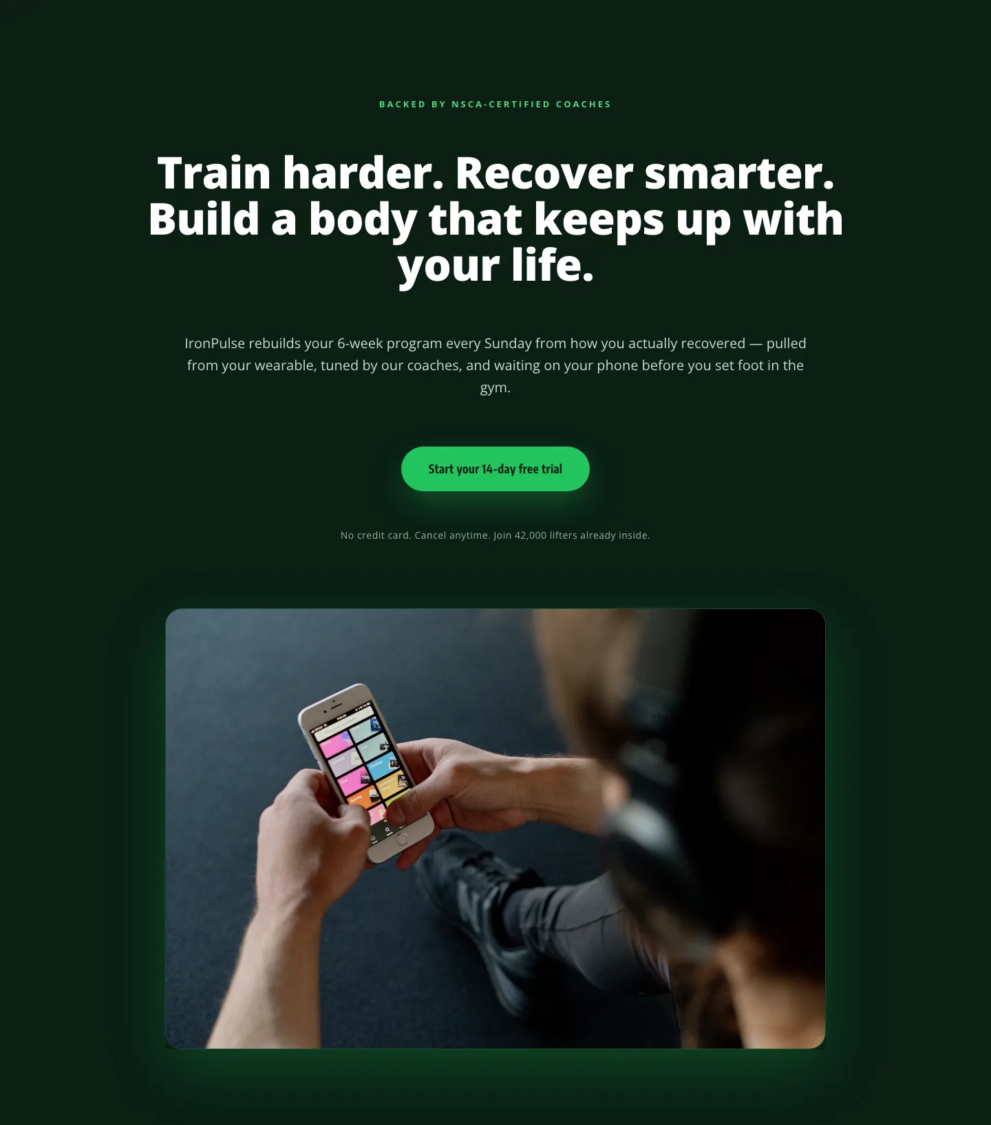
Bold Fitness App Hero Layout for Divi 5: IronPulse Adaptive Training
hero · fitness · bold
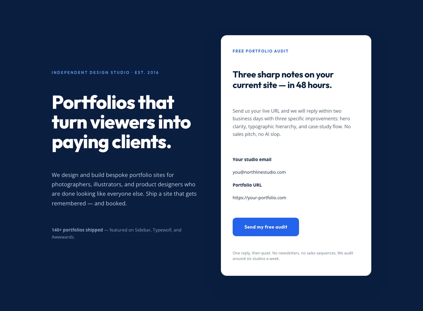
Bold Portfolio Hero with Free Audit Sign-up: Divi 5 Layout
hero · portfolio · bold
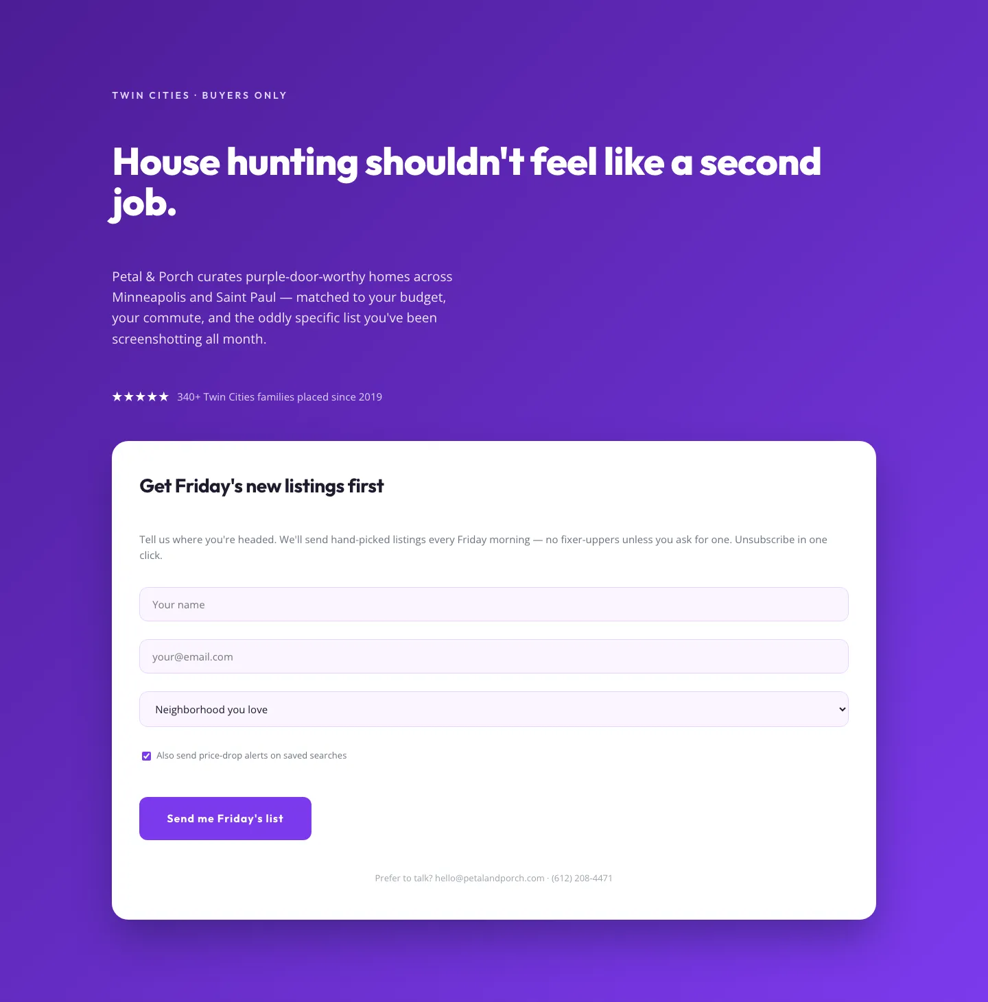
Playful Real Estate Hero with Weekly Listings Signup: Divi 5 Layout
hero · real_estate · playful
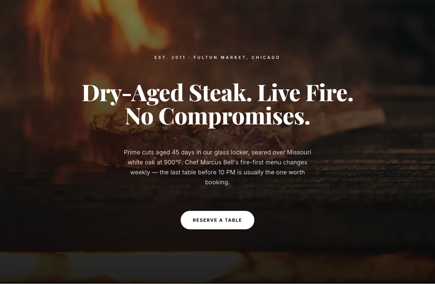
Bold Steakhouse Hero Layout for Divi 5: Fire & Dry-Aged
hero · restaurant · bold
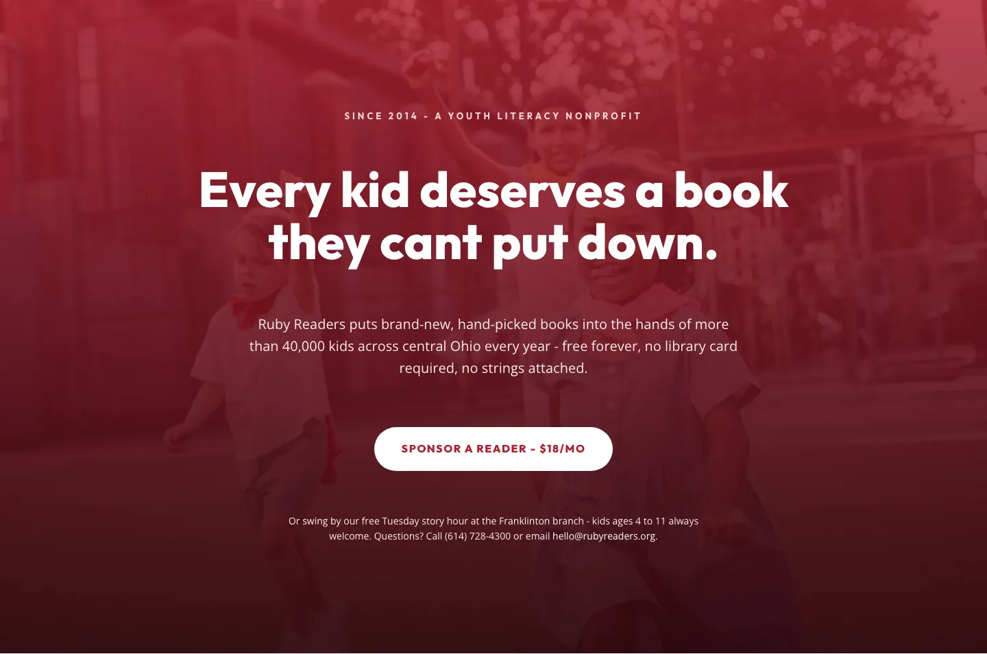
Ruby Readers Nonprofit Hero: Playful Divi 5 Layout
hero · nonprofit · playful
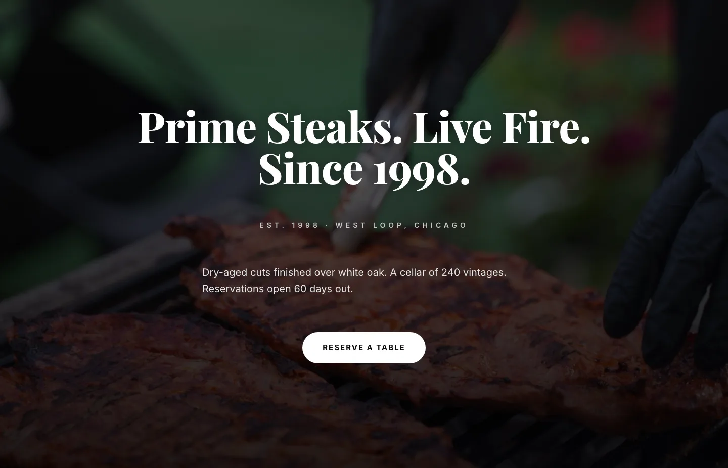
Prime Steaks Hero Section: Bold Monochrome Restaurant Layout for Divi 5
hero · restaurant · bold