
Playful Nonprofit Features Section for Divi 5: Animal Rescue Layout
Warm, playful four-column features layout for nonprofits and animal rescues. Built for Divi 5 with rounded cards, soft shadows, and a heartfelt tone donors love.
Rate this element
Download this section, free
- Divi 5 JSON, imports in seconds
- Commercial license included
- No account needed
Click to view the full page
Overview
The layout opens on a warm blush canvas (#fff5f3) with 90px of vertical breathing room, so the section reads as a distinct chapter no matter what sits above or below it. A small coral eyebrow ("Why We Wag" in uppercase Outfit 700 with 3px letter-spacing) sets the tone, then hands off to a Heading module scaled at 44px on desktop, 34px on tablet, and 28px on phone. Both the H2 and the supporting paragraph are capped at 760px and 680px respectively and center-aligned, giving the intro block a magazine-column feel that stays readable on wide monitors without stretching into an unwelcome banner.
Below it, a four-column row (1_4,1_4,1_4,1_4) delivers the actual features: Rescue & Rehab, Foster Network, Adopt-A-Bestie, and Volunteer Crew. Each card is a self-contained white block (#ffffff) with 20px rounded corners, 32/24px padding, and a soft coral-tinted shadow (rgba(192,57,43,0.12)) that lifts the tiles off the blush background without turning glossy. A 64px circular Image module sits at the top of every card, followed by an H3 in Outfit 700 22px and a short 15px body paragraph. The same rhythm on all four so the row scans as one grid rather than four unrelated columns.
On phone, the row switches to flexDirection: column, so each card stretches to full width and stacks vertically. The typography scale bakes in the shrink for you (the H2 drops through its three-step response) so nothing crowds narrow screens and the cards keep their generous padding intact. The palette does most of the emotional work: the coral accent (#c0392b), the deep-plum headings (#1f1235), and the muted lilac body (#4a3a55) give the whole block a warm, adoption-lounge feel that still clears contrast checks.
What’s inside
- Two-row structure: centered intro (eyebrow + H2 + supporting paragraph) above a 4-column feature grid
- Four white cards (`1_4,1_4,1_4,1_4`) with 20px rounded corners, 32/24px padding, and a coral-tinted `preset2` shadow
- Circular 64px Image module at the head of every card (`border-radius: 100px`), swap for icons or photos of your own
- Native Divi 5 Section / Row / Column / Heading / Text / Image modules only: no third-party plugins, no custom code
- Responsive H2 that scales 44 → 34 → 28px across desktop, tablet, and phone
- Phone stacking via `flexDirection: column` on the row, cards go single-file with padding preserved
- Outfit heading font pairing (H2 800 / H3 700) with tracked-out uppercase eyebrow at 14px / 3px letter-spacing
- Coordinated palette (blush `#fff5f3`, coral `#c0392b`, plum `#1f1235`, lilac body `#4a3a55`) tuned for warmth over corporate polish
Who it’s for
Animal rescues, humane societies, and pet-focused nonprofits are the most obvious home: the copy is written around adoption, fostering, and volunteering, and the coral-and-blush palette matches the warm, hopeful tone those donors and adopters respond to. But the underlying structure is niche-agnostic: any nonprofit with four programs or pillars to summarize slots straight in, youth mentoring orgs, community food pantries, environmental groups, arts collectives, faith-based charities. The four-card grid also works nicely for donation tiers, service categories on a wellness or coaching site, family-focused SaaS feature groups, or a preschool's "how our day works" section. Reach for this section any time you need a features block that feels friendly and human rather than boardroom-corporate.
Customization tips
Start with the palette. Swap #c0392b on the eyebrow and the shadow tint for your brand accent, then update #1f1235 on the headings and #4a3a55 on body copy to match. The section background #fff5f3 was chosen as a coral-complementary blush; if you shift accents to teal or navy, retint the background so nothing clashes. Keep the H2 to roughly 60–80 characters so it holds two lines on desktop and three on phone without overflowing the 760px cap. Card headings read best at 2–3 words; card paragraphs at 20–30 words, the four-column row falls apart visually if one card runs significantly taller than its neighbors. Replace the four Pexels images with your own at a square 1:1 aspect ratio (the circular crop is baked in via a 64px width plus a fully-rounded border-radius). If you'd rather show icons than photos, drop a Divi Icon module in place of each Image module and clear the circular radius on that column.
How to install this layout
- Download the layout JSON file from this page.
- Open the target page in the Divi 5 builder.
- Open the portability panel (up/down arrows icon) and choose the Import tab.
- Upload the JSON. Tick “replace existing content” only for full-page imports.
- Check the page at desktop and mobile widths, then swap in your copy and images.
Full walkthrough with troubleshooting: How to Import a Divi 5 Layout.
Questions about Playful Nonprofit Features Section for Divi 5: Animal Rescue Layout
Does the 4-card grid stay 4-across on tablet, or does it break?
The row is set to `1_4,1_4,1_4,1_4` and only flips to `flexDirection: column` on the phone breakpoint, so tablet keeps all four cards side-by-side. On smaller tablets that can feel cramped: if it does for you, override the row layout on tablet to a 2×2 by setting column widths to `1_2` for that breakpoint.
Can I swap the circular photos for icons?
Yes. Replace each Image module with a Divi Icon module and remove the 100px border-radius on the column. The 64px width and centered alignment translate directly to the icon size setting, so the visual rhythm stays intact.
What image aspect ratio should I use for the card thumbnails?
Square (1:1). The Image module is set to a 64px width with a fully-rounded border-radius, so a non-square source will be visibly cropped inside the circle. Anything from 200×200 up works, the image is scaled down.
How long can the H2 headline be before it wraps awkwardly?
It's capped at 760px and scales down to 28px on phone, so aim for 60–80 characters. Two lines on desktop and three on phone is the sweet spot; longer than that and the intro block starts eating the space above the cards.
What's the first thing I should change if I'm not a nonprofit?
The four H3s and their supporting sentences. The card structure and rhythm hold for anything (service tiers, program pillars, product benefits) but the copy is written specifically for an animal rescue. Rewrite those eight text blocks first, then re-tint the coral accent to your brand color.
Which Divi version does this layout need?
Divi 5. The layout is generated natively for Divi 5 and validated against its real module structure before publication, so it imports clean into the current builder.
Can I use this layout on client websites?
Yes. Every download includes a commercial license covering unlimited sites you own or build for clients. Only reselling or redistributing the layout file itself is prohibited.
More feature grids
Browse all feature grids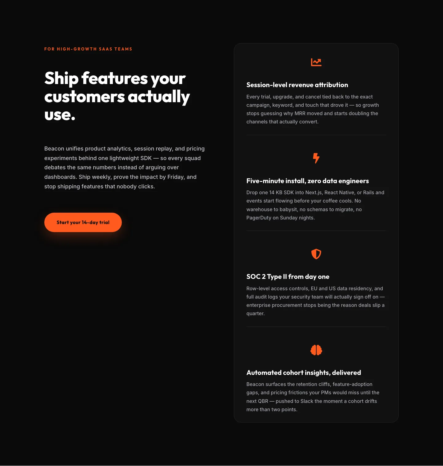
SaaS Features Section: Ship Features Customers Actually Use | Divi 5 Bold Layout
features · saas · bold
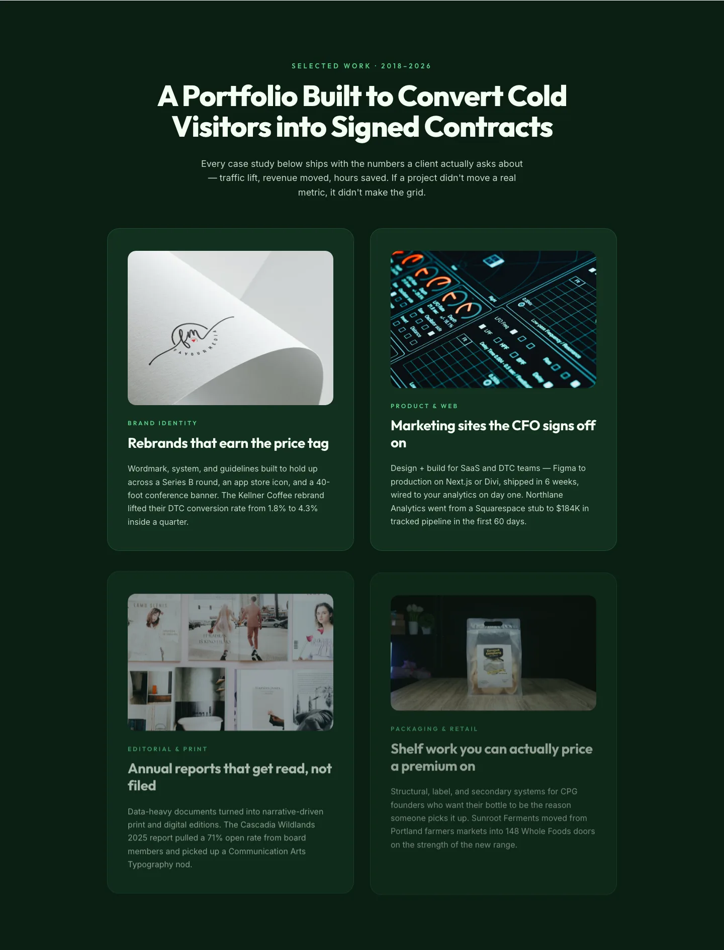
Bold Portfolio Features Grid: Divi 5 Case Study Layout
features · portfolio · bold
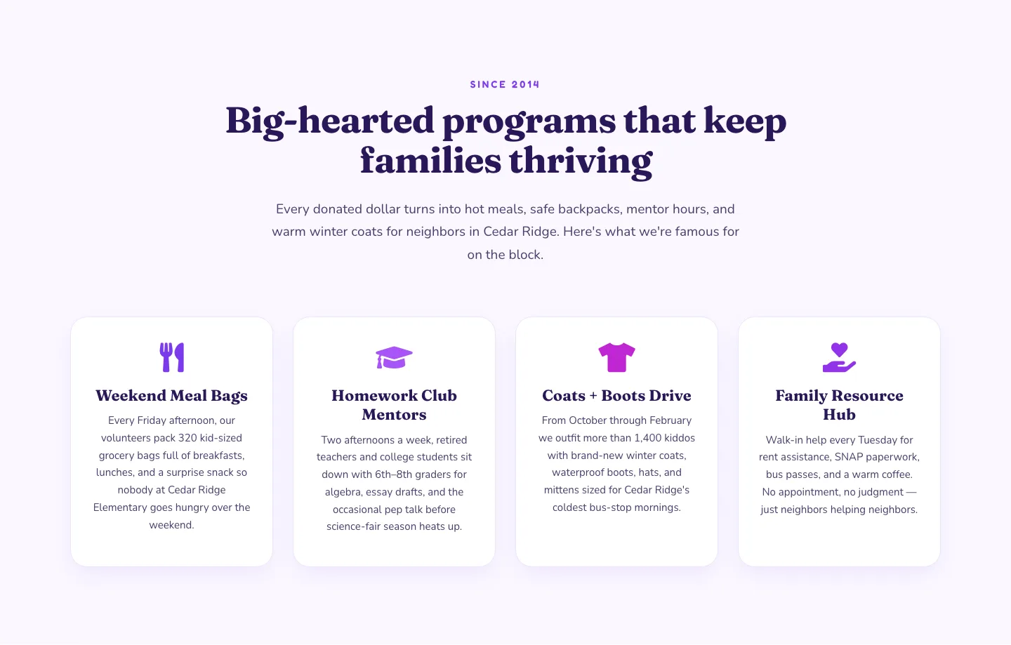
Playful Nonprofit Features Section: Four-Column Icon Cards for Divi 5
features · nonprofit · playful
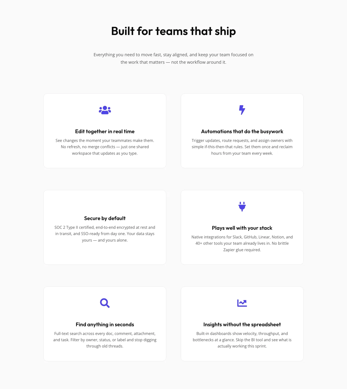
SaaS Features Section: Minimal Divi 5 Layout for Product Teams
features · saas · minimal
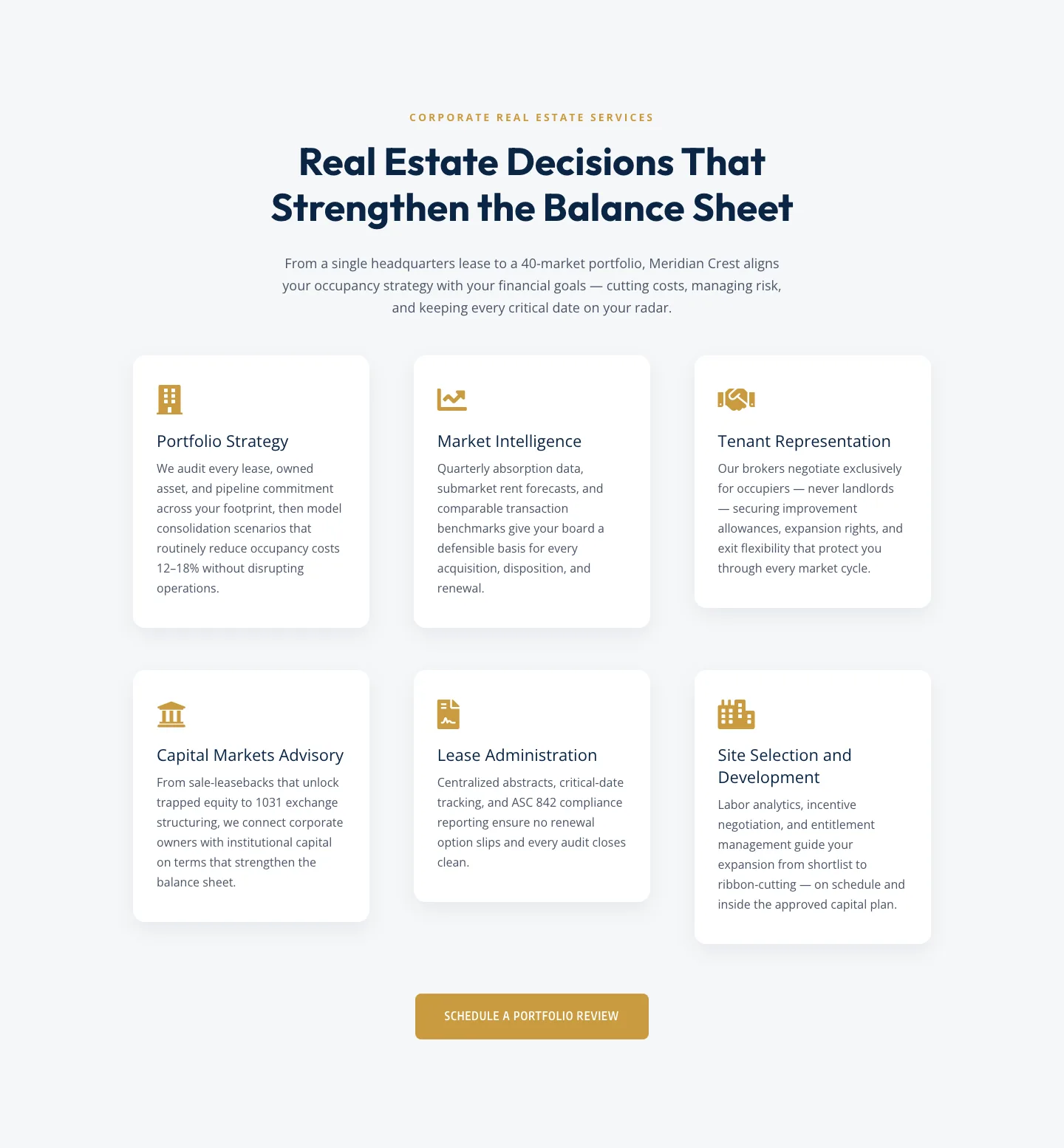
Corporate Real Estate Features Section: Six-Pillar Service Grid for Divi 5
features · real_estate · corporate
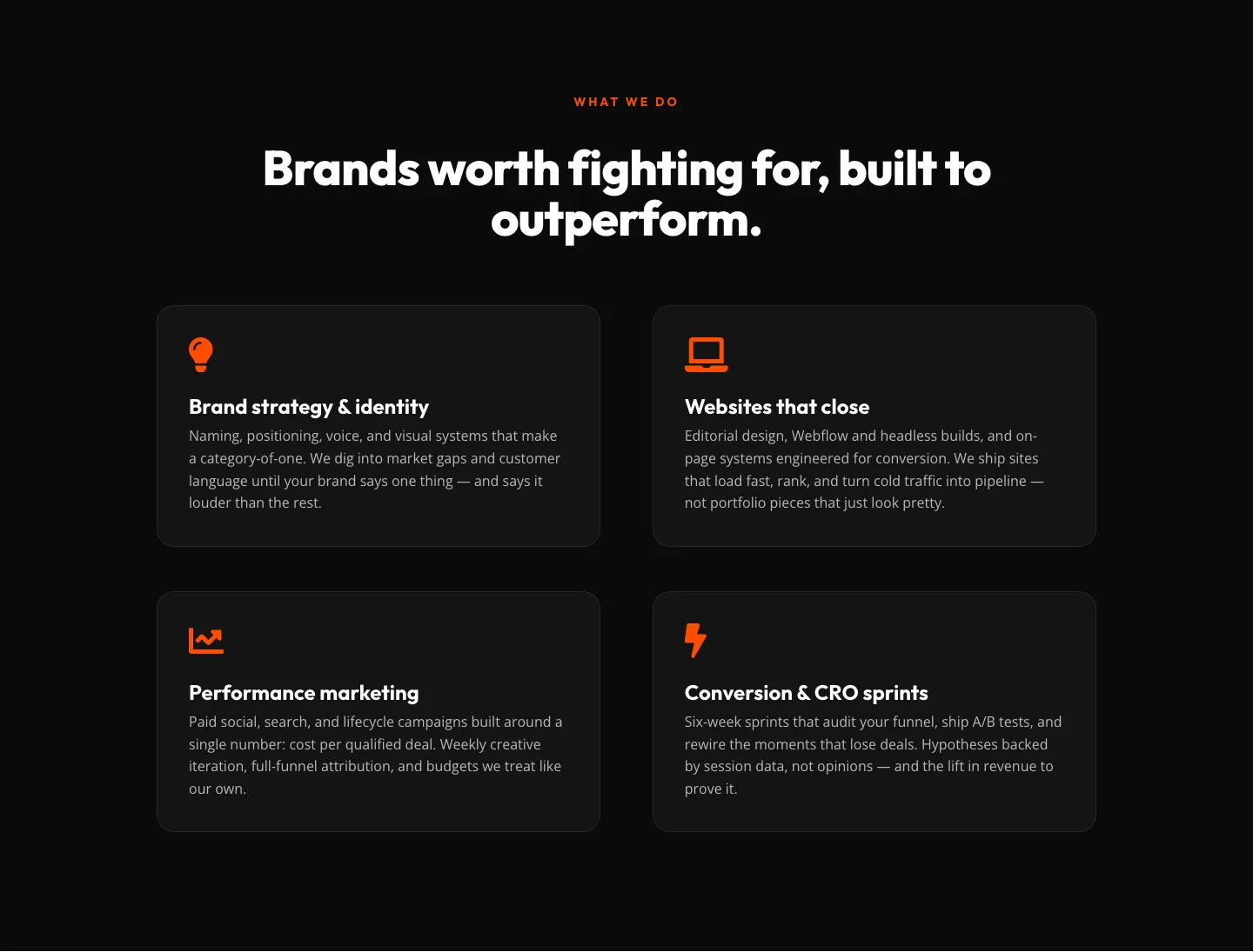
Bold Agency Features Section: Divi 5 Services Grid Layout
features · agency · bold