
Warm Community Kitchen Landing Page for Divi 5: Hot Lunch and Pantry
A warm, elegant Divi 5 full landing page for a nonprofit community kitchen. Features hero stats, mission sections, tiered giving tiers, testimonial, FAQ, and a volunteer sign-up form. Ready to import.
Rate this element
Download this section, free
- Divi 5 JSON, imports in seconds
- Commercial license included
- No account needed
Click to view the full page
Overview
The layout opens with a two-column hero on a warm parchment gradient (#f4ead9 to #fdf8f0 at 150deg, stepping from 96px vertical padding on desktop to 64px on tablet and 44px on phone). The left column stacks an all-caps Nunito label, an H1 in Lora at 60px with tight -1px tracking and text-wrap: balance, an 18px body paragraph at 1.6em, and a pill-shaped burnt sienna button with a soft rgba box shadow. The right column answers the headline with three overlapping stat cards: 4,120 hot lunches, 38 volunteers on the rota, and 9 partner pantries. On desktop each card is rotated slightly (-3deg, +2deg, -1deg) via the transform decoration and stacks with a -40px negative top margin to create a fanned, physical feel. On mobile the transforms are zeroed out and the margins become a clean 16px gap. Every card shares the same 28px corner radius, 1px sand border (#d9c7a8), and cream fill (#fdf8f0), so the visual weight reads as small objects resting on the page rather than a data table.
The center of the page belongs to three program sections: the hot lunch, the Saturday pantry, and the table. Each occupies a full-width alternating image-and-text row inside a solid #f4ead9 section. Images are locked to 4:3 aspect ratio with object-fit cover. Text columns carry a numbered label (01, 02, 03 in 13px uppercase Nunito), an H3 in Lora at 32px/1.25em, a body paragraph, and a plain underlined inline link as a secondary CTA. The Saturday pantry row places the image on the right on desktop and uses a CSS order: -1 override on mobile so the image still appears above the text when the columns stack, preserving the alternating rhythm on small screens. Text-side padding is 48px on desktop, 24px on tablet, and zeroed on phone.
A four-cell impact grid anchors the narrative in numbers. It uses Divi Group in CSS grid mode with gridColumnCount: 4 (collapsing to 2 on tablet and phone) and a 1px separator line achieved by setting the wrapper background to #d9c7a8 and the cell backgrounds to #f4ead9 with 1px column and row gaps. Figures render in 64px Lora at weight 300 with -2px letter spacing, deliberately light and chalked in feel. Below that, a centered testimonial sets a 160px Lora opening quotation mark above a 44px/1.3em centered quote (scaling to 34px and 26px), with a 56px circular avatar image and two short attribution lines in Nunito underneath.
The lower sections handle conversion. Four Blurb modules in a 2x2 grid cover the ways to help, each with a Font Awesome icon on a round terracotta circle. A three-column pricing section differentiates tiers at the column level: the middle tier uses a solid #a0502a background with white type, a 'Most chosen' badge built from a nested Group and Text module, and icon checklists using Divi Icon paired with Text modules. A two-column FAQ grid presents six questions with 2px top-border separators. A photo-background CTA section with a floating left-anchored card closes the giving arc. A final volunteer section splits an icon checklist from a live Divi Contact Form with pill-shaped fields and a terracotta submit button.
What’s inside
- Three hero stat cards built with nested Divi Group modules, rotated on desktop (-3deg, +2deg, -1deg) via the transform decoration and stacked with -40px negative top margins to overlap; transforms and margins reset to flat on mobile
- Three alternating program rows pairing Divi Image modules at a locked 4:3 aspect ratio with numbered H3 headings, body text, and inline text links; the Saturday pantry row uses CSS order: -1 on the image column to maintain image-first stacking on mobile
- Four-cell impact statistics grid using Divi Group in CSS grid mode with a 1px #d9c7a8 gap separator, rendering four figures (cost per lunch, tonnes rescued, surplus percentage, volunteer hours) in 64px Lora at weight 300
- Full-width testimonial with a 160px Lora opening quotation mark, a 44px centered serif quote scaled responsively to 26px on phone, and a 56px circular Divi Image module for the attributed speaker
- Four Divi Blurb modules in a 2x2 grid, each with a Font Awesome icon on a round terracotta (#a0502a) background, covering monthly giving, volunteering, food donation, and food drives
- Three-column pricing section where each tier is a styled Divi Column with 28px rounded corners, Divi Icon plus Text checklist rows, and pill-shaped Divi Button modules; the middle column uses a solid #a0502a background with white type and a 'Most chosen' badge
- Two-column FAQ grid with six questions covering donations, food giving, no-sign-up dining, first-time volunteering, memorial gifts, and email frequency; each group is separated by a 2px top border via the Group module's border decoration
- Divi Contact Form module with Name and Email fields styled with 999px border radius, a #fdf8f0 fill, and a terracotta 'Sign me up' submit button matching the page's primary CTA style
Who it’s for
This layout is built for nonprofits and charitable organizations that need to explain distinct programs, build donor trust, and capture both financial and volunteer commitments on a single page. It fits community kitchens, food banks, mutual aid groups, church outreach programs, and volunteer-run charities directly out of the box. The structure handles three parallel services with equal visual weight, so it adapts well to hospices, housing charities, neighborhood support groups, or any organization running a kitchen alongside a pantry or distribution service. The tiered giving section translates cleanly to any recurring-donation model where you want to name and differentiate giving levels without a third-party plugin.
Customization tips
The page's palette pivots on a single accent: burnt sienna (#a0502a). It drives the hero CTA button, the Blurb icon circles, the highlighted pricing column background, the contact form submit button, and the donation button in the CTA panel. Swapping that one value globally changes the personality of the whole page. The warm parchment pair (#f4ead9 for section backgrounds and #fdf8f0 for card fills) can shift from artisan to institutional by moving toward cooler off-whites without touching any typography.
The H1 uses text-wrap: balance, so it reads well up to roughly 10 words. Beyond that the line rhythm breaks. Keep the hero body paragraph to two sentences or around 30 words. The stat cards in the hero are designed for a two-to-four-digit figure and a descriptor of no more than six words. All images in the alternating rows expect 4:3 source material at 1600px wide or wider; the CTA section background expects at least 1920px wide. The pricing card checklists each hold three feature lines. Adding a fourth works, but a fifth will push that card taller than its neighbors on desktop, breaking the equal-height stretch.
How to install this layout
- Download the layout JSON file from this page.
- Open the target page in the Divi 5 builder.
- Open the portability panel (up/down arrows icon) and choose the Import tab.
- Upload the JSON. Tick “replace existing content” only for full-page imports.
- Check the page at desktop and mobile widths, then swap in your copy and images.
Full walkthrough with troubleshooting: How to Import a Divi 5 Layout.
Questions about Warm Community Kitchen Landing Page for Divi 5: Hot Lunch and Pantry
How are the tilted stat cards in the hero built?
Each card is a Divi Group module with a CSS transform rotation set in the decoration.transform property: -3deg, +2deg, and -1deg respectively. A -40px top margin on the second and third cards creates the overlapping fan. Phone-breakpoint overrides zero out both the rotation and the negative margin, so the cards stack as clean separate tiles on mobile with a 16px gap.
Does the image order flip correctly on mobile for the alternating rows?
Yes. The Saturday pantry row places the image column on the right on desktop. On mobile, a CSS order: -1 override on that image column pulls it above the text column when the row stacks vertically, so all three program sections display image-then-text on small screens without any manual reordering.
How many images does the layout use and what dimensions should replacements be?
There are five photographs in total: three 4:3 program images in the alternating rows, one full-section background image in the final CTA panel, and one square avatar in the testimonial. Replacement sources for the 4:3 images should be at least 1600px wide. The background image should be 1920px wide or wider. The avatar can be any square crop; the 999px border-radius on the Image module clips it to a circle regardless of source dimensions.
What is the 'Most chosen' badge on the middle pricing card and how is it edited?
It is a Divi Group module containing a single Text module with the words 'Most chosen', styled with a cream (#fdf8f0) background, 12px corner radius, and 12px all-caps Nunito type. It sits inside the middle pricing column above the tier title. To change the label, edit that Text module's inner content. To hide it, delete the Group or set its background to the column's own #a0502a color so it disappears visually.
Does the contact form in the volunteer section need extra configuration to send emails?
The Divi Contact Form module uses WordPress's built-in wp_mail function and sends to the site admin email address by default, so no third-party service is required. If the server's mail delivery is unreliable, a WordPress SMTP plugin resolves it without any changes to the layout or the form's styling.
What should I update first when adapting this layout for a different organization?
Start with the seven numbers in the hero stat cards (4,120 / 38 / 9) and the four cells in the impact grid ($4 / 11t / 76% / 1,400hrs). Each is a standalone Divi Text module, so they can be edited individually without touching surrounding structure. Then update the three program row headings and body paragraphs. Leaving the images as placeholders until the copy is final saves time, since the 4:3 aspect ratio constrains the crop rather than the content.
Which Divi version does this layout need?
Divi 5. The layout is generated natively for Divi 5 and validated against its real module structure before publication, so it imports clean into the current builder.
Can I use this layout on client websites?
Yes. Every download includes a commercial license covering unlimited sites you own or build for clients. Only reselling or redistributing the layout file itself is prohibited.
More full landing pages
Browse all full landing pages
Dark Developer Tool Landing Page for Divi 5: Log Tracing Platform
full_landing · saas · dark

Elegant Coaching Landing Page for Divi 5: Founder Burnout Recovery
full_landing · coaching · elegant
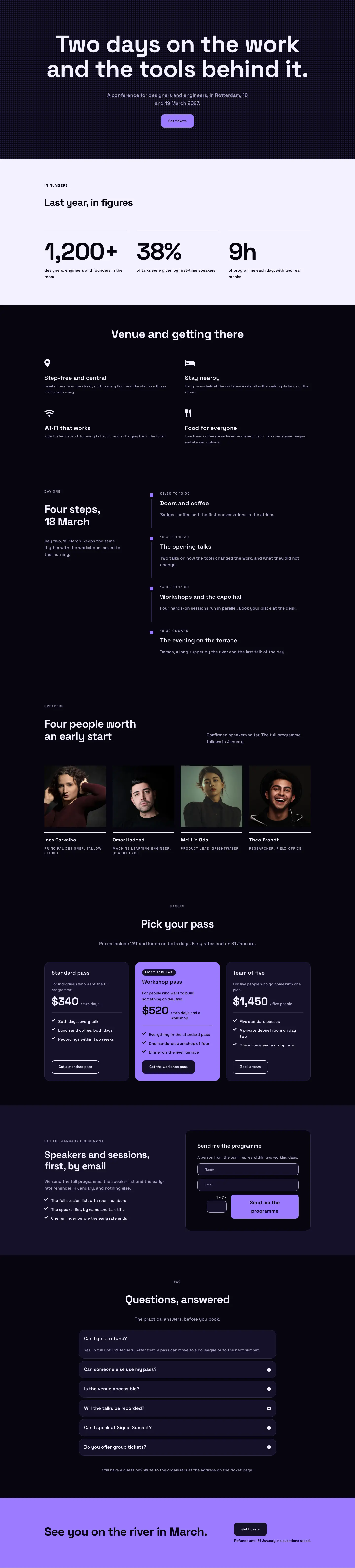
Dark Glass Conference Landing Page for Divi 5: Signal Summit
full_landing · events · dark

Elegant Restaurant Landing Page for Divi 5: Ten-Seat Omakase Counter
full_landing · restaurant · elegant

Bold Studio Landing Page for Divi 5: Motion and Brand Design
full_landing · agency · bold

Playful Small-Batch Preserves Landing Page for Divi 5: Little Jars
full_landing · ecommerce · playful