
Elegant Coaching Landing Page for Divi 5: Founder Burnout Recovery
A refined Divi 5 full landing page for a founder burnout recovery coaching practice. Features hero, symptoms checklist, programme stages, pricing cards, testimonial, FAQ, and contact form in a lavender and deep navy palette.
Rate this element
Download this section, free
- Divi 5 JSON, imports in seconds
- Commercial license included
- No account needed
Click to view the full page
Overview
This landing page is built around a single tension: the founder who is still functional but running on empty. The layout opens with a two-column hero section on a soft lavender background (#f4f1fb) where a 4:5 portrait photograph with 16px rounded corners sits flush left, and a white card group — with a negative left margin that pulls it across the image — carries the headline, subhead, body copy, and primary CTA. The card has a subtle #e2dcf2 border and its own 16px radius, so it reads as a floating object rather than a flat column. Heading weight alternates between an uppercase Figtree label at 14px and a 52px Newsreader serif (#1d1a33) with -1px tracking and text-wrap: balance — a pairing that signals editorial refinement without performing luxury.
The second section introduces an eight-item symptom checklist: a narrow left column holds the section label and h2, while the wider right column renders the items in a two-column CSS grid (collapsing to one on mobile) using inline icon + text groups. Each row uses Font Awesome checkmarks at 18px in #1d1a33 — the same near-black as the body copy — which keeps the list legible without the visual noise of colored dots. Desktop padding on each item is 14px vertical; phone drops to 10px, so the stack never feels cramped on small screens.
The programme section uses a full-width single column centered at max-width: 720px for the heading and a four-column grid (two on tablet, one on phone) for the stage cards. Each card shows a 48px purple circle badge, a connecting #e2dcf2 divider line that hides on phone, and a Newsreader h3 with a Figtree body. Below the grid a centered CTA button repeats the primary purple. The founder bio section that follows reverses the column weight — the photo column is narrower (9/24 flex) and uses a distinctive mixed-radius image (999px top, 32px bottom) for an organic feel, while the wider copy column carries a 40px Newsreader headline and three paragraphs at 22px — the largest body text on the page, calibrated for the intimate tone of a personal letter.
The testimonial section uses a dark overlay gradient (rgba(29,26,51,0.7) at both stops) over a full-bleed Pexels background, with the pull quote set in Newsreader at 42px in near-white #faf8ff. The opening quotation mark is a standalone text element at 120px / 0.8em line-height — a typographic device that anchors the quote visually without a separate decorative module. Sections alternate between white, lavender, and #1d1a33 deep navy, giving each topic its own temperature. On mobile all row layouts switch to flexDirection: column and padding steps down in three defined breakpoints (104px → 72px → 48px), ensuring a consistent reading rhythm across devices.
What’s inside
- Two-column hero with an overlapping white card group: 4:5 portrait image, Newsreader h1 at 52px, Figtree body copy, and a rounded primary CTA button
- Eight-item symptom checklist rendered in a two-column CSS grid (one on phone) using divi/icon + divi/text inline groups with Font Awesome checkmarks
- Four-stage programme grid (four columns desktop, two tablet, one phone) with numbered 48px circle badges, connecting divider lines, and individual stage headings and descriptions
- Founder bio section with a mixed-radius portrait (999px top / 32px bottom), name and title caption, and a three-paragraph personal letter in 22px Newsreader with italic sign-off
- Full-bleed testimonial section using a Pexels background image with a 70% dark overlay gradient and a 42px pull quote with oversized decorative opening quotation mark
- Pricing section with two side-by-side programme cards — one on `#f4f1fb`, one on `#1d1a33` — each containing a price, feature checklist with icon rows, and individual CTA buttons
- Five-question accordion FAQ using native divi/toggle modules with bottom-border separators, Newsreader h3 titles at 28px, and a Figtree body at 17px/1.7em line-height
- Contact section pairing an icon-labeled details list (email, phone, location, hours) with a divi/contact-form card on a white background with styled fields, rounded borders, and the purple submit button
Who it’s for
This layout suits any solo practitioner or boutique firm selling high-ticket coaching or consulting services: executive coaches, leadership advisors, therapists-turned-consultants, and founders who have pivoted into peer advisory work. The tone is deliberate and unhurried, which also fits somatic practitioners, mindfulness instructors, and burnout specialists targeting corporate clients. It is not suited to group programmes or course-based offers where social proof volume matters more than the depth of a single relationship.
Customization tips
The two brand colors to change first are the primary purple (#6b4fd1) used on buttons, numbered badges, and the final CTA section background, and the lavender (#f4f1fb) used as the alternate section tint. Both appear in the Divi 5 global colors panel if the pack ships with presets; changing them there updates the whole page at once.
Portrait images throughout use a 4:5 aspect ratio locked in the module settings — swap in your own photo at 800px × 1000px minimum to avoid upscaling. The hero image renders up to 1600px wide on large displays, so supply a high-resolution file. The testimonial background is a full-cover Pexels photo; any landscape image above 1920px wide works without cropping issues.
Headline copy in the hero and founder-bio sections uses text-wrap: balance and tight negative letter-spacing (-1px), so headings up to about 60 characters reflow naturally. Longer copy will break across more lines but remain readable. Keep stage names in the programme grid under 20 characters to avoid card-height mismatches.
How to install this layout
- Download the layout JSON file from this page.
- Open the target page in the Divi 5 builder.
- Open the portability panel (up/down arrows icon) and choose the Import tab.
- Upload the JSON. Tick “replace existing content” only for full-page imports.
- Check the page at desktop and mobile widths, then swap in your copy and images.
Full walkthrough with troubleshooting: How to Import a Divi 5 Layout.
Questions about Elegant Coaching Landing Page for Divi 5: Founder Burnout Recovery
How does the hero card overlap the photograph on desktop?
The white card group uses a negative left margin (-128px on desktop, -96px on tablet) to pull it over the image column. On phone the margin resets to 0 and a negative top margin (-64px) overlaps the image vertically instead, keeping the stacked layout readable without a gap between them.
What keeps the programme stage cards the same height across the four columns?
The parent group uses CSS grid with a fixed four-column count and 24px column gap. Card height is determined by the longest content in any card; all four cells in the same row share that height automatically. On tablet the grid drops to two columns, and on phone to one, so height matching is handled by the browser in each breakpoint.
What image shape does the founder portrait use, and why does it look different from the hero photo?
The founder portrait has 999px radius on the top two corners and 32px on the bottom two, giving it a stadium-top, square-bottom silhouette. The hero image uses uniform 16px radius on all four corners. Both are set to `objectFit: cover` and a 4:5 aspect ratio locked inside the image module.
Which modules make up the testimonial pull quote — is there a blockquote module?
There is no dedicated blockquote module. The section uses a plain divi/text element for the oversized opening quotation mark (120px Newsreader, 0.8em line-height), a second divi/text for the quote body at 42px, a divi/divider as a short decorative rule, and two more divi/text elements for the attribution name and title. The dark overlay is a gradient applied directly to the section background, not a separate module.
What do I edit first after importing if I want to replace the sample contact details?
The contact section near the bottom of the page has four icon + text pairs (email, phone, location, hours) built from divi/icon and divi/text groups. Replace the placeholder text in each divi/text module. The contact-form button label and the CTA section footer note also contain the example email address and phone number, so search for `stillwatercoaching.example` and `555-0140` to catch every instance.
Does the layout include a sticky navigation header?
No. This is a focused single-page layout with no navigation module. The page relies on repeated CTA buttons within each section to drive conversions. If you need a sticky nav, add one above the first section using your theme's global header or a separate Divi header module.
Which Divi version does this layout need?
Divi 5. The layout is generated natively for Divi 5 and validated against its real module structure before publication, so it imports clean into the current builder.
Can I use this layout on client websites?
Yes. Every download includes a commercial license covering unlimited sites you own or build for clients. Only reselling or redistributing the layout file itself is prohibited.
More full landing pages
Browse all full landing pages
Dark Developer Tool Landing Page for Divi 5: Log Tracing Platform
full_landing · saas · dark
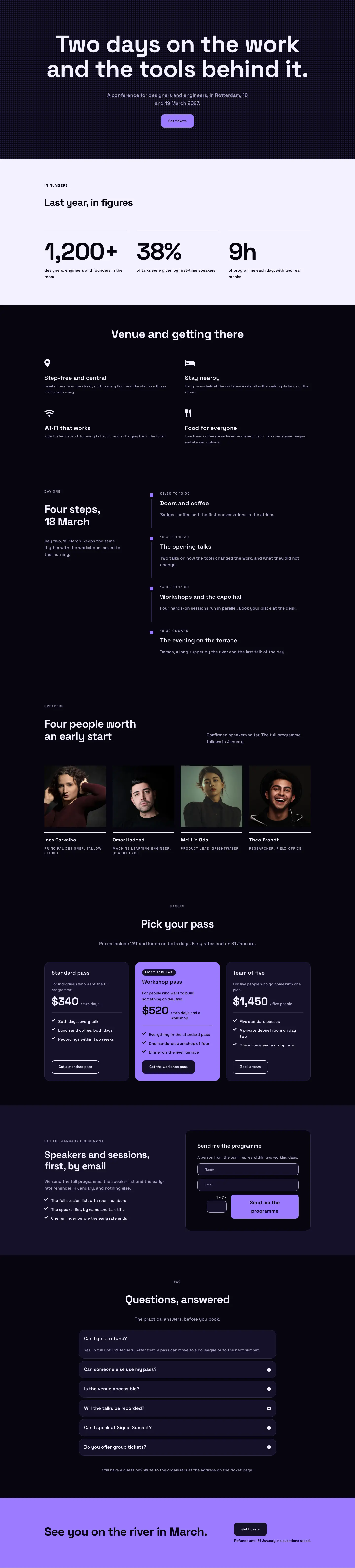
Dark Glass Conference Landing Page for Divi 5: Signal Summit
full_landing · events · dark

Elegant Restaurant Landing Page for Divi 5: Ten-Seat Omakase Counter
full_landing · restaurant · elegant

Bold Studio Landing Page for Divi 5: Motion and Brand Design
full_landing · agency · bold

Playful Small-Batch Preserves Landing Page for Divi 5: Little Jars
full_landing · ecommerce · playful

Elegant Furniture Maker Portfolio Landing Page for Divi 5: Ashdown Workshop
full_landing · portfolio · elegant