
Elegant Restaurant Landing Page for Divi 5: Ten-Seat Omakase Counter
A dark, refined Divi 5 full landing page for an intimate omakase counter restaurant. Features a cinematic hero, photo gallery, chef bio, testimonial, stats, FAQ accordion, and contact form.
Rate this element
Download this section, free
- Divi 5 JSON, imports in seconds
- Commercial license included
- No account needed
Click to view the full page
Overview
The layout opens with a full-viewport hero that sets the register immediately: a darkened counter photograph sits behind a left-anchored column holding an H4 eyebrow in Jost uppercase at 3px letter-spacing, a 72px Bodoni Moda H1 at weight 300 ("Seventeen courses, served one at a time."), a 20px Jost body line, and a pair of buttons. The primary "Reserve a seat" button uses a 2px-radius bronze fill (#b8925a); the secondary "Read the menu" sits in a transparent outline with a matching 1px ivory border. Below a 2px solid divider, three sparse metadata lines (address, days open, duration) repeat the same uppercase-tracked Jost treatment at 14px, grounding the experience in logistics without breaking the mood. On phones the group drops to a 560px minimum height and the H1 scales to 38px; the button group wraps with a 12px row gap.
The interior moves through eight tightly sequenced sections, all sharing the same near-black base (#120e0b) with vertical padding that scales from 160 to 200px on desktop down to 72 to 88px on phones. "The plates" gallery uses a three-column flex row of divi/group containers, each holding two stacked divi/image modules with alternating 4:5 and 4:3 aspect ratios. The offset heights produce a masonry-like rhythm without JavaScript or custom CSS. Images carry object-fit cover and zero border-radius, keeping every frame editorial and flush. "Our story" floats over a second full-bleed background photograph (68% dark gradient overlay, matching the hero) and follows it with a 4-column CSS grid timeline (collapsing to 2 columns on tablet and 1 on phone), where each milestone card opens with a 2px #f7f1e6 top border, a 48px bold Bodoni Moda year, an H3 heading, and a single body line.
Two sections carry the persuasion arc. The pull-quote section opens with a 160px Bodoni Moda open-quotation mark in #a89c88, places the quote text (Bodoni Moda 44px, max-width 960px, centered) beneath it, and closes with a 56px circular avatar paired with a name and role in a flex row. The chef portrait section puts a 4:5 image in a 9/24-fraction column (pill-top border radius, 32px bottom corners) against a 15/24 column carrying the chef letter: three short paragraphs in Bodoni Moda 22px at 1.6em line-height, followed by an italic Bodoni Moda signature, the whole column in #f1e9dc on #1c1713.
The layout closes with a "By the numbers" stat grid (four cards divided by 1px #3b3129 gaps, each showing a 64px weight-300 Bodoni Moda figure and an uppercase tracked Jost label: 10 seats, 17 courses, 96% rebooking rate, 4 sake breweries) and a divi/accordion FAQ with six pre-written items. The final section pairs a venue photograph column (4:5, pill-top/32px-bottom radius) with Font Awesome icon contact-detail rows and a divi/contact-form (Name, Email, Message) that uses the same bronze submit button as the hero, giving the page a booking entry point at every scroll depth.
What’s inside
- Full-viewport hero section with a full-bleed background image, 68% dark gradient overlay, left-aligned H1/H4/button group, a 2px horizontal divider, and three uppercase spaced metadata lines (address, schedule, duration)
- Three-column staggered image gallery: six divi/image modules with alternating 4:5 and 4:3 aspect ratios create a masonry-like column rhythm using native Divi flex layout, no JavaScript or extra plugins
- Four-column CSS grid timeline with 2px top-border milestone cards, 48px bold Bodoni Moda year numerals, H3 titles, and body lines; collapses to 2 columns on tablet and 1 on phone
- Centered pull-quote section with a 160px decorative open-quotation mark, a 44px editorial quote, and a circular avatar attribution row (56px image, name, role)
- Two-column chef portrait section: 4:5 image with pill-top/32px-bottom border radius in a 9/24 column, paired with a multi-paragraph Bodoni Moda chef letter and italic signature in a 15/24 column
- Four-cell stat grid with 1px #3b3129 gap borders on a near-black field, 64px weight-300 Bodoni Moda numerals, and uppercase tracked Jost labels
- divi/accordion FAQ with six pre-written items, #1c1713 toggle backgrounds, and 1px warm-brown borders, styled in Bodoni Moda 19px questions with Jost 16px answers
- Integrated divi/contact-form (Name, Email, Message) with Font Awesome icon contact-detail rows and a bronze submit button that matches the hero's primary CTA exactly
Who it’s for
This layout is built for omakase counters, tasting-menu restaurants, chef's table concepts, and intimate supper clubs where scarcity and storytelling do the selling. It also suits high-end sake bars, private dining rooms, and wine-pairing experiences that need to communicate a narrative before a guest commits to booking. Web designers and agency developers working with upscale hospitality clients will find the full-page structure covers brand story, food photography, social proof, a FAQ, and a reservation form in a single import, without needing additional templates or page sections.
Customization tips
The palette centers on two values you will change most often: the near-black base (#120e0b, used on section backgrounds) and the bronze accent (#b8925a, used on the primary button fill and border in both the hero and the contact form). Swapping both instantly shifts the mood, from Japanese counter to Parisian wine bar to Nordic tasting room. Bodoni Moda carries the editorial weight in all display headings, the pull quote, the chef letter, and the stat numerals; replacing it with Playfair Display or Cormorant Garamond preserves the serif authority while changing the voice. Jost handles all body text, eyebrows, and button labels and swaps cleanly to Inter or DM Sans if you need a more neutral tone.
For photography, the hero and story background images are wide 16:9 shots at 1920px; prepare those crops first. The gallery modules alternate between 4:5 and 4:3 crops, so have both orientations ready for each dish. The chef portrait and venue contact image both expect 4:5. Keep the hero body copy under 25 words to avoid crowding on tablet, where the H1 drops to 52px.
How to install this layout
- Download the layout JSON file from this page.
- Open the target page in the Divi 5 builder.
- Open the portability panel (up/down arrows icon) and choose the Import tab.
- Upload the JSON. Tick “replace existing content” only for full-page imports.
- Check the page at desktop and mobile widths, then swap in your copy and images.
Full walkthrough with troubleshooting: How to Import a Divi 5 Layout.
Questions about Elegant Restaurant Landing Page for Divi 5: Ten-Seat Omakase Counter
What aspect ratios does the gallery section need?
The three-column gallery has six divi/image modules. In each column the first image is 4:5 (portrait) and the second is 4:3 (landscape), except column two which reverses the order. All images use object-fit cover, so slightly off-ratio photos will fill without distortion, though the cropped edges may cut important detail — prepare your food photography in both ratios before replacing the placeholders.
The hero has a background photograph behind the text. How do I replace it?
The photo is set on the divi/section background decoration, not inside a divi/image module. Open the section settings, go to Background, and swap the image URL. A gradient overlay (rgba(11,8,6,0.68)) is layered on top with "overlays image: on" — leave it active when you replace the photo, and adjust the opacity stops if your image is lighter or darker than the original.
Does the contact form send email out of the box?
The divi/contact-form module uses Divi's native form handling and sends to the address configured in your WordPress email settings, or to whichever address you set inside the module's Email field after import. No third-party form plugin is required. Test the form immediately after import to confirm your WordPress mail transport is working.
How does the four-column timeline reflow on smaller screens?
The "Our story" milestone section uses CSS grid with gridColumnCount set to 4 on desktop, 2 on tablet, and 1 on phone — wired directly in the divi/group layout decoration so no custom CSS is needed. Each card's 2px top border, Bodoni Moda year, and body text stack correctly at every breakpoint.
The bronze button color appears in more than one place. Do I have to update each one separately?
Yes. The bronze (#b8925a) is applied individually to three divi/button and divi/contact-form button modules and is not linked to a global color token inside this layout file. Update each button's fill and border color separately, or assign the hex to a Divi global color preset before importing and reference it from there to keep future changes in one place.
The H1 is 72px on desktop. Will it overflow on narrow phones?
No. The H1 is explicitly set to 52px on tablet and 38px on phone in the module decoration, and the layout applies text-wrap balance to short headlines. Keep the H1 under 8 words and the 38px mobile size stays clean. Longer headlines may wrap to three lines at 38px, which can push the button pair further down the viewport on small devices.
Which Divi version does this layout need?
Divi 5. The layout is generated natively for Divi 5 and validated against its real module structure before publication, so it imports clean into the current builder.
Can I use this layout on client websites?
Yes. Every download includes a commercial license covering unlimited sites you own or build for clients. Only reselling or redistributing the layout file itself is prohibited.
More full landing pages
Browse all full landing pages
Dark Developer Tool Landing Page for Divi 5: Log Tracing Platform
full_landing · saas · dark

Elegant Coaching Landing Page for Divi 5: Founder Burnout Recovery
full_landing · coaching · elegant
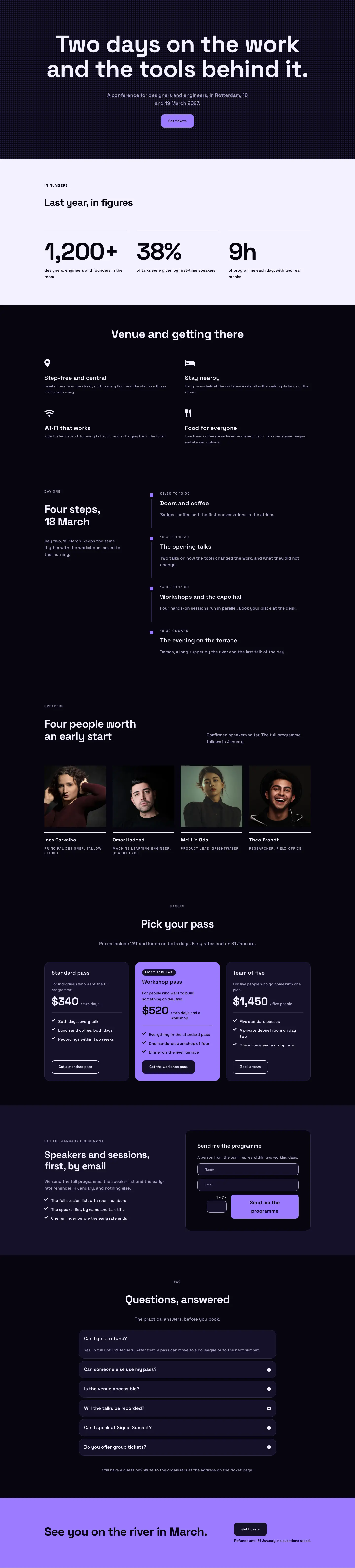
Dark Glass Conference Landing Page for Divi 5: Signal Summit
full_landing · events · dark

Bold Studio Landing Page for Divi 5: Motion and Brand Design
full_landing · agency · bold

Playful Small-Batch Preserves Landing Page for Divi 5: Little Jars
full_landing · ecommerce · playful

Elegant Furniture Maker Portfolio Landing Page for Divi 5: Ashdown Workshop
full_landing · portfolio · elegant