
Dark Developer Tool Landing Page for Divi 5: Log Tracing Platform
A dark, developer-focused Divi 5 full landing page for a log tracing SaaS. Features hero, stats, feature walkthrough, before/after comparison, pricing cards, testimonial, FAQ, and CTA sections.
Rate this element
Download this section, free
- Divi 5 JSON, imports in seconds
- Commercial license included
- No account needed
Click to view the full page
Overview
The layout runs across nine sections and uses two alternating surface tones, near-black #090b0a and a slightly lighter #131815, as its primary canvas, with a single amber accent (#ffb000) reserved for the closing CTA bar. Every border and divider is a 1px dashed line in #27302b, which gives the whole page a terminal-printout quality without hard rules or drop shadows. The typography pairing is fixed throughout: Space Grotesk at semibold or bold for all headings and display numerals, Azeret Mono for all body copy, labels, and button text. The combination reads as developer-adjacent without feeling cold, and it holds up at every viewport because both families are well-hinted Google Fonts.
The hero opens with a 50/50 flex row. The left column holds an Azeret Mono eyebrow line, a Space Grotesk H1 at 56px (stepping to 42px at tablet and 34px at phone), a short subheading paragraph at 18px, and a flex-wrapped button group. The primary button fills amber (#ffb000) with a dashed amber border; the secondary is a ghost with the same dashed border treatment in off-white. Across the gutter the right column holds a #131815 card with a dashed outer border and four spec-sheet rows in 14px Azeret Mono, each separated by a 1px dashed Divider module. This puts four concrete product facts in the same viewport as the headline, with no scroll required to reach the ingest rate, retention window, supported platforms, and support tier.
A full-width statistics section breaks from the dark palette to an off-white #e9ede9 background and places three metric cells in a CSS grid at 40px column gap. Each cell opens with a 2px dashed horizontal rule, then a 96px Space Grotesk numeral at bold weight and -2px tracking, followed by a short Azeret Mono label. At tablet the numerals drop to 64px; at phone the grid collapses to a single column. All three figures are plain Text modules, so they update instantly when you replace the placeholder copy. Three alternating image/text feature rows follow on the dark background, each built as a vertically centred 50/50 flex row with a 4:3 cover-fit image and a text column carrying a numbered eyebrow, an H3, a body paragraph constrained to a 480px Group, and an underlined inline link. The second row uses order: -1 on its image column at phone, so the image always stacks above its text regardless of which desktop column it occupies.
The page closes through four more sections: a before/after comparison block that pairs a dark Icon-and-Text card against a near-white one with the same structure and contrasting fills; a numbered setup walkthrough in an asymmetric 8/24 + 16/24 column split where each step number is an 80px Space Grotesk numeral separated from the next by a 1px dashed Divider; a single Testimonial module on a #131815 card with dashed border; a two-column pricing grid with individual CTA buttons per tier; a five-item Toggle FAQ accordion with the first item open and dashed bottom borders between questions; and an amber CTA bar that spans full width with a horizontal flex between headline and button group, stacking to a column on phone. Padding on every section steps from 88px desktop to 64px tablet to 40px phone, so proportions scale cleanly across device sizes.
What’s inside
- Hero 50/50 flex row: Space Grotesk H1 (56px/42px/34px) with Azeret Mono eyebrow, subheading paragraph, and two-button group (amber filled primary + ghost secondary, both with dashed borders)
- Spec-sheet card in the hero right column: #131815 background, dashed outer border, four Azeret Mono fact rows each separated by a 1px dashed Divider module
- Statistics grid on an off-white (#e9ede9) section: three CSS-grid cells, each with a 2px dashed rule above a 96px Space Grotesk bold numeral and a short Azeret Mono label, collapsing to one column on phone
- Three alternating feature rows: 4:3 cover-fit image paired with a numbered eyebrow (01/02/03), H3 heading, body paragraph in a 480px Group, and underlined inline link; second row inverts image column order on phone via order: -1
- Before/after comparison cards: dark #131815 card with Font Awesome X-icon rows vs near-white #e9ede9 card with checkmark rows and a CTA button, both built as Group modules with identical padding structure
- Numbered setup steps in an asymmetric 8/24 + 16/24 column split: 80px Space Grotesk step numerals, H3 sub-headings in 26px, and 1px dashed Divider modules between each step
- Testimonial module on a #131815 dashed-border card with portrait image, author name, job title, company link, and Azeret Mono body text
- Five-item Toggle FAQ accordion with dashed bottom borders, first item open by default, Space Grotesk 28px question headings, and a community forum prompt below the final toggle
Who it’s for
This layout suits any SaaS or developer tool company that needs to present a technical product to an engineering audience without sacrificing marketing clarity. It works for observability platforms, log management tools, APM vendors, incident management software, and infrastructure monitoring products. Agencies building landing pages for DevOps-adjacent clients will find the before/after comparison structure and numbered setup walkthrough directly reusable. The pricing section handles a freemium model out of the box, making it equally useful for open-core developer tools that offer a self-hosted tier alongside a paid cloud option.
Customization tips
The amber #ffb000 appears in the hero primary button, its dashed border, and the closing CTA section background. Swap it in Divi's global colour presets and all three update together. The three surface tones (#090b0a, #131815, #e9ede9) are applied per-section in the decoration panel; adjust them independently if your brand palette runs cooler or warmer.
The spec-sheet card in the hero is built for four rows. A fifth row stretches the card but stays readable; dropping to three tightens it nicely. Feature-row body copy is constrained to a 480px Group module, so keep paragraphs to roughly 50 to 60 words to avoid pushing the text column taller than the paired 4:3 image. The Pexels images are cover-fit at a 4:3 aspect ratio; any landscape photo at that ratio drops in without layout shifts. Pricing card feature lists are Icon + Text rows inside a Group with no fixed height, so you can add or remove bullet rows freely. Step numerals in the setup section are plain Text modules at 80px, so updating the count is a one-field edit.
How to install this layout
- Download the layout JSON file from this page.
- Open the target page in the Divi 5 builder.
- Open the portability panel (up/down arrows icon) and choose the Import tab.
- Upload the JSON. Tick “replace existing content” only for full-page imports.
- Check the page at desktop and mobile widths, then swap in your copy and images.
Full walkthrough with troubleshooting: How to Import a Divi 5 Layout.
Questions about Dark Developer Tool Landing Page for Divi 5: Log Tracing Platform
How does the second feature row handle image order on mobile?
The second alternating row applies order: -1 to its image column on phone, which moves the image above the text block in the stacked layout regardless of which column the image sits in on desktop. The other two feature rows stack in natural document order.
What typefaces does the layout use, and do I need to install them separately?
Space Grotesk for all headings and display numerals, Azeret Mono for body copy, labels, and buttons. Both are Google Fonts. Set them in the Divi module font fields and Divi 5 loads them automatically; no manual installation or additional plugin is needed.
Can I make the statistics section dark to match the rest of the page?
Yes. The off-white (#e9ede9) background is a section-level colour in the decoration panel. Change it to #131815 or #090b0a, then update the heading and numeral colours inside each Text and Heading module from #090b0a to #e9ede9. The 2px dashed rules above each stat are also set to #090b0a, so change those to #27302b or #8f9a93 to keep them visible on the darker surface.
Are the spec-sheet rows, stat figures, and pricing numbers editable without touching code?
All numbers and labels are Text or Heading modules in the Divi visual builder. Click any figure and type your own. The spec-sheet rows are individual Text modules separated by Divider modules, so you can add, reorder, or remove rows without changing any layout structure.
How do I swap the X marks and checkmarks in the comparison cards?
Each icon is a Divi 5 Icon module with a Font Awesome glyph in its unicode field. The X mark uses  and the checkmark uses . Open the Icon module in the builder and change the unicode value to any other Font Awesome icon you need.
How do I replace the testimonial portrait photo?
Open the Testimonial module and update the portrait URL in its Portrait field. The dark card background (#131815) and 2px dashed border (#27302b) are set in the module's decoration panel and remain untouched when you swap the image or update the author details.
Which Divi version does this layout need?
Divi 5. The layout is generated natively for Divi 5 and validated against its real module structure before publication, so it imports clean into the current builder.
Can I use this layout on client websites?
Yes. Every download includes a commercial license covering unlimited sites you own or build for clients. Only reselling or redistributing the layout file itself is prohibited.
More full landing pages
Browse all full landing pages
Elegant Coaching Landing Page for Divi 5: Founder Burnout Recovery
full_landing · coaching · elegant
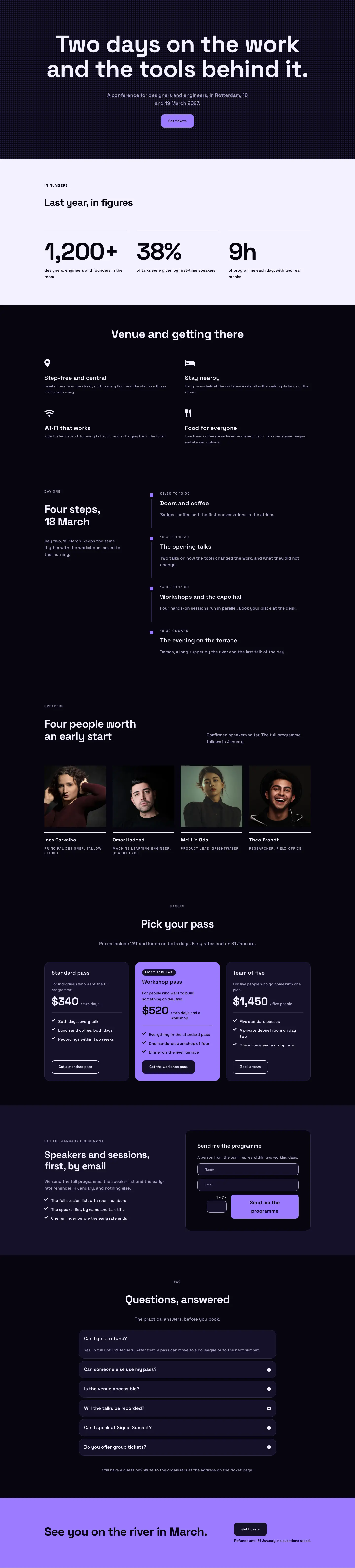
Dark Glass Conference Landing Page for Divi 5: Signal Summit
full_landing · events · dark

Elegant Restaurant Landing Page for Divi 5: Ten-Seat Omakase Counter
full_landing · restaurant · elegant

Bold Studio Landing Page for Divi 5: Motion and Brand Design
full_landing · agency · bold

Playful Small-Batch Preserves Landing Page for Divi 5: Little Jars
full_landing · ecommerce · playful

Elegant Furniture Maker Portfolio Landing Page for Divi 5: Ashdown Workshop
full_landing · portfolio · elegant