
Playful Small-Batch Preserves Landing Page for Divi 5: Little Jars
A playful ecommerce landing page for a small-batch jam brand. Hero, process steps, ingredients checklist, testimonial, pricing tiers, stats, FAQ, and CTA — all in one Divi 5 layout.
Rate this element
Download this section, free
- Divi 5 JSON, imports in seconds
- Commercial license included
- No account needed
Click to view the full page
Overview
Little Jars is a ten-section full landing page built around a warm two-tone palette: cream (#fff4e6) and white sections alternate in a regular rhythm, with coral pink (#ef4f7a) reserved exclusively for primary CTAs and the highlighted pricing card. Deep plum (#2e1238) carries all text, borders, and shadows. The hero opens on a single centered column inside a radial gradient that bleeds from white at the top into the warm cream, placing an h1 at 64px (scaling to 48px on tablet and 36px on phone) above a capped 600px body paragraph and two pill-shaped buttons. Those buttons carry a hard 6px/6px/0px box shadow with zero blur -- a neo-brutalist detail that repeats across every card, accordion block, and pricing tier in the layout, giving all interactive elements a consistent tactile weight. A wide product image sits below, bordered at 36px radius with a peach rule and a deep soft shadow, followed by a three-item inline trust bar.
The process section uses three two-column rows, each pairing a 4:3 cover image with a numbered heading (01, 02, 03) and a short paragraph. Desktop layout alternates image left and image right; the second row sets order: -1 on the image column in the phone breakpoint so all three steps render image-above-text on mobile without needing manual overrides. Padding on the copy column also shifts per breakpoint: 48px right on desktop, 24px on tablet, zero on phone, preventing cramped text at narrow widths.
After a full-bleed testimonial section with a 68% dark-plum overlay gradient over a background photograph, the page moves through an ingredients checklist, a numbered order-flow section, and a four-cell stats grid before reaching the pricing tiers. The stats grid runs four columns on desktop and two on tablet and phone, each cell padded at 40px and separated by 1px peach gaps. Typography throughout uses only two typefaces: Bricolage Grotesque for all display headings and the large numerals, DM Sans for body copy, labels, and button text. The combination reads as artisanal but structured, comfortable at every breakpoint without any custom CSS outside the builder.
The pricing section presents three cards side by side with equal column flex and stretch alignment so cards always reach the same height. The middle card uses a solid coral pink fill with a white CTA button, while the outer cards sit on white with outline buttons. A nested group inside the middle card carries the "Most popular" badge, styled as a white pill with Bricolage Grotesque text at 12px. All three cards share the same 36px radius, 2px border, and hard shadow, and each contains a heading, a tagline, a large price figure, a feature checklist, and a button, stacking in a single column on phone.
What’s inside
- Ten-section full landing page: hero with radial-gradient background, slim trust bar, three alternating image/copy process rows, ingredients checklist, full-bleed testimonial with overlay gradient, numbered order-flow steps, four-cell stats grid, three-tier pricing cards, accordion FAQ, and a coral CTA band
- Pill-shaped CTAs and all pricing/accordion cards share a hard 6px/6px/0px box shadow with no blur, applied consistently via Divi 5's box-shadow decoration properties for a unified neo-brutalist tactile feel
- Three alternating 4:3 cover-image process rows built with Divi's column order property on the second row, so all three steps render image-above-copy on phones regardless of their left/right desktop arrangement
- Eight-item ingredients checklist in a 2-column CSS grid (1 column on phone), each row pairing a FontAwesome checkmark Icon module with a DM Sans Text module at 17px
- Four-cell stats grid (4 columns desktop, 2 on tablet and phone) with 64px Bricolage Grotesque figures at font-weight 300, cells separated by 1px peach (#f0d6c2) gaps on a #f0d6c2 grid background
- Three pricing card columns with a highlighted center card (coral pink fill, white CTA button, nested 'Most popular' badge group), all cards equal height via flex-stretch and each containing a feature checklist built from Icon and Text modules
- Native Accordion module with six FAQ items, 36px border radius, 2px solid #2e1238 border, and the same hard 6px/6px offset shadow used throughout, centered at 800px max-width
- Full-bleed testimonial section with a 68% opacity dark-plum overlay gradient over a section background image, 120px Bricolage Grotesque quotation mark, 42px pull-quote text, and a 64px white divider rule above the attribution
Who it’s for
This layout fits artisan food producers selling direct-to-consumer: preserves, condiments, honey, pickles, sauces, or any small-batch consumable where provenance and handwork are the selling point. The subscription tier structure (single unit, a trio, a larger box) also suits gift food brands, farm-shop operators moving from wholesale to DTC, or subscription box businesses. Freelance WordPress developers and Divi agency teams building for food-and-beverage clients will find the full conversion scaffolding already in place: provenance storytelling, ingredient transparency, social proof, three-tier pricing, and an FAQ, covering the typical journey from trust-building to checkout.
Customization tips
The palette runs on three recurring hex values: #2e1238 (deep plum), #ef4f7a (coral pink), and #fff4e6 (warm cream). Updating these three in Divi's global color presets propagates through every border, shadow, button fill, and section background. The hero uses a radial CSS gradient built from the cream value; update both gradient color stops when rebranding.
Hero image: the container stretches to 960px wide with no fixed aspect ratio, so a wide landscape crop at roughly 16:9 or wider works best. The three process images use a 4:3 aspect ratio with object-fit cover; landscape or square crops work well, but portrait images will be cropped heavily from the sides.
The H1 is set at 64px with text-wrap: balance, which handles comfortably up to around 55 characters before breaks become uneven. Hero body copy sits in a 600px-wide centered container; one to two sentences keeps the layout breathing. All pricing figures and stats grid numbers are plain Text modules and can be edited directly in the builder without touching any decoration settings.
How to install this layout
- Download the layout JSON file from this page.
- Open the target page in the Divi 5 builder.
- Open the portability panel (up/down arrows icon) and choose the Import tab.
- Upload the JSON. Tick “replace existing content” only for full-page imports.
- Check the page at desktop and mobile widths, then swap in your copy and images.
Full walkthrough with troubleshooting: How to Import a Divi 5 Layout.
Questions about Playful Small-Batch Preserves Landing Page for Divi 5: Little Jars
Why does the image in the second process row appear above the text on mobile when it is in the right column on desktop?
The second row's image column has `order: -1` set in the phone layout decoration inside the JSON. This moves it visually to the top of the stacked column flow. The first and third rows place their images in the left column naturally, so all three steps render image-then-text on phones without any manual CSS overrides.
Is the FAQ accordion a custom toggle or a native Divi 5 module?
It uses Divi 5's native Accordion module. The container receives a 36px border radius, a 2px solid #2e1238 border, and a 6px/6px/0px hard box shadow, matching the pricing card style. Open and closed toggle states both use a white background set in the module's openToggle and closedToggle decoration properties, so the accordion sits cleanly on either a white or cream section background.
The middle pricing card has a 'Most popular' badge. Is that a Divi badge component?
No. It is a nested Group module inside the card column, given a white background, a 12px border radius, and small padding via the decoration spacing properties. The label text is a plain Text module in Bricolage Grotesque at 12px. You can edit the label, change the background color, or delete the group entirely to make all three cards visually equal.
What images does the layout include, and what should I replace them with?
The layout references four Pexels photographs: a wide jar arrangement used as the hero image (full column width up to 960px), and three 4:3 process images showing halved oranges beside a marmalade jar, hands tying string around a jar, and hands lifting a jar from a table. Replace them with your own product photography at matching crops. The testimonial section also has a separate Pexels kitchen image behind a 68% dark overlay, so almost any kitchen or pantry shot works there.
The stats grid and trust bar show specific figures like 14k jars and 1,240 reviews. Are those built into the layout permanently?
No, they are placeholder copy generated with the layout. Every figure (14k, 4.8, 71%, 6 kg in the grid; '4.8 out of 5' and '1,240 reviews' in the trust bar) is a plain Text module. Update them to your actual numbers directly in the Divi builder with no layout changes required.
Can I add or remove process steps in the 'How it is made' section?
Yes. Each step is a self-contained two-column row. Delete a row to go from three steps to two, or duplicate a row to add a fourth. If you add a row, copy the padding settings from an adjacent row (48px right on the copy column at desktop, 24px tablet, 0px phone) to keep the spacing consistent across breakpoints.
Which Divi version does this layout need?
Divi 5. The layout is generated natively for Divi 5 and validated against its real module structure before publication, so it imports clean into the current builder.
Can I use this layout on client websites?
Yes. Every download includes a commercial license covering unlimited sites you own or build for clients. Only reselling or redistributing the layout file itself is prohibited.
More full landing pages
Browse all full landing pages
Dark Developer Tool Landing Page for Divi 5: Log Tracing Platform
full_landing · saas · dark

Elegant Coaching Landing Page for Divi 5: Founder Burnout Recovery
full_landing · coaching · elegant
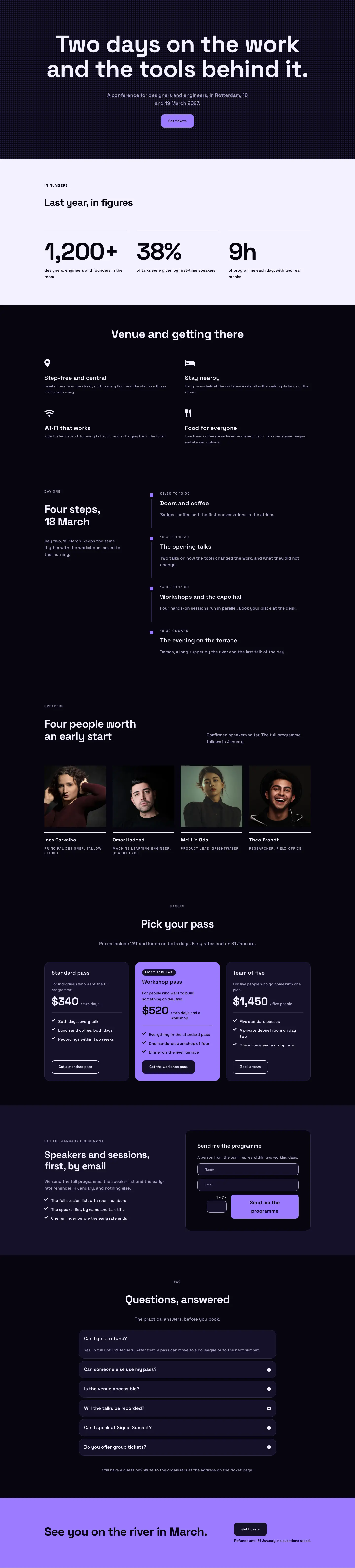
Dark Glass Conference Landing Page for Divi 5: Signal Summit
full_landing · events · dark

Elegant Restaurant Landing Page for Divi 5: Ten-Seat Omakase Counter
full_landing · restaurant · elegant

Bold Studio Landing Page for Divi 5: Motion and Brand Design
full_landing · agency · bold

Elegant Furniture Maker Portfolio Landing Page for Divi 5: Ashdown Workshop
full_landing · portfolio · elegant