
Playful Nonprofit Contact Page Layout for Divi 5: Small Wonders
A warm, playful Divi 5 contact layout for nonprofits and literacy organizations. Coral CTA, friendly copy, and a donate/volunteer/visit intent form.
Rate this element
Download this section, free
- Divi 5 JSON, imports in seconds
- Commercial license included
- No account needed
Click to view the full page
Overview
The layout centers on a single cream-backed section (#fff8ec, 120px top and bottom padding) that cradles a white content card capped at 1040px wide. The card rounds all four corners at 32px and sits on a soft coral drop shadow (rgba(255,107,107,0.14) at 24px vertical / 60px blur), so the whole panel reads like a friendly note pinned to a bulletin board. Inside, a coral uppercase eyebrow ('Drop us a line') sits above an H2 headline that steps down from 44px on desktop to 36px on tablet and 30px on phone. A proper three-tier type ramp that keeps the greeting warm without dominating small screens.
Below the greeting, a 640px-wide intro paragraph names three specific asks (donations, volunteering, mobile-library bookings) so visitors self-sort before they touch the form. A single centered line of contact details (email, phone, hours, address) follows in warm browns (#4b3a30 body, #7a5a4a meta, coral reserved strictly for links). Every text block on the page uses Outfit, so there is exactly one typeface to manage across weights.
The Divi Contact Form module is the workhorse: a 2×2 grid of half-width inputs (Name, Email, School or Organization, Intent) with a full-width message textarea underneath, all wrapped in a 20px-radius container with a hairline #f0e3d0 border and cream #fffaf1 field fills at 14px radius. The submit button 'Send a little sunshine' is a fully rounded coral pill (999px radius) with a soft coral shadow that deepens on hover. On phone, section padding relaxes to 80px vertical, card padding shrinks to 48px/28px, and the row switches to a column flex direction so every field stacks naturally.
What’s inside
- Native Divi 5 Contact Form module with five fields (Name, Email, School/Organization, Intent, Message). No third-party form plugin required
- White content card at 1040px max-width, 32px rounded corners, soft coral drop shadow floating on a cream `#fff8ec` section
- Three-tier responsive H2 type ramp (44px desktop → 36px tablet → 30px phone)
- Vertical rhythm tuned with explicit bottom margins (eyebrow 14px, headline 20px, intro 40px, contact block 48px) so nothing collides
- Fully rounded coral pill submit button with a shadow that lifts from 10px to 14px offset on hover
- Field styling package: cream `#fffaf1` fills, 14px radius, hairline `#f0e3d0` border, Outfit at 15px
- Inline contact-details paragraph (email, phone, hours, address) rendered above the form as centered plain text
- Phone-only overrides that drop section padding to 80px, card padding to 48px/28px, and stack the field grid into a single column
Who it’s for
This is a natural fit for small, community-facing nonprofits where tone matters as much as the ask: literacy programs, children's charities, mobile libraries, PTAs, museum education departments, church youth ministries, community reading rooms, and summer-camp organizations. The warm coral-and-cream palette and rounded card make it feel approachable rather than institutional, so it works for any cause that wants to invite conversation instead of running a formal intake. Because the intent field lets visitors self-declare (donate, volunteer, host a visit), it also suits organizations juggling several parallel programs from one contact page. Skip it if your brand is corporate or strictly minimalist: this layout leans into softness and rounded shapes, and would need real restyling to fit a harder-edged voice.
Customization tips
Palette swaps are the fastest win: replace the coral #ff6b6b (used on the eyebrow, submit button fill, link color, and box-shadow tint) with your brand accent, and update the shadow color to match. It currently uses coral at 14% opacity on the card and 35% on the button. The cream section background #fff8ec and the near-cream field fill #fffaf1 are close cousins on purpose; keep them within a few percent of each other or the field boundaries will start to feel harsh. For copy, the H2 comfortably takes 6–10 words and the intro paragraph is sized for roughly 30–40 words. Go longer and the 640px column starts to feel dense. Field placeholders should stay under about 45 characters each so nothing truncates on phone. The layout ships without any images, so aspect ratios are not a concern: but if you drop a photo into the card, plan on a 3:2 landscape crop at ~1200px wide to sit above the eyebrow.
How to install this layout
- Download the layout JSON file from this page.
- Open the target page in the Divi 5 builder.
- Open the portability panel (up/down arrows icon) and choose the Import tab.
- Upload the JSON. Tick “replace existing content” only for full-page imports.
- Check the page at desktop and mobile widths, then swap in your copy and images.
Full walkthrough with troubleshooting: How to Import a Divi 5 Layout.
Questions about Playful Nonprofit Contact Page Layout for Divi 5: Small Wonders
Which form service handles submissions?
The layout uses Divi's built-in Contact Form module, which mails submissions to the receiver address set on the module (currently hello@smallwondersreading.org). No Gravity Forms, WPForms, or third-party service is needed. Just update the receiver email in the module settings after import.
Do the form fields stack cleanly on mobile?
Yes. The four half-width inputs (Name, Email, School/Organization, Intent) collapse to full width on phone via the row's column flex direction, and the Message textarea is already full-width. Section padding also drops from 120px to 80px vertical and card padding shrinks to 48px/28px so nothing feels cramped.
What should I change first after importing?
Swap the coral `#ff6b6b` for your brand color in three places (eyebrow text, submit-button background, and the card's box-shadow), then rewrite the contact-details paragraph: email, phone, hours, and address are all hard-coded text, not dynamic fields.
Are any images or icons used?
No. The layout is fully typographic and leans on shape (rounded card, pill button) and a soft coral shadow for personality. That keeps page weight low and means there are no image licenses, aspect ratios, or alt text to manage on import.
Can I add a subject dropdown or file upload?
Yes. The Divi Contact Form module supports select and file-upload field types. Insert a new Contact Field between Intent and Message, set its type, and match the existing `flexType` (12_24 for a half-width field, 24_24 for full width) so it lines up with the current grid.
Which Divi version does this layout need?
Divi 5. The layout is generated natively for Divi 5 and validated against its real module structure before publication, so it imports clean into the current builder.
Can I use this layout on client websites?
Yes. Every download includes a commercial license covering unlimited sites you own or build for clients. Only reselling or redistributing the layout file itself is prohibited.
More contact forms
Browse all contact forms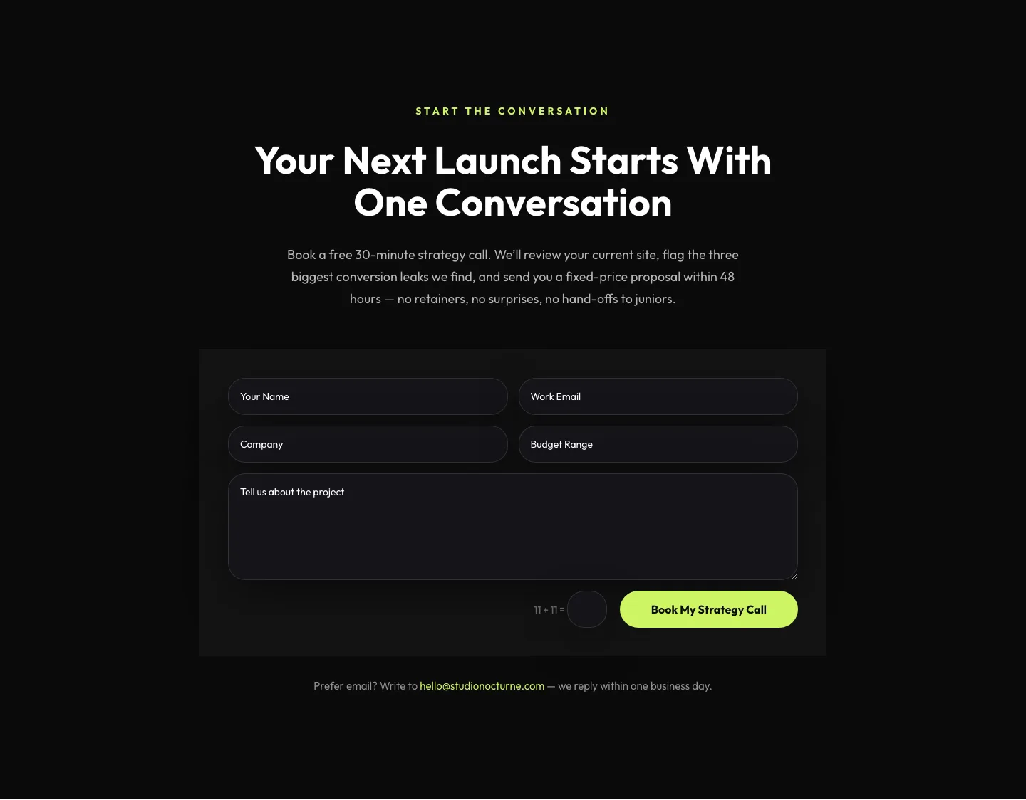
Dark Agency Contact Form: Book a Strategy Call Divi 5 Layout
contact · agency · dark
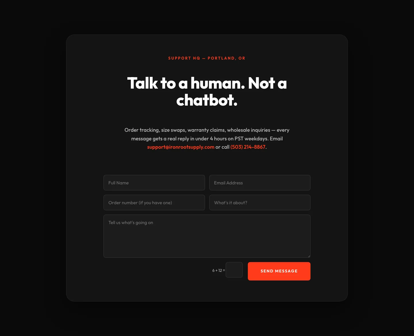
Bold Ecommerce Contact Form Layout for Divi 5: Ironroot
contact · ecommerce · bold
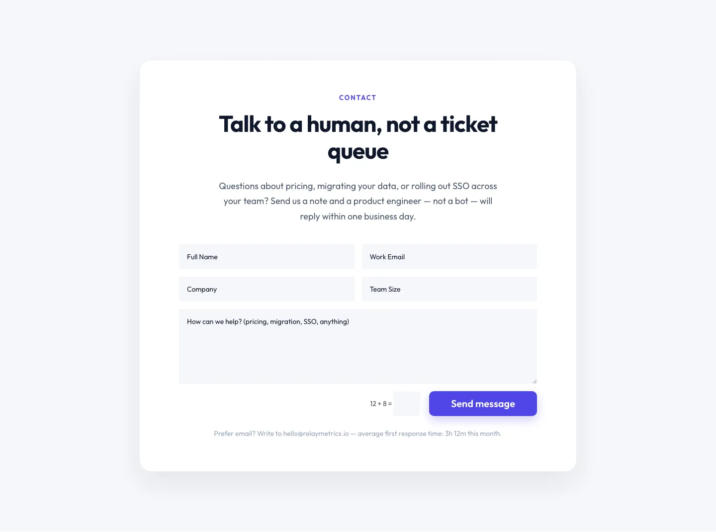
Minimal SaaS Contact Form Section: Divi 5 Layout
contact · saas · minimal
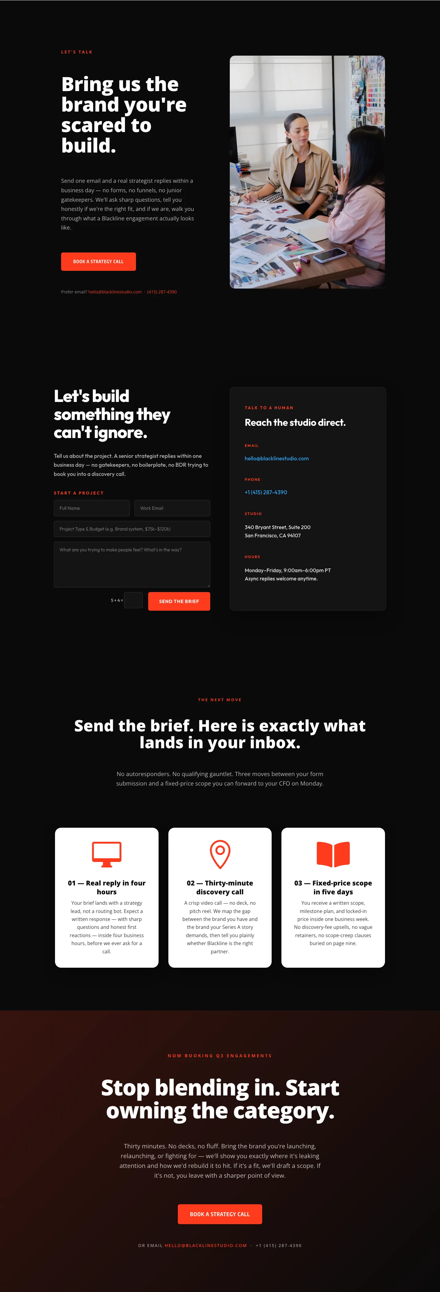
Blackline Studio: Bold Agency Contact Page for Divi 5
contact · agency · bold
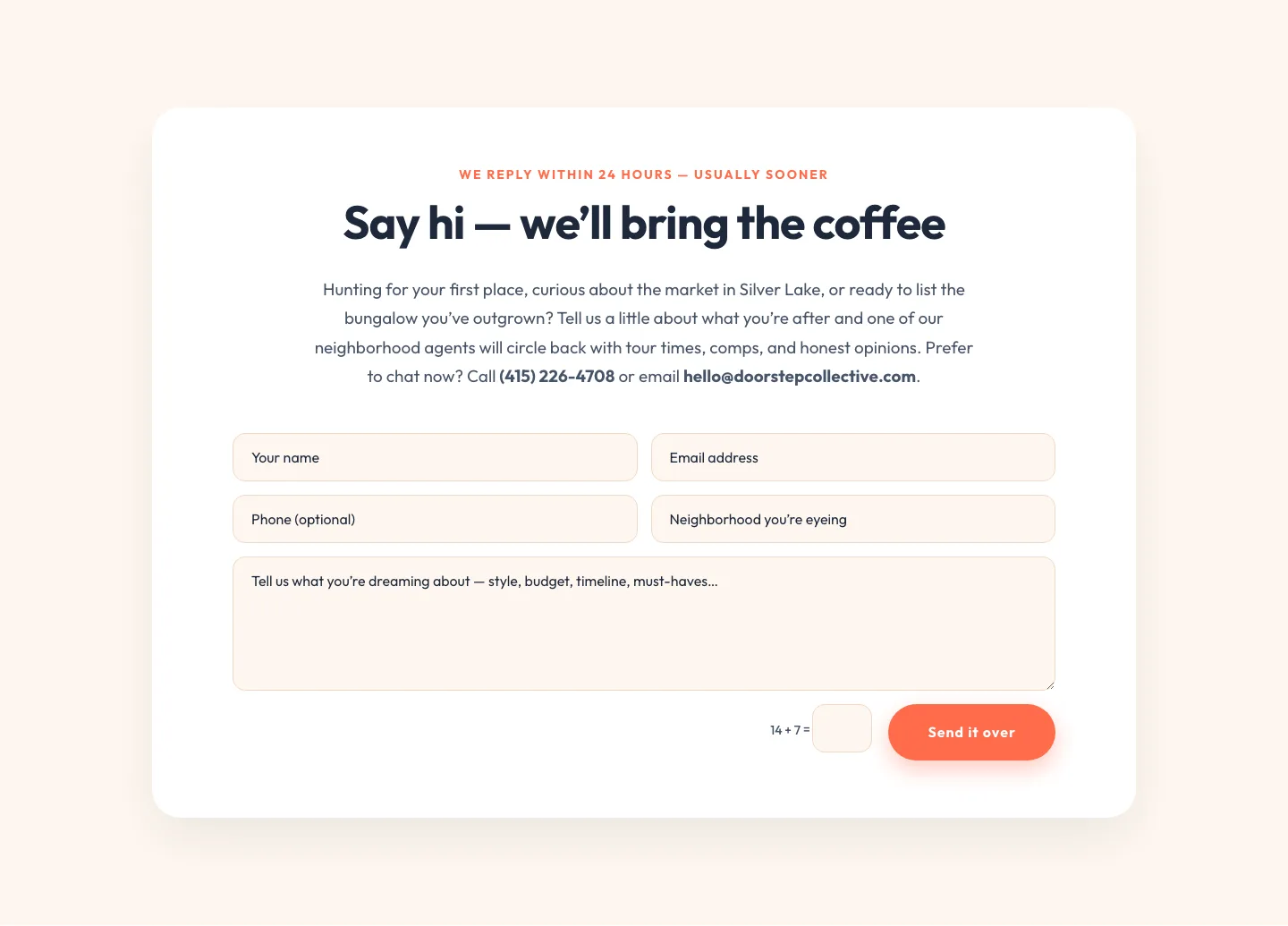
Playful Real Estate Contact Form Divi 5 Layout
contact · real_estate · playful
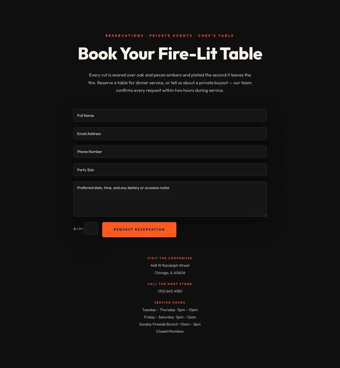
Bold Restaurant Reservation Contact Layout for Divi 5
contact · restaurant · bold