
Minimal SaaS Contact Form Section: Divi 5 Layout
Clean, conversion-ready Divi 5 contact section for SaaS sites: centered card with rounded corners, two-column form fields, indigo CTA button, and a human-touch support note. Fully responsive.
Rate this element
Download this section, free
- Divi 5 JSON, imports in seconds
- Commercial license included
- No account needed
Click to view the full page
Overview
A single-section contact block built as a soft, elevated card sitting on a light #F6F7FB canvas. The section runs 120px of top/bottom padding on desktop (80px on tablet, 64px on phone), and the white card inside is constrained to an 880px max-width with 64px of internal padding, a 24px border-radius, a 1px #EEF0F4 hairline, and a low-lying shadow (rgba(15,23,42,0.08)) that lifts it just enough to feel intentional without competing with the form.
Inside the card, the hierarchy is deliberately narrow and centered: an indigo #4F46E5 uppercase eyebrow (13px, 2px letter-spacing) sets the section label, followed by a 46px H2 (Outfit, weight 700, -1px tracking, #0F172A ink) that steps down to 36px on tablet and 30px on phone. A 560px-wide 18px sub-heading in slate #475569 at 1.7em line-height gives the eye a place to rest before the form itself.
The Divi 5 Contact Form module is centered inside the card at 720px max-width. The first four fields (Full Name, Work Email, Company, Team Size) sit two-up as 12_24 half-columns; the Message field spans the full 24_24 row. Every input uses the same #F6F7FB fill as the outer canvas, a small trick that makes the fields feel recessed into the card. The submit button is a solid indigo pill (#4F46E5 → #4338CA on hover) with a soft indigo shadow that grows on hover, and a muted #94A3B8 disclaimer sits below it, quietly promising a real reply time.
On mobile, the section padding collapses to 64px, card padding drops to 40px top/bottom and 24px horizontal, the button padding tightens to 16px, and the heading rescales cleanly. So nothing feels cramped at 375px.
What’s inside
- Native Divi 5 Contact Form module with five pre-labeled fields (Full Name, Work Email, Company, Team Size, Message): Name/Email/Company/Team Size as two-up half-columns, Message full-width
- Indigo `#4F46E5` submit button with a `#4338CA` hover state and a lifting `rgba(79,70,229,…)` box-shadow that grows from 20px to 32px blur on hover
- Elevated white card row (880px max-width, 24px radius, 1px `#EEF0F4` border, soft `rgba(15,23,42,0.08)` shadow) sitting on a `#F6F7FB` section canvas
- Three-part heading stack: uppercase indigo eyebrow, tight-tracked 46px H2, 18px slate sub-heading. All centered with sensible max-widths (640px / 560px)
- Muted response-time disclaimer at the bottom, with the recipient email styled as an indigo link
- Pre-wired CSS IDs (`#contact` on the section and `#getintouch` on the card) ready for anchor-menu jumps
- Full responsive scale-down: section padding 120 → 80 → 64px, card padding 64 → 40/24px, heading 46 → 36 → 30px, button padding 44 → 16px
- `Outfit` typography applied consistently across eyebrow, heading, sub-text, form fields, and captcha for a uniform SaaS feel
Who it’s for
This is a drop-in contact section for SaaS marketing sites, B2B product pages, and internal tool landing pages where the goal is to qualify a lead in as few fields as possible. It suits early-stage startups adding a "Talk to sales" or "Book a demo" anchor, dev-tool and API companies that want to route enterprise questions to a real engineer, and agencies building SaaS templates for clients. It also works well for productized services (consulting retainers, migration help, SSO rollout) and for any team that has already invested in a clean, minimal, indigo-leaning brand. Think design systems built on slate + a single accent. It's not intended for high-volume support intake or booking-driven businesses that need a calendar embed instead.
Customization tips
Swap the accent by find-and-replacing #4F46E5 (button fill, eyebrow, link color) and #4338CA (hover) with your brand color: the shadow color rgba(79,70,229,…) should match. Keep the H2 under about 45 characters or the 46px desktop size will wrap awkwardly inside the 640px max-width; the sub-heading has room for roughly 200 characters before it starts pushing the form down. There are no images in this layout, so no aspect ratios to worry about. Change the receiver email in the Contact Form module settings (currently hello@relaymetrics.io) before you publish. If you want fewer fields, delete Company and Team Size and widen Full Name and Work Email to 24_24 full-width. Replace the response-time line with your real SLA, or remove it entirely if you can't back it up. The section anchor #contact is set on the outer section; the inner row also has #getintouch if you'd rather link to the card.
How to install this layout
- Download the layout JSON file from this page.
- Open the target page in the Divi 5 builder.
- Open the portability panel (up/down arrows icon) and choose the Import tab.
- Upload the JSON. Tick “replace existing content” only for full-page imports.
- Check the page at desktop and mobile widths, then swap in your copy and images.
Full walkthrough with troubleshooting: How to Import a Divi 5 Layout.
Questions about Minimal SaaS Contact Form Section: Divi 5 Layout
Which Divi module is the actual form built on?
Divi 5's native Contact Form module, no third-party plugin required. It ships with five fields pre-configured: Full Name, Work Email, Company, Team Size, and Message. The first four sit as two half-width columns; Message is full width.
How does the two-column form behave on mobile?
The half-width fields stack vertically at Divi's mobile breakpoint, the card's horizontal padding drops from 64px to 24px, and the section padding shrinks from 120px to 64px so the form still has breathing room without eating the viewport.
What should I edit first before publishing?
Three things: the H2 ("Talk to a human, not a ticket queue"), the recipient email in the Contact Form module's Email tab (currently `hello@relaymetrics.io`), and the footer disclaimer that quotes a specific 3h 12m response time. Change or delete that unless you can honor it.
Are any images or icons included?
No. The section is deliberately image-free: a card, a heading stack, a form, and a footer note. That's what makes it drop cleanly into an existing page without clashing with imagery above or below it.
Can I use it as an anchor destination from my primary menu?
Yes. The section has the CSS ID `#contact` and the inner card has `#getintouch`, so a menu link to `/#contact` or `/#getintouch` will scroll straight to it without any extra setup.
How do I change the indigo accent to my brand color?
Find-and-replace `#4F46E5` (eyebrow text, button fill, link color) and `#4338CA` (button hover). Also update the button's box-shadow color `rgba(79,70,229,…)` so the lift-on-hover matches your new accent.
Which Divi version does this layout need?
Divi 5. The layout is generated natively for Divi 5 and validated against its real module structure before publication, so it imports clean into the current builder.
Can I use this layout on client websites?
Yes. Every download includes a commercial license covering unlimited sites you own or build for clients. Only reselling or redistributing the layout file itself is prohibited.
More contact forms
Browse all contact forms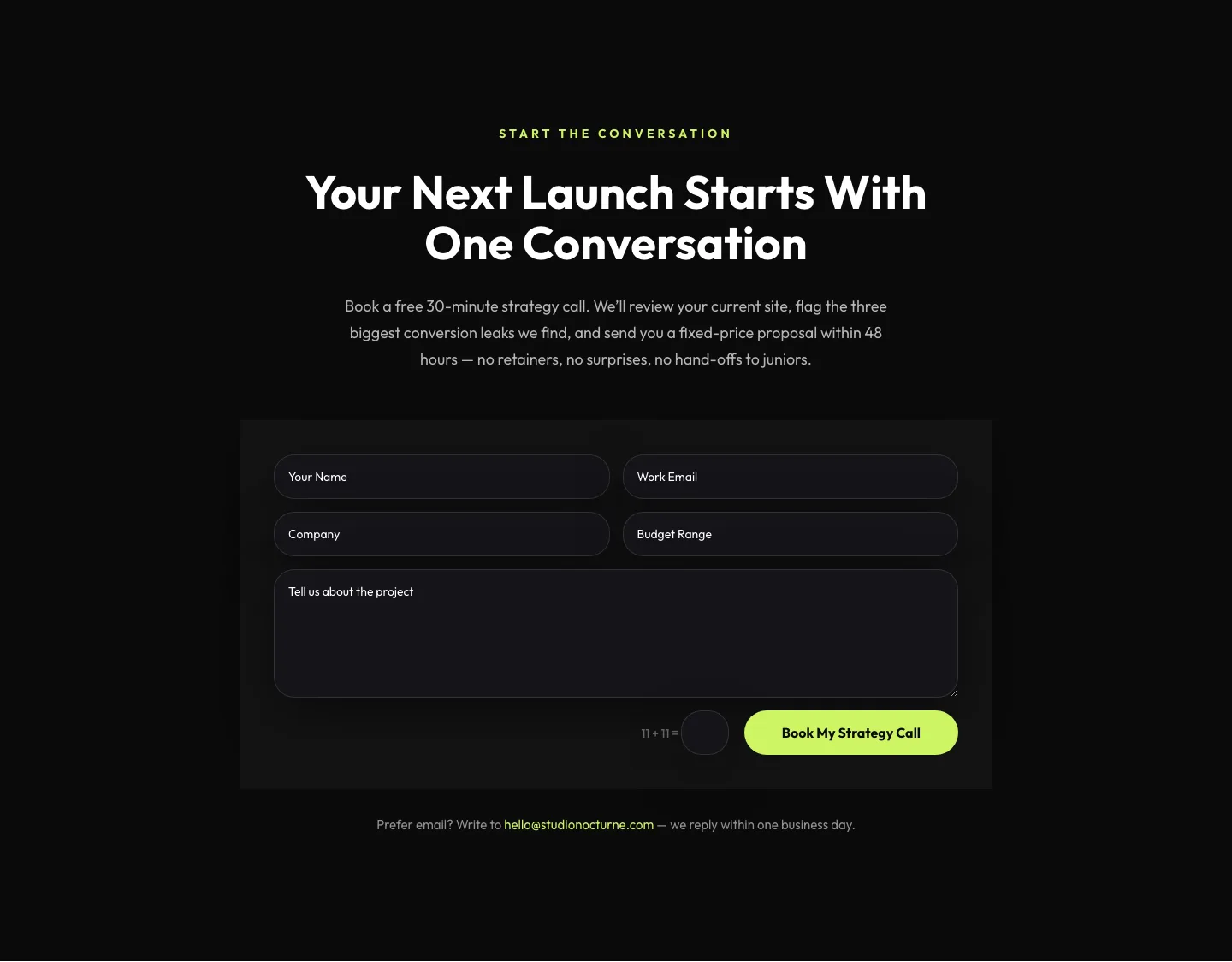
Dark Agency Contact Form: Book a Strategy Call Divi 5 Layout
contact · agency · dark
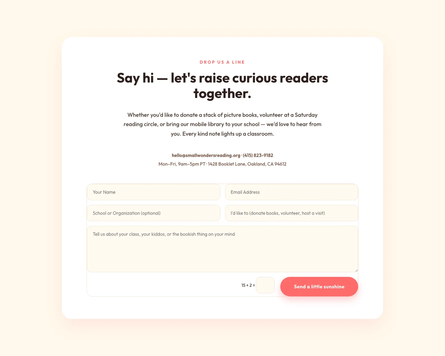
Playful Nonprofit Contact Page Layout for Divi 5: Small Wonders
contact · nonprofit · playful
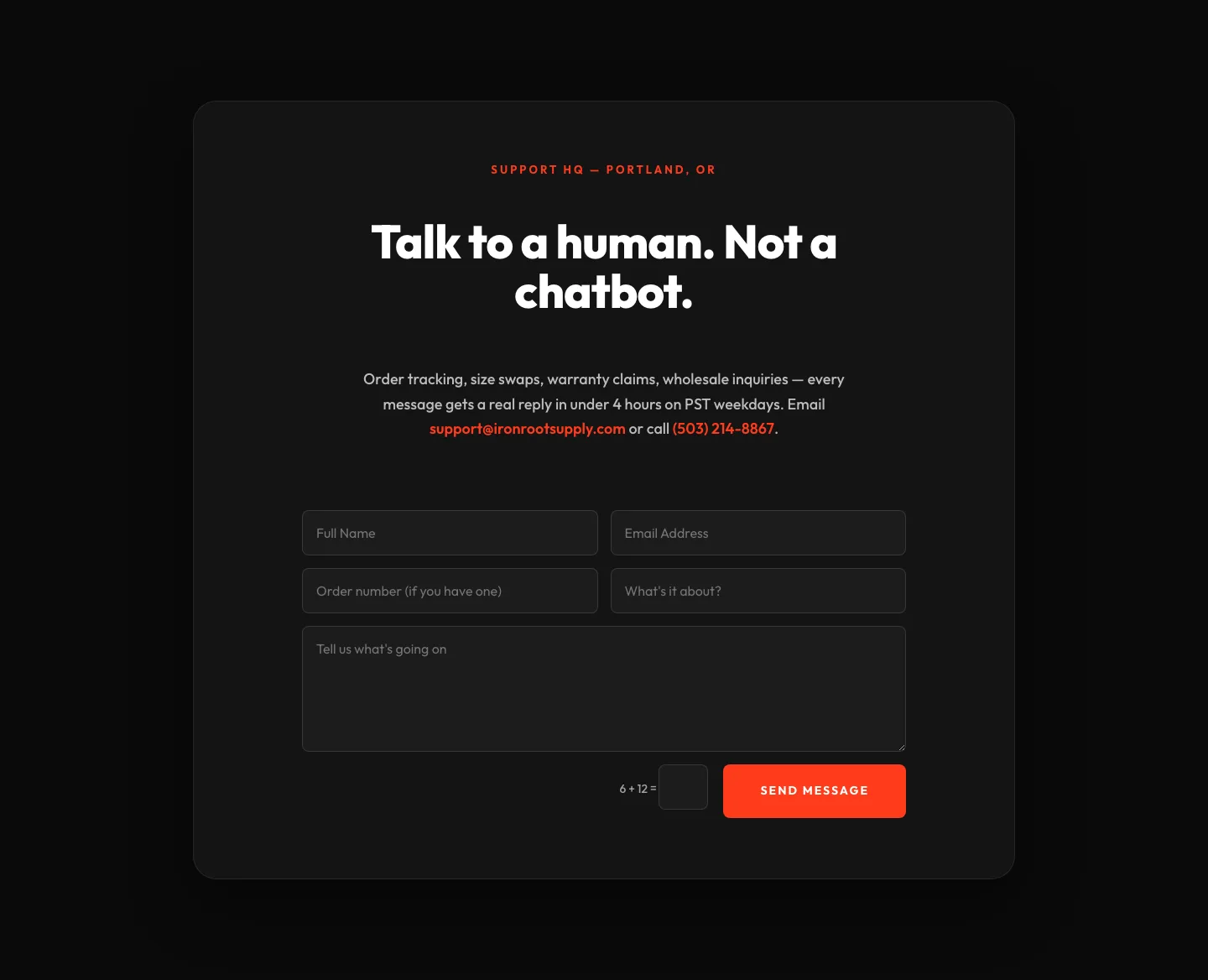
Bold Ecommerce Contact Form Layout for Divi 5: Ironroot
contact · ecommerce · bold
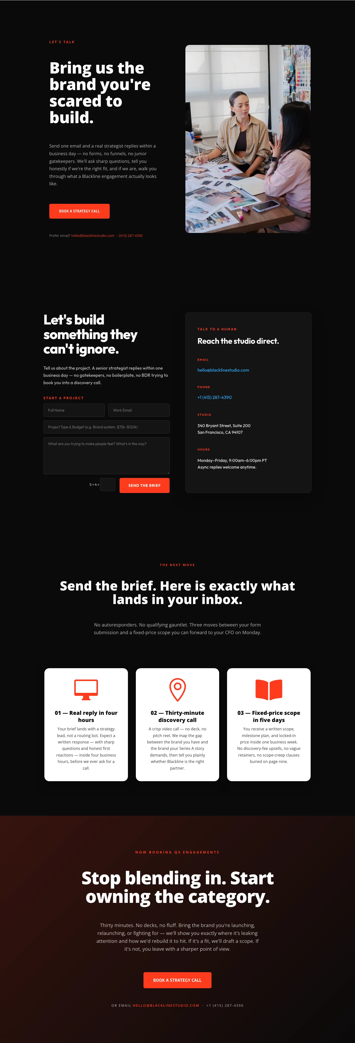
Blackline Studio: Bold Agency Contact Page for Divi 5
contact · agency · bold
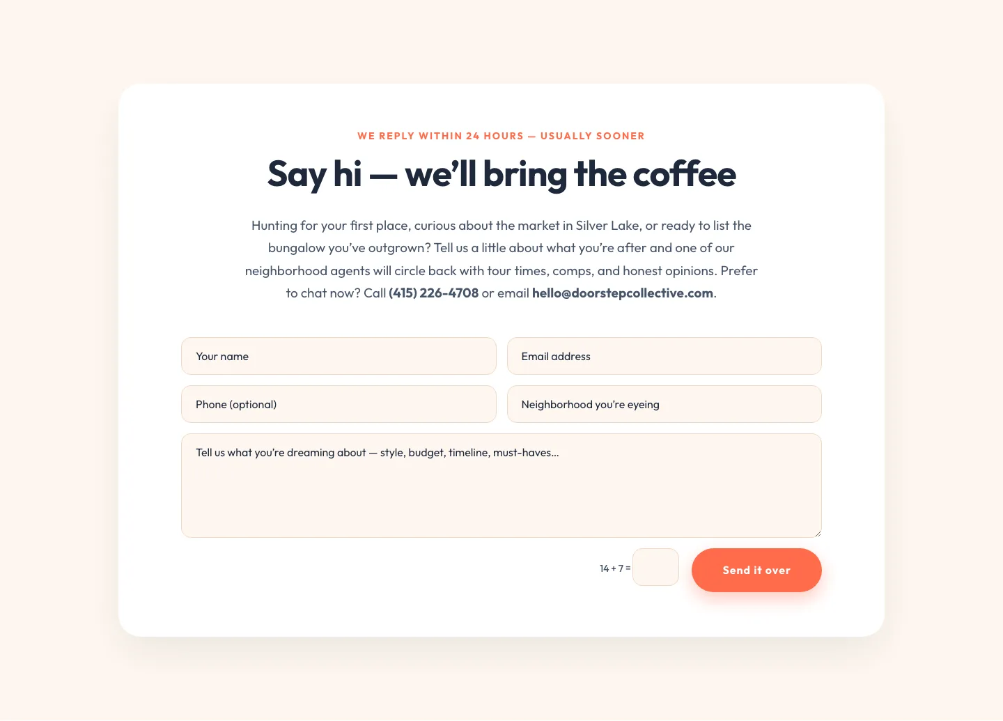
Playful Real Estate Contact Form Divi 5 Layout
contact · real_estate · playful
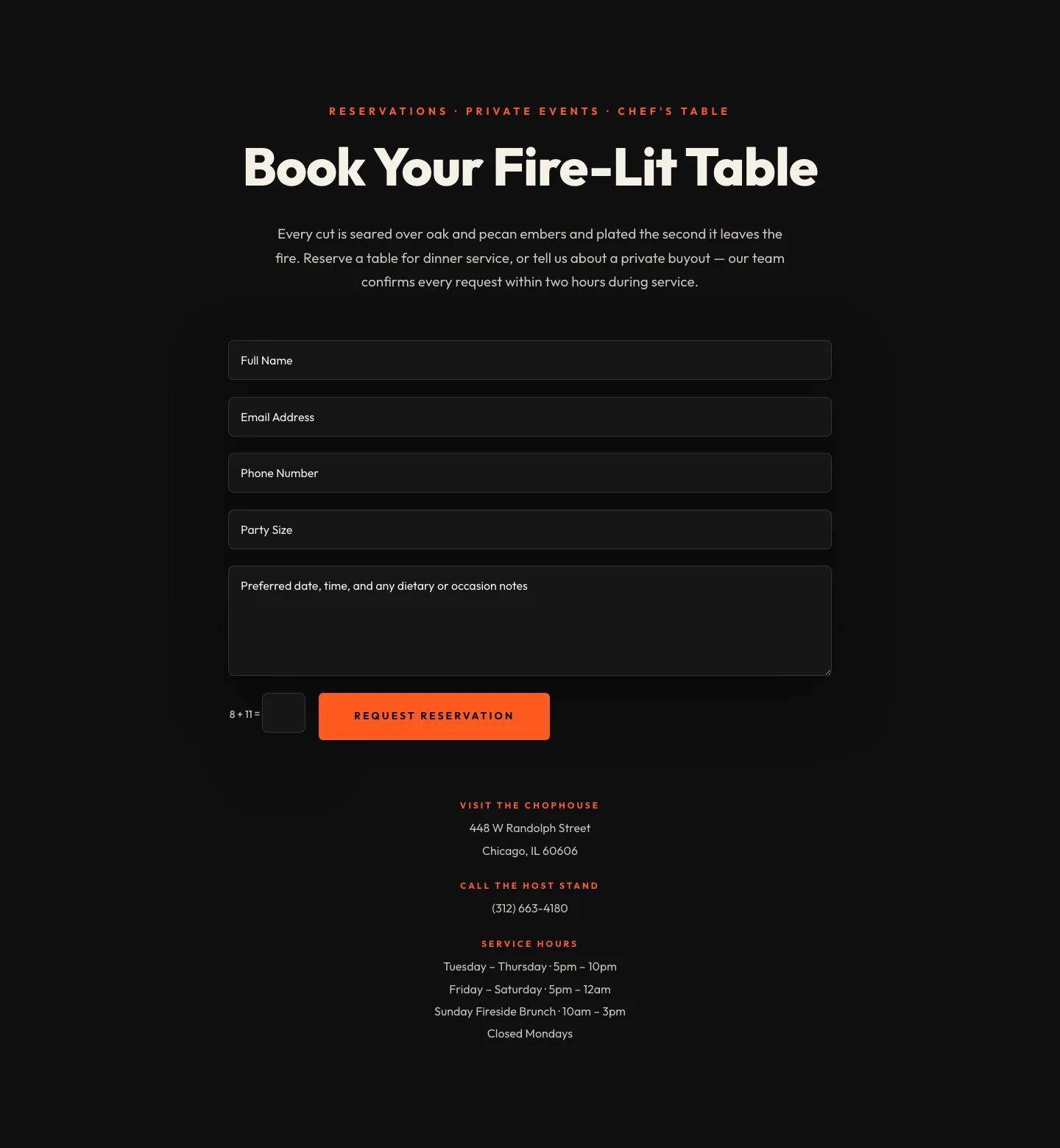
Bold Restaurant Reservation Contact Layout for Divi 5
contact · restaurant · bold