
Playful Nonprofit Features Section: 4-Column Crayon Club Layout
Warm, playful 4-column features section for a kids' nonprofit: bold coral headings, rounded white cards, icon callouts, and friendly copy ready to drop into Divi 5.
Rate this element
Download this section, free
- Divi 5 JSON, imports in seconds
- Commercial license included
- No account needed
Click to view the full page
Overview
This is a playful, warmth-first features section built around a single row of four equal-width cards (1/4, 1/4, 1/4, 1/4) sitting on a soft blush background (#fff5f5) with generous 96px top and bottom padding on desktop that eases to 64px on phones. Above the grid, a compact intro column carries three layers of hierarchy: a bright red eyebrow line (★ Why families love us ★, 13px, uppercase, 4px letter-spacing), a big Outfit 800 h2 in deep crayon-red (#c1121f, 52px desktop → 40px tablet → 32px phone), and a friendlier 19px sub-paragraph capped at 680px so the copy stays readable even on wide monitors.
Each of the four feature cards uses the same recipe: a white background, 40px/28px padding, a 24px border radius, a 2px #ffd6d6 outline, and a soft red-tinted drop shadow (rgba(230,57,70,0.10) at 0 12px 32px). A 48px Font Awesome icon in the accent red sits centered at the top, followed by a 22px h3 in the same crayon-red, and a 15px body paragraph in a dark plum (#3d1414) for calm, high-contrast reading. Icons rotate through heart, image, users, and star to give each card its own visual note without breaking the family.
The row uses flexbox with justify-content: center, align-items: stretch, and a 24px column/row gap, so all four cards line up at equal height regardless of copy length. On phone the row flips to flex-direction: column, stacking the cards vertically at full width while the section padding shrinks so nothing feels cramped. The result is a features block that reads as friendly and youthful (clearly nonprofit, clearly for families) without giving up the grid discipline a serious site needs.
What’s inside
- One Divi 5 section with a 4-column features row plus a centered intro column above it
- Eyebrow + h2 + supporting paragraph stack, with the h2 stepping down 52px → 40px → 32px across desktop, tablet, and phone
- Four identical card columns using native Divi 5 Column background, padding, border-radius, border, and box-shadow controls. No Blurb module trickery
- Native Divi 5 Icon module in each card (heart, image, users, star from Font Awesome) at 48px in the accent red
- Divi 5 Heading + Text modules for the intro; Icon + Text modules inside each card for h3 and description
- Full palette baked in: `#fff5f5` section, `#ffffff` cards, `#ffd6d6` card borders, `#e63946` accent, `#c1121f` headings, `#3d1414` body, `#6b2727` sub-copy
- Flex row with 24px gaps, stretch alignment, and wrap enabled. So cards stay equal-height on desktop and flip to a single column on phone
Who it’s for
Built for nonprofit and community-org websites that want to explain "why we exist" without sounding like a grant application: after-school programs, kids' art and music clubs, youth mentoring, family drop-in centers, food-access programs, playful daycares, camp websites, and community-run libraries. The tone is warm and slightly funny ("Snack Time Is Sacred"), which fits organizations aimed at parents and kids more than corporate donors. It also works well as a "how it works" or "what makes us different" strip on independent creative studios that lean into a hand-made brand: think illustrators, ceramics teachers, kids' bookshops, or family-run cafés. If your brand voice is buttoned-up or clinical, this section will read as too loud.
Customization tips
Start with the palette: this is a monochrome red-family scheme, so change the section background, card border, accent icon color, and heading color together to keep the harmony intact, try swapping to a mint/forest set (#f4faf6, #c8ecd4, #2f9e5f, #0f5132) or a butter/mustard set for a different vibe. Copy limits: card headings read best at three or four words (avoid two-line h3 wraps), and body paragraphs are tuned for roughly 22–30 words each. Longer text will push cards out of alignment. The intro paragraph has a hard max-width of 680px, so don't paste a full mission statement in there. Swap the four Font Awesome icons in each Icon module (Divi's picker) to match your program: palette, hand-holding, music note, ribbon, book, etc. Because the row is flex with align-items: stretch, adding a fifth card will start a second row on desktop; if you'd rather three across, change the row to 1_3, 1_3, 1_3 and remove one column.
How to install this layout
- Download the layout JSON file from this page.
- Open the target page in the Divi 5 builder.
- Open the portability panel (up/down arrows icon) and choose the Import tab.
- Upload the JSON. Tick “replace existing content” only for full-page imports.
- Check the page at desktop and mobile widths, then swap in your copy and images.
Full walkthrough with troubleshooting: How to Import a Divi 5 Layout.
Questions about Playful Nonprofit Features Section: 4-Column Crayon Club Layout
Does this section use any third-party plugins or custom code?
No. It uses only the native Divi 5 Section, Row, Column, Heading, Text, and Icon modules. The cards are pure Column styling (background, padding, border-radius, border, and box-shadow) so no Blurb or extension is required.
How does the 4-column grid behave on tablet and phone?
On desktop the row is a flex row with a 24px column/row gap and `flex-wrap: wrap`, so the four cards sit side by side at equal height. On phone the row explicitly switches to `flex-direction: column`, which stacks the cards full-width in a single column. Tablet keeps the four-across layout by default; if the columns feel too tight, drop to two-per-row by editing the row's flex settings.
Where should I start editing?
Replace the eyebrow ("★ Why families love us ★"), the h2, and the intro paragraph first. Those set the tone. Then rewrite each card's h3 and short body copy to match your four "why us" points, keeping headings to about three or four words and bodies to two short sentences so all four cards stay the same height.
There are no photos, is that intentional?
Yes. The section is icon-led on purpose: four 48px Font Awesome icons in the accent red carry the visual weight, which keeps the block fast to load and easy to translate to any nonprofit theme. If you want photography, swap each Icon module for an Image module at roughly 1:1 (square) or 4:3 crop and keep the file sizes small so the row still feels light.
Can I add a call-to-action button under the grid?
Yes: the section is a simple stack, so you can add a new row below the four-column row with a centered Button module (e.g., "Sign your kid up" or "Donate"). Match the button background to `#e63946` and the text color to white to stay consistent with the accent palette already in the layout.
Which Divi version does this layout need?
Divi 5. The layout is generated natively for Divi 5 and validated against its real module structure before publication, so it imports clean into the current builder.
Can I use this layout on client websites?
Yes. Every download includes a commercial license covering unlimited sites you own or build for clients. Only reselling or redistributing the layout file itself is prohibited.
More feature grids
Browse all feature grids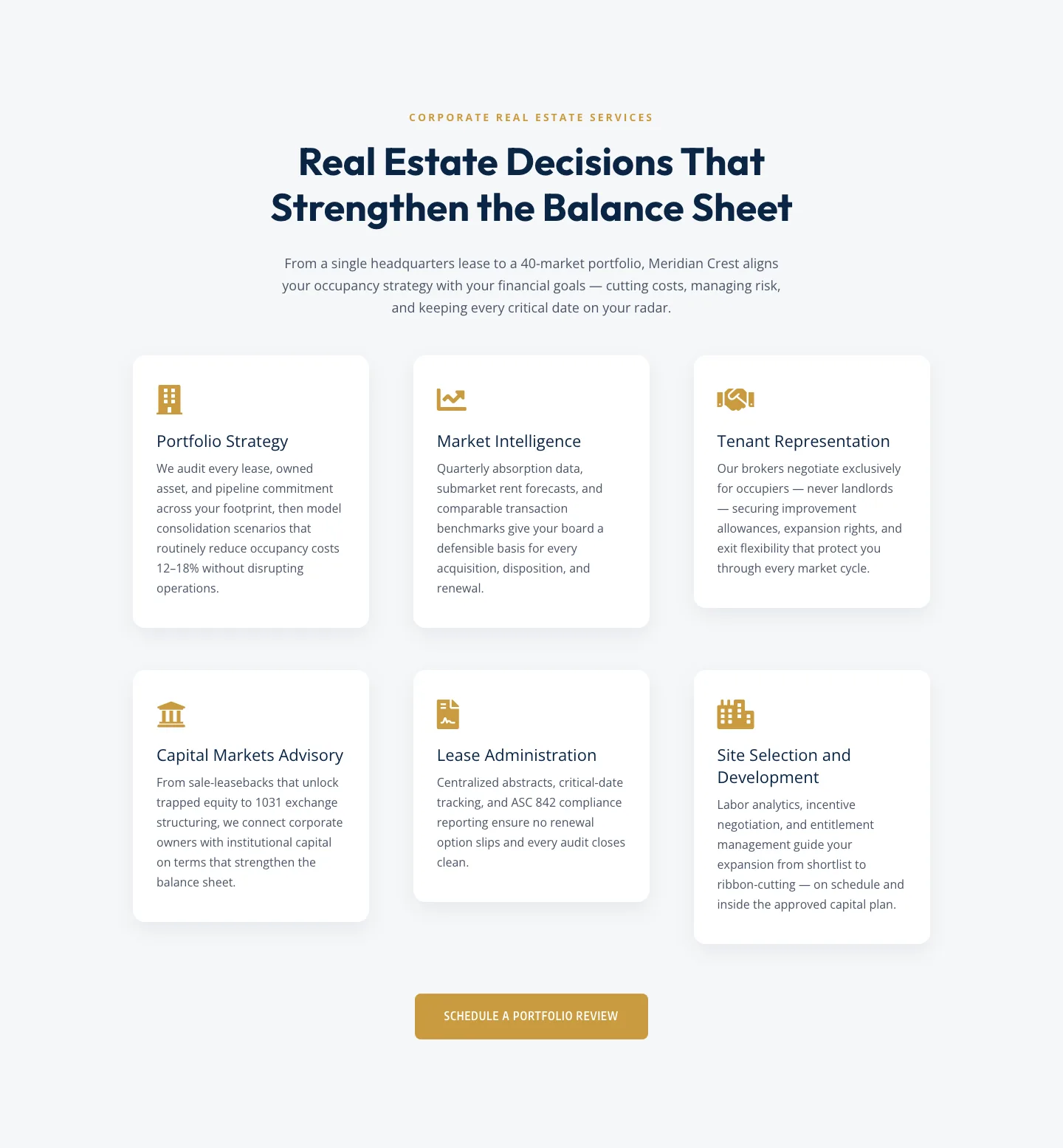
Corporate Real Estate Features Section: Six-Pillar Service Grid for Divi 5
features · real_estate · corporate
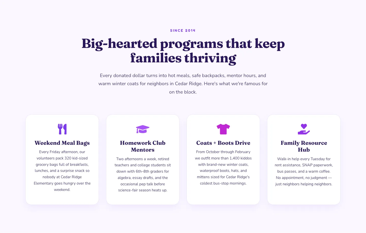
Playful Nonprofit Features Section: Four-Column Icon Cards for Divi 5
features · nonprofit · playful
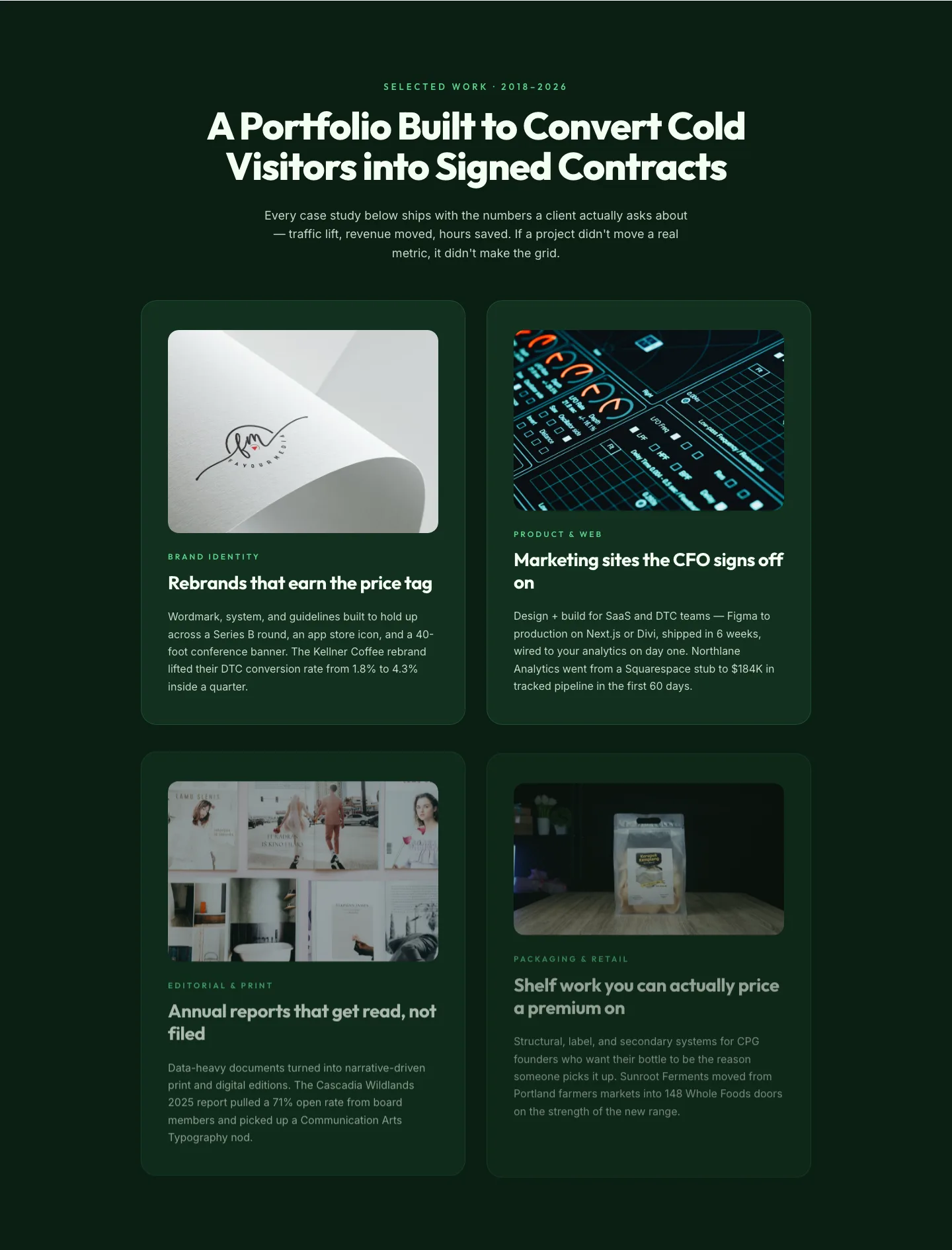
Bold Portfolio Features Grid: Divi 5 Case Study Layout
features · portfolio · bold
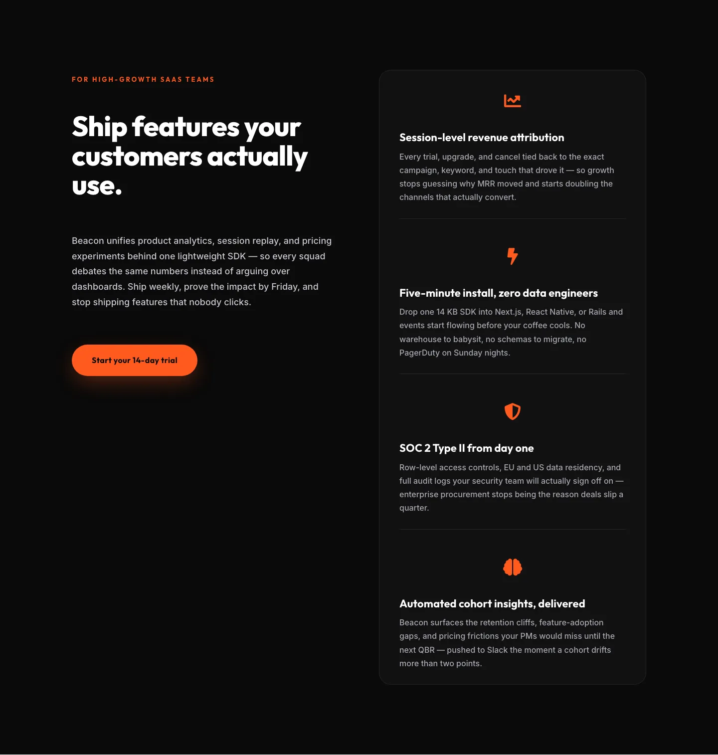
SaaS Features Section: Ship Features Customers Actually Use | Divi 5 Bold Layout
features · saas · bold
SaaS Features Section: Minimal Divi 5 Layout for Product Teams
features · saas · minimal
Bold Agency Features Section: Divi 5 Services Grid Layout
features · agency · bold