
Bold Ecommerce Features Section: Free Shipping, Returns & Weekly Drops
Bold three-card Divi 5 features layout for ecommerce brands. Highlight free express shipping, no-fight returns, and a Friday drop with a punchy orange accent on black.
Rate this element
Download this section, free
- Divi 5 JSON, imports in seconds
- Commercial license included
- No account needed
Click to view the full page
Overview
The layout opens with a centered intro column capped at 780px: a small orange eyebrow (WHY SHOP STRAYLINE), a heavy Outfit H2 at 58px with -1px letter-spacing ("Built for buyers who don't settle."), and a 19px subhead in low-opacity white. That header runs above a three-column 1_3/1_3/1_3 row with a 28px column and row gap, so the three benefit cards line up cleanly under one voice.
Each card is 20px-rounded with overflow hidden and a full-bleed image module at the top capped to a 220px max-height. Two of them use a #161616 dark surface with a thin translucent orange border (rgba(255,77,0,0.18)), keeping the tone quiet: SHIPPING and RETURNS carry the reassurance copy, free express shipping over $75, and a 60-day no-fight return with a pre-paid label. The third card flips to a saturated orange fill (#ff4d00) with black type, which turns "A fresh drop every Friday at noon" into the visual anchor of the row and gives the pill-shaped black button ("See this week's drop") a place to land without competing for attention.
Vertical rhythm on desktop is 110px section padding, 48px between the header and the card row, 28px between cards, and a consistent 28px horizontal padding inside each card so the eyebrow, H3 and body copy all sit on the same left edge. On phone, section padding drops to 72px, the H2 scales from 58 → 34px with a slightly looser 1.1em line-height, and the three columns stack full-width in order: the orange card still lands last, so it reads as the payoff at the bottom of the scroll.
What’s inside
- Dark section (#0a0a0a) with 110px desktop / 72px phone vertical padding for a strong break between sections
- Centered intro column capped at 780px: orange eyebrow, Outfit 800 H2 (58 → 44 → 34px), 19px subhead
- Three-column 1_3/1_3/1_3 row with matching 28px column and row gaps
- Two dark cards (#161616) with 1px translucent orange borders for SHIPPING and RETURNS
- One inverted accent card (#ff4d00) that turns the weekly-drop promise into the row's focal point
- Full-bleed image module at the top of each card, capped at 220px max-height and 20px corner radius
- Pill-shaped Divi 5 Button (999px radius) on the orange card, black fill with orange uppercase label
- Consistent 28px internal padding on every card so eyebrow, H3 and body copy share one left edge
Who it’s for
Direct-to-consumer ecommerce brands with a bold personality: apparel and streetwear labels doing weekly drops, sneaker and accessories stores, small-batch beauty, coffee subscriptions, home goods, direct-import furniture. Anywhere you need to answer the three questions a first-time buyer actually has (how fast does it ship, what happens if I don't like it, and what's new), this row does the job. It also fits merch shops attached to creators, Shopify-to-WordPress migrations that want a familiar benefit-trio pattern, and any store where the promotional calendar is itself a reason to come back every week.
Customization tips
Every color runs off two hex values: swap #ff4d00 for your brand accent and #0a0a0a for your section base and you're 90% done, the third card and the button inherit both automatically. The two dark cards use #161616 as a card surface; nudge to #0f0f0f for more contrast or lift to #1c1c1c for a softer stack. Keep card H3 copy to about 4–6 words at 26px, or drop the size to 22px if you need a longer promise. Card images are set to 100% width with a 220px max-height cap, so horizontal photos around 1200×800 (roughly 3:2 or 16:10) crop cleanly. Tall or square shots will feel tight. Body copy handles two to three sentences per card before the vertical rhythm starts to feel long. Point the button at your actual drops or new-arrivals collection URL, and update the SHIPPING / RETURNS / THE DROP labels to match the promises you're really keeping.
How to install this layout
- Download the layout JSON file from this page.
- Open the target page in the Divi 5 builder.
- Open the portability panel (up/down arrows icon) and choose the Import tab.
- Upload the JSON. Tick “replace existing content” only for full-page imports.
- Check the page at desktop and mobile widths, then swap in your copy and images.
Full walkthrough with troubleshooting: How to Import a Divi 5 Layout.
Questions about Bold Ecommerce Features Section: Free Shipping, Returns & Weekly Drops
Which card should I edit first?
The orange one. It's the visual anchor and the only card carrying a CTA, so update the H3, the body copy, and the button link (currently /drops) to point at your real new-arrivals or drops collection. Everything else on the row supports that card.
What happens on mobile?
Section padding drops from 110px to 72px, the H2 scales from 58px → 34px with a looser 1.1em line-height, and the three columns stack full-width in source order. The orange card lands last, so it reads as the payoff at the bottom of the scroll.
What modules does it actually use?
Native Divi 5 only: one Section, two Rows, four Columns (one for the intro, three for the cards), a Text for the eyebrow, a Heading for the H2, another Text for the subhead, then Image + Text + Heading + Text stacked inside each card, with a Button module on the orange card.
What aspect ratio should the card images be?
Horizontal, roughly 3:2 or 16:10 around 1200×800. Images are set to 100% width with a 220px max-height cap, so tall or square crops feel cramped. Lifestyle and in-context shots work better than tight pack-shots here: the images set the mood, they don't sell the SKU.
Can I drop to two cards or add a fourth?
You can drop to two by deleting one column and switching the row structure to 1_2/1_2, the 28px gap stays consistent. A fourth card is doable with 1_4 columns, but bring the H3 size down from 26px so the row doesn't wrap awkwardly on tablet.
Where is the orange accent used besides the third card?
Two other places: the small eyebrow above the H2 ("WHY SHOP STRAYLINE") and the 18%-opacity borders around the two dark cards. Swap the accent hex once and all three spots update from the same value.
Which Divi version does this layout need?
Divi 5. The layout is generated natively for Divi 5 and validated against its real module structure before publication, so it imports clean into the current builder.
Can I use this layout on client websites?
Yes. Every download includes a commercial license covering unlimited sites you own or build for clients. Only reselling or redistributing the layout file itself is prohibited.
More feature grids
Browse all feature grids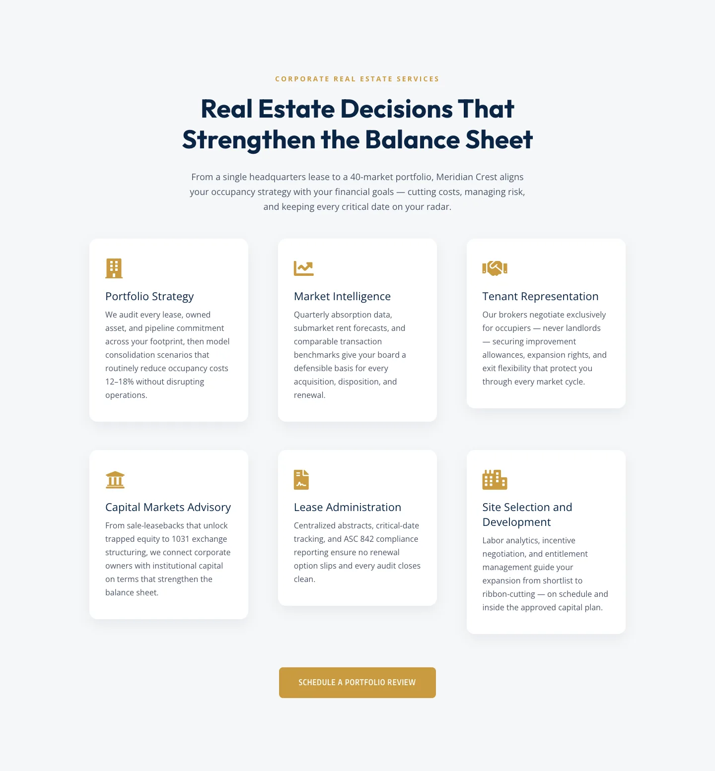
Corporate Real Estate Features Section: Six-Pillar Service Grid for Divi 5
features · real_estate · corporate
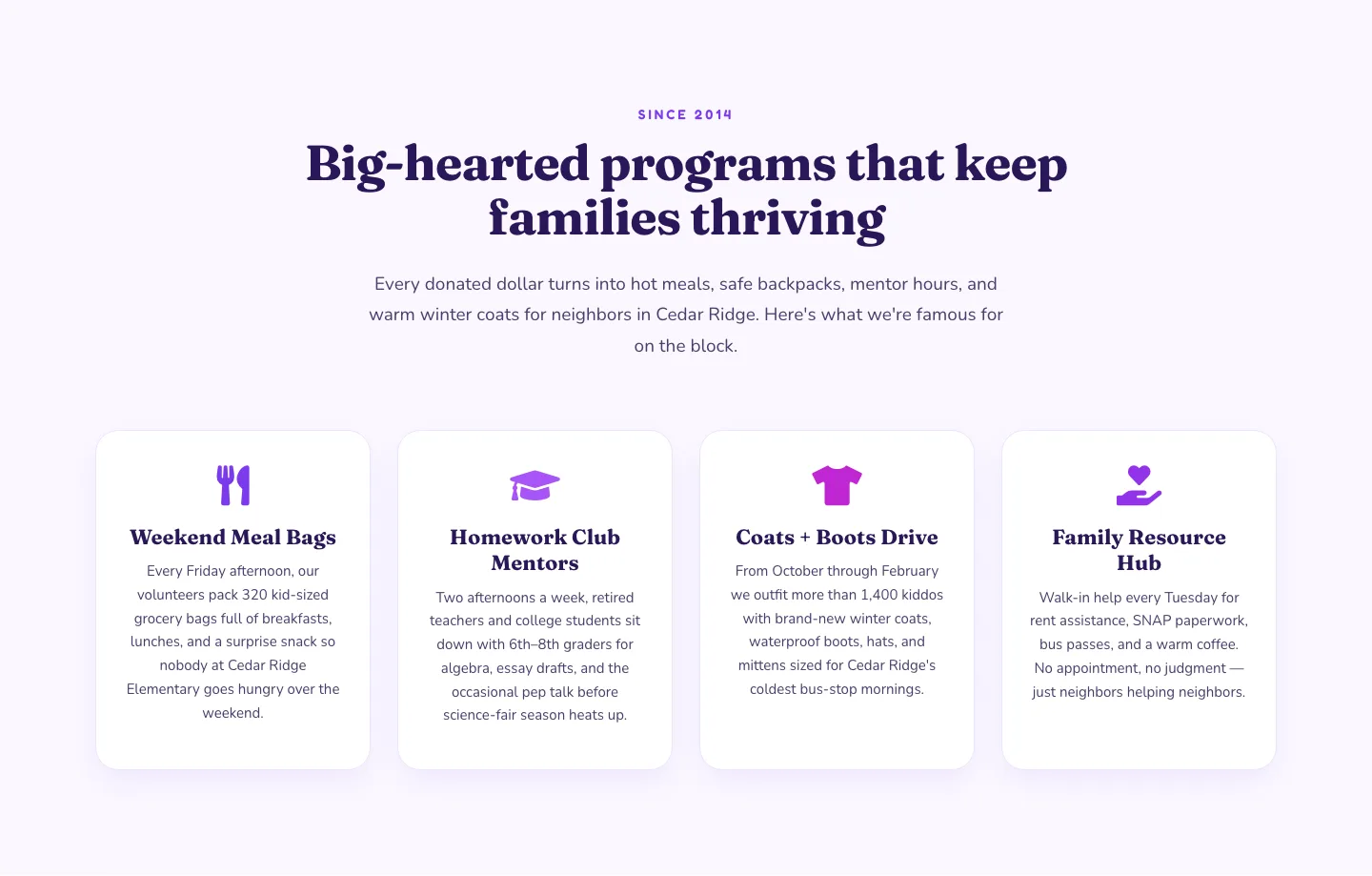
Playful Nonprofit Features Section: Four-Column Icon Cards for Divi 5
features · nonprofit · playful
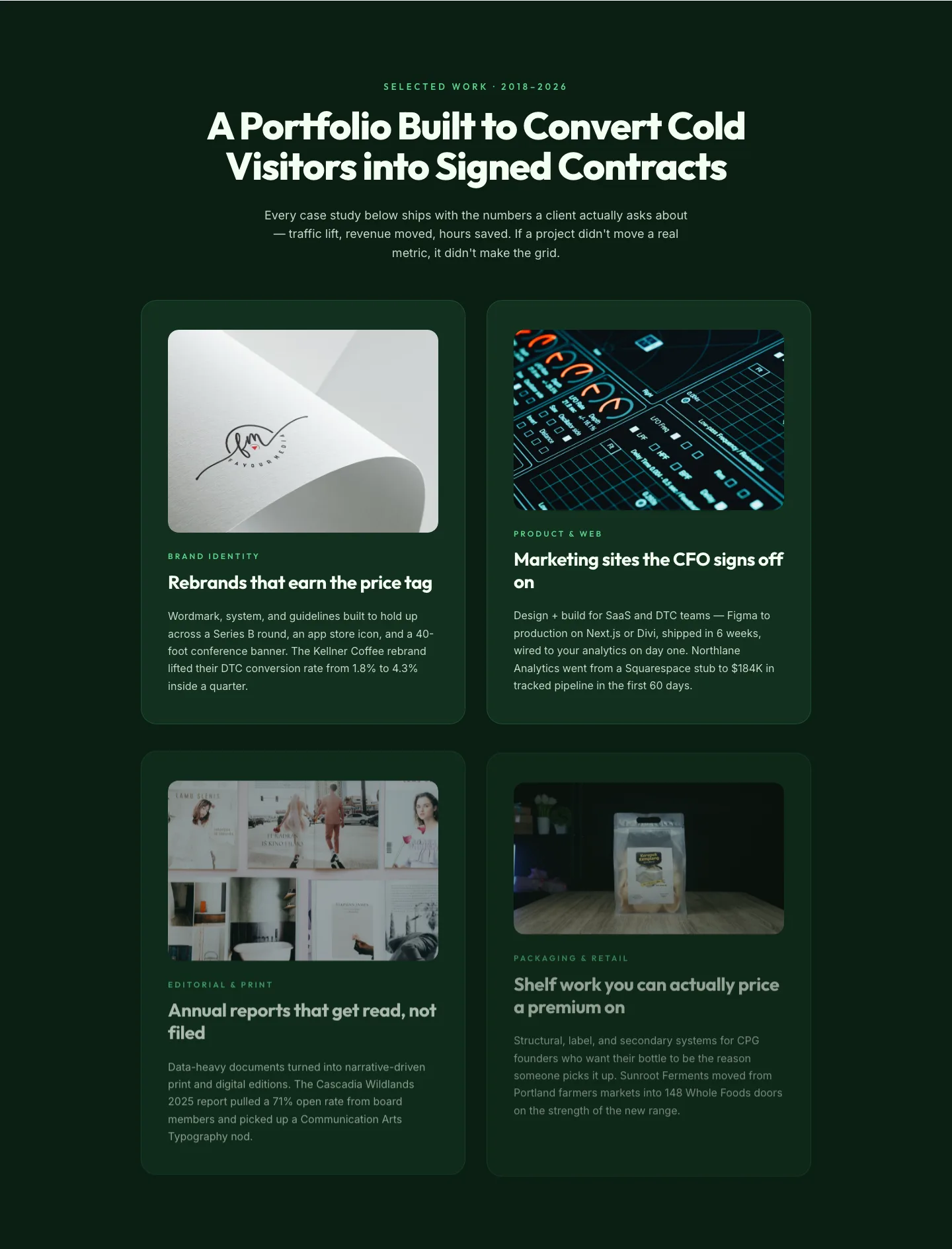
Bold Portfolio Features Grid: Divi 5 Case Study Layout
features · portfolio · bold
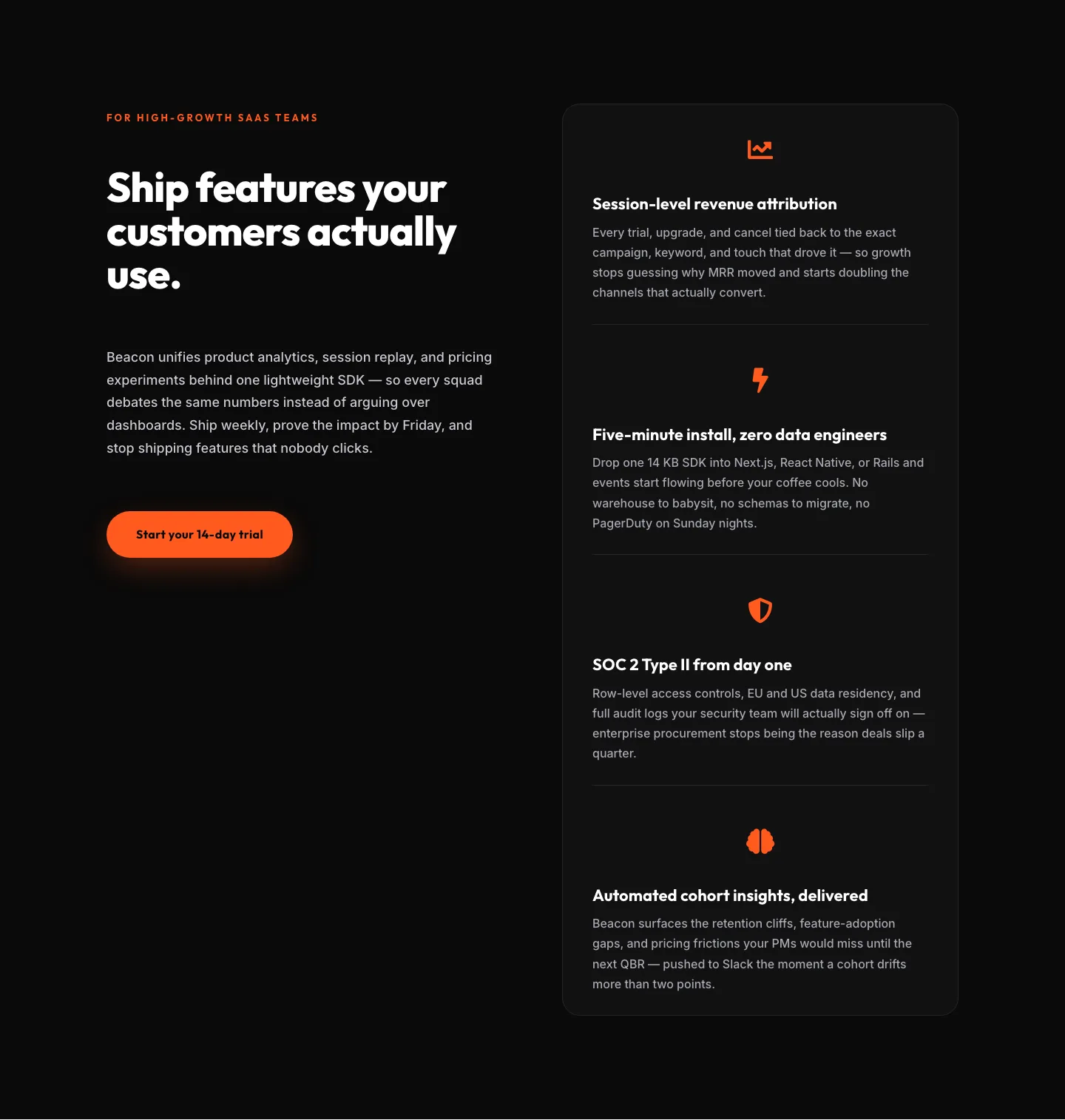
SaaS Features Section: Ship Features Customers Actually Use | Divi 5 Bold Layout
features · saas · bold
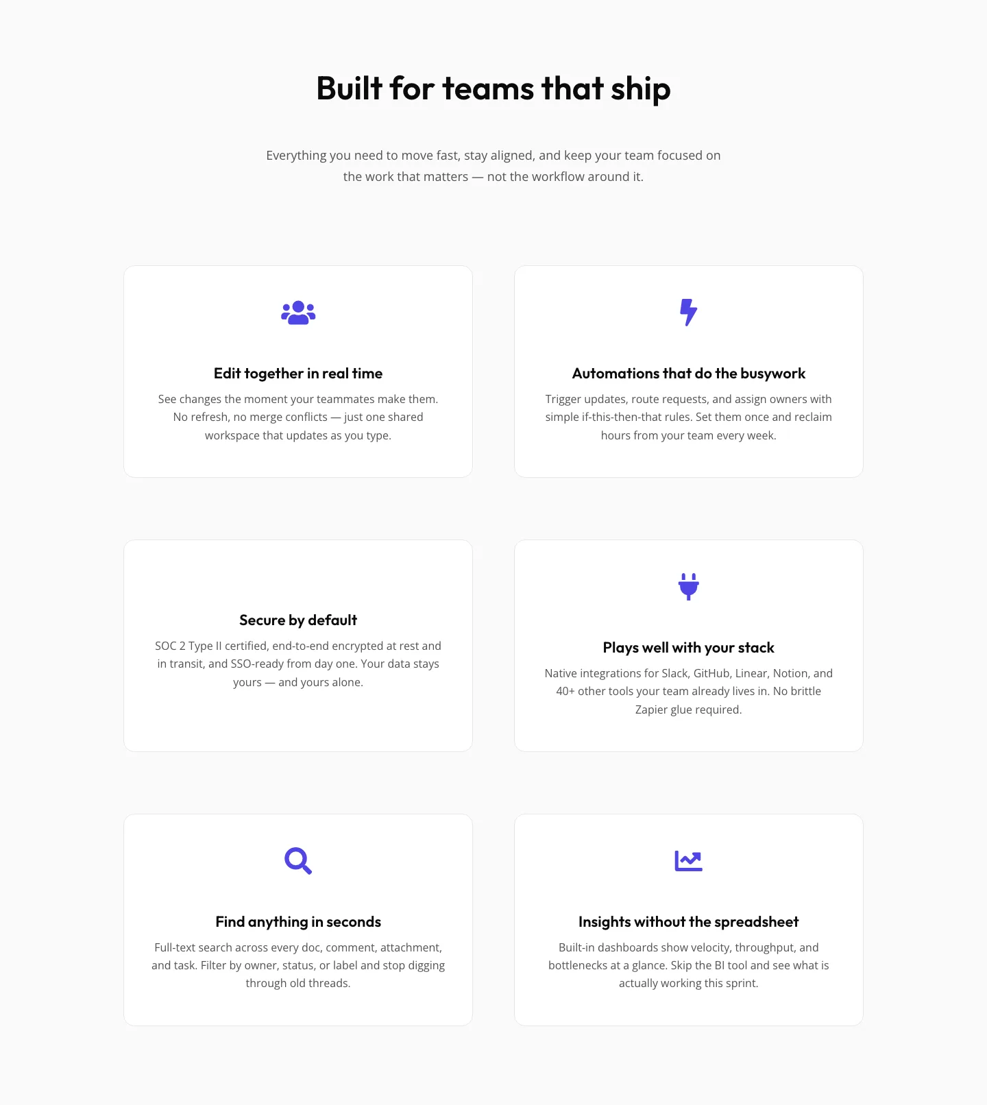
SaaS Features Section: Minimal Divi 5 Layout for Product Teams
features · saas · minimal
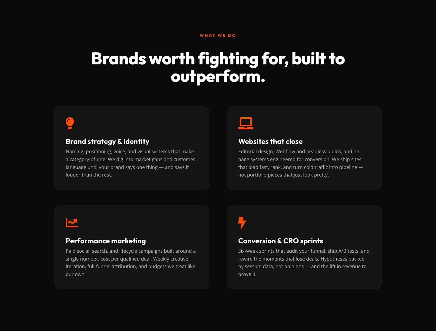
Bold Agency Features Section: Divi 5 Services Grid Layout
features · agency · bold