
Bold Portfolio Features Section: 2×2 Grid for Divi 5
A bold, dark-navy Divi 5 features section for portfolio sites. 2×2 grid highlights identity, conversion, speed, and motion design with imagery.
Rate this element
Download this section, free
- Divi 5 JSON, imports in seconds
- Commercial license included
- No account needed
Click to view the full page
Overview
A dark-mode features block built for portfolio studios that want to look confident on desktop and still read cleanly on a phone. The whole section sits on a deep navy canvas (#050E2C) with 110px of vertical breathing room, so it separates decisively from whatever sits above and below it: a hero or a case-study grid, typically. At the top, an Outfit-800 h2 in white anchors the block at 56px desktop, stepping down to 42px on tablet and 34px on phone with tight -1px letter spacing, and a muted #B3C8E6 supporting paragraph sits centered underneath it at 18px with generous 1.7em line height. Both are width-capped (880px and 720px respectively) so long lines never sprawl across widescreens.
Below the intro, four feature cards arrange into a strict 2×2 grid using two 1_2, 1_2 rows. Each card is a slightly-lighter navy tile (#0B1A40) with 36px of synced interior padding, 20px rounded corners, and a hair-thin 1px border tinted rgba(77,163,255,0.18). Just enough to catch the eye without competing with the imagery. The internal rhythm is identical across all four: a rounded 12px photograph, 22px of margin, an Outfit-700 h3 at 26px, 12px of margin, then a 16px paragraph in the same muted blue as the intro. On tablet and phone the two-column rows collapse to a single stacked column by default, which keeps every card at full readable width without any custom breakpoint work.
What’s inside
- One Divi 5 Section with a navy `#050E2C` background and 110px vertical padding, ready to drop between a hero and a portfolio grid
- Full-width intro row with a centered H2 headline (Outfit 800, responsive 56/42/34px) and a max-720px supporting paragraph
- Two `1_2, 1_2` rows composing a 2×2 grid of feature cards on desktop that stacks cleanly on mobile
- Four native card modules using stock Image + Heading + Text, no third-party module dependencies
- Card styling: `#0B1A40` fill, 36px synced padding, 20px border-radius, and a subtle 1px `rgba(77,163,255,0.18)` border
- 12px rounded photograph at the top of each card with a fixed 22px gap before the H3
- Consistent Outfit type stack across headings (800/700 weights) with muted `#B3C8E6` body copy tuned to 1.7em line height
- Copy blocks pre-written for portfolio studios: identity, conversion, performance, and motion design
Who it’s for
Independent designers, freelance developers, boutique branding agencies, motion studios, and creative directors who want a features block that feels premium instead of templated. The tone of the pre-written copy (identity, conversion, performance, motion) leans toward studios pitching mid-market and enterprise clients, but the card structure is generic enough for photographers, illustrators, video producers, architecture practices, or interior designers who want to explain a working method without turning it into a wall of text. It also works well as an "about our process" slot on a service page, or as a differentiator block sitting between a hero and a project grid on a homepage.
Customization tips
Palette is driven by three colors: swap #050E2C (section), #0B1A40 (cards), and the rgba(77,163,255,...) border tint via Divi presets to reskin the whole block in one pass; keep the body text a desaturated tint of your accent so contrast stays readable on dark. The H2 tolerates up to about 8 words before wrapping awkwardly on mobile; H3 card titles work best at 2–4 words. Body paragraphs sit comfortably at 25–40 words, go longer and the cards will grow uneven. Replace the Pexels images with 940×650 (roughly 16:11) landscape shots so the 12px radius crops cleanly; anything much wider forces the H3 too far down the card. If you need three or six features instead of four, duplicate a card and switch the row structure to 1_3, 1_3, 1_3.
How to install this layout
- Download the layout JSON file from this page.
- Open the target page in the Divi 5 builder.
- Open the portability panel (up/down arrows icon) and choose the Import tab.
- Upload the JSON. Tick “replace existing content” only for full-page imports.
- Check the page at desktop and mobile widths, then swap in your copy and images.
Full walkthrough with troubleshooting: How to Import a Divi 5 Layout.
Questions about Bold Portfolio Features Section: 2×2 Grid for Divi 5
How does the 2×2 grid behave on mobile?
The two `1_2, 1_2` rows collapse to single-column stacks by default in Divi 5, so on phone you get four full-width cards in vertical order. The H2 also scales down from 56px to 34px automatically via built-in tablet and phone breakpoints, and card padding stays at 36px so nothing feels cramped.
What Divi modules does this actually use?
Only three, all native: Heading, Text, and Image. There's no Blurb module, no icon font, no third-party add-on. That keeps the file lightweight and means the layout will import cleanly into any Divi 5 site regardless of what other plugins you're running.
Can I change the images without breaking the card layout?
Yes, the images are simple Divi Image modules with a 12px border-radius and a fixed 22px bottom margin. Swap the URLs for your own uploads at roughly 940×650 (or any 16:11-ish landscape crop) and the cards will keep their proportions. Portrait images will make the cards taller and uneven.
What should I edit first before publishing?
The four H3s and their paragraphs: the pre-written copy is aimed at design studios, so if you're a photographer or a developer the wording will feel off. After that, swap the four Pexels photographs for work from your own portfolio, since generic stock undercuts the block's whole "we do custom work" argument.
Can I add or remove cards?
For three cards, change the second row's column structure from `1_2, 1_2` to `1_3, 1_3, 1_3` and move one card up. For six cards, duplicate the row and rebalance. The card styling (background, padding, border, radius) is set at the column level, so duplicating a whole column preserves the look.
Which Divi version does this layout need?
Divi 5. The layout is generated natively for Divi 5 and validated against its real module structure before publication, so it imports clean into the current builder.
Can I use this layout on client websites?
Yes. Every download includes a commercial license covering unlimited sites you own or build for clients. Only reselling or redistributing the layout file itself is prohibited.
More feature grids
Browse all feature grids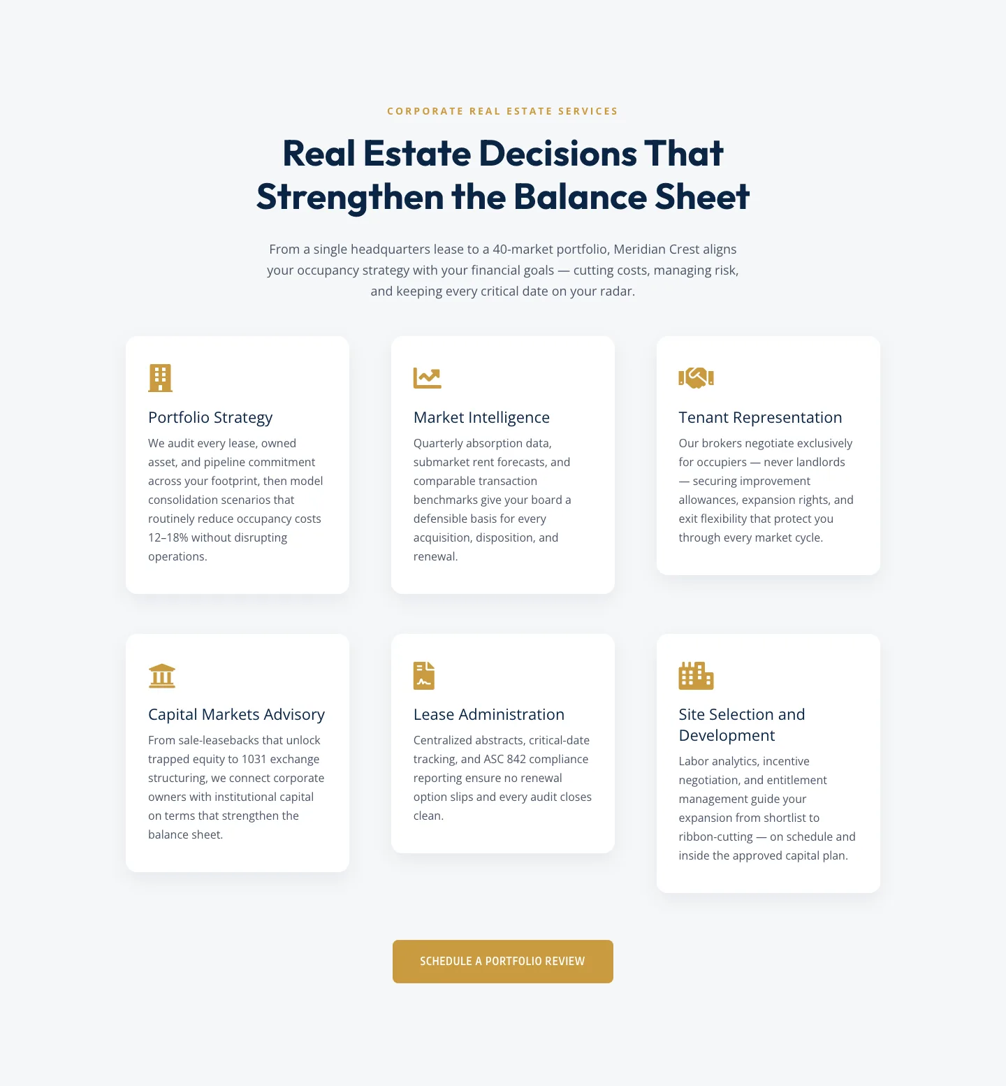
Corporate Real Estate Features Section: Six-Pillar Service Grid for Divi 5
features · real_estate · corporate
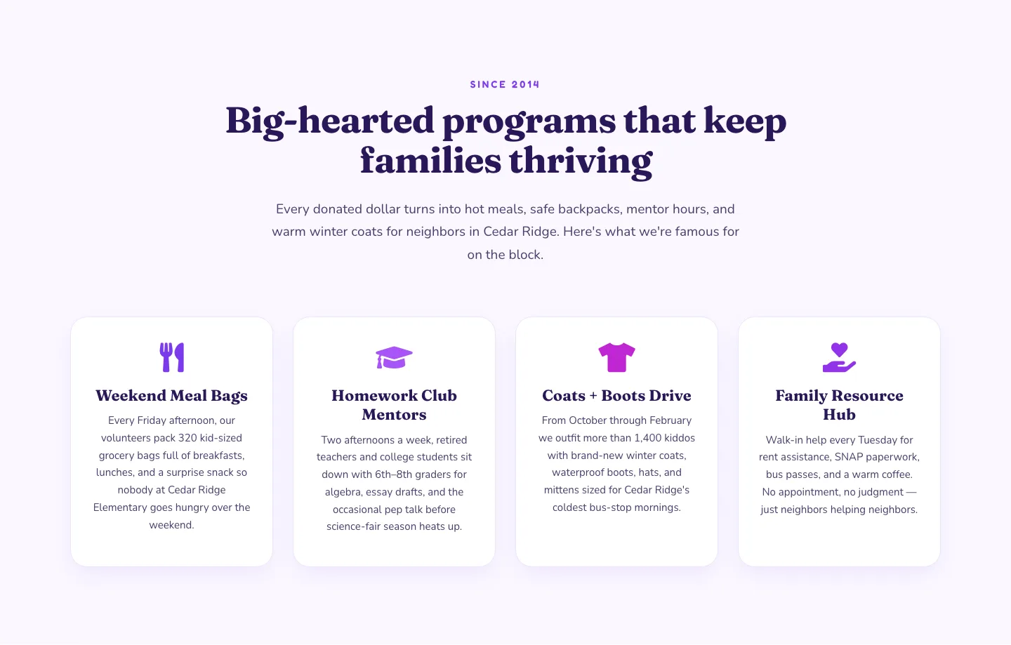
Playful Nonprofit Features Section: Four-Column Icon Cards for Divi 5
features · nonprofit · playful
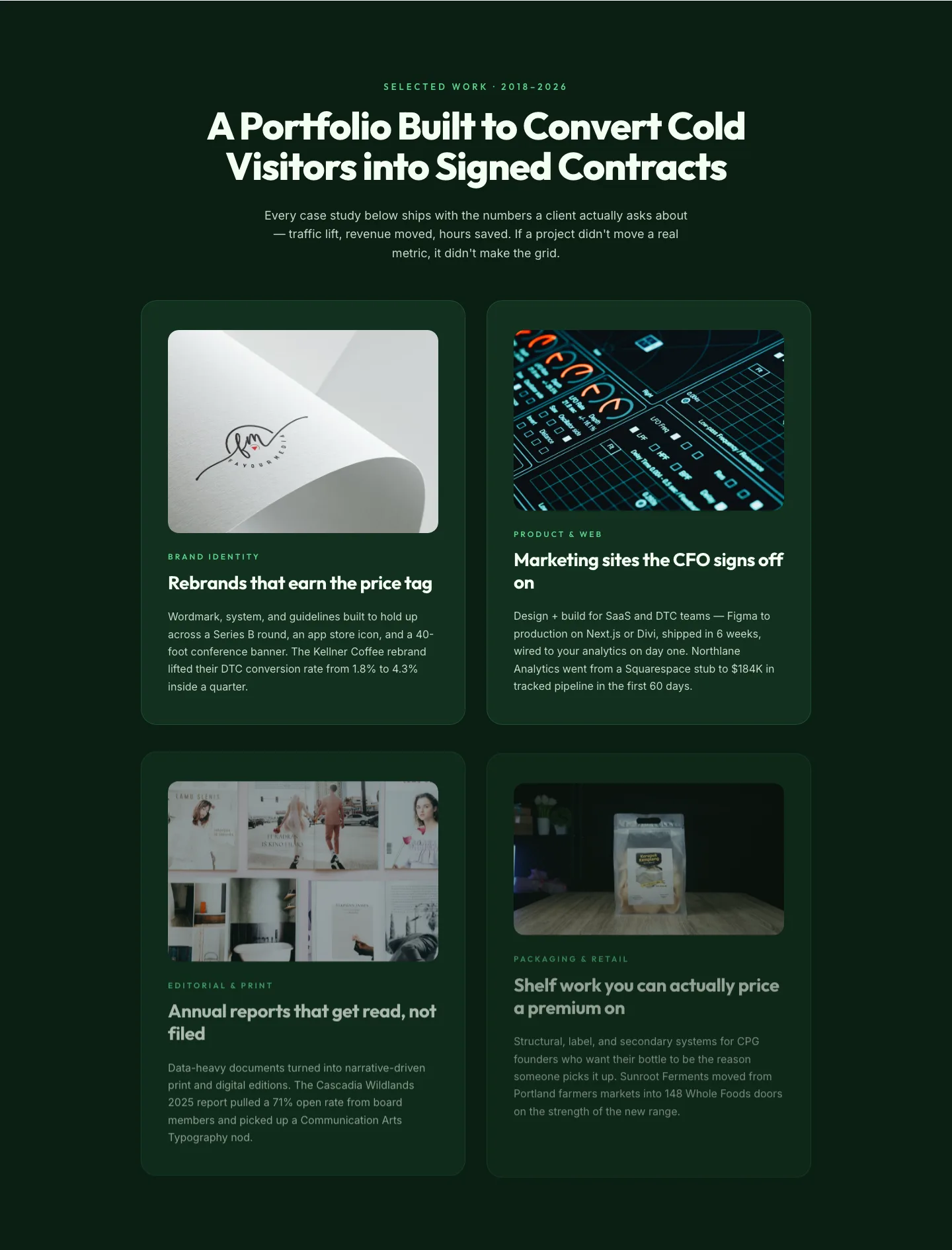
Bold Portfolio Features Grid: Divi 5 Case Study Layout
features · portfolio · bold
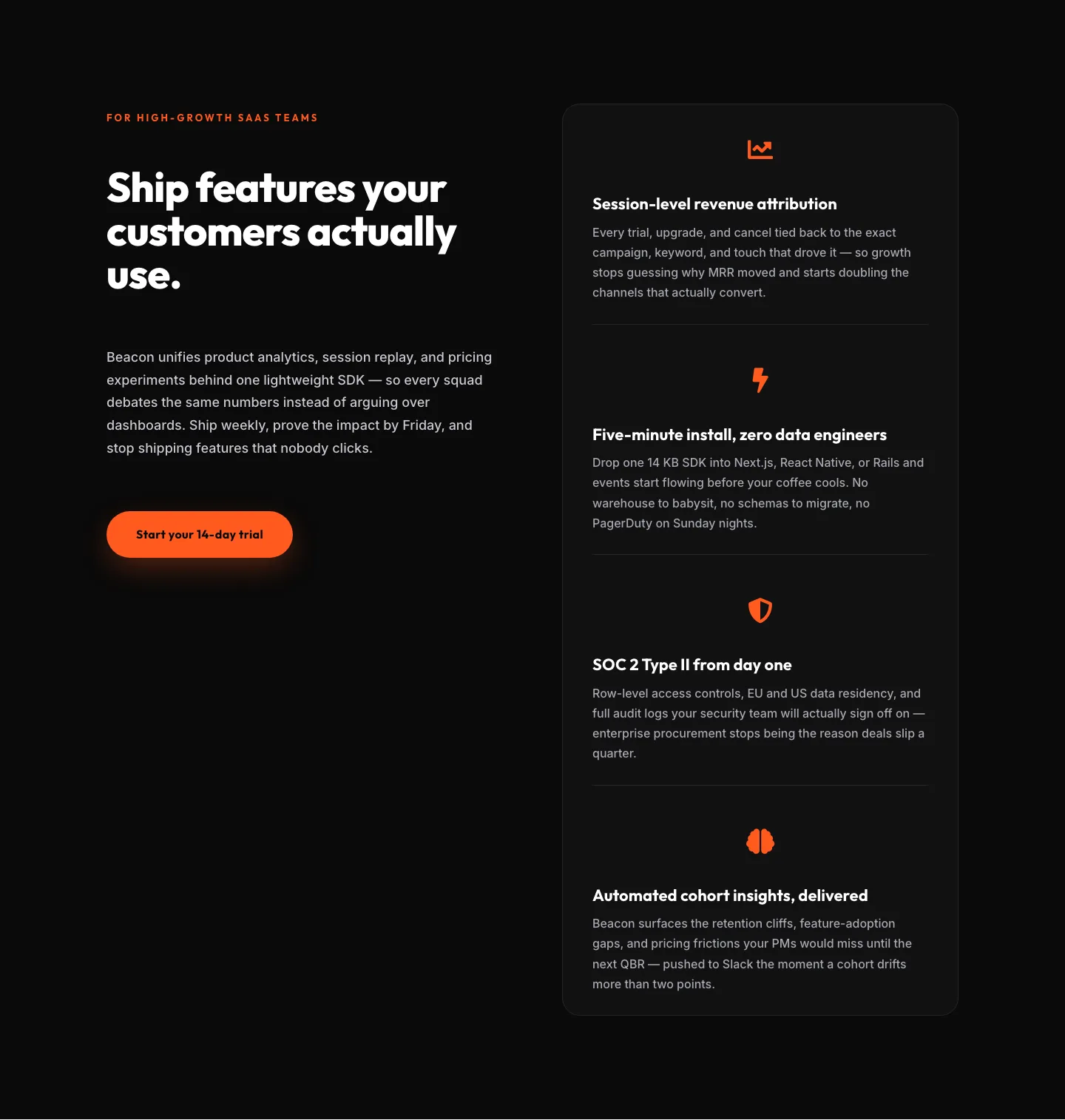
SaaS Features Section: Ship Features Customers Actually Use | Divi 5 Bold Layout
features · saas · bold
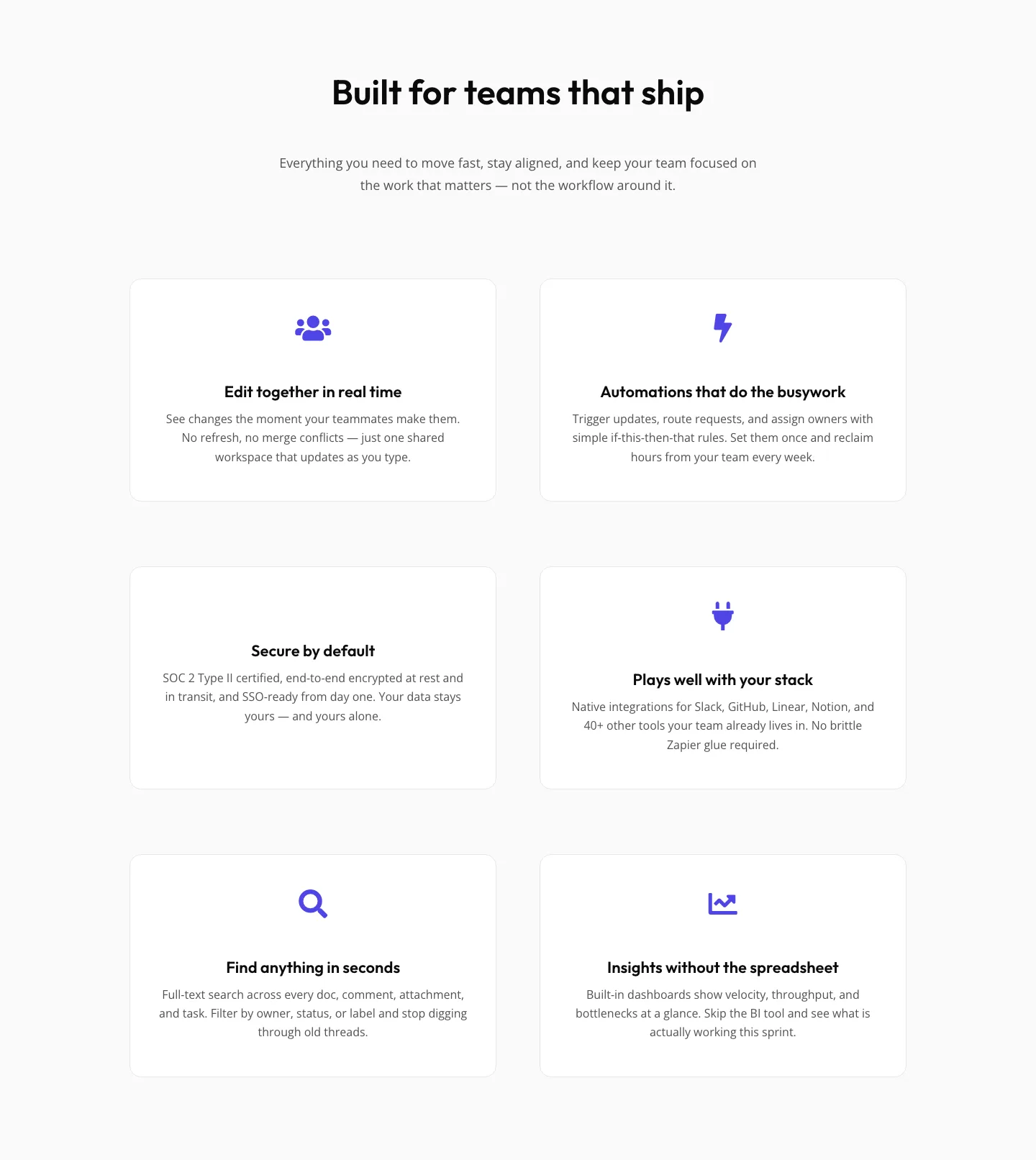
SaaS Features Section: Minimal Divi 5 Layout for Product Teams
features · saas · minimal
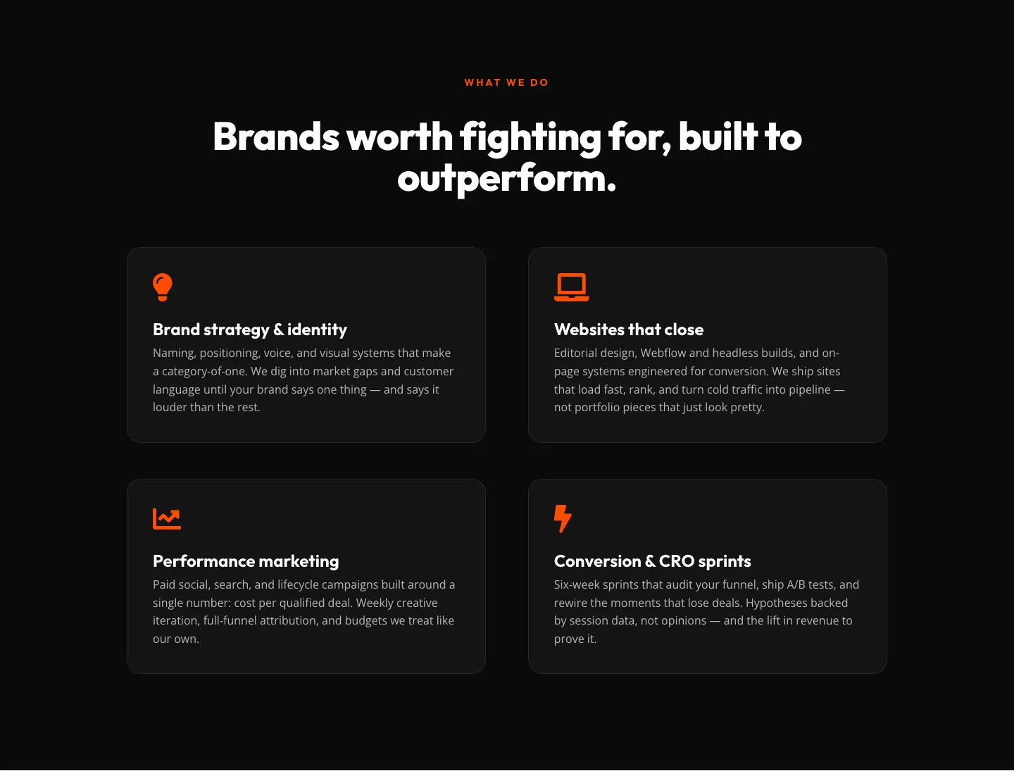
Bold Agency Features Section: Divi 5 Services Grid Layout
features · agency · bold