
Bold Agency Features Section: Divi 5 Services Grid Layout
High-contrast Divi 5 features layout for agencies. Dark services grid with orange accents showcasing brand strategy, web design, performance marketing, and CRO.
Rate this element
Download this section, free
- Divi 5 JSON, imports in seconds
- Commercial license included
- No account needed
Click to view the full page
Overview
This features section commits fully to a dark, high-contrast look: the section background is a near-black #0a0a0a with generous 110px vertical padding on desktop (tightened to 70px on phones), so the four service cards read as a self-contained, confident block rather than a list squeezed between other sections. The hierarchy is a classic three-step: a small orange eyebrow ("What we do") set in uppercase Outfit at 14px with 3px letter-spacing, followed by a heavyweight Outfit 800 headline at 56px with tight 1.05 line-height and -1px letter-spacing, constrained to an 880px max-width and centered so long agency positioning statements stay readable.
The services themselves live in a 2×2 grid built from two rows of equal 1/2 columns. Each column is styled as a card: a slightly lifted #141414 surface, 20px rounded corners, a hairline 1px border at 8% white opacity, and uniform 36px padding on all sides. That combination (dark-on-dark surfaces separated by a subtle border rather than shadows) is what gives the layout its editorial, studio feel without any imagery at all.
Inside each card, a 40px Font Awesome icon in the accent orange (#ff4d00) anchors the eye, followed 24px below by a text module carrying a 24px white h3 and 16px muted-gray (#b8b8b8) body copy at 1.6 line-height. The orange appears exactly twice per viewport pass (eyebrow and icons) which keeps it working as an accent instead of a theme. On tablet the headline steps down to 40px and on phones to 32px, while the 1/2 columns stack naturally into a single column, so the cards keep their full padding and remain comfortably tappable on small screens.
What’s inside
- Full-width dark section (#0a0a0a) with responsive vertical padding: 110px desktop, 70px on phones
- Centered intro row: uppercase orange eyebrow text module + Outfit 800 heading module scaled 56/40/32px across breakpoints
- 2×2 services grid built from two 1/2 + 1/2 column rows, four cards total
- Card styling done at the column level: #141414 background, 20px radius, 1px rgba-white border, 36px padding
- Four native Divi 5 Icon modules (Font Awesome, 40px) in the #ff4d00 accent color
- Per-card text module combining a 24px h3 and muted #b8b8b8 body copy in one module for easy editing
- No images required: the entire section is typography, icons, and surfaces, so it loads with zero media weight
- Consistent Outfit font family declared across eyebrow, heading, and card titles
Who it’s for
This grid was written for creative and digital agencies (the four cards ship with real service copy for brand strategy, web design, performance marketing, and CRO) but the structure suits any studio selling three to six distinct services: dev shops, video production houses, SEO consultancies, or design collectives. The dark palette and heavy Outfit type give it a premium, slightly aggressive tone, so it fits brands that lead with confidence rather than warmth. It also works well for SaaS marketing sites listing product pillars, or freelancer portfolios that want to look bigger than one person. If your brand lives on white backgrounds and soft pastels, plan on inverting the palette rather than dropping this in as-is.
Customization tips
Start with the two colors that define the layout: the accent #ff4d00 (set on the eyebrow heading font and all four icon modules) and the card surface #141414 (set on each column's background). Swapping the orange for your brand color takes four icon edits plus one text-module heading edit, do that before touching copy. Keep card headlines to 2–4 words so the 24px h3 stays on one line, and keep body copy between 25 and 40 words per card so the four cards stay visually equal in height when paired side by side. The icons are standard Font Awesome picks in Divi's icon picker, swap them per service in seconds. If you need six services instead of four, duplicate one row; the 24px top padding between card rows carries over automatically. No images are involved, so there are no aspect ratios to manage: if you'd rather use logos or custom glyphs, replace each Icon module with an Image module sized around 40px.
How to install this layout
- Download the layout JSON file from this page.
- Open the target page in the Divi 5 builder.
- Open the portability panel (up/down arrows icon) and choose the Import tab.
- Upload the JSON. Tick “replace existing content” only for full-page imports.
- Check the page at desktop and mobile widths, then swap in your copy and images.
Full walkthrough with troubleshooting: How to Import a Divi 5 Layout.
Questions about Bold Agency Features Section: Divi 5 Services Grid Layout
Which Divi 5 modules does this section actually use?
Only native ones: a Section, three Rows, Columns, two Text modules, one Heading module, and four Icon modules. There are no third-party modules, no code modules, and no global elements. Everything edits directly in the Divi 5 builder.
How does the 2×2 card grid behave on mobile?
The two 1/2 + 1/2 rows stack into a single column on phones, so the four cards appear in reading order top to bottom. Each card keeps its 36px internal padding, and the section's outer padding drops from 110px to 70px so the block doesn't feel oversized on small screens. The headline also steps down to 32px with a slightly looser 1.1 line-height.
Does the layout include any stock images I need to replace?
No. It's entirely typography, Font Awesome icons, and flat color surfaces. That means nothing to license, nothing to compress, and no broken image links after import. If you want per-service illustrations, you'd add them yourself in place of the icons.
What should I edit first after importing?
The four card icons and the accent color. The orange #ff4d00 appears in exactly five places (the eyebrow and four icons), so re-branding is quick. Then rewrite the h3 titles and body copy inside each card's single text module: headline and paragraph live together, so it's one edit per card.
Can I use this on a light background instead of dark?
Yes, but it's a deliberate inversion, not one click: change the section background, the four column backgrounds, the white heading/h3 colors, the #b8b8b8 body color, and the 8%-white card borders (flip to a dark rgba). Budget ten minutes rather than one.
Which Divi version does this layout need?
Divi 5. The layout is generated natively for Divi 5 and validated against its real module structure before publication, so it imports clean into the current builder.
Can I use this layout on client websites?
Yes. Every download includes a commercial license covering unlimited sites you own or build for clients. Only reselling or redistributing the layout file itself is prohibited.
More feature grids
Browse all feature grids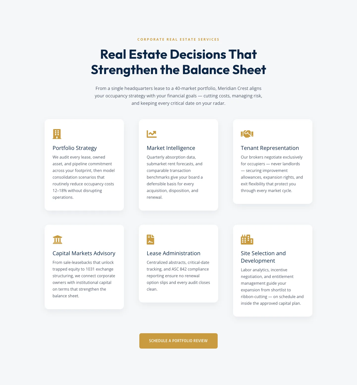
Corporate Real Estate Features Section: Six-Pillar Service Grid for Divi 5
features · real_estate · corporate
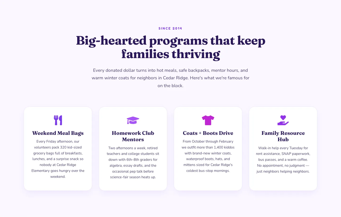
Playful Nonprofit Features Section: Four-Column Icon Cards for Divi 5
features · nonprofit · playful
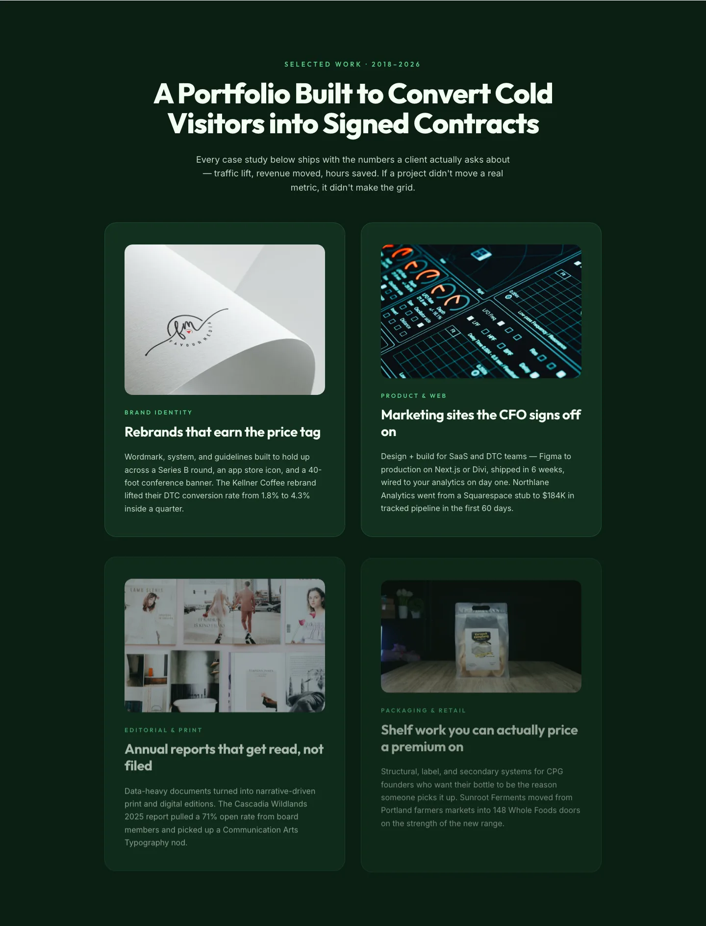
Bold Portfolio Features Grid: Divi 5 Case Study Layout
features · portfolio · bold
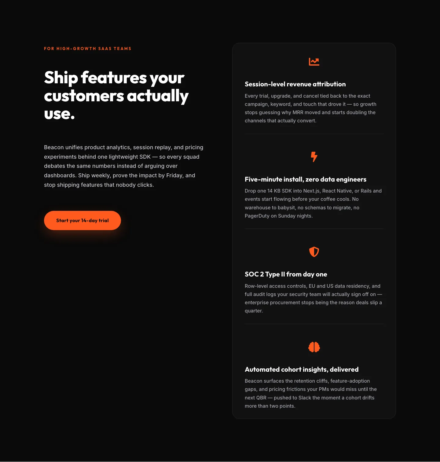
SaaS Features Section: Ship Features Customers Actually Use | Divi 5 Bold Layout
features · saas · bold
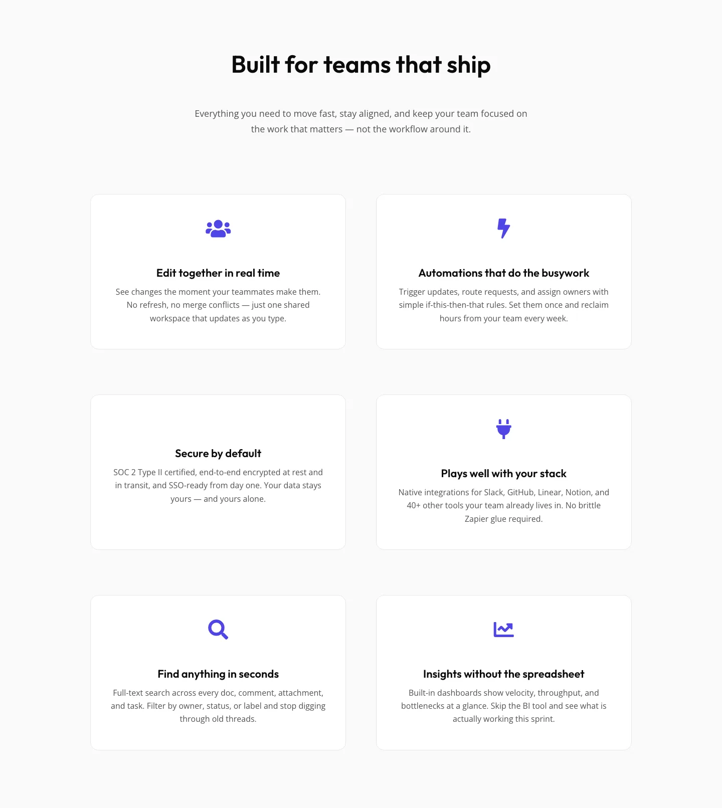
SaaS Features Section: Minimal Divi 5 Layout for Product Teams
features · saas · minimal
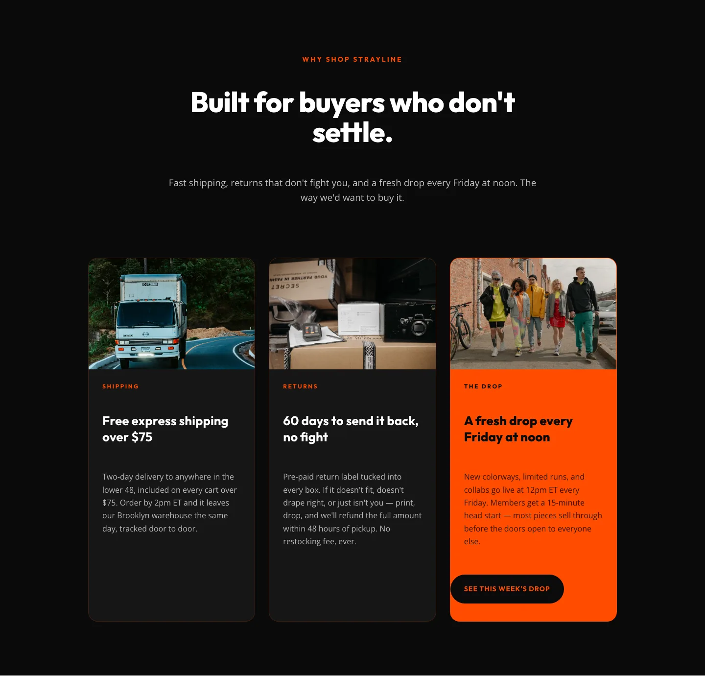
Bold Ecommerce Features Section: Free Shipping, Returns & Weekly Drops
features · ecommerce · bold