
SaaS Features Section: Ship Features Customers Actually Use | Divi 5 Bold Layout
Bold dark SaaS features section for Divi 5 with orange accents, icon-led benefits, session attribution, SOC 2, and a high-contrast trial CTA. Instant download.
Rate this element
Download this section, free
- Divi 5 JSON, imports in seconds
- Commercial license included
- No account needed
Click to view the full page
Overview
Two-column split section on a near-black #0a0a0a canvas, with 140px vertical padding on desktop that eases to 90px on tablet and 70px on phone. The row is capped at 1240px with an 80px column gap and a 56px row gap, so nothing feels cramped at wide breakpoints. The left column carries the argument: an orange uppercase eyebrow at 13px with 3px tracking, a 56px Outfit headline in white with tight -1px letter-spacing, an 18px Inter lead paragraph, and a pill CTA with an orange drop-shadow that intensifies on hover.
The right column is a self-contained feature card: 24px radius, hairline white border at 8% opacity, and a translucent rgba(255,255,255,0.03) fill that lifts it just off the section background. Inside, four feature blocks stack vertically. Each block opens with a 34px FontAwesome icon in the signature orange, followed by a 22px Outfit H3 in white and a supporting paragraph in Inter at 16px with a softer #a8a8b3 body color for hierarchy. A 1px bottom border at 8% white opacity acts as an almost-invisible divider between the four blocks, keeping the ideas separated without competing with the icons.
The palette does clear work: black grounds the composition, orange carries every point of tension (eyebrow, icons, CTA fill, CTA glow), and three greys (pure white for primary type, #c9c9d1 for the lead body, #a8a8b3 for supporting body) build the reading order. On phone, the row switches to flex-direction: column so the pitch stacks above the card, the H2 steps down 56 → 42 → 34px across breakpoints, and the card's inner padding tightens from 44px to 32/24 so it still breathes on a 375px screen.
What’s inside
- Two-column row (1_2 · 1_2), 1240px max-width, 80px column gap and 56px row gap, aligned to flex-start
- Left-column pitch stack: uppercase eyebrow (Outfit 13/700, 3px tracking) → 56px H2 Outfit 800 → 18px Inter lead → pill CTA
- Pill button with 999px radius, orange fill (#ff5a1f), Outfit 700 label, and an orange drop-shadow that grows on hover
- Right-column feature card: 24px radius, 1px 8%-white border, translucent white fill, 44px inner padding (32/24 on phone)
- Four icon + heading + body feature blocks separated by hairline 1px bottom borders at 8% white opacity
- Ready-to-swap FontAwesome glyphs at 34px in orange (chart-line, bolt, shield, users). No custom SVGs
- Responsive scale: H2 56 → 42 → 34px, section padding 140 → 90 → 70px, row stacks vertically on phone
- Zero images: the entire visual load is carried by typography, icons, and the palette contrast
Who it’s for
Purpose-built for SaaS marketing pages where the value prop needs to land twice: once as the headline pitch on the left, once as concrete capability proofs on the right. It fits analytics platforms, developer tools, dev-experience products, PLG apps, API companies, dashboards, and session-replay or observability tools where a technical buyer wants specifics before booking a demo. The dark canvas with a single hot accent skews modern and product-forward, so it also plays well for fintech infrastructure, security tooling, AI platforms, and design systems. It's a natural fit for a features section further down a landing page, or as the opening statement of a product page. Less suited to warm consumer brands, retail, hospitality, or wellness. Reach for a lighter section there.
Customization tips
The whole section leans on one accent (#ff5a1f) and one background (#0a0a0a). Swap those two hex values and the eyebrow, icon color, button fill, glow shadow, and border tint all follow the change. Keep the H2 to seven or eight words so it still clears at 34px on phone without wrapping to four lines. Feature titles read best at three to five words; the body paragraphs work up to about 220 characters before the card gets tall on tablet. FontAwesome icons are drop-in, replace the unicode value inside each Icon module and pick something at similar visual weight so the four blocks stay balanced. No images are used, so there are no aspect ratios to manage; if you want to swap the feature card for a product screenshot, target 1:1 or 4:5 so it matches the card's approximate height. If you shorten the list to three blocks, delete the last bottom-border style so there's no orphan divider under the final block.
How to install this layout
- Download the layout JSON file from this page.
- Open the target page in the Divi 5 builder.
- Open the portability panel (up/down arrows icon) and choose the Import tab.
- Upload the JSON. Tick “replace existing content” only for full-page imports.
- Check the page at desktop and mobile widths, then swap in your copy and images.
Full walkthrough with troubleshooting: How to Import a Divi 5 Layout.
Questions about SaaS Features Section: Ship Features Customers Actually Use | Divi 5 Bold Layout
How does the two-column layout behave on mobile?
The row switches to flex-direction column on phone, so the left-side pitch (eyebrow, headline, lead paragraph, button) stacks above the feature card. The H2 steps down from 56px to 42px on tablet and 34px on phone, section padding compresses from 140px to 70px, and the card's inner padding tightens from 44px to 32px top / 24px sides so nothing crowds a 375px viewport.
Which Divi 5 modules build this section?
Native only: Section, Row, Column, Text (for the eyebrow, lead body, and each feature's H3 + paragraph), Heading (for the H2), Button, and Icon. The right-side 'card' is just the second Column with background color, border, radius, and padding decorations. No custom code, no third-party modules, nothing to install.
Are there any images, and what should I know about imagery?
This section is intentionally image-free, icons and typography carry the entire visual load. If you'd rather show a product screenshot in place of the feature card, drop an Image module into the second column at 1:1 or 4:5 and it will roughly match the card's proportions without stretching the row.
What should I edit first after importing it?
Rewrite the eyebrow, H2, and lead paragraph on the left column with your own product name and one-sentence positioning, then replace the four H3 + body pairs on the right with your real feature messaging. If orange isn't your brand, change the accent hex once at the section level and it propagates to the eyebrow, icons, button fill, and button glow shadow.
Can I add a fifth or sixth feature block?
Yes, duplicate any of the existing Icon + Text pairs inside the second column and drop it in above the last block. Keep the same 28px bottom margin plus the 1px 8%-white bottom border so the divider rhythm stays consistent. The row is set to flex-wrap, so vertical growth on the right without matching content on the left is fine.
Which Divi version does this layout need?
Divi 5. The layout is generated natively for Divi 5 and validated against its real module structure before publication, so it imports clean into the current builder.
Can I use this layout on client websites?
Yes. Every download includes a commercial license covering unlimited sites you own or build for clients. Only reselling or redistributing the layout file itself is prohibited.
More feature grids
Browse all feature grids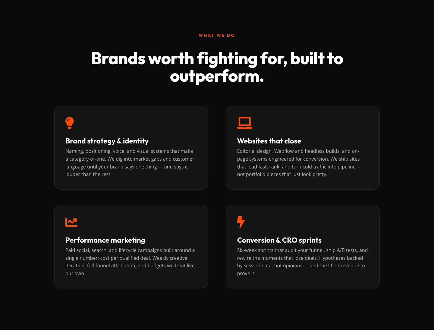
Bold Agency Features Section: Divi 5 Services Grid Layout
features · agency · bold
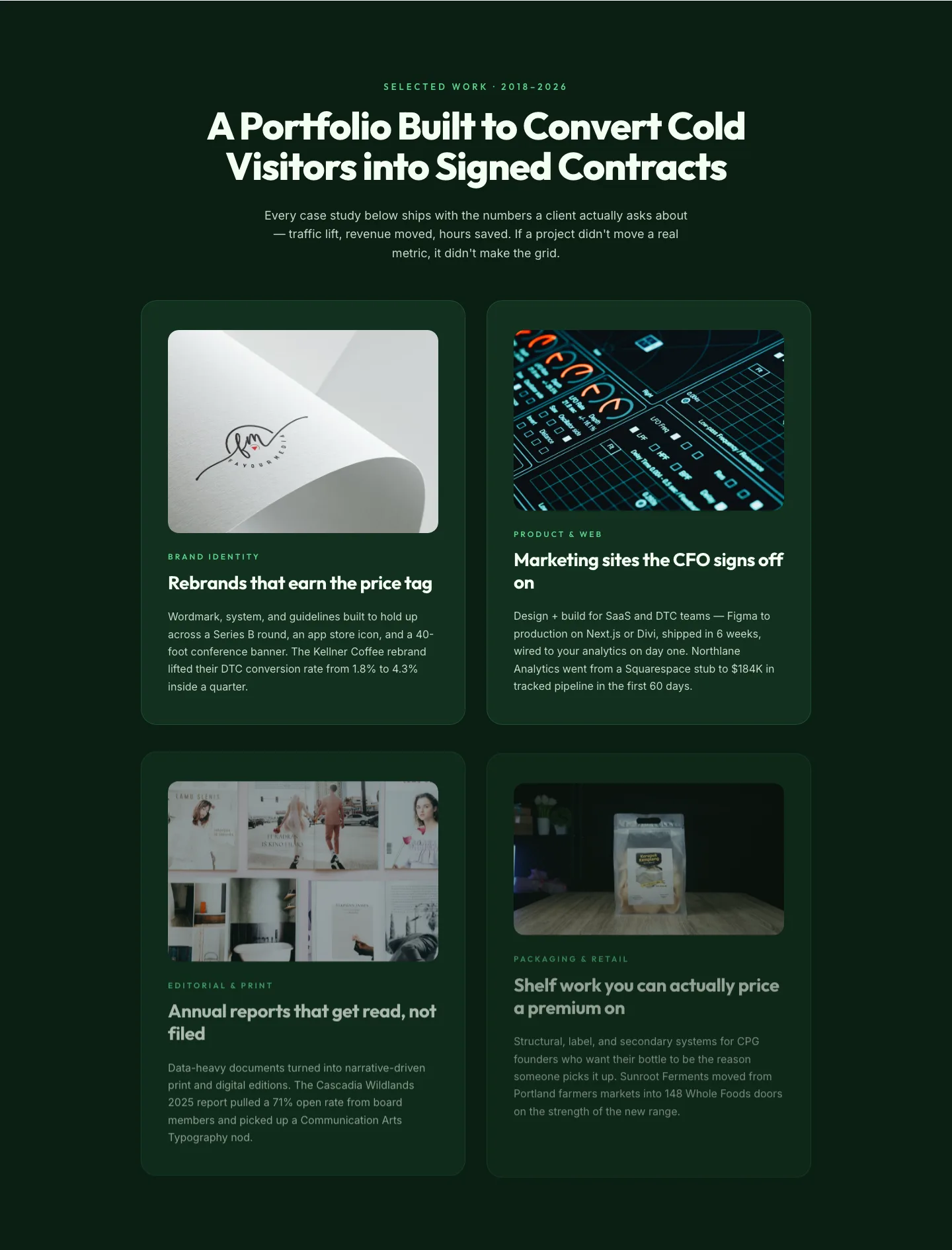
Bold Portfolio Features Grid: Divi 5 Case Study Layout
features · portfolio · bold
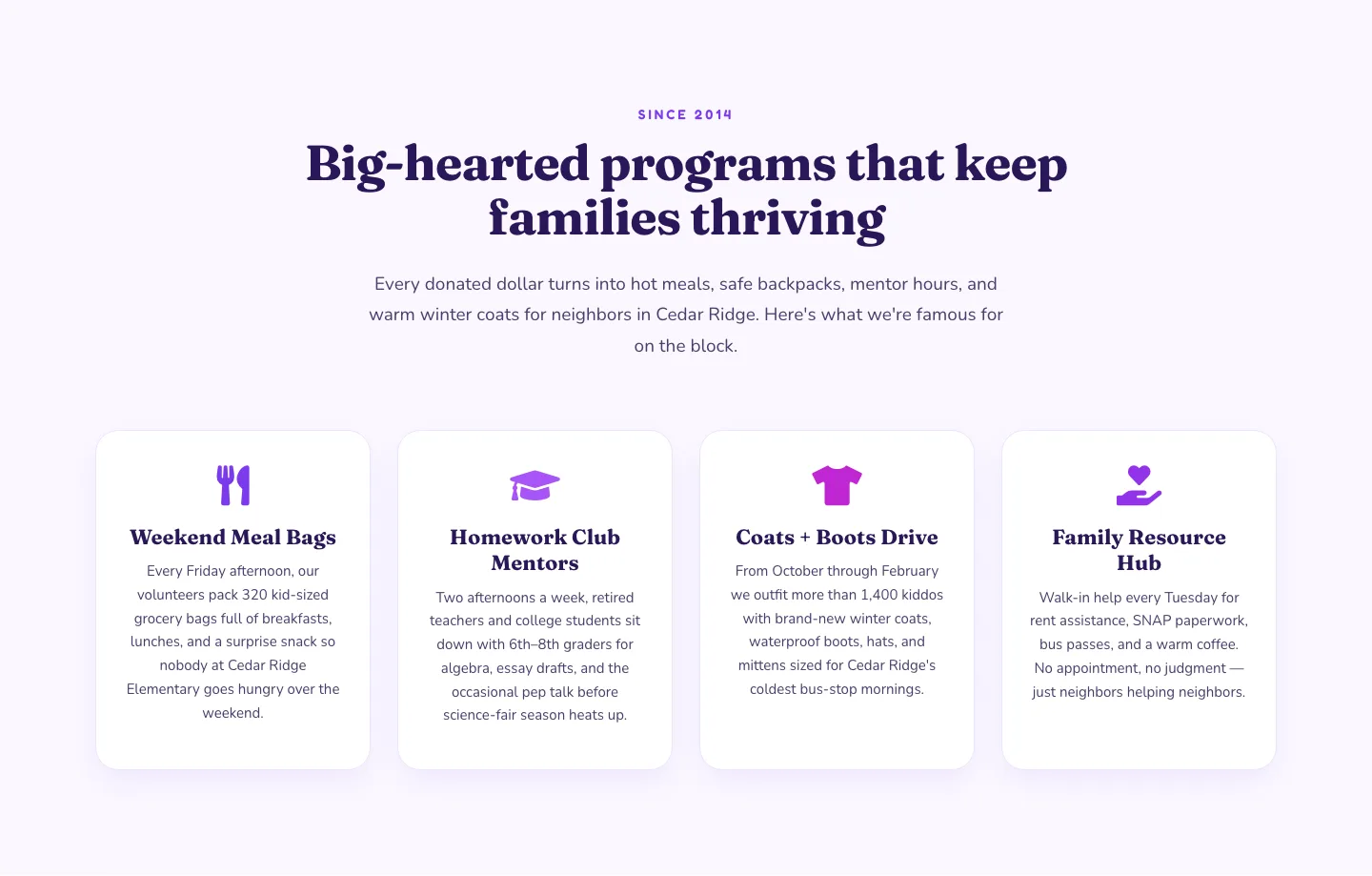
Playful Nonprofit Features Section: Four-Column Icon Cards for Divi 5
features · nonprofit · playful
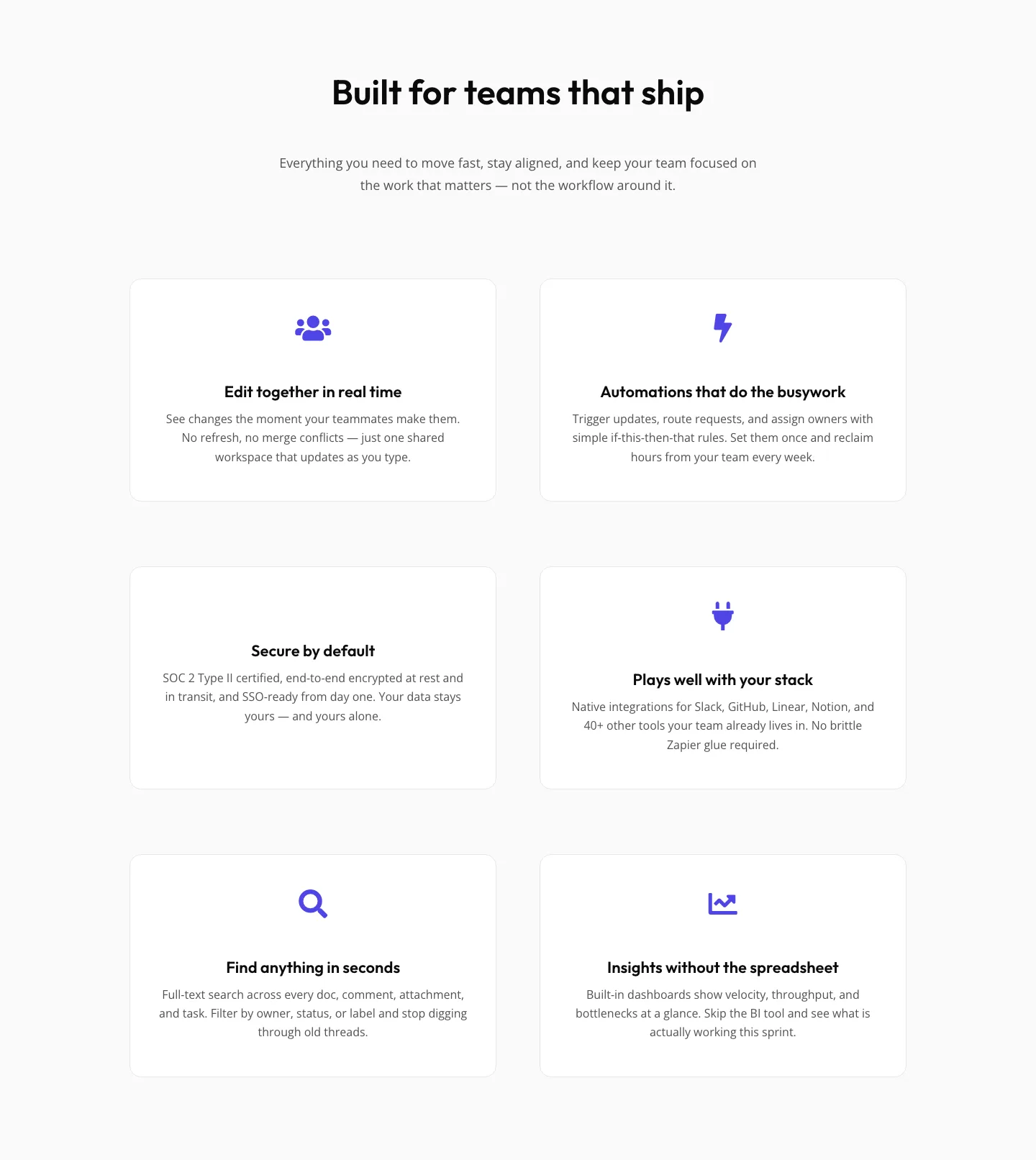
SaaS Features Section: Minimal Divi 5 Layout for Product Teams
features · saas · minimal
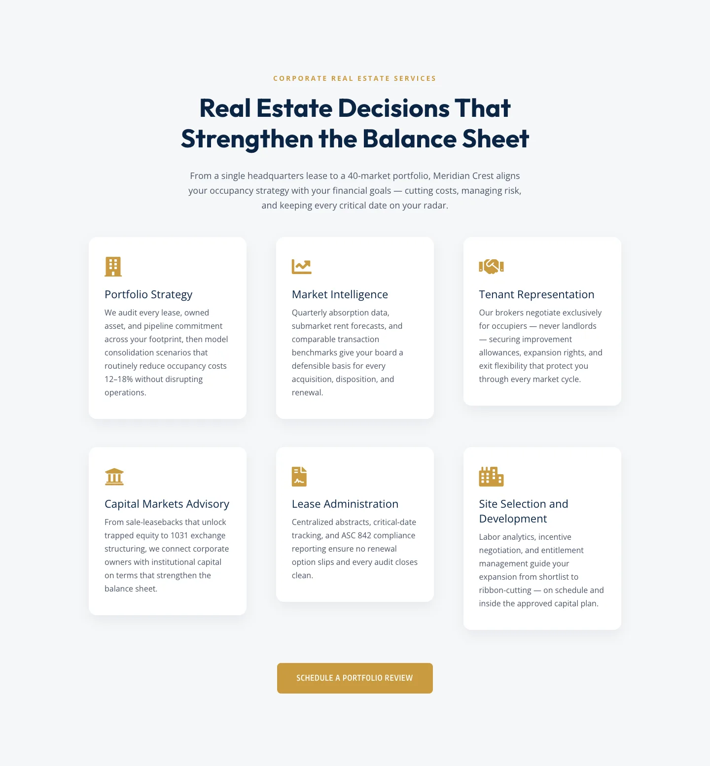
Corporate Real Estate Features Section: Six-Pillar Service Grid for Divi 5
features · real_estate · corporate
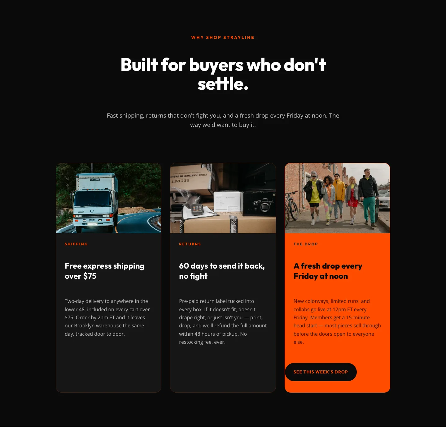
Bold Ecommerce Features Section: Free Shipping, Returns & Weekly Drops
features · ecommerce · bold