
Playful Nonprofit Features Section: Four-Column Icon Cards for Divi 5
Warm, playful Divi 5 features section for nonprofits. Four purple icon cards spotlight programs like meal bags, mentoring, coat drives, and family resources.
Rate this element
Download this section, free
- Divi 5 JSON, imports in seconds
- Commercial license included
- No account needed
Click to view the full page
Overview
This section opens with a centered eyebrow line ("Since 2014" in uppercase Fredoka with 3px letter-spacing and a deep violet (#7c3aed)) that sets a friendly, established tone before the display headline. The H2 uses Fraunces at 52px on desktop, tightened to a −1px letter-spacing and a 1.1em line-height, then steps down to 38px on tablet and 30px on phone so the wordmark-style typography stays legible without wrapping awkwardly on small screens. A short supporting paragraph sits at a 680px max-width for comfortable reading, in Nunito 19px with a generous 1.7em line-height that softens to 16px on phone.
Below the intro, four equal 1/4 columns sit inside a 1240px-wide row with a 28px column and row gap. Each card is a white panel on the section's lavender wash (#faf7ff), wrapped in a 1px #ece5fb hairline border and a 24px radius, then lifted off the page with a soft violet-tinted shadow (rgba(124,58,237,0.10)). On hover the card translates up by 8px and the shadow deepens to rgba(124,58,237,0.22): a small, playful piece of feedback that matches the nonprofit's warm voice without feeling gimmicky.
Inside every card, a 42px Font Awesome icon leads, each one tinted a different shade of the palette (#7c3aed, #a855f7, #c026d3, #9333ea) so the four programs feel distinct at a glance. The H3 uses Fraunces 22px for a soft display feel, and the body copy drops to Nunito 15px at 1.65em line-height: tight enough to keep cards short, roomy enough to read. The section pads 110px top and bottom on desktop, 80px on tablet, 64px on phone, and the row flips to a single stacked column at phone width so cards read top-to-bottom without cramping.
What’s inside
- One Divi 5 Section on a #faf7ff lavender wash, padded 110/80/64px across desktop, tablet, and phone.
- Intro row with three stacked Text/Heading modules: eyebrow tag, Fraunces H2 (52 / 38 / 30px), and a Nunito lead paragraph capped at 680px.
- Four equal 1/4 columns inside a 1240px, 90%-wide row with 28px column and row gaps and flex-wrap enabled for tablet.
- Each card: white background, 1px #ece5fb border, 24px radius, 36/28px padding, and a violet-tinted preset3 box shadow.
- Hover state on every card translates Y by −8px and deepens the shadow, no custom CSS required.
- One Divi Icon module per card at 42px, each pre-colored to a different violet/magenta shade so programs read as distinct.
- One Text module per card containing an H3 in Fraunces 22px plus a Nunito 15px body block for the program description.
- Phone breakpoint flips the row to flex-direction column so cards stack cleanly at full width.
Who it’s for
Built for community-facing nonprofits, foundations, mutual-aid groups, PTAs, faith-based outreach, food banks, animal rescues, and youth programs. Anywhere the site needs to summarize four flagship programs on one glance-friendly row. The warm violet palette and rounded, playful typography flatter organizations that talk to families, kids, and volunteers rather than corporate donors, so it's a natural fit for school-adjacent charities, after-school clubs, and neighborhood initiatives. It also works well on "About what we do" pages for small B Corps, community co-ops, or civic groups that want a friendly, human tone. Because the icons and copy are fully editable, it adapts just as easily to service-line grids for tutoring platforms, wellness collectives, or coaching practices that want the same soft, welcoming feel.
Customization tips
Palette: the section wash (#faf7ff) and the four icon colors (#7c3aed, #a855f7, #c026d3, #9333ea) all live at the module level. Swap them in the Design tab to retune to your brand in under a minute. Fonts: Fraunces + Fredoka + Nunito are all Google Fonts; change them once in the Divi theme options and every heading, eyebrow, and body block follows. Copy: keep card headings to 2–4 words so they don't wrap past two lines at 22px, and hold the description around 30–45 words so cards stay the same height across the row. Icons: use any Font Awesome glyph, they render at 42px, so pick shapes that read clearly at small sizes. No images ship with this section, so there are no aspect ratios to manage. If you need a fifth card, duplicate a 1/4 column and the flex-wrap row will drop it neatly onto a second line.
How to install this layout
- Download the layout JSON file from this page.
- Open the target page in the Divi 5 builder.
- Open the portability panel (up/down arrows icon) and choose the Import tab.
- Upload the JSON. Tick “replace existing content” only for full-page imports.
- Check the page at desktop and mobile widths, then swap in your copy and images.
Full walkthrough with troubleshooting: How to Import a Divi 5 Layout.
Questions about Playful Nonprofit Features Section: Four-Column Icon Cards for Divi 5
How does the four-column grid behave on tablet and mobile?
The row is flex-wrap enabled, so on tablet the cards reflow to two-per-row at the 1/2 column width, then stack to a single full-width column on phone thanks to the flex-direction:column override at that breakpoint.
Which Divi 5 modules does this section actually use?
Only four native ones: Section, Row, Column, Text, Heading, and Icon. No third-party plugins, no custom code. Everything is editable from the visual builder.
Are there any images to swap out?
No. The design is icon-led, using four Font Awesome icons (utensils, graduation cap, mitten, hands-helping) at 42px. That keeps the download tiny and means you never have to source photography for it.
What should I edit first after importing?
Replace the eyebrow tag ("Since 2014"), the H2, and the four card headings and descriptions with your own program names. Then retune the four icon colors if your brand isn't in the violet family, everything else can stay.
Can I add a fifth or sixth program card?
Yes. Duplicate any 1/4 column inside the row. The row uses flex-wrap, so extra cards drop cleanly onto a second line at the same 28px gap and card styling.
Does the card hover lift work out of the box?
Yes: the −8px Y translate and deeper violet shadow are set on the column's hover state in Divi 5, so it works immediately after import with no custom CSS.
Which Divi version does this layout need?
Divi 5. The layout is generated natively for Divi 5 and validated against its real module structure before publication, so it imports clean into the current builder.
Can I use this layout on client websites?
Yes. Every download includes a commercial license covering unlimited sites you own or build for clients. Only reselling or redistributing the layout file itself is prohibited.
More feature grids
Browse all feature grids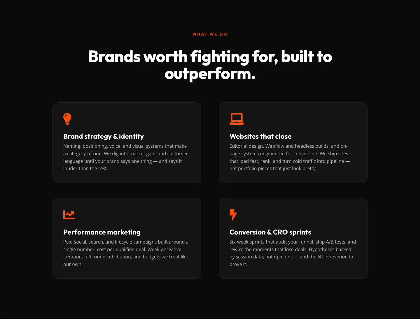
Bold Agency Features Section: Divi 5 Services Grid Layout
features · agency · bold
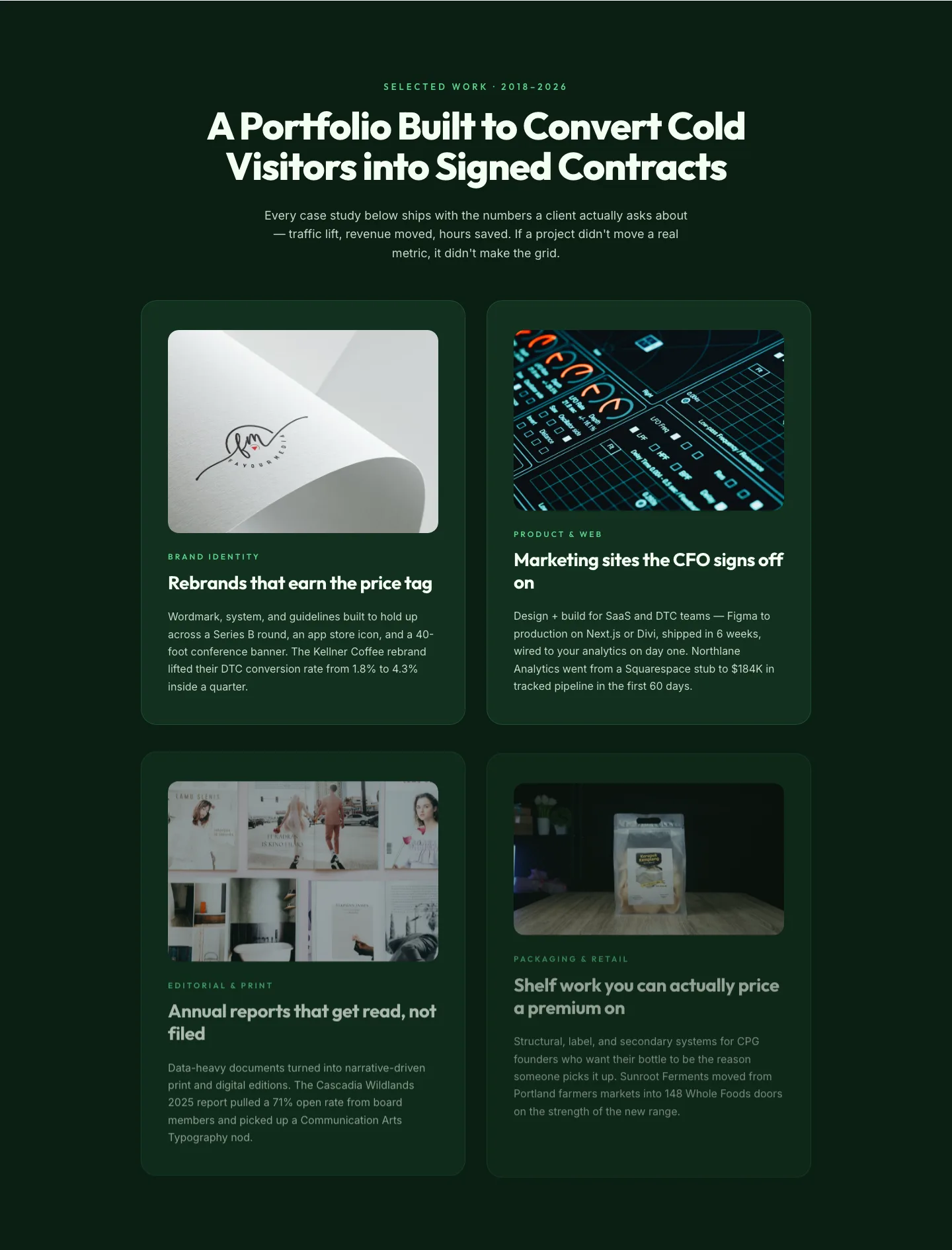
Bold Portfolio Features Grid: Divi 5 Case Study Layout
features · portfolio · bold
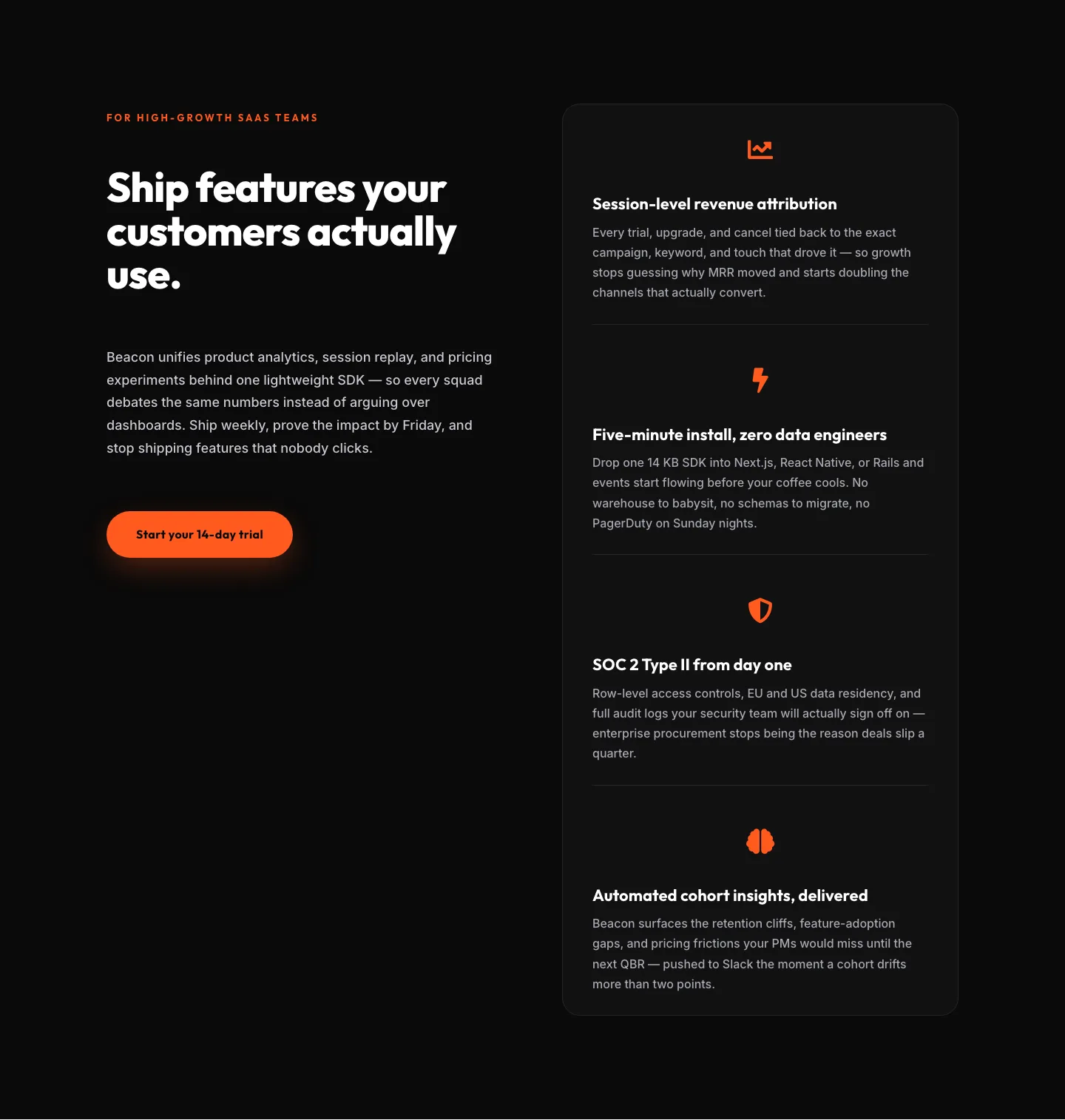
SaaS Features Section: Ship Features Customers Actually Use | Divi 5 Bold Layout
features · saas · bold
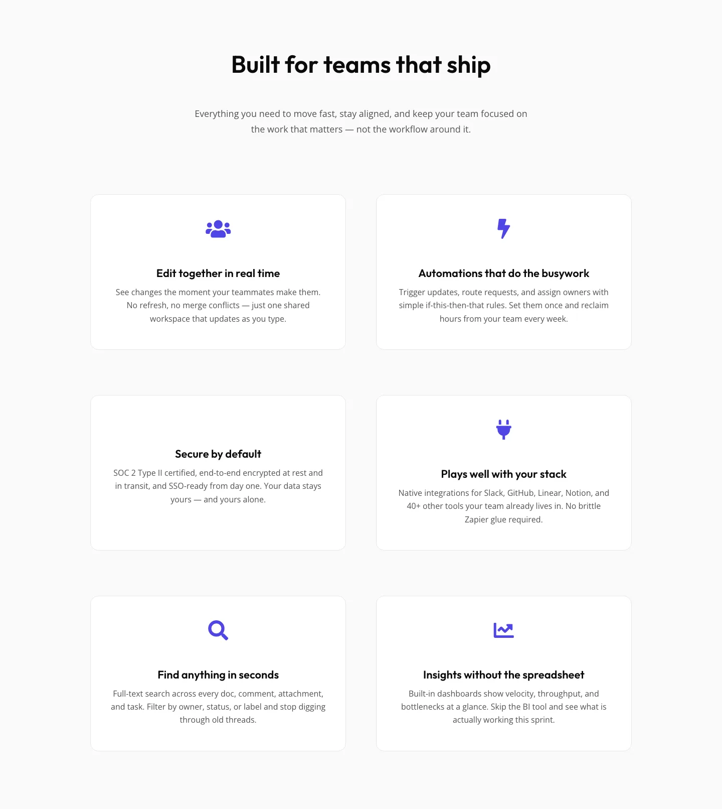
SaaS Features Section: Minimal Divi 5 Layout for Product Teams
features · saas · minimal
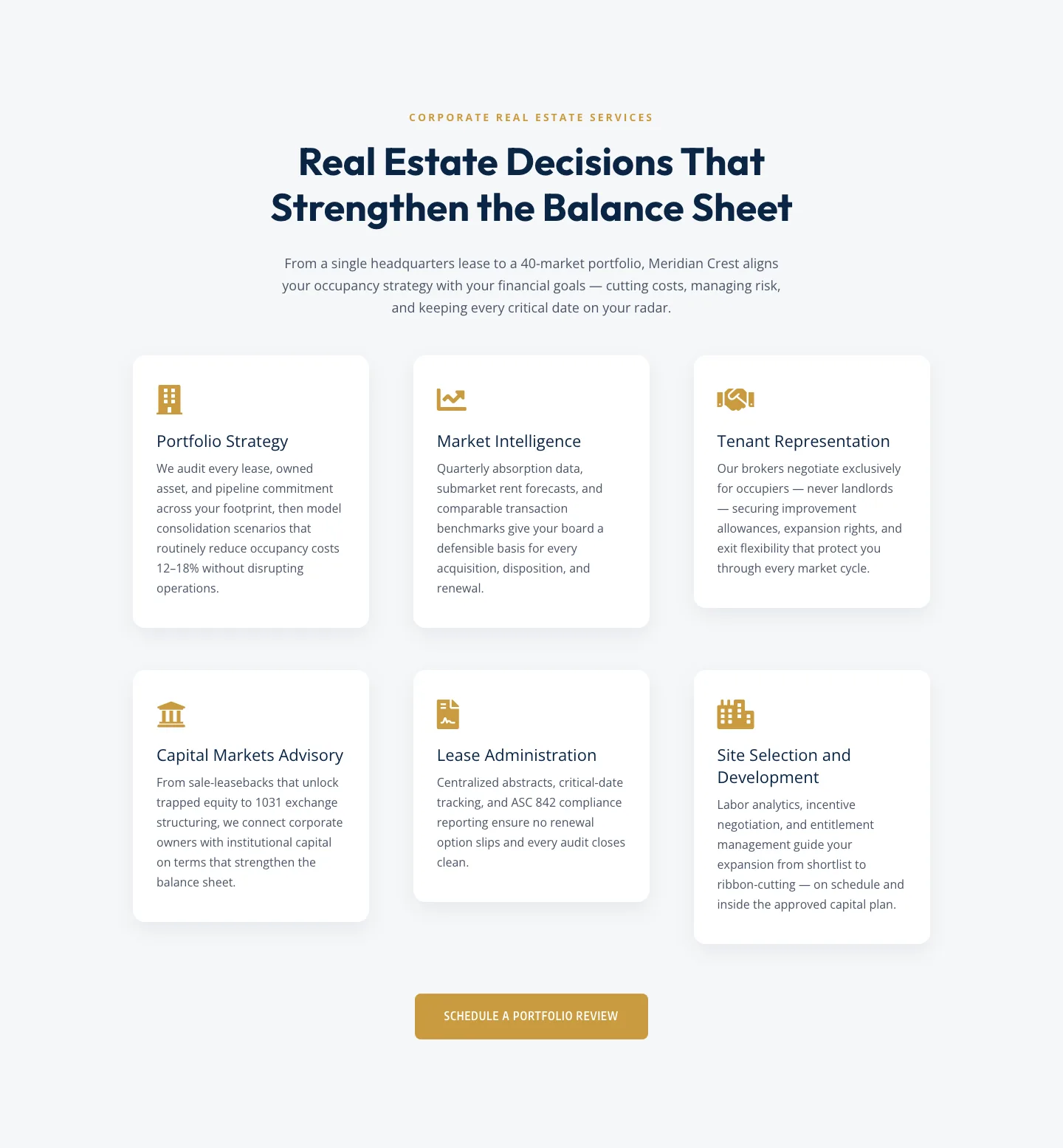
Corporate Real Estate Features Section: Six-Pillar Service Grid for Divi 5
features · real_estate · corporate
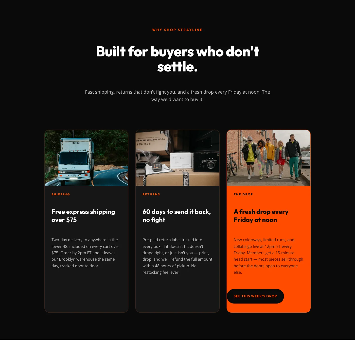
Bold Ecommerce Features Section: Free Shipping, Returns & Weekly Drops
features · ecommerce · bold