
Bold Portfolio Features Grid: Divi 5 Case Study Layout
A bold, dark-green Divi 5 features section for portfolios: 2x2 case-study grid with tag labels, project titles, and results-driven copy for designers and studios.
Rate this element
Download this section, free
- Divi 5 JSON, imports in seconds
- Commercial license included
- No account needed
Click to view the full page
Overview
This is a two-row features grid built for portfolio and case-study work. A centered intro row leads with a small green eyebrow ("Selected Work · 2018–2026") set in Outfit uppercase with wide 4px tracking, followed by an oversized H2 (58px desktop, 44px tablet, 34px phone) with a tight -1.5px letter-spacing and a 1.05 line-height that locks the display type into a confident, poster-like block. A single line of Inter body copy sits under the headline at 640px max-width so the eye reads it in one pass before dropping into the grid.
Below the intro, four case-study cards sit in a 2×2 layout at desktop (two 1_2, 1_2 rows with a 32px gap on both axes). Each card is a self-contained unit: a 720×480 image with 16px rounded corners, a small green category eyebrow, an H3 project title in Outfit 700 at 28px, and a two-sentence result-focused paragraph in Inter 16px. The card surface (#12301f) sits one step lighter than the section background (#0b1f14) with a subtle 1px green border and a slide-in-from-bottom animation staggered 600 → 700 → 800 → 900ms across the four cards, so they cascade as the section enters the viewport.
The palette is disciplined: a deep forest green background, a slightly warmer card surface, near-white body text (#f4fff2), a muted green paragraph tone (#c9d9c8), and a single saturated accent (#5cd18a) reserved for the eyebrows and hover glow. That restraint is what lets the imagery carry the weight, the cards read like frames in a lookbook rather than boxes on a webpage.
On mobile the grid collapses cleanly: the row's flexDirection flips to column, cards stack full-width at flexType 24_24, inner padding drops from 44/40px to 32/28px, and the H2 falls to 34px with a slightly looser 1.1 line-height. Section padding tightens from 120px to 72px top and bottom, so the rhythm survives on a phone without feeling cramped.
What’s inside
- Two-row structure: centered intro row (eyebrow + H2 + supporting paragraph) followed by a 2×2 case-study grid at desktop, single column on phone
- Four native Divi 5 card columns (`1_2` at desktop, `24_24` at phone) with matching padding, rounded 24px corners, and a hover box-shadow glow tuned to the accent green
- Each card uses stock Divi Image, Text, and Heading modules (no third-party plugin, no custom shortcodes) so every field is editable directly in the visual builder
- Staggered slide-from-bottom entrance animations (600/700/800/900ms) create a cascading reveal without any code or plugins
- Type system: Outfit for eyebrows and headings, Inter for body, imported through Divi's built-in Google Fonts, no manual `@font-face`
- Responsive typography baked into the modules: H2 scales 58 → 44 → 34px, H3 scales 28 → 24px, section padding scales 120 → 90 → 72px
- Dark forest palette with a single saturated accent token (#5cd18a), the whole section can be re-skinned by editing four hex values
- Result-first copy pattern: category eyebrow, project title, then a two-sentence blurb ending in a concrete number. A template that keeps every card honest
Who it’s for
Independent designers, illustrators, photographers, motion artists, and small studios that need a case-study grid where the work has to sell the pitch. It's tuned for portfolios that want to look editorial rather than templated: branding shops, product design consultancies, packaging studios, agency landing pages, and freelance developers who want to lead with proof, not personality. The dark palette also makes it a natural fit for architects, industrial designers, and interior designers whose photography is already high-contrast. If you sell creative services on outcomes (rebrand → conversion lift, site build → pipeline, packaging → retail placement), the copy pattern in each card is already shaped to that story. It works less well for playful, illustrative, or maximalist brands. The restraint is the whole point.
Customization tips
Start by editing the four hex values that define the palette: the section background (#0b1f14), the card surface (#12301f), the accent (#5cd18a), and the border color (rgba(92,209,138,0.18)). Swap the accent to your brand color and the whole section re-tones without touching a single module. Keep card titles to 4–6 words so they don't wrap past two lines at desktop 28px. That's where the grid rhythm holds. Body paragraphs sit best at 30–45 words; anything longer and the four cards stop matching heights. Replace the Pexels images with your own at a 3:2 ratio (recommended 1440×960, minimum 940×650) so the 16px rounded corners crop cleanly across breakpoints. If you have more than four case studies, duplicate the second row: the animations use fixed durations, so bump the new cards to 1000ms/1100ms to keep the cascade. To add a CTA, drop a Button module into the intro column below the paragraph; don't add it inside a card, since the hover shadow is already the interactive affordance.
How to install this layout
- Download the layout JSON file from this page.
- Open the target page in the Divi 5 builder.
- Open the portability panel (up/down arrows icon) and choose the Import tab.
- Upload the JSON. Tick “replace existing content” only for full-page imports.
- Check the page at desktop and mobile widths, then swap in your copy and images.
Full walkthrough with troubleshooting: How to Import a Divi 5 Layout.
Questions about Bold Portfolio Features Grid: Divi 5 Case Study Layout
How does the 2×2 grid behave on tablets and phones?
At desktop the row uses `flex-direction: row` with a 32px gap and `flexWrap: wrap`, so the four cards sit in a 2×2 grid at 1200px max-width. On tablet the cards keep their 1_2 width but inner padding stays generous at 44/40px. On phone the row switches to `flex-direction: column` and each card flexes to full width (`24_24`), padding compresses to 32/28px, and the H2 drops from 58px to 34px.
Which Divi 5 modules does this layout use?
Only native modules: Divi Section, Row, Column, Text, Heading, and Image. There are no code modules, no shortcodes, and no third-party dependencies. Every setting (including the hover shadow, border radius, and stagger animations) is applied through standard Divi 5 module options.
Are the Pexels photos included in the download?
No. The layout ships with Pexels image URLs as placeholders so the design renders correctly on first import. You'll want to replace all four with your own project shots. They're licensed for use in the demo but you should upload your own work before publishing.
What should I edit first after importing?
Four things in order: (1) the H2 headline in the intro row, (2) the four card images at 3:2 ratio, (3) each card's category eyebrow, title, and paragraph, and (4) the accent color (#5cd18a) if you're not using green. That's the minimum edit pass to make the section yours.
Can I add a fifth or sixth case study?
Yes, duplicate one of the existing rows and adjust. Because the row uses `flexWrap: wrap`, adding a third row of two cards flows naturally. If you'd rather have three columns per row, change the row's column structure from `1_2, 1_2` to `1_3, 1_3, 1_3` and drop card padding from 40px to 32px so the tighter columns still breathe.
How do I turn off the slide-in animations?
Open each card column, go to the Design tab → Animation, and set the style to None. There are four columns, each with its own animation timing (600/700/800/900ms), so you'll toggle four independently. The rest of the layout has no animations attached.
Which Divi version does this layout need?
Divi 5. The layout is generated natively for Divi 5 and validated against its real module structure before publication, so it imports clean into the current builder.
Can I use this layout on client websites?
Yes. Every download includes a commercial license covering unlimited sites you own or build for clients. Only reselling or redistributing the layout file itself is prohibited.
More feature grids
Browse all feature grids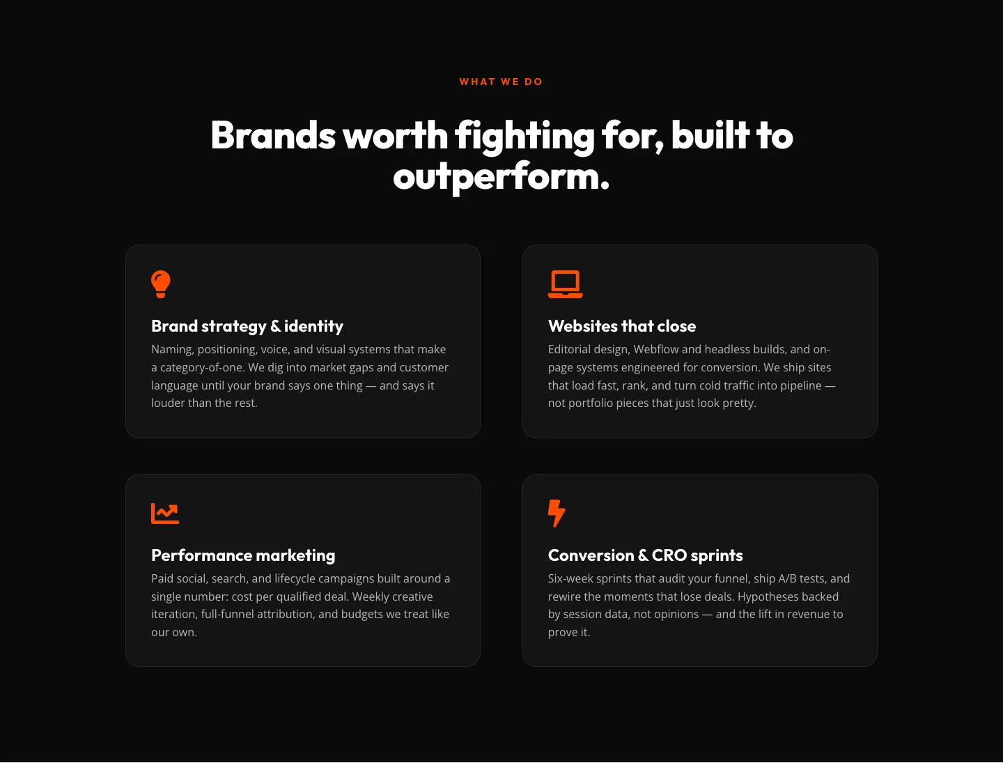
Bold Agency Features Section: Divi 5 Services Grid Layout
features · agency · bold
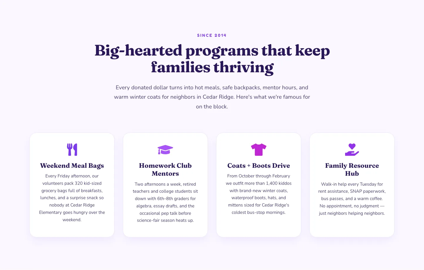
Playful Nonprofit Features Section: Four-Column Icon Cards for Divi 5
features · nonprofit · playful
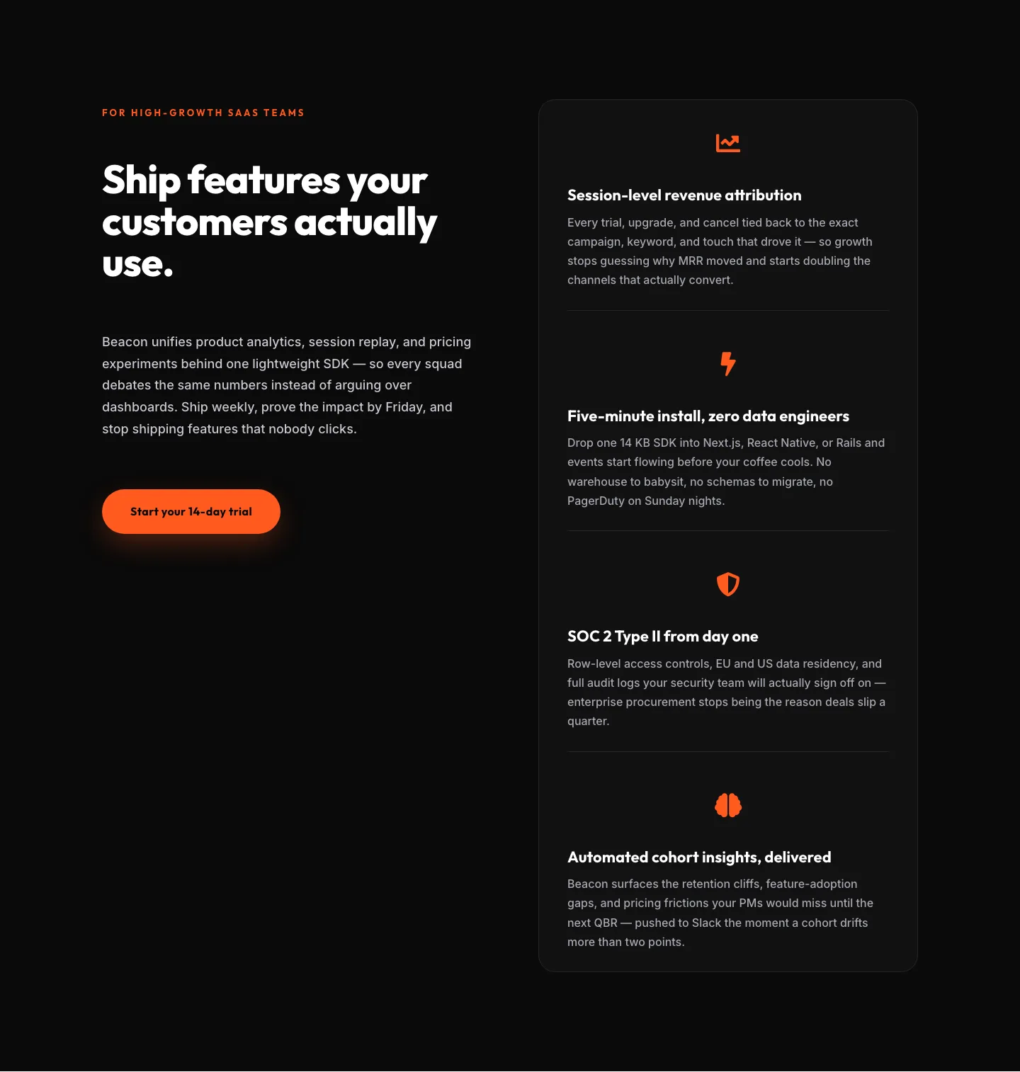
SaaS Features Section: Ship Features Customers Actually Use | Divi 5 Bold Layout
features · saas · bold
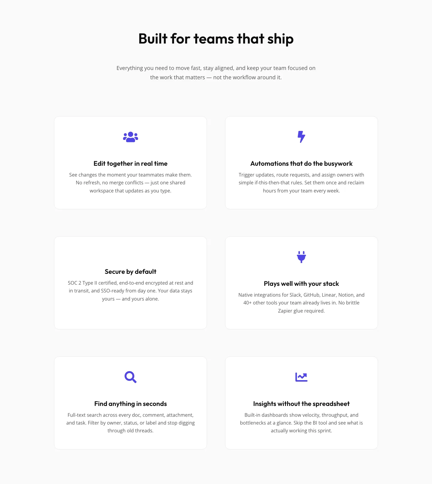
SaaS Features Section: Minimal Divi 5 Layout for Product Teams
features · saas · minimal
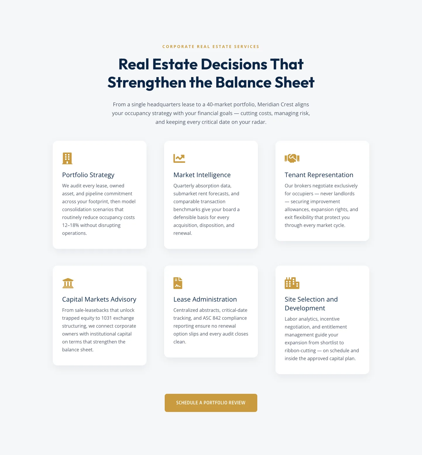
Corporate Real Estate Features Section: Six-Pillar Service Grid for Divi 5
features · real_estate · corporate
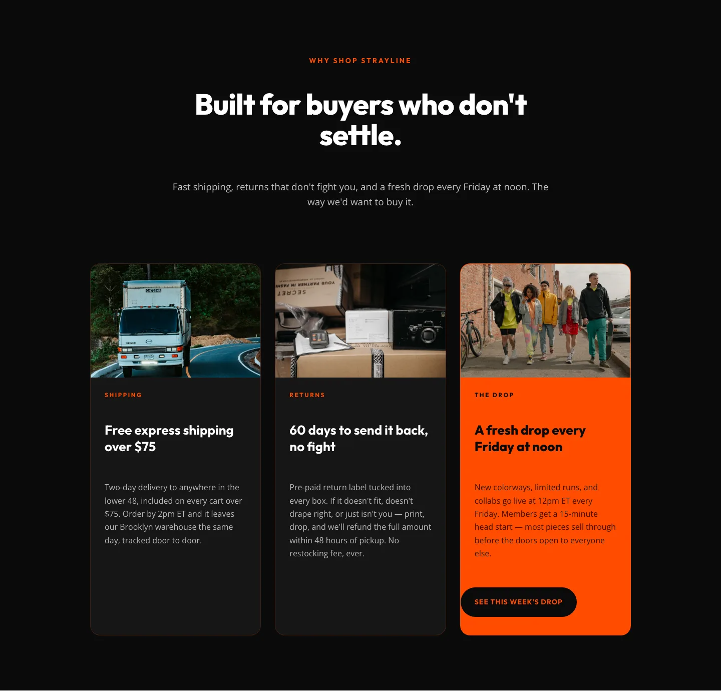
Bold Ecommerce Features Section: Free Shipping, Returns & Weekly Drops
features · ecommerce · bold