
Bold Ecommerce CTA Section: 'The Drop Is Live' Divi 5 Layout
High-impact Divi 5 CTA section for ecommerce and fashion stores. Dark hero-style background, bold orange 'Shop the Drop' button, urgency copy, and trust badges. Download the JSON and launch in minutes.
Rate this element
Download this section, free
- Divi 5 JSON, imports in seconds
- Commercial license included
- No account needed
Click to view the full page
Overview
This is a single full-bleed section built for one job: push a shopper to click the button. A dark #0b0b0d base is overlaid with a 90° gradient (94%→70% opacity) sitting on top of a lifestyle background image, so the photo reads as texture instead of competing with the type. Vertical padding is heavy (140px top and bottom on desktop, easing to 96px on phone) which gives the block room to breathe when it drops between denser sections above and below.
Everything lives in one centered 4_4 column capped at 760px, so the content sits as a tight, centered stack. The hierarchy is deliberate and short: a small orange eyebrow in uppercase 3px-tracked caps announces the moment (The Summer Drop Is Live), a heavy 64px Outfit headline (dropping to 38px on phone) delivers the hook, a 20px body paragraph at 580px max-width explains the offer in one breath, and a pill-shaped CTA finishes the pitch. A muted micro-line under the button carries the trust cues (shipping, returns, rating) at 14px so they support the click without stealing attention.
The palette is a two-color system: near-black surface plus a single accent orange (#ff4d00, hover #e13d00) reused on the eyebrow, the button fill, and a soft orange box-shadow glow beneath the button. That repetition is what makes the CTA feel like the destination, every accent on the page points at the same target. On phone, the row flips to flexDirection: column, the headline scales down its line-height to 1.1em, and the padded background image stays cover-positioned, so the section keeps its full-bleed drama on a 375px screen without any manual re-layout.
What’s inside
- One dark full-bleed section with a gradient overlay on top of a swappable background image (drop your own product/lifestyle shot in)
- Centered 4_4 column, 760px max-width row: tight stack, no side columns to wrangle
- Uppercase eyebrow Text module in accent orange with 3px letter-spacing for the announcement line
- Outfit 64px / 800-weight Heading module (38px on phone) with a purpose-built 1.05em line-height for two-line hooks
- Body Text module capped at 580px, 20px / 1.7em, tuned for a single scannable sentence
- Pill Button module (100px radius, 44px horizontal padding) with an orange glow box-shadow that intensifies on hover
- Trust micro-line Text module for shipping / returns / rating cues sitting just under the button
- Phone breakpoint tuned in-file: padding drops to 96px vertical and the row switches to column flex direction
Who it’s for
Built for ecommerce brands that run on urgency: apparel drops, sneaker launches, DTC beauty restocks, jewelry collections, and any store that leans on new-arrivals moments. It slots equally well onto a Shopify-to-Divi rebuild, a WooCommerce homepage above the product grid, or as a closing block on a collection page. Fashion, streetwear, and lifestyle brands will feel most at home with the bold black-and-orange palette, but the two-color system swaps cleanly for beauty (black + rose), outdoor (charcoal + safety yellow), or food-and-beverage (espresso + tomato). Also useful as a members-only teaser, a Black Friday hero, or a pre-launch waitlist block on a landing page.
Customization tips
Start with the copy: the headline is built for a 4–6 word hook, so keep it punchy; anything past ~40 characters will wrap awkwardly on phone at 38px. The body paragraph is capped at 580px and reads best around 20–30 words. For the palette, change two hex values and you have a new brand: the accent orange (#ff4d00 and its #e13d00 hover) appears on the eyebrow, button fill, and box-shadow glow, and the section background (#0b0b0d) sets the whole mood. If you keep the background image, use a horizontal shot with subject weight on the sides. The centered stack will cover the middle. A 3:2 or 16:9 crop at 1600px wide is plenty since the gradient overlays it. Change the button label to match the destination (Shop the Drop, Join the Waitlist, Claim Early Access) and rewrite the trust micro-line with your real shipping / returns / rating numbers before publishing.
How to install this layout
- Download the layout JSON file from this page.
- Open the target page in the Divi 5 builder.
- Open the portability panel (up/down arrows icon) and choose the Import tab.
- Upload the JSON. Tick “replace existing content” only for full-page imports.
- Check the page at desktop and mobile widths, then swap in your copy and images.
Full walkthrough with troubleshooting: How to Import a Divi 5 Layout.
Questions about Bold Ecommerce CTA Section: 'The Drop Is Live' Divi 5 Layout
How does this section behave on mobile?
The row switches to a column flex direction on phone, vertical padding eases from 140px to 96px, and the headline scales from 64px to 38px with a slightly looser 1.1em line-height. The 580px body cap and centered alignment carry over, so the stack stays legible on a 375px screen without any manual tweaks.
Which Divi 5 modules does it use?
Five native modules only (an eyebrow Text, a Heading, a body Text, a Button, and a trust-line Text) all inside a single Section > Row > Column (4_4). No third-party plugins, no code modules, no custom HTML.
What should I change first after importing?
The five copy strings and the background image. Rewrite the eyebrow, headline, body paragraph, button label, and trust micro-line to your offer, then swap the Pexels background URL in the Section's background settings for your own product or lifestyle photo. The palette and spacing are already dialed in.
Can I use it without a background image?
Yes. Turn the image off in the Section background and the underlying `#0b0b0d` fill with its gradient overlay still reads as a rich dark surface. The orange accent and button glow keep the section from feeling flat.
Will the trust line numbers stay accurate?
Those are placeholder examples (`Free shipping over $75 · 30-day free returns · Rated 4.9/5 by 12,000+ shoppers`). Edit that Text module to reflect your real policies and review counts before publishing. It's the single most important string to update.
Where is this section designed to sit on a page?
It's a closer or mid-page hinge, not a hero. Drop it after a product grid, between a features block and a footer, or as a promotional band on a collection page. The 140px vertical padding gives it enough presence to interrupt scroll without feeling like a second hero.
Which Divi version does this layout need?
Divi 5. The layout is generated natively for Divi 5 and validated against its real module structure before publication, so it imports clean into the current builder.
Can I use this layout on client websites?
Yes. Every download includes a commercial license covering unlimited sites you own or build for clients. Only reselling or redistributing the layout file itself is prohibited.
More call-to-action
Browse all call-to-action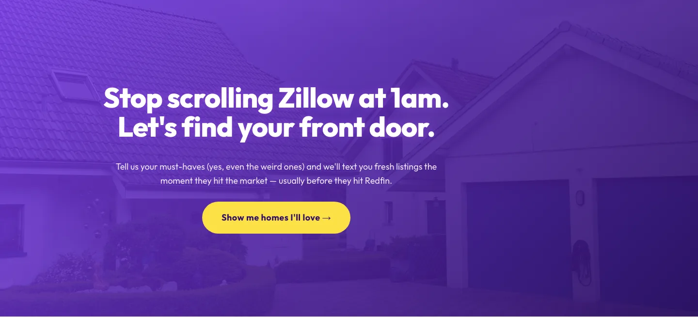
Playful Real Estate CTA: Purple Gradient Listing Alert Signup
cta · real_estate · playful
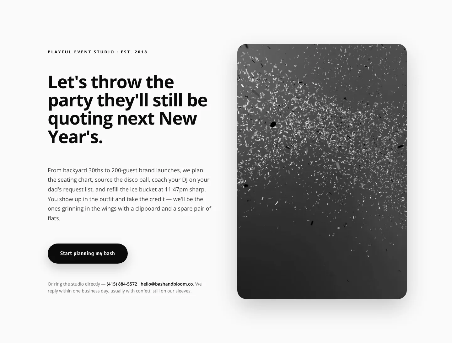
Playful Events CTA Layout for Divi 5: Bash & Bloom
cta · events · playful
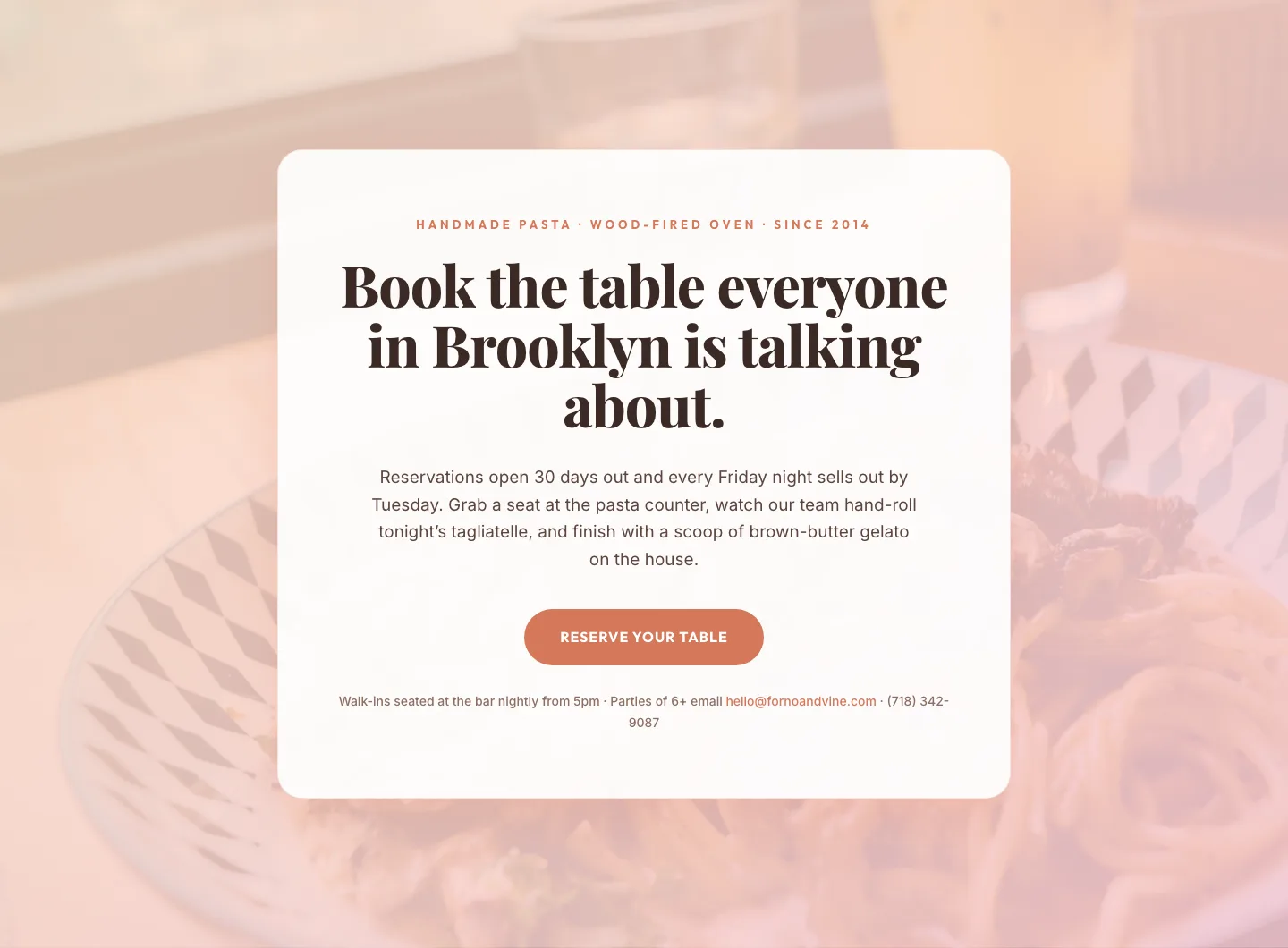
Bold Restaurant Reservation CTA: Divi 5 Layout
cta · restaurant · bold

Bold Purple SaaS CTA Banner: Full-Bleed Divi 5 Layout
cta · saas · bold
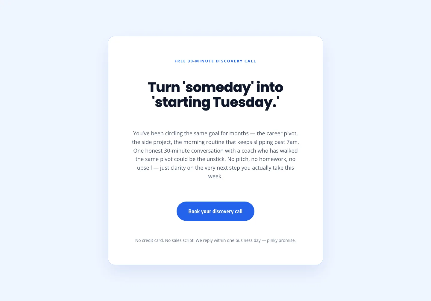
Coaching Discovery Call CTA: Playful Divi 5 Layout
cta · coaching · playful

CTA: Portfolio Bold Blue
cta · portfolio · bold