
Bold Fitness CTA: Full-Bleed Banner
High-impact Divi 5 fitness CTA section with full-bleed parallax banner, bold Oswald headline, urgency deadline, and prominent enrollment button. Perfect for gyms, transformation challenges, and personal training offers.
Rate this element
Download this section, free
- Divi 5 JSON, imports in seconds
- Commercial license included
- No account needed
Click to view the full page
Overview
The layout is a single-column, full-bleed CTA banner built around vertical rhythm and one commanding headline. The section sits on a deep oxblood base (#7a0000) with a fixed-parallax photograph behind a diagonal 135° gradient that fades from near-black rgba(20,0,0,0.85) to a warm red wash rgba(180,20,20,0.55): the image reads as texture and mood rather than the subject, which is why the copy never fights the photo for attention. Vertical padding is deliberately generous: 160px top and bottom on desktop, 100px on tablet, and 80px on phone, giving the message room to dominate whatever viewport it lands in.
Inside, the row is capped at 1080px and centered, with a column that flex-stacks every element on the vertical axis and center-aligns them. The Oswald headline runs at 72px, weight 900, -1px letter-spacing, and 1.02em line-height (heavy, tight, and unapologetic) followed by a supporting paragraph at 20px in warm off-white (#f5e6e6) constrained to a 720px max-width so line length stays readable at long form. A small uppercase eyebrow in pink-red (#ffb3b3) with 2px letter-spacing carries the scarcity beat ("Only 24 spots open…") directly above the button, exactly where a fitness sign-up needs the deadline pressure to sit.
The primary button inverts the palette: white surface, dark-red label (#7a0000), 2px white border, 6px radius, uppercase 18px, and a preset3 drop shadow (0 / 14px / 40px, rgba(0,0,0,0.45)) that visibly lifts it off the photo. Hover swaps the surface to accent red #e63946 with white text, a satisfying on-brand flip rather than a subtle fade. A 14px contact line sits below the button as a low-pressure fallback for people not ready to click.
What’s inside
- Single-section, single-column CTA banner (`divi/section` → `divi/row` → `divi/column`): one focus point, no distractions
- Layered background: solid `#7a0000` fill + parallax fitness photo + 135° dark-to-red gradient overlay set to 85%→55% opacity
- Oswald 72px display headline module at weight 900 with -1px tracking and 1.02em line-height
- Supporting `divi/text` paragraph capped at 720px max-width for comfortable reading
- Uppercase `divi/text` eyebrow with 2px letter-spacing, purpose-built for a scarcity/deadline line
- White-on-red `divi/button` with 2px border, `preset3` drop shadow, and hover fade to `#e63946`
- Secondary `divi/text` module beneath the CTA for phone + email as a low-pressure fallback
- Responsive vertical padding step-down (160 → 100 → 80px) across desktop, tablet, and phone
Who it’s for
Independent gyms, CrossFit boxes, martial-arts and boxing gyms, boot-camp programs, HIIT and spin studios, personal-trainer landing pages, transformation-challenge sign-ups, supplement launches, athletic-apparel drops, and combat-sports events. The high-contrast red-and-black palette and imperative voice suit brands built on intensity, anywhere a soft pastel hero would undersell the offer. It also works well for cohort-based coaching programs (strength, nutrition, recovery) that need to communicate a hard deadline and a seat cap in one screen. Skip it for clinical wellness, prenatal fitness, or yoga-first studios, where the aggression of the copy and the deep-red palette will feel off-brand: those audiences want reassurance, not a challenge.
Customization tips
Start with the headline, body paragraph, button label, and button URL. Those are the four modules that carry the whole section. Update the uppercase eyebrow with a real cohort date and seat count, or delete that text module entirely if you don't run cohorts. Swap the section background image to your own gym photo at ≥2000px wide (landscape, roughly 3:2 or wider); the parallax + full-bleed crop is unforgiving to small or portrait shots. For a lighter tone, change the base color from #7a0000 to a mid-red like #b02020, drop the gradient's dark stop to rgba(30,0,0,0.6), and the whole section warms up without touching typography. Keep the headline to 4–6 short words so it holds two lines at 72px on phones; each additional word costs you a line and hurts the impact. If you need a secondary CTA, duplicate the button module and give it a transparent background with a 2px white border so it reads as ghost.
How to install this layout
- Download the layout JSON file from this page.
- Open the target page in the Divi 5 builder.
- Open the portability panel (up/down arrows icon) and choose the Import tab.
- Upload the JSON. Tick “replace existing content” only for full-page imports.
- Check the page at desktop and mobile widths, then swap in your copy and images.
Full walkthrough with troubleshooting: How to Import a Divi 5 Layout.
Questions about Bold Fitness CTA: Full-Bleed Banner
What's the first thing I should edit?
The headline, the body paragraph, the eyebrow scarcity line, and the button label + URL. In that order. Everything else (colors, spacing, shadow) is safe to leave at defaults until the copy is locked.
Is the background image included, or do I bring my own?
The layout ships pointing at a Pexels sample URL so it renders immediately. Replace it with your own gym or athlete photo in the section background settings: anything ≥2000px wide, landscape orientation works best because the section is full-bleed and parallax-cropped.
Does the parallax background work on mobile?
It's set to `on` in the JSON, but iOS Safari and most mobile browsers ignore fixed-attachment backgrounds and fall back to a scrolling image. That's expected. It's also why the phone padding drops to 80px, so the image still frames the copy without the parallax effect.
How does the 72px headline hold up on small phones?
The headline size isn't fluid-typography'd, so on a 360px-wide screen the sample copy wraps to three or four short lines. Keep your headline to five or six words (like the shipped example) and it holds two clean lines on almost any phone.
Can I add a secondary button next to the primary one?
Yes: duplicate the `divi/button` module and give the copy a ghost style: transparent background, 2px white border, white label. That keeps the white "Claim Your Spot" button as the obvious primary and the second button as a lower-commitment option like "See the schedule."
Which modules does the layout actually use?
Just five native Divi 5 module types: `divi/section`, `divi/row`, `divi/column`, `divi/heading`, `divi/text` (used three times for body, eyebrow, and contact line), and `divi/button`. No third-party modules, no code blocks.
Which Divi version does this layout need?
Divi 5. The layout is generated natively for Divi 5 and validated against its real module structure before publication, so it imports clean into the current builder.
Can I use this layout on client websites?
Yes. Every download includes a commercial license covering unlimited sites you own or build for clients. Only reselling or redistributing the layout file itself is prohibited.
More call-to-action
Browse all call-to-action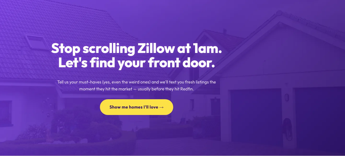
Playful Real Estate CTA: Purple Gradient Listing Alert Signup
cta · real_estate · playful
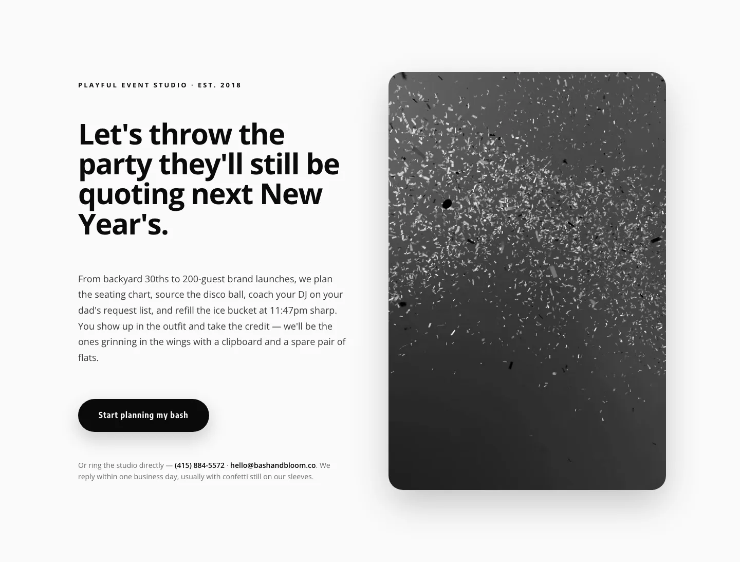
Playful Events CTA Layout for Divi 5: Bash & Bloom
cta · events · playful
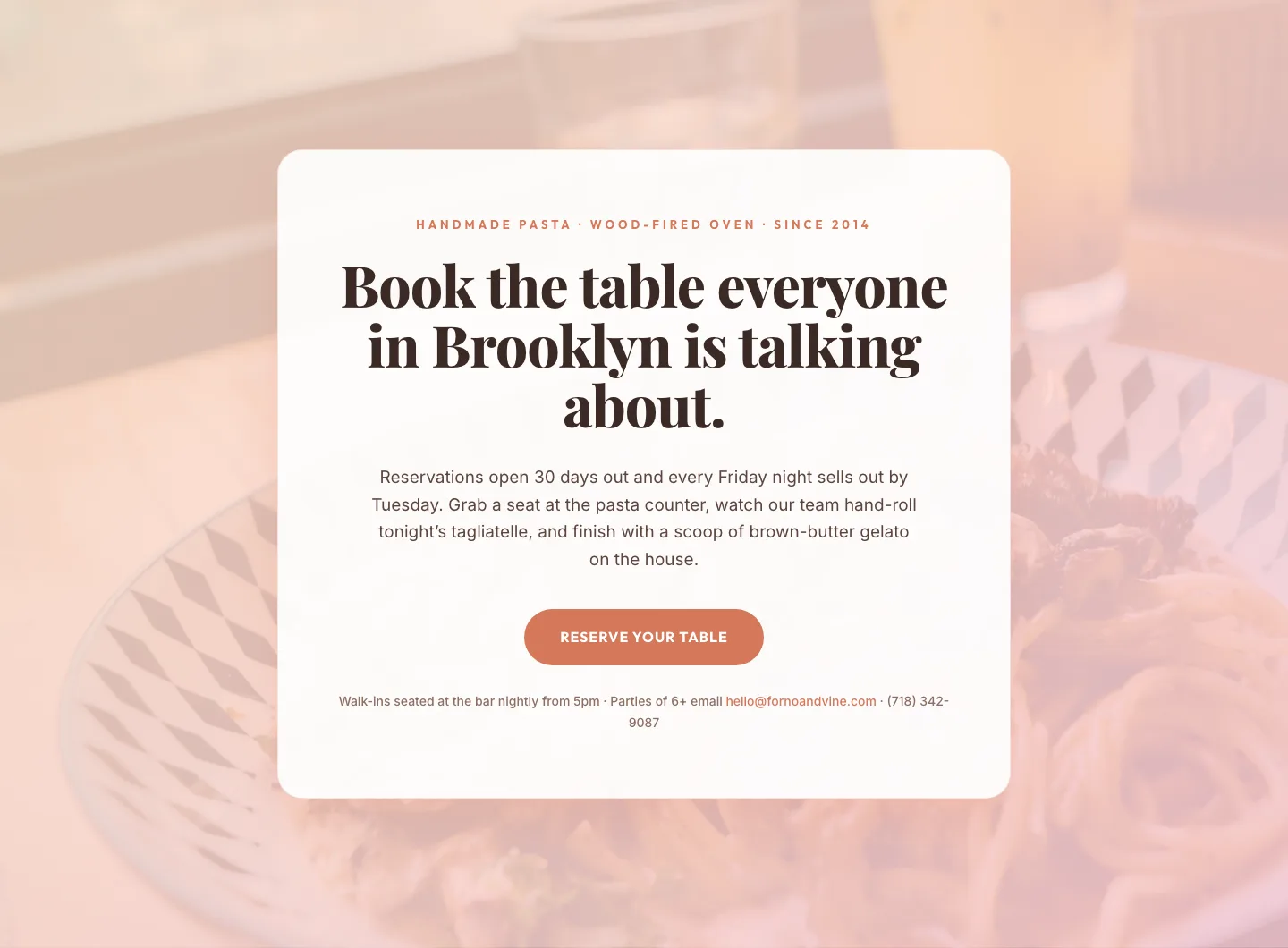
Bold Restaurant Reservation CTA: Divi 5 Layout
cta · restaurant · bold

Bold Purple SaaS CTA Banner: Full-Bleed Divi 5 Layout
cta · saas · bold
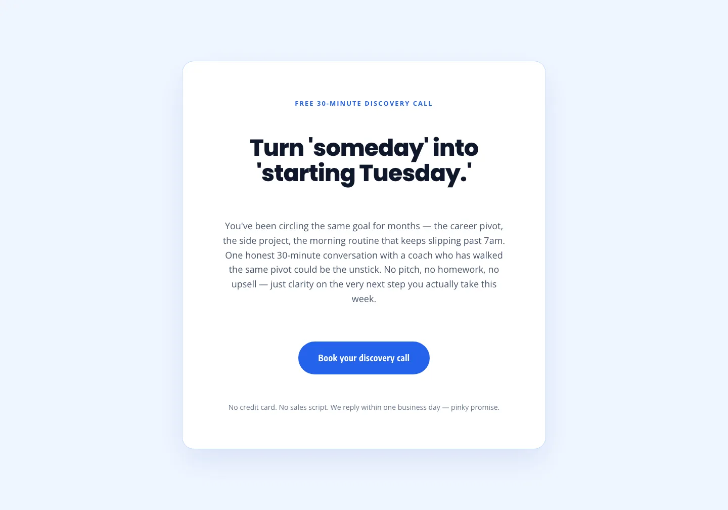
Coaching Discovery Call CTA: Playful Divi 5 Layout
cta · coaching · playful

CTA: Portfolio Bold Blue
cta · portfolio · bold