
Playful Agency CTA: Idea Sprint Booking Card
Mint-green playful CTA section for creative agencies. Centered card invites visitors to book a free 30-minute Idea Sprint with a friendly, human tone.
Rate this element
Download this section, free
- Divi 5 JSON, imports in seconds
- Commercial license included
- No account needed
Click to view the full page
Overview
This layout is a single centered card floated over a soft mint section: a 920px-wide white panel with 28px rounded corners, a hairline mint border (#a7f3d0), and a deep-green box shadow that gives the card a gentle lift without feeling glossy. The section sits on #ecfdf5 with 120px of vertical breathing room on desktop, and the card itself uses generous 80px vertical / 72px horizontal padding so nothing crowds the edges. Everything inside the card is center-aligned, which makes the piece read as one confident invitation rather than a wall of copy competing for attention.
The vertical rhythm walks the eye down deliberately: a small uppercase eyebrow (For brands ready to smile more in emerald #10b981, 13px with 3px letter-spacing) → a 52px display heading in deep forest #064e3b on a tight 1.08 line-height → a 19px body paragraph clamped to a 620px max-width so the line length stays readable → a solid emerald button with a green-glow shadow → an italic fine-print line offering a plain-email fallback. Label, promise, explanation, action, safety net: five beats, one column, no distractions.
Mobile behaviour is baked in through Divi 5's phone tokens. Section padding drops from 120px to 80px, the card's inner padding drops from 80/72 to 48/28, the row switches to flexDirection: column, and the heading scales from 52px to 34px so it never overwhelms a phone screen. Because there are no images and no side-by-side columns to reflow, the piece stays visually identical across breakpoints. Just tighter. The palette does all the color work (mint background, white card, emerald accents, forest text), which means a full rebrand is four hex swaps.
What’s inside
- Single-card composition: one Section, one Row with a single 4_4 Column, everything centered inside a 920px max-width card
- White card treatment: 28px rounded corners, 1px `#a7f3d0` mint border, and a soft emerald `preset3` box shadow for a subtle lift
- Uppercase emerald eyebrow at 13px with 3px letter-spacing sets tone before the headline hits
- 52px forest-green display heading (`#064e3b`, weight 700, -0.5px letter-spacing) that scales to 34px on phone
- Body paragraph capped at 620px max-width so the line length stays comfortable at 19px
- Solid emerald CTA button with a green-glow `preset2` shadow, 14px radius, and a dark-green hover state
- Italic fine-print email fallback line under the button for readers who won't click a CTA
- Responsive padding tokens across every level (section 120→80, card 80/72→48/28) so it drops onto a phone without hand-tuning
Who it’s for
Best for creative agencies, design studios, brand shops, and freelance operators who want their call-to-action to feel warm rather than aggressive. The tone (the fun website at the party, a free 30-minute Idea Sprint, a real human, we promise fallback) pitches consultations, discovery calls, homepage audits, or paid workshops the way boutique studios actually book work. It also drops neatly into copywriting practices, personal-brand consultancies, playful coaching businesses, and small SaaS teams running book a demo flows that don't want the corporate default. Anywhere you'd rather charm the reader into a call than shout at them, this card fits.
Customization tips
The palette is four hex values doing all the color work: #ecfdf5 (section), #FFFFFF (card), #10b981 (eyebrow + button + shadow tint), #064e3b (heading + button hover). Swap those to reskin the whole card: try lavender/violet for wellness brands, warm terracotta for hospitality, or deep navy/coral for retro-agency energy. Keep the headline under about 70 characters so it holds cleanly at 52px without a lopsided third line, and aim for 40–55 words in the body paragraph before the 620px max-width forces a fourth line. The button label works best at 2–4 words, anything longer and the emerald pill starts to dominate the card. Point the button linkUrl (currently #book) at your booking tool (Calendly, SavvyCal, Cal.com) and swap the fine-print email for your real inbox. There are no images to source, so a rebrand is copy + palette + link, nothing else.
How to install this layout
- Download the layout JSON file from this page.
- Open the target page in the Divi 5 builder.
- Open the portability panel (up/down arrows icon) and choose the Import tab.
- Upload the JSON. Tick “replace existing content” only for full-page imports.
- Check the page at desktop and mobile widths, then swap in your copy and images.
Full walkthrough with troubleshooting: How to Import a Divi 5 Layout.
Questions about Playful Agency CTA: Idea Sprint Booking Card
Which Divi 5 modules does this layout actually use?
Native only: one Section, one Row with a single 4_4 Column, one Heading module, three Text modules (eyebrow, body paragraph, italic fine-print), and one Button module. No third-party plugins, no custom code, no icon libraries.
How does the card behave on mobile?
Section padding steps down from 120px to 80px vertical, the card's inner padding drops from 80/72 to 48/28, the row's flex direction switches to column, and the heading scales from 52px to 34px. Everything stays centered: the composition doesn't rearrange, it just tightens.
Are there any images or icons in this layout?
No. It's a pure typography-and-button card. That's why it drops in fast: nothing to source, nothing to license, no image aspect ratios to fight. The visual weight comes from the mint palette, the rounded card, and the soft green shadow.
Where does the CTA button point, and how do I change it?
Currently to the in-page anchor `#book`. Open the Button module and swap `linkUrl` for a Calendly / SavvyCal / Cal.com link, or a full booking-page URL, before you publish. The button label (`Grab an Idea Sprint`) lives in the same panel.
What should I edit first after importing?
The headline and eyebrow, they set the whole tone. Then rewrite the body paragraph so it names your real offer (audit, discovery call, workshop) with a specific duration and deliverable. Change the button label and link next, and finally replace the fine-print email `hello@ferngullystudio.com` with your real inbox.
Can I change the emerald palette without breaking the design?
Yes: the color logic is just four values (mint background, white card, emerald accent, forest text). Change them in the section background, card row background/border, eyebrow text, heading, button, and hover states, and the composition holds. The border, button glow, and heading contrast were all tuned to the emerald family, so pick a palette with a similarly wide light-to-dark range.
Which Divi version does this layout need?
Divi 5. The layout is generated natively for Divi 5 and validated against its real module structure before publication, so it imports clean into the current builder.
Can I use this layout on client websites?
Yes. Every download includes a commercial license covering unlimited sites you own or build for clients. Only reselling or redistributing the layout file itself is prohibited.
More call-to-action
Browse all call-to-action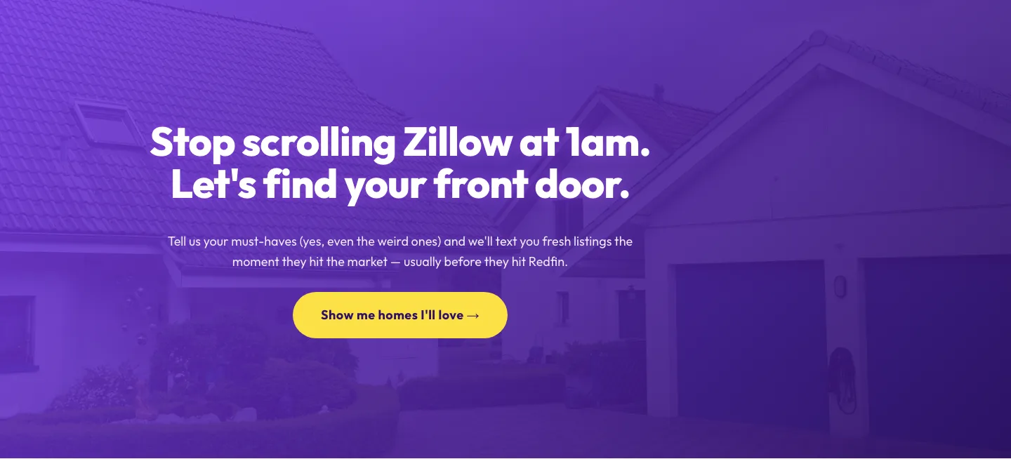
Playful Real Estate CTA: Purple Gradient Listing Alert Signup
cta · real_estate · playful
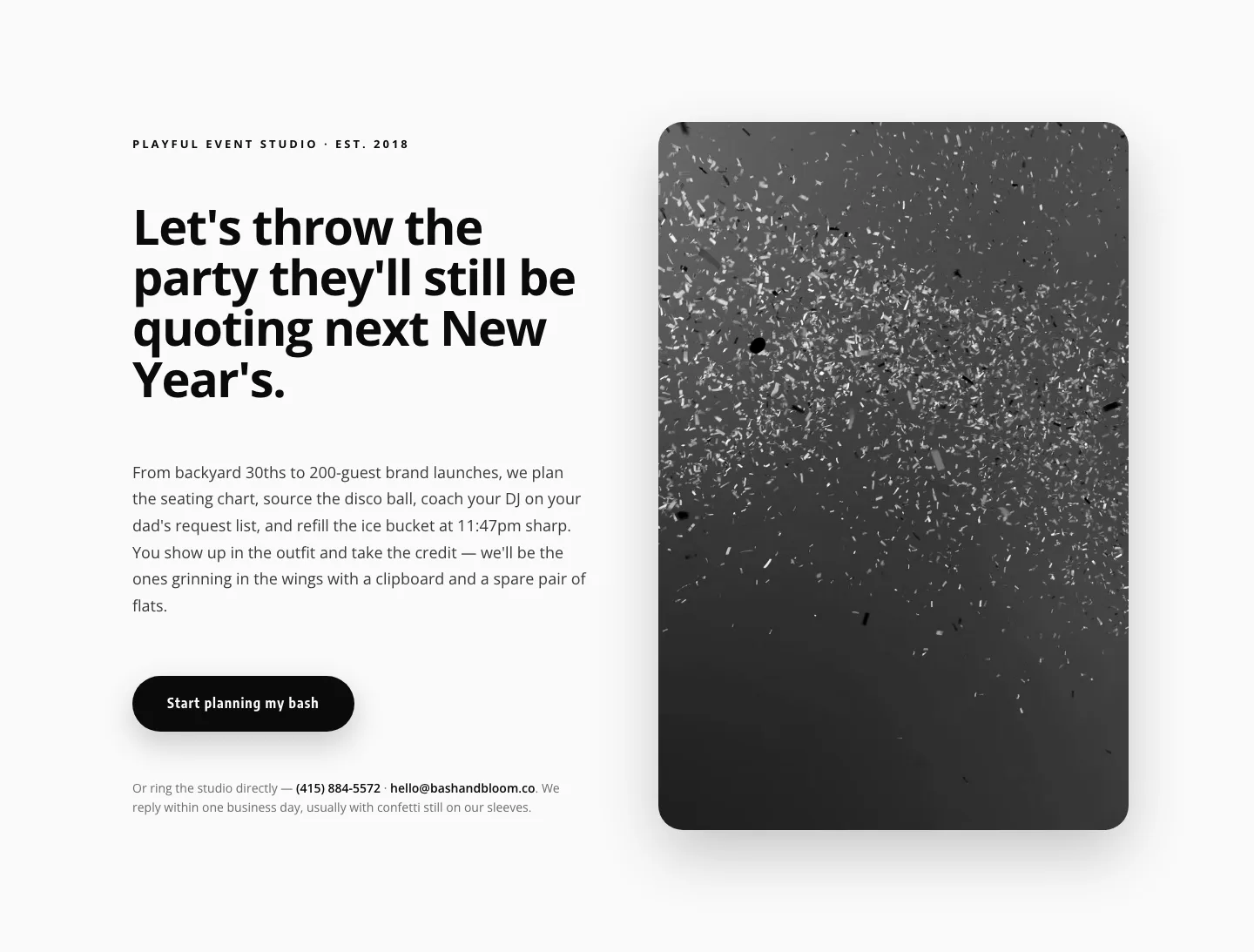
Playful Events CTA Layout for Divi 5: Bash & Bloom
cta · events · playful
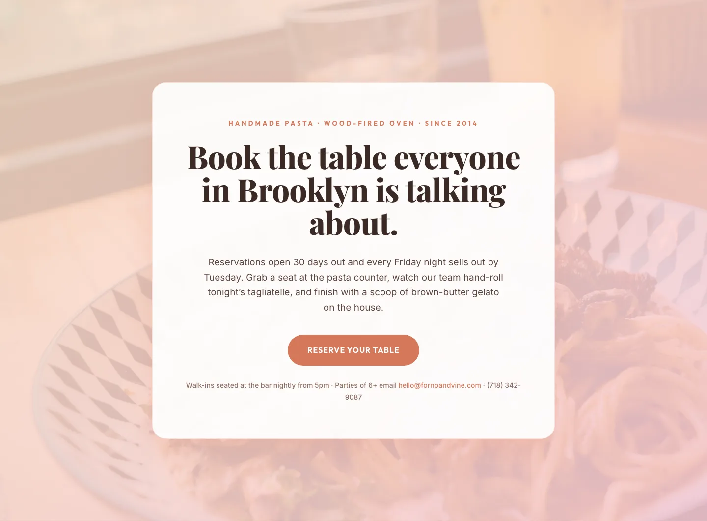
Bold Restaurant Reservation CTA: Divi 5 Layout
cta · restaurant · bold

Bold Purple SaaS CTA Banner: Full-Bleed Divi 5 Layout
cta · saas · bold
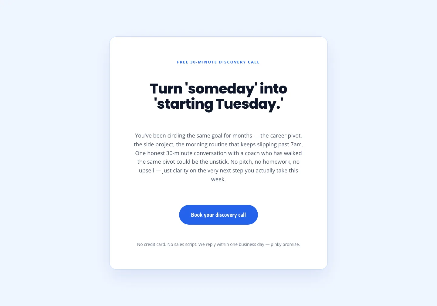
Coaching Discovery Call CTA: Playful Divi 5 Layout
cta · coaching · playful

CTA: Portfolio Bold Blue
cta · portfolio · bold