
Playful Real Estate CTA: Open House Weekend Tour Booking
A warm, playful Divi 5 CTA section for real estate open houses. Bold orange headline, rounded pill buttons, tour reservation + SMS contact, and a sunlit porch photo.
Rate this element
Download this section, free
- Divi 5 JSON, imports in seconds
- Commercial license included
- No account needed
Click to view the full page
Overview
A two-column desktop split centers a friendly, sales-forward pitch on the left and a rounded, sunlit porch photo on the right, held together by a 64px column gap inside a 1200px max-width container that fills 88% of the viewport. The left column stacks four ordered pieces: a small orange eyebrow ("Open House Weekend" at 14px, 700 weight, 3px letter-spacing, uppercase), an 800-weight display headline at 52px with a tight -1px letter-spacing and 1.05 line-height, a warmly worded 18px body paragraph at 1.7em line-height, and a two-up CTA row.
The whole section sits on a warm cream #FFF6EC background with 110px of vertical padding, which relaxes to 80px on tablet and 60px on phone. The orange accent (#EA6A1A on eyebrow, primary button fill, and image drop shadow) anchors attention without overwhelming the headline color (#1F1408) or the body copy (#4A3A2A). The right column wraps its photo in a 28px border-radius, adds a soft 60px-blur orange-tinted shadow, and hides overflow so the image can hover-scale to 1.03x cleanly inside the rounded frame.
Below the paragraph, a nested two-column row holds the CTAs: a primary orange pill labeled "Reserve My Tour Slot" (deep orange fill, white type, a translate-y -3px lift on hover, shadow blooming from 28px to 36px blur) and a secondary outlined pill "Text Maya: (415) 428-7702" wired to an sms: link that opens the phone's Messages composer. A 14px fine-print line under the buttons offers a mailto: fallback, three warm contact channels in one CTA block.
On tablet the row's flexDirection flips to column so text stacks above the photo, the headline drops to 40px, and section padding softens to 80px. On phone the headline shrinks again to 32px, the two buttons collapse into a single-file stack, and the section breathes at 60px top and bottom: no horizontal scroll, no overflow squeeze.
What’s inside
- Eyebrow → 52px H1 → 18px body → dual CTA stack in the left column, with a fine-print mailto: line underneath
- Primary pill button (999px radius, orange fill, white text, hover lift and shadow bloom) linked to an on-page signup anchor
- Secondary outlined pill button wired to an sms: deep link so mobile taps open the Messages composer pre-addressed
- Image column with 28px rounded corners, orange-tinted 60px drop shadow, and a 1.03x hover scale inside a hidden-overflow frame
- Warm cream #FFF6EC section background with a single orange accent (#EA6A1A / #C7530B hover) carried across eyebrow, button, shadow, and links
- Responsive type ramp (52 / 40 / 32px headline) and section padding ramp (110 / 80 / 60px) baked into the module settings
- Two-column desktop layout that stacks to a single column on tablet and phone via flexDirection changes
Who it’s for
Real estate agents and teams promoting open houses, weekend tours, or new listings that want a warmer, more human voice than the corporate default. It suits boutique brokerages, neighborhood-focused agents, first-time-buyer brands, and family-oriented listings where inviting language beats a hard sell. The pattern also works for property managers hosting apartment tours, new-home builders inviting model-home visits, and vacation rental hosts pushing off-season stays. Beyond real estate, any local, appointment-driven business fits: interior designers running showroom weekends, custom builders showing spec houses, wedding venues offering walk-throughs, or coaches hosting free consult days. Anywhere a friendly invite plus phone plus email outperforms a cold contact form, this section drops in cleanly.
Customization tips
Swap #EA6A1A (and its #C7530B hover) for your brand accent, #FFF6EC for the section background, and #1F1408 for the headline color. Three preset-level edits reskin the whole block. Keep the headline under about 48 characters so the two-line rhythm on desktop and 32px phone size stay clean. Body copy reads best around 240–320 characters; longer paragraphs push the CTAs below the fold on phones. Replace the porch photo with a landscape 3:2 or 4:3 crop around 940×650 (1880×1300 @2x for retina), a hero property, agent portrait, or open-door interior all fit the rounded 28px frame. Update the sms: link to your team's number and the mailto: to your inbox; the fine-print line can also host a WhatsApp deep link or a calendar URL. Both buttons share a 999px pill radius, so a single value change reshapes both if you want softer square corners.
How to install this layout
- Download the layout JSON file from this page.
- Open the target page in the Divi 5 builder.
- Open the portability panel (up/down arrows icon) and choose the Import tab.
- Upload the JSON. Tick “replace existing content” only for full-page imports.
- Check the page at desktop and mobile widths, then swap in your copy and images.
Full walkthrough with troubleshooting: How to Import a Divi 5 Layout.
Questions about Playful Real Estate CTA: Open House Weekend Tour Booking
Does the second button really open a text message on phones?
Yes. It's wired to sms:+14154287702, so tapping it on a phone launches the Messages composer with the number pre-filled. Swap the number in the button's link field and the behavior carries over, no plugin or tracking script needed.
What image size works best in the right-hand column?
The source used is 940×650 (roughly 1880×1300 at 2x for retina). Landscape 3:2 or 4:3 photos sit best inside the 28px rounded frame, porches, exteriors, or interior wide shots. Tall portrait crops will get pinched on desktop.
How does the two-column layout behave on mobile?
The row's flexDirection switches to column on tablet and phone, so the text block stacks above the photo. Inside that, the two CTA buttons also collapse into a single-column stack, and section padding drops from 110px to 60px on phone.
What should I edit first when repurposing this for a different listing?
The eyebrow ("Open House Weekend"), the headline, the address/hours/host details in the paragraph, and both button labels plus their sms: and #anchor links. Swap the porch photo last, everything else carries the pitch.
Are there any icons, sliders, or animations to worry about?
No icons and no slider. The primary button has a small hover lift (translate -3px) with a deeper shadow, and the image has a 1.03x hover scale: both are CSS-only transforms baked into the module settings, no third-party plugin required.
Which Divi version does this layout need?
Divi 5. The layout is generated natively for Divi 5 and validated against its real module structure before publication, so it imports clean into the current builder.
Can I use this layout on client websites?
Yes. Every download includes a commercial license covering unlimited sites you own or build for clients. Only reselling or redistributing the layout file itself is prohibited.
More call-to-action
Browse all call-to-action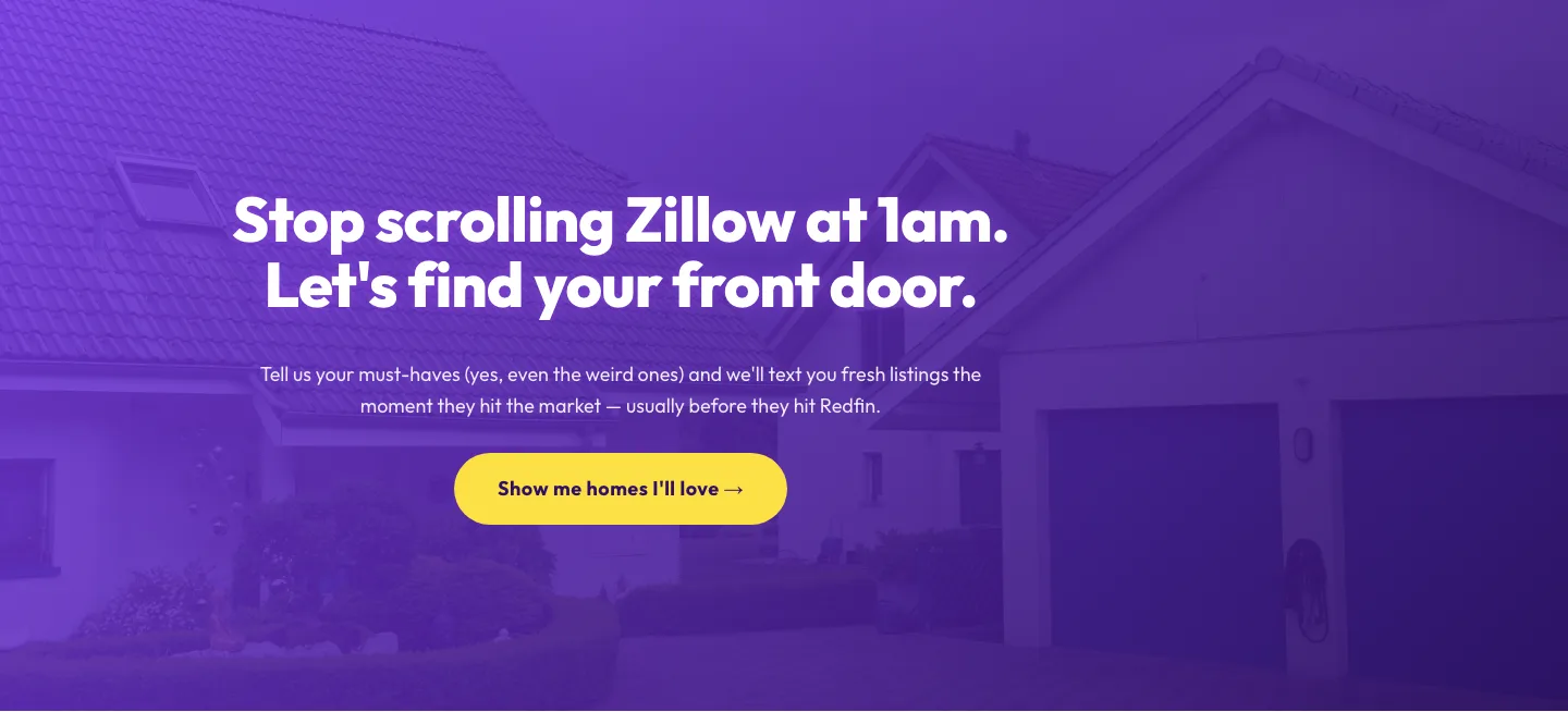
Playful Real Estate CTA: Purple Gradient Listing Alert Signup
cta · real_estate · playful
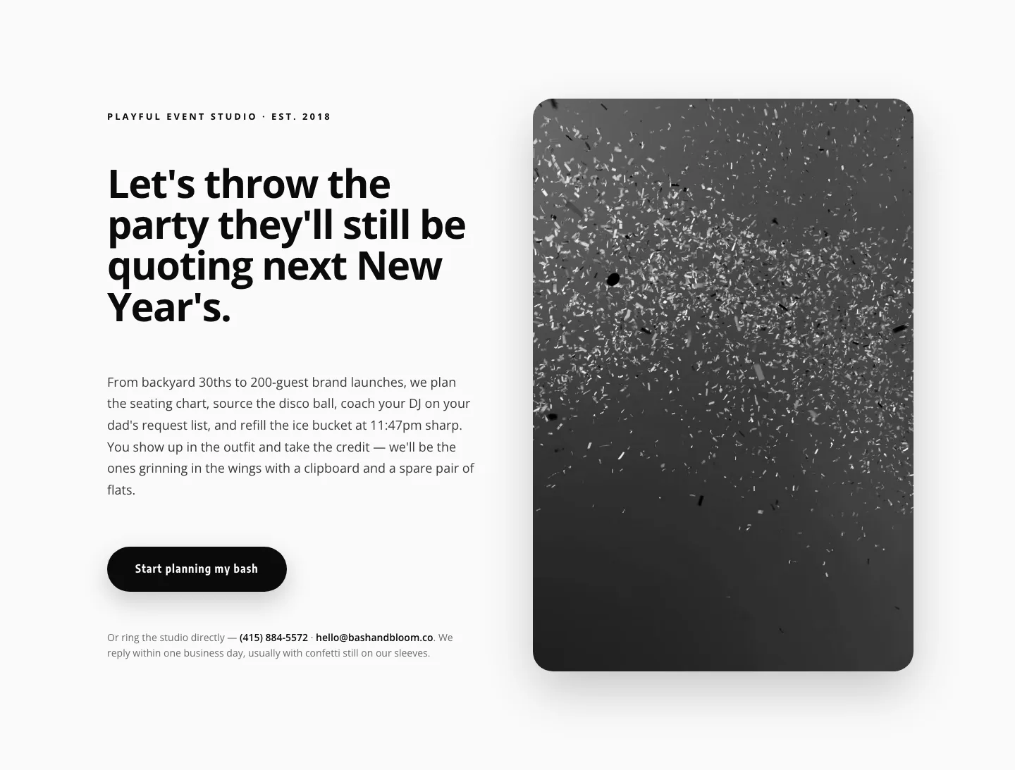
Playful Events CTA Layout for Divi 5: Bash & Bloom
cta · events · playful
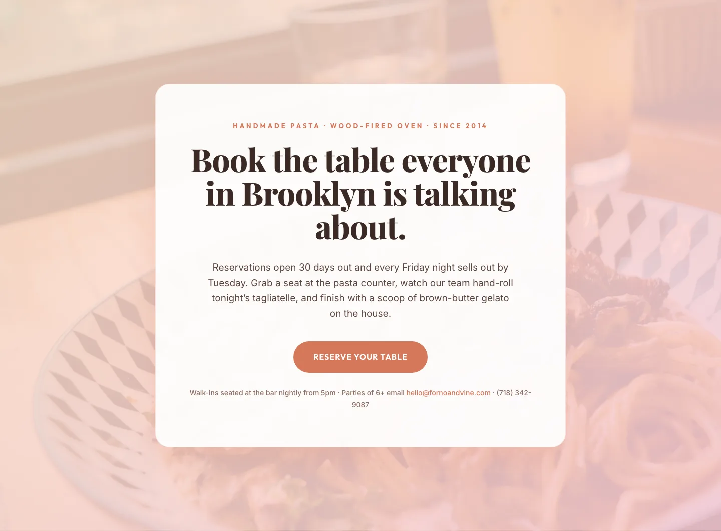
Bold Restaurant Reservation CTA: Divi 5 Layout
cta · restaurant · bold

Bold Purple SaaS CTA Banner: Full-Bleed Divi 5 Layout
cta · saas · bold
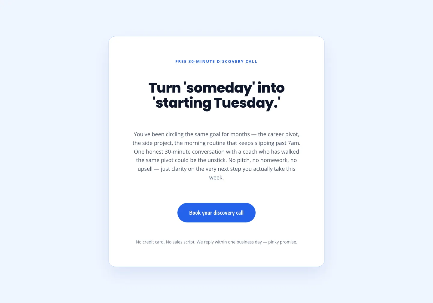
Coaching Discovery Call CTA: Playful Divi 5 Layout
cta · coaching · playful

CTA: Portfolio Bold Blue
cta · portfolio · bold