Minimal Ecommerce Shop Grid Layout for Divi 5: North Field Essentials
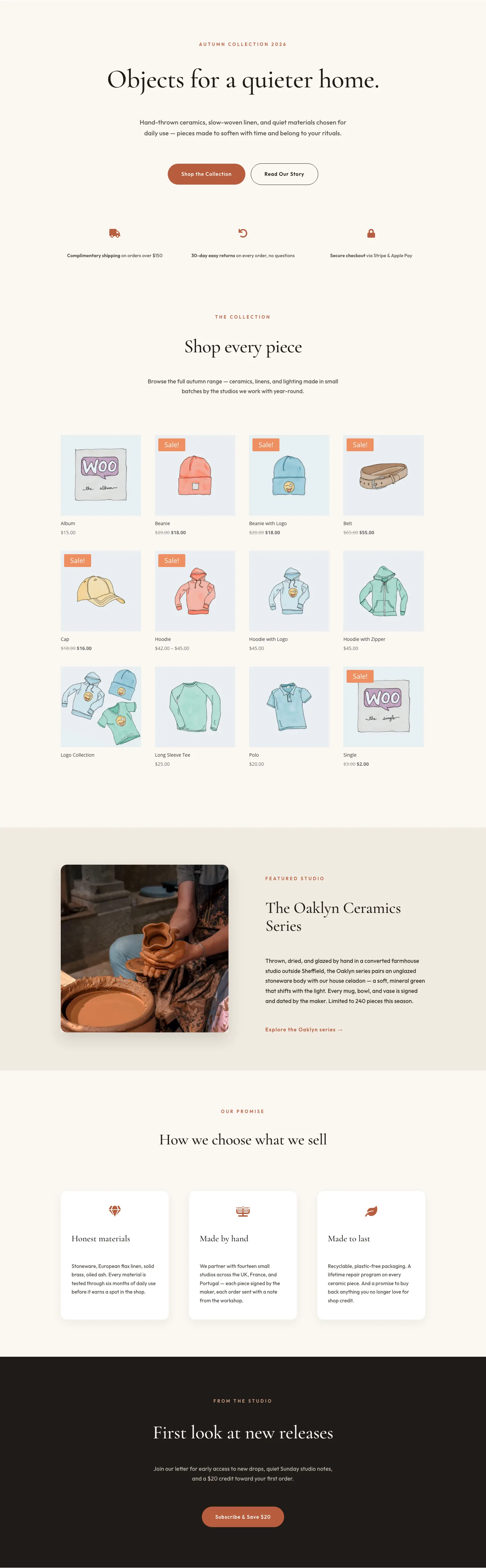
A calm, editorial shop grid section for Divi 5 ecommerce stores. Warm off-white background, centered eyebrow, oversized Outfit headline, and a native WooCommerce product grid: ready for small-batch homewares, essentials, and lifestyle brands.
Rate this element
Download this section, free
- Divi 5 JSON, imports in seconds
- Commercial license included
- No account needed
Click to view the full page
Overview
North Field Essentials is a quiet, editorial take on a WooCommerce shop grid: the kind of opener you'd expect on a small-batch homewares site, not a big-box store. The section sits on a warm cream backdrop (#f7f5f1) with 140px of vertical breathing room on desktop, so the intro block feels composed rather than compressed. A single terracotta eyebrow line ("New Season · Fall 2026", #b45f3f, tracked 3px and uppercased) anchors the top of the composition and gives the palette its only real accent. Everything else stays in a near-black heading (#1a1a1a) and a soft grey body (#4a4a4a).
The hierarchy is deliberately narrow and centered. The 58px Outfit headline is capped at 820px wide with -1px tracking so a long product-brand statement still reads as a single sentence. The 18px supporting paragraph is clamped to 640px at a generous 1.7em line height, that ratio is what keeps the intro readable without turning into a wall of text. Below the copy sits the native Divi Shop module, which reads your WooCommerce catalog and renders it as a clean product grid; the layout leaves that module's own padding at zero so the grid inherits your theme's product-card density instead of fighting it.
On tablet and phone the section rescales rather than restructures. Section padding drops from 140px to 96px to 72px, the headline steps 58px → 44px → 34px, and the row switches to a stacked column direction. Because the whole intro is already a single centered column, nothing reflows awkwardly on narrow screens: the eyebrow, heading, body, and grid stay in the same visual order, just tighter.
What’s inside
- Uppercase eyebrow text module in Outfit 500, 13px, 3px letter-spacing, terracotta `#b45f3f` for a single-accent palette
- Centered H1 heading module in Outfit 600 at 58px desktop / 44px tablet / 34px phone with -1px tracking, capped at 820px
- Supporting paragraph text module at Outfit 400, 18px, 1.7em line height, clamped to 640px so intro copy stays scannable
- Native Divi Shop module wired to your WooCommerce catalog, the grid renders live products from the category or list you point it at
- Cream section background token (`#f7f5f1`) with 140 / 96 / 72px vertical padding across the three breakpoints
- 1240px max-width row with 24px side gutters that collapses to a single stacked column on phone
- Single type family (Outfit) at three weights across the whole section, so a preset-level font swap restyles everything at once
Who it’s for
Small-batch product brands: homewares, ceramics, apothecary, coffee, stationery, slow-fashion basics, anywhere the story is "made carefully, priced honestly." It also fits curated boutique shops, artisan food and drink, indie bookstores, and independent design studios that sell a limited SKU set and want the catalog to feel like a lookbook rather than a warehouse. Because the intro runs long-form (up to 640px wide), it suits brands whose positioning is part of the sell: Sunday-market vendors going online, subscription boxes launching a seasonal collection, or a Shopify escapee rebuilding on WordPress with WooCommerce. Skip it if you carry hundreds of SKUs and need aggressive filtering, category chips, or a dense mega-grid up top: this section is built for restraint, not merchandising density.
Customization tips
Palette swaps live in three places: the section background (#f7f5f1), the terracotta eyebrow (#b45f3f), and the near-black heading (#1a1a1a). Change all three at the Divi preset level and the section restyles in a single pass, the body grey (#4a4a4a) will usually still read against whatever cream or off-white you pick. Copy limits: keep the eyebrow to five or six words (the 3px letter-spacing eats horizontal space fast), the headline to roughly ten words so it stays inside two lines at 58px, and the intro paragraph to about 45 words before the 640px cap wraps into a fourth line. The Shop module inherits your WooCommerce product-image aspect ratio, square (1:1) or portrait (4:5) images give the cleanest grid; mix them and the row heights will jitter. Point the Shop module at a specific category or a curated include list so the featured grid stays tight instead of paginating.
How to install this layout
- Download the layout JSON file from this page.
- Open the target page in the Divi 5 builder.
- Open the portability panel (up/down arrows icon) and choose the Import tab.
- Upload the JSON. Tick “replace existing content” only for full-page imports.
- Check the page at desktop and mobile widths, then swap in your copy and images.
Full walkthrough with troubleshooting: How to Import a Divi 5 Layout.
Questions about Minimal Ecommerce Shop Grid Layout for Divi 5: North Field Essentials
How does the section render the actual product grid?
It uses the native Divi Shop module, which pulls products directly from your WooCommerce store. Whatever category, tag, or include list you point it at is what shows up: the layout doesn't ship with a hard-coded product list, so there's nothing to swap out one by one.
Do I need WooCommerce installed for this to work?
Yes. The Shop module is WooCommerce-powered, so WooCommerce needs to be active on the site with at least one published product before the grid will render anything. Without it, the intro block still shows but the grid area stays empty.
How does the intro block behave on mobile?
The section padding steps from 140px down to 96px on tablet and 72px on phone, and the headline scales 58px → 44px → 34px. Everything stays centered and single-column, so nothing reflows out of order: the eyebrow, heading, body, and grid keep the same rhythm, just tighter.
What should I edit first after importing?
Replace the eyebrow ("New Season · Fall 2026"), the headline, and the intro paragraph in that order. That's the entire above-the-grid message. Then open the Shop module and set the category and product count to match your catalog. Your product photography will do most of the visual work from there.
Can I change the typeface without breaking the composition?
Yes. The whole section uses Outfit at three weights (500 / 600 / 400). Swap it in one place via a Divi typography preset and every module in the section picks up the new family: the sizes and tracking were tuned for a geometric sans, so pair-alike fonts (Inter, DM Sans, Manrope) drop in cleanly.
Why is the eyebrow the only colored element?
That single terracotta line is the palette's only real accent, and the restraint is what makes the section read as editorial rather than promotional. If you need a second accent, the safest place to introduce it is inside the heading (a colored word or an accent underline). Not the body copy.
Which Divi version does this layout need?
Divi 5. The layout is generated natively for Divi 5 and validated against its real module structure before publication, so it imports clean into the current builder.
Can I use this layout on client websites?
Yes. Every download includes a commercial license covering unlimited sites you own or build for clients. Only reselling or redistributing the layout file itself is prohibited.