
Bold Agency Testimonials Section: Dark Divi 5 Layout with Client Proof Cards
High-impact Divi 5 testimonials section for agencies: dark background, three white review cards with portraits, orange hover accents, and a case-study CTA button. Validated JSON, ready to import.
Rate this element
Download this section, free
- Divi 5 JSON, imports in seconds
- Commercial license included
- No account needed
Click to view the full page
Overview
This section is built around one contrast decision: near-black canvas, white cards. The section background is a deep #0a0a0a with generous 120px vertical padding on desktop (dropping to 80px with 24px side gutters on phone), so the three white testimonial cards read as bright, high-value objects floating on dark space rather than boxes in a grid. Each card gets a heavy 36px-blur drop shadow to lift it off the background: and on hover, that shadow shifts to an orange glow while the card's subtle 1px border flips to the accent color, giving the whole row a tactile, interactive feel without any custom code.
The header stack follows a classic three-tier hierarchy: an uppercase orange eyebrow ("CLIENT RECEIPTS") set at 14px with aggressive 5px letter-spacing, a 60px Outfit heading with tight -1px tracking and 1.05 line-height, and a supporting paragraph capped at 680px width in 70%-opacity white so it recedes behind the claim. The heading scales deliberately (60px desktop, 44px tablet, 34px phone) so the punchy two-beat headline never wraps awkwardly on small screens.
The cards themselves sit in a flex row with 32px gaps and stretch alignment, so all three stay equal height even when quote lengths differ. Each column is a true one-third (8/24 flex basis) on desktop and snaps to full width on phone with a tighter 24px stack gap. A single pill-shaped CTA button (orange fill, dark uppercase label, its own orange glow shadow) closes the section 56px below the cards, centered, pointing readers toward case studies while the proof is still fresh.
What’s inside
- Three native Divi 5 Testimonial modules with author name, job title, company, and portrait fields. No third-party review plugin needed
- Equal-height card row using Divi 5 flex layout (stretch alignment, 32px column/row gaps) that wraps cleanly and stacks to single column on phone
- Hover states baked into the cards: border flips from 12%-white to orange (#ff4d00) and the drop shadow becomes an orange glow, all preset-level, zero CSS
- Three-tier header stack: uppercase letterspaced eyebrow, 60px Outfit h2 with per-breakpoint sizes (60/44/34px), and a 680px max-width intro paragraph
- Pill CTA button (999px radius) with orange glow shadow, hover lift, and dark uppercase label, centered under the cards
- Responsive spacing built in: 120px section padding with 6vw fluid gutters on desktop, tightening to 80px/24px on phone
- Anchor-ready section with a #testimonials HTML ID for one-page navigation links
Who it’s for
This one is written for agencies (creative studios, branding shops, performance-marketing teams) and the copy leans into that voice with metric-driven quotes ("cut our cost-per-demo by 41%"). But the structure fits anyone selling outcomes: consultants, freelance designers and developers, SaaS teams collecting customer proof, or coaches with client transformations to show. The dark palette pairs naturally with bold portfolio sites, launch pages, and personal brands that already run dark themes. If your site is airy and pastel, you'll want to invert the palette (easy. See customization) rather than drop this in as-is. It works best placed after a services or portfolio section, where the CTA to case studies has somewhere real to point.
Customization tips
Start with the copy: the three quotes are 25–35 words each, and the equal-height flex row is most forgiving when you stay in that range. One 60-word quote will stretch all three cards. Swap the pravatar placeholder portraits first; they're square (500×500), and any square headshot crops correctly, so export client photos at 1:1. To re-palette, you only need to touch two colors: the section background (#0a0a0a) and the accent orange (#ff4d00), which appears in five places, eyebrow text, card hover border, card hover glow, button fill, and button shadow. Change all five together or the hover states will feel disconnected. Company names and job titles are dedicated Testimonial module fields, not free text, so they'll stay consistently styled as you edit. Keep the headline to six words or fewer, at 60px it wraps to a second line fast. The button links to "#" by default; point it at your case-studies page before publishing.
How to install this layout
- Download the layout JSON file from this page.
- Open the target page in the Divi 5 builder.
- Open the portability panel (up/down arrows icon) and choose the Import tab.
- Upload the JSON. Tick “replace existing content” only for full-page imports.
- Check the page at desktop and mobile widths, then swap in your copy and images.
Full walkthrough with troubleshooting: How to Import a Divi 5 Layout.
Questions about Bold Agency Testimonials Section: Dark Divi 5 Layout with Client Proof Cards
Which Divi 5 modules does this section use?
Native modules only: two Heading modules (eyebrow + h2), a Text module for the intro, three Testimonial modules for the cards, and a Button module for the CTA. No code modules, no shortcodes, no third-party plugins.
Do the three cards stay the same height if my quotes are different lengths?
Yes: the card row uses Divi 5's flex layout with stretch alignment, so all three cards match the tallest one. That said, keeping quotes within roughly 25–40 words keeps the cards compact instead of stretched.
How does it behave on mobile?
The cards stack into a single full-width column with a 24px gap, the heading steps down from 60px to 44px on tablet and 34px on phone, and the section padding tightens from 120px to 80px vertical with 24px side gutters. All of this ships in the layout, nothing to configure.
Are the portrait photos included?
The layout ships with placeholder avatars loaded from pravatar.cc so it previews realistically, but you should replace them with real client headshots. The portrait field expects a square image, 500×500px or larger works well.
Can I add a fourth testimonial?
Yes. Duplicate one of the three columns: each is a 1/3-width flex column and the row is set to wrap, so a fourth card flows to a second line. For an even grid you'd add two more (six total) or change the column flex basis to 1/4.
What should I edit first?
The three quotes and author fields, then the portraits, then the button link (it's a placeholder). The headline and eyebrow are next: the copy is agency-flavored, so tune the voice to your brand before touching any styling.
Which Divi version does this layout need?
Divi 5. The layout is generated natively for Divi 5 and validated against its real module structure before publication, so it imports clean into the current builder.
Can I use this layout on client websites?
Yes. Every download includes a commercial license covering unlimited sites you own or build for clients. Only reselling or redistributing the layout file itself is prohibited.
More testimonials
Browse all testimonials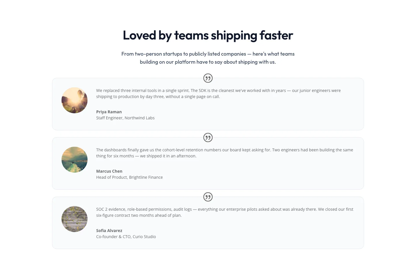
Minimal SaaS Testimonials Section: Three-Column Customer Quotes
testimonials · saas · minimal
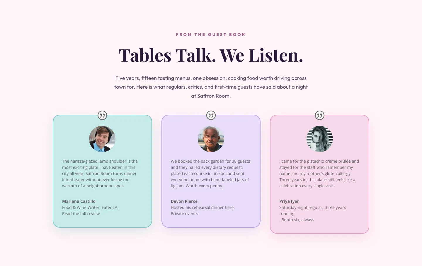
Tables Talk. We Listen.: Bold Restaurant Testimonials Layout for Divi 5
testimonials · restaurant · bold
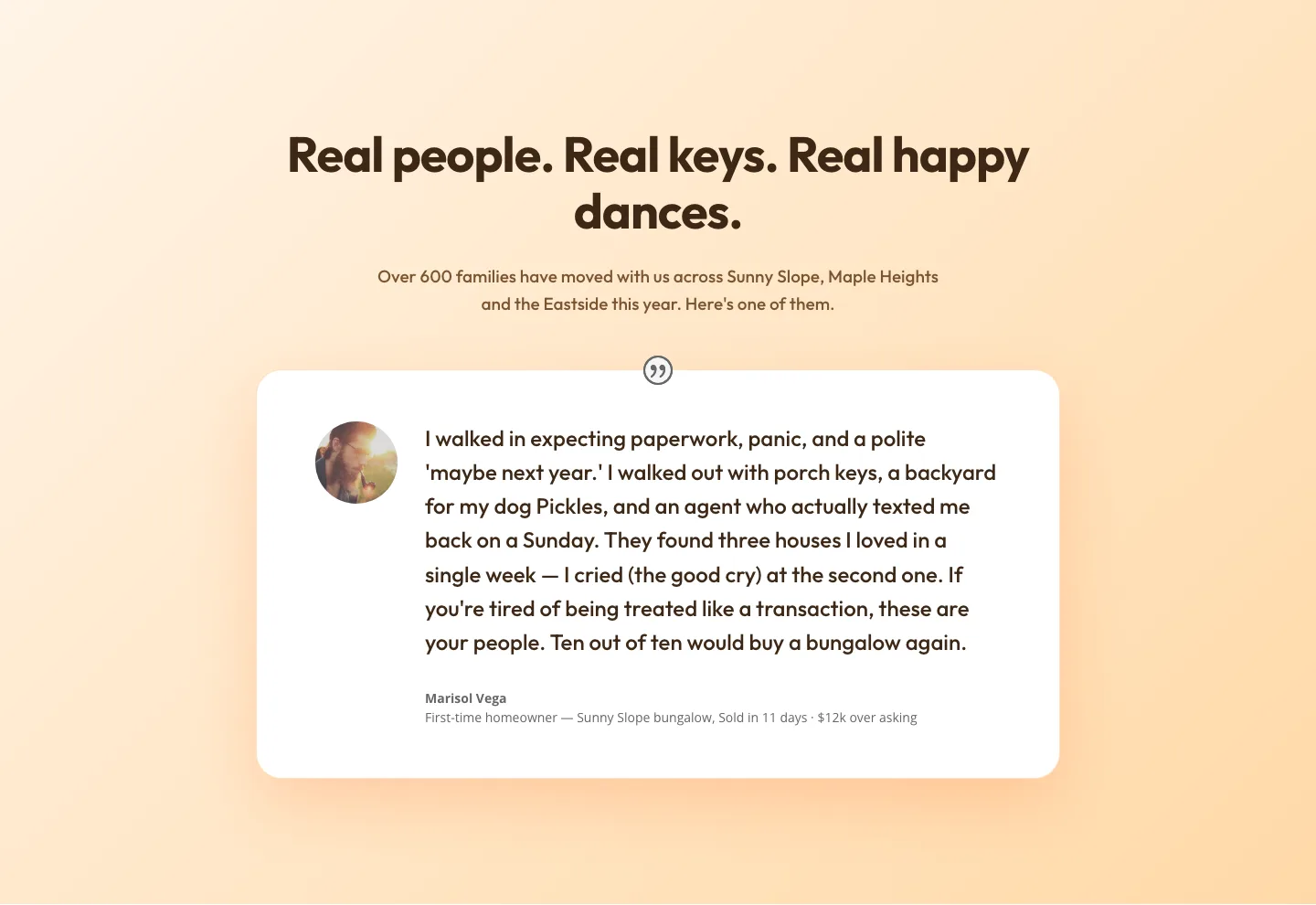
Playful Real Estate Testimonials Section: Warm Client Story Block | Divi 5 Layout
testimonials · real_estate · playful
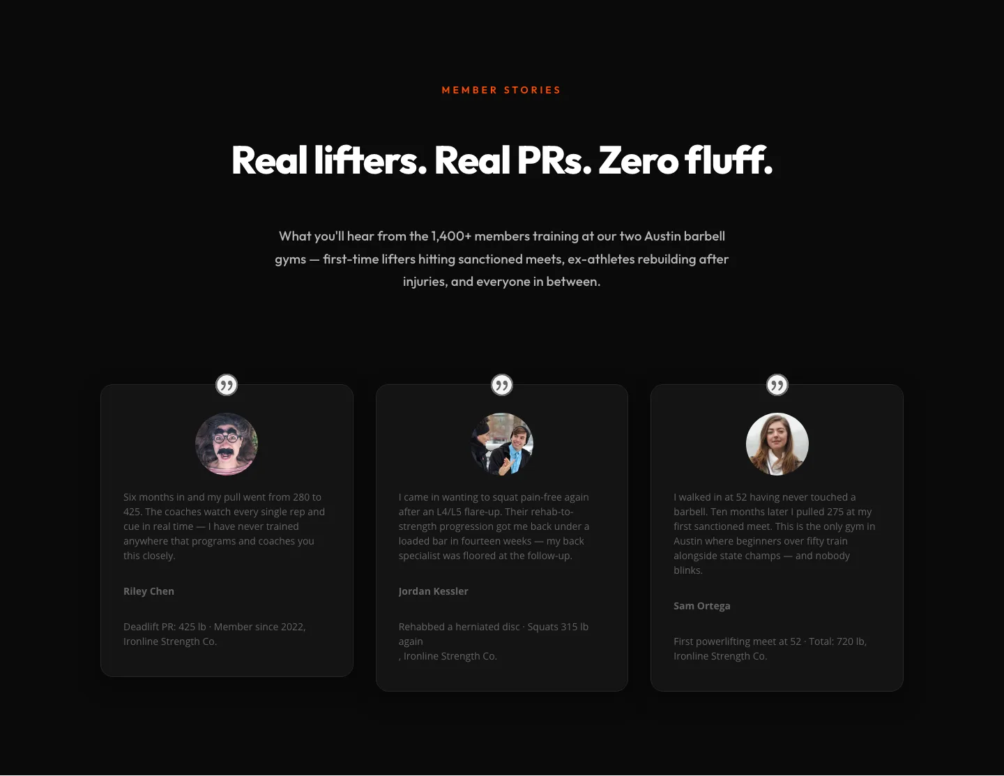
Bold Fitness Testimonials Section for Divi 5: Gym & Barbell Club
testimonials · fitness · bold
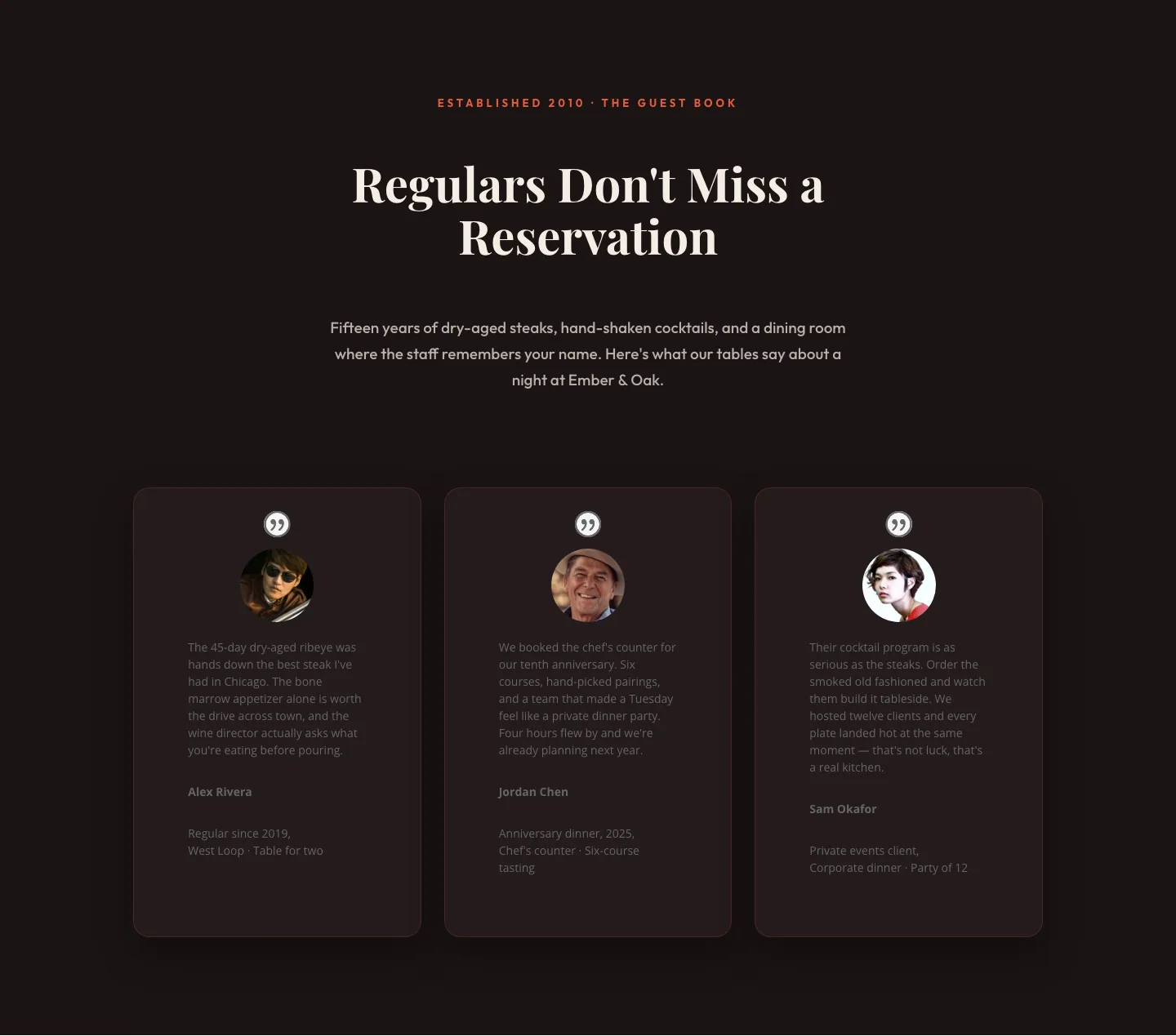
Bold Restaurant Testimonials Layout: Divi 5 Steakhouse Guest Book
testimonials · restaurant · bold
Bold Fitness Testimonials Section: Divi 5 Gym Member Stories Layout
testimonials · fitness · bold